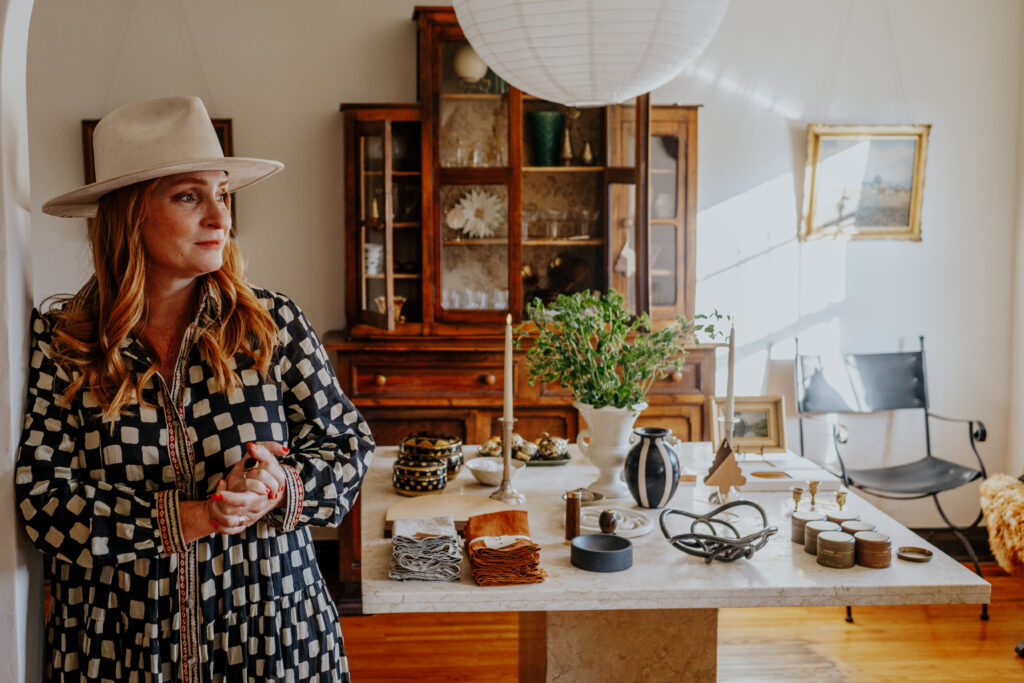
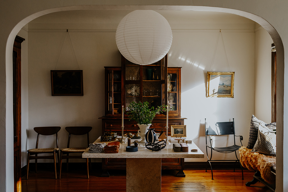
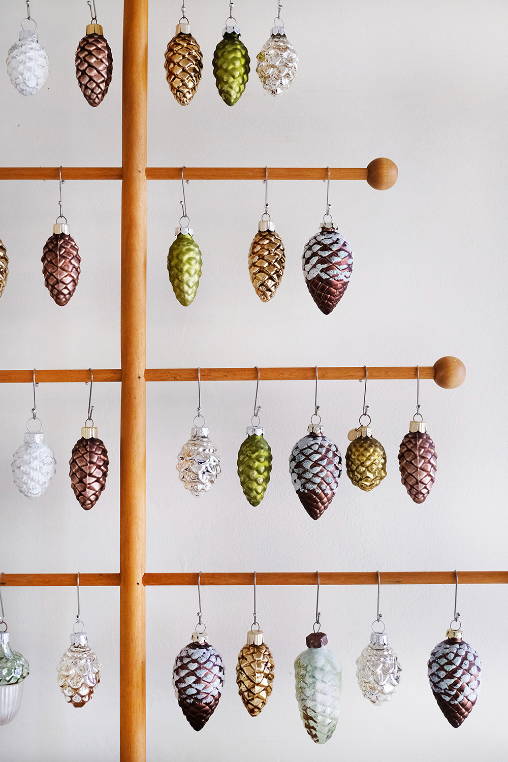
Hi friends, you probably already know this, but I OPENED A SHOP! It’s been a long time dream and in true Jeran fashion, I decided very spontaneously to lease a building and open.
I want to document more of this decision and process here on the blog. But to be completely honest, right now I don’t have the time or energy to share more then this announcement and some images my friend @allyswenphotography took for me just before I opened. I’ll be back and share more, but for now here’s where we are located and when we are open.
Oleander + Palm
1022 Truxtun Ave, Bakersfield CA 93301
Tuesday – Saturday 10 am – 5 pm
I hope you can come a visit me, but if that is not possible my online shop is still there and I’m adding new items to it all the time. Thanks for all the support friends.
This post is sponsored by The Company Store. Thank you for supporting the brands that help make this blog possible.
Happy Monday!
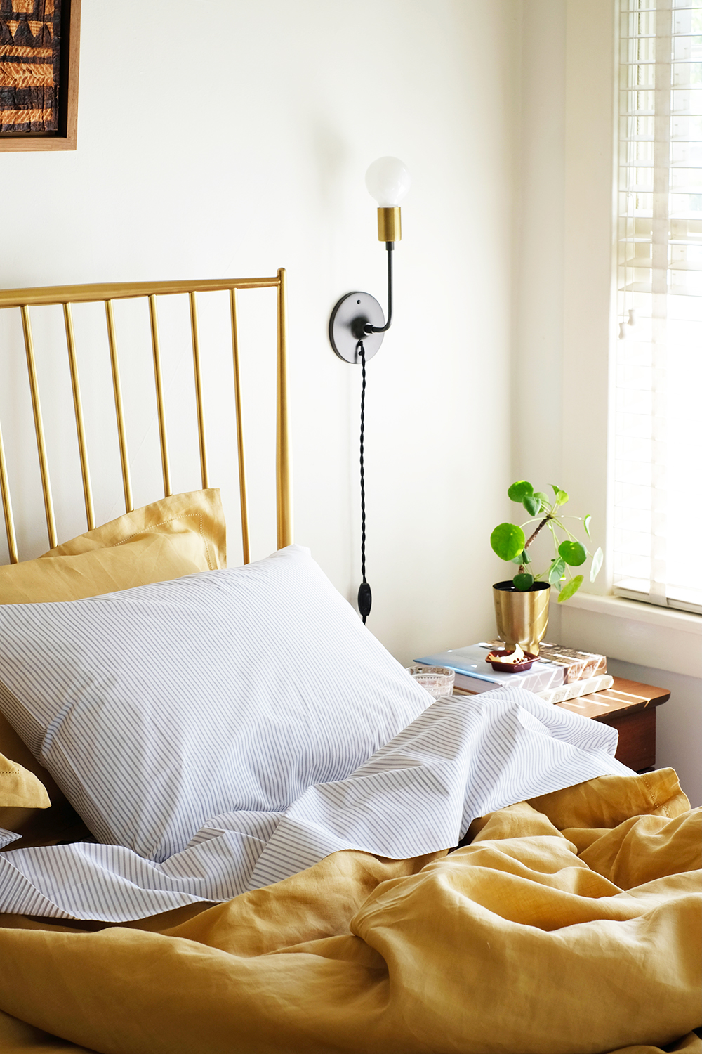
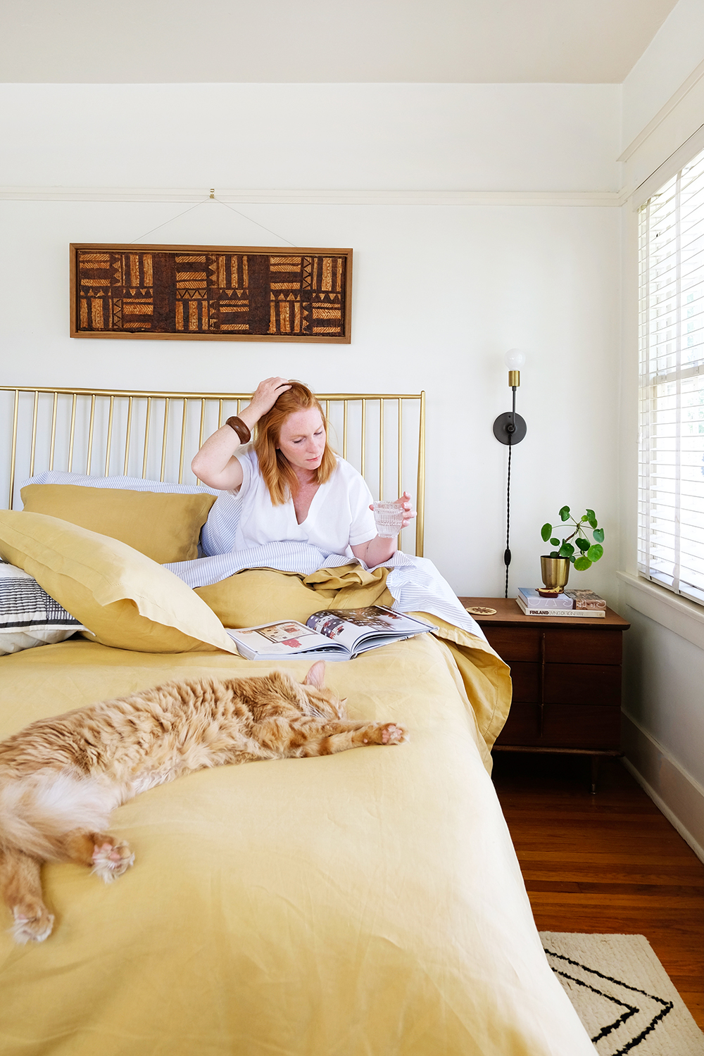
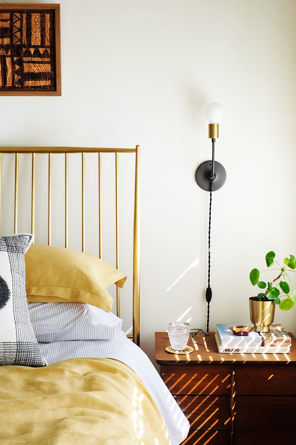
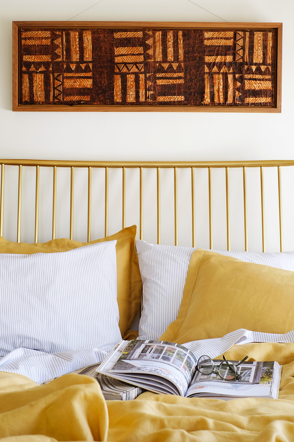
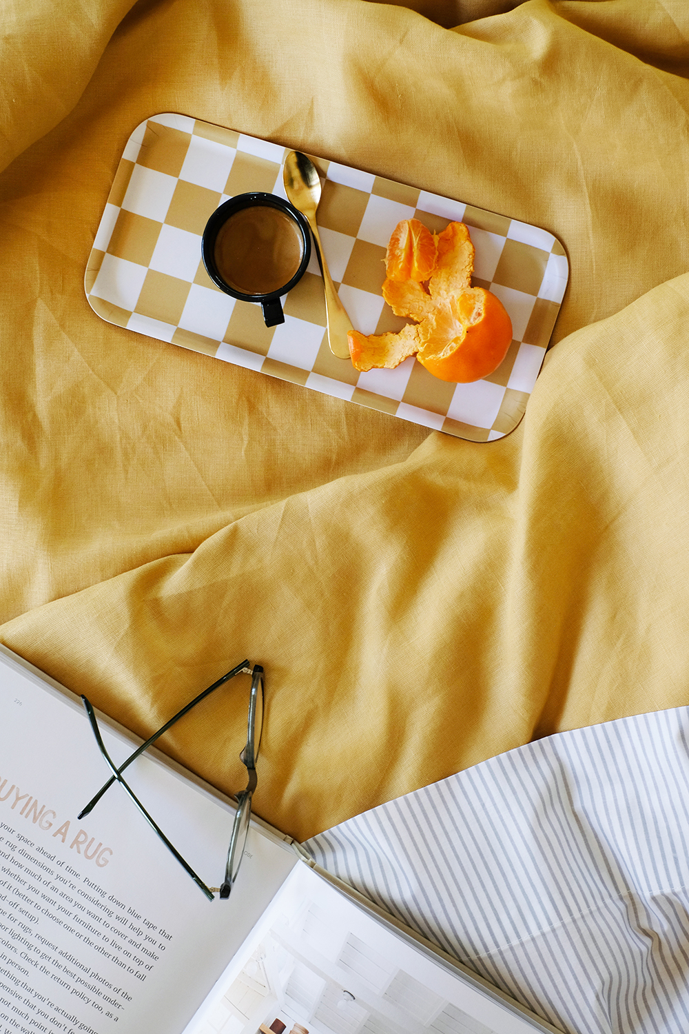
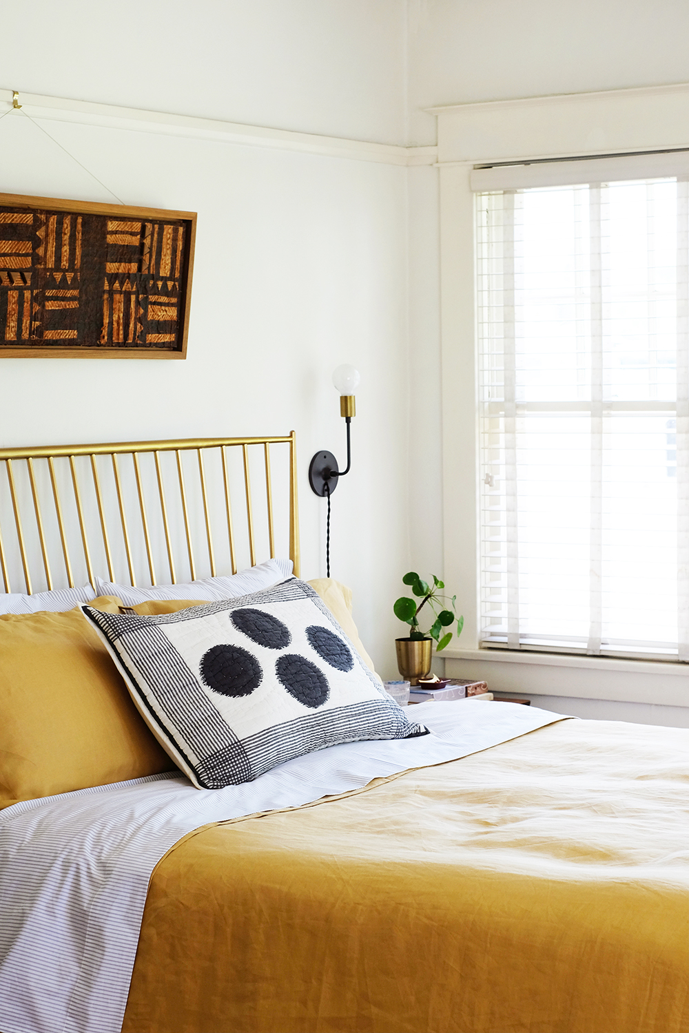
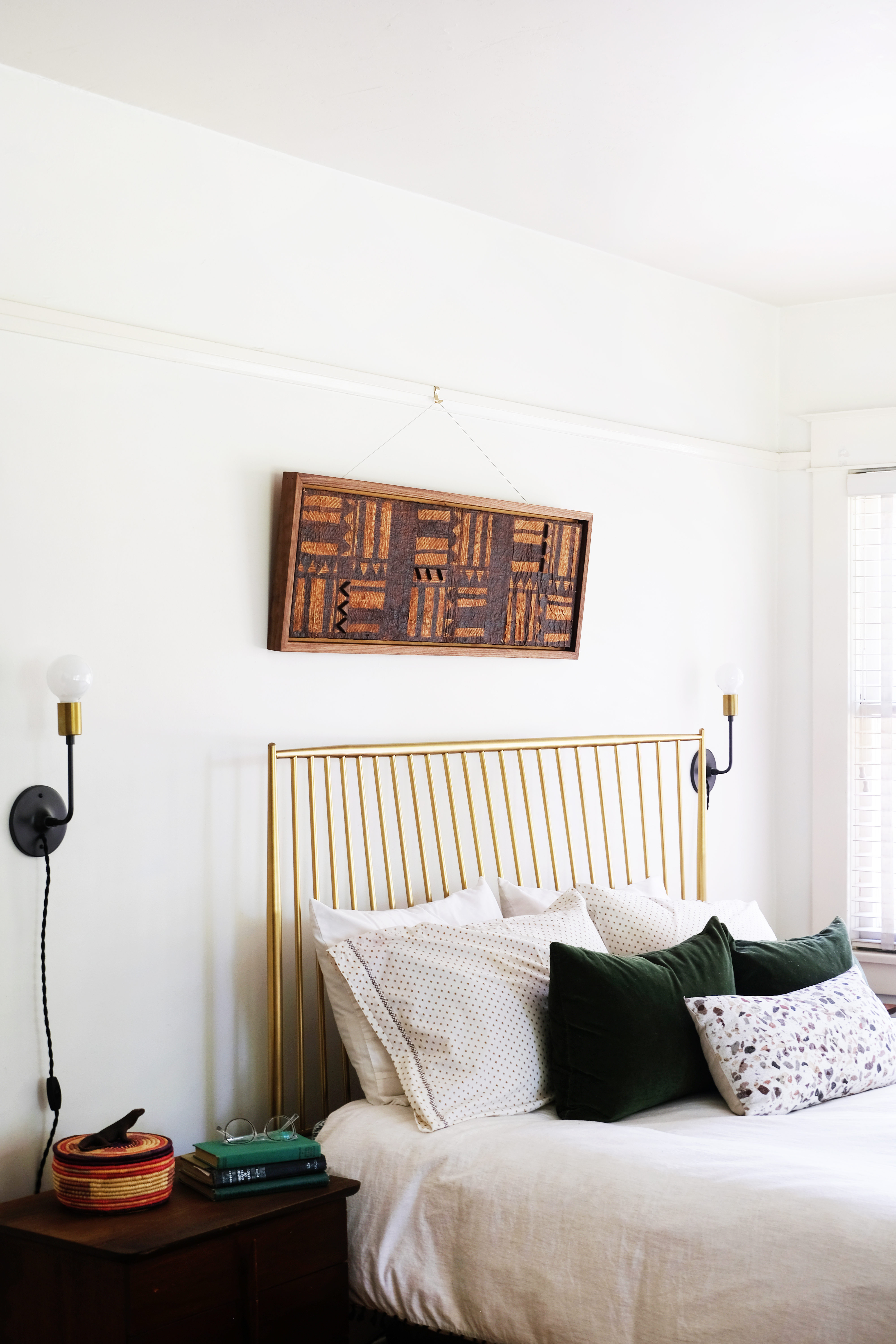
There is no time like Spring for wanting to spruce up and give rooms a refresh. I’ve been itching to change things up a little. And while I’ve been on an “all white bedding” kick for quite a few years, I’m craving a lot more color these days. My husband, Lonnie, is always happy when a stray from neutrals and add a burst of color. Since I’m ready for the sun and warmer days, we decided to bring in a little sunshine with a beautiful warm mustard colored Legends Hotel™ Relaxed Linen Duvet Cover and Shams from The Company Store.
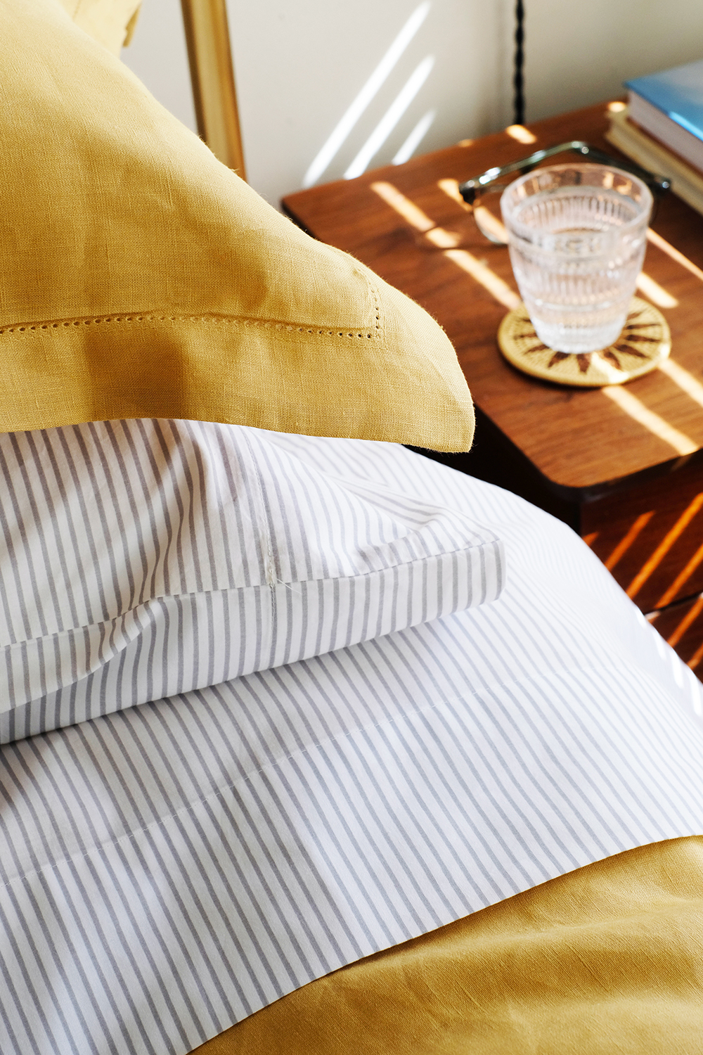
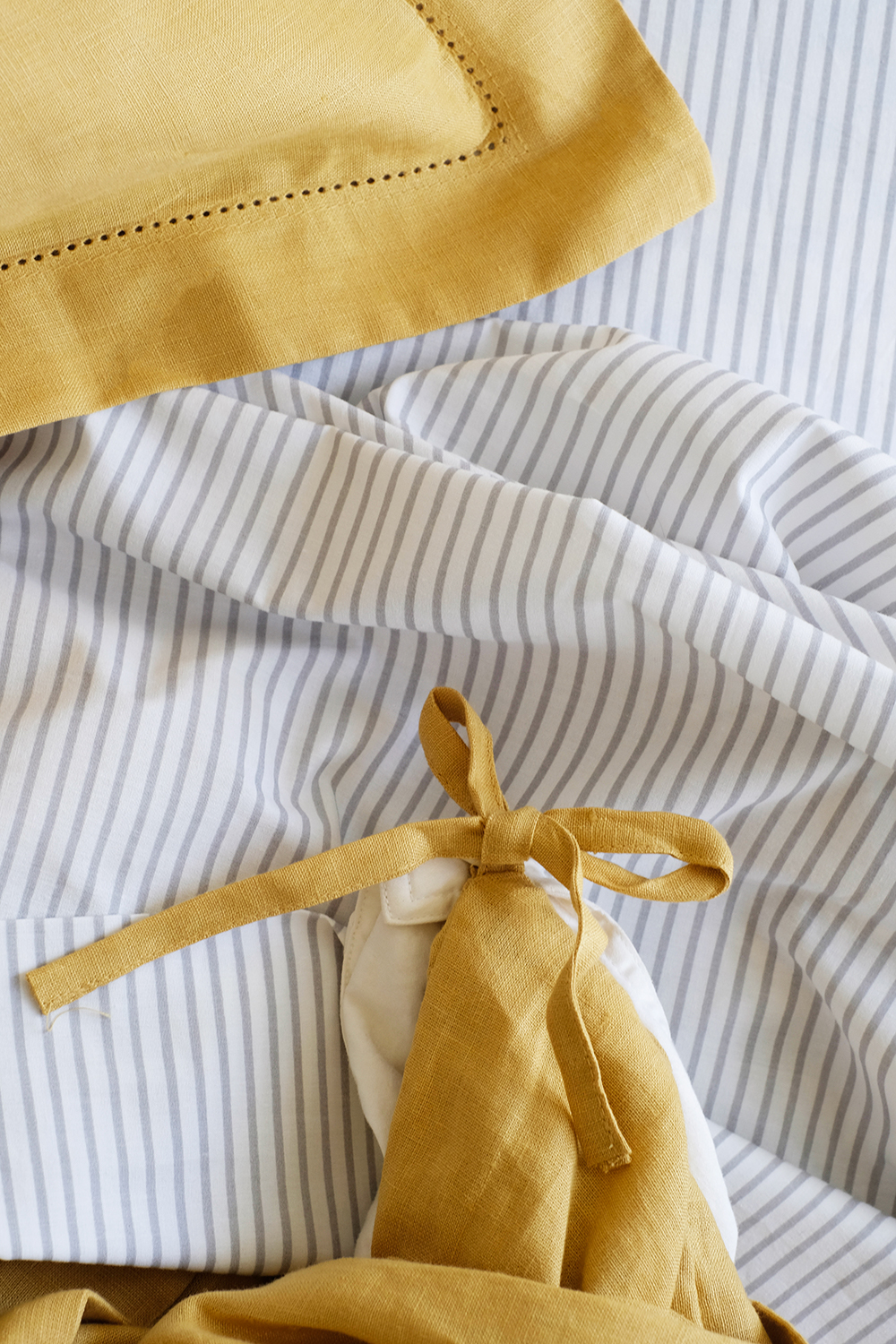
I’m very impressed with the details like the pretty linen hem stitch around the duvet and the shams. This grey and yellow might be a combo we’ve all played with before, but it still feels current to me with this subtle pattern and just enough texture.
And the duvet cover has four interior corner ties to secure the duvet insert in place – because there is nothing worse than a duvet scooting all the way down to one end.
I love wearing linen, especially when the weather gets warmer. It’s great breathable natural fiber. It’s relaxed and the opposite of anything fussy or fancy. And, for all the same reasons, I’ve been wanting to try linen bedding. This is the softest linen and this gorgeous Legends Hotel™ Relaxed Linen Duvet Cover comes in 10 beautiful colors. I had a hard time choosing. There’s a gorgeous Green and a rusty red/orange called Russet that were both very tempting. But, I’ve been wanting to push myself a bit with colors lately, so this golden hue felt like the brave and bold choice. I think I made the right choice, It matched the brass of my bed frame spot on, which is kind of fun.
I also added a fun Ink Spot Cotton Voile QuiltedSham to the center of the bed to add a little visual interest and pattern. You know I’m a fan of black and white and this sure does look sharp with the mustard yellow.
I’m such a fan of working with what you have and just making a few simple tweaks here and there. Fresh bedding is all this room needed to feel like a new space.
This post is sponsored by Carpet One Floor & Home. Thank you for supporting the brands that help make this blog possible.
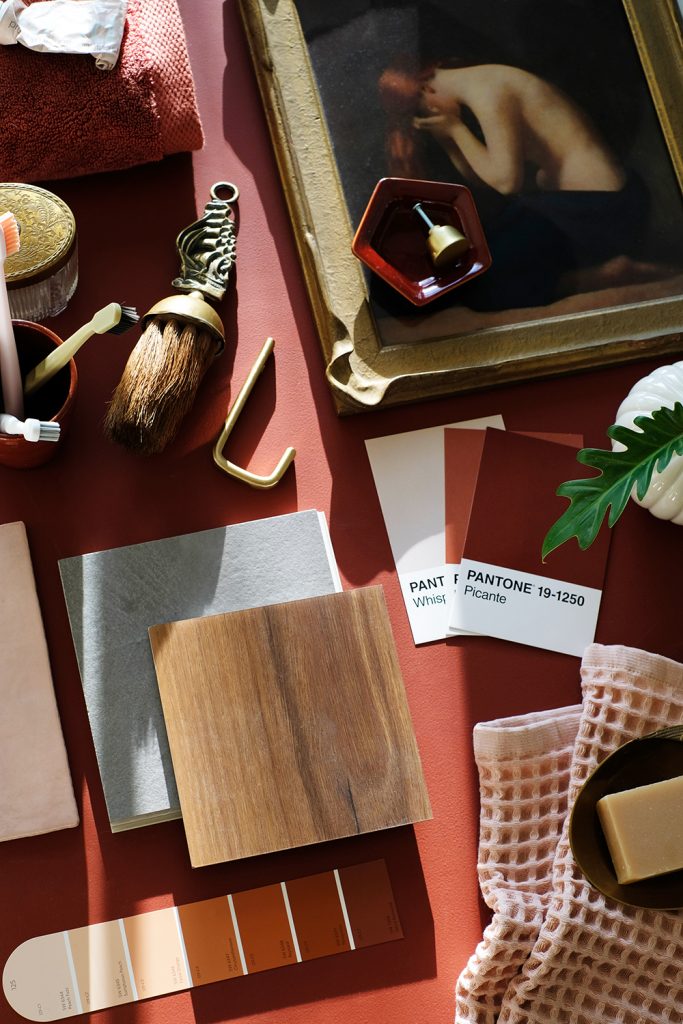
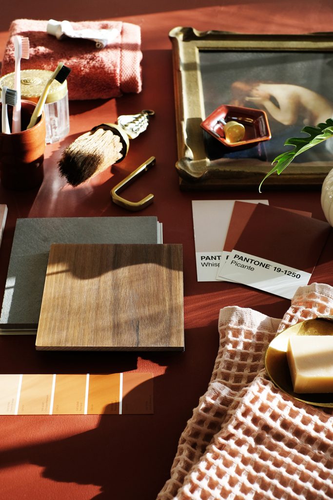
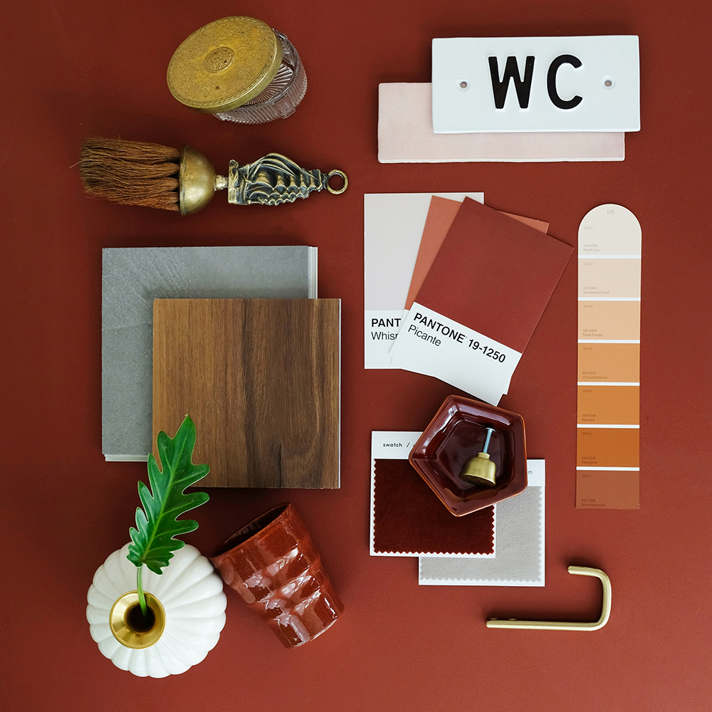
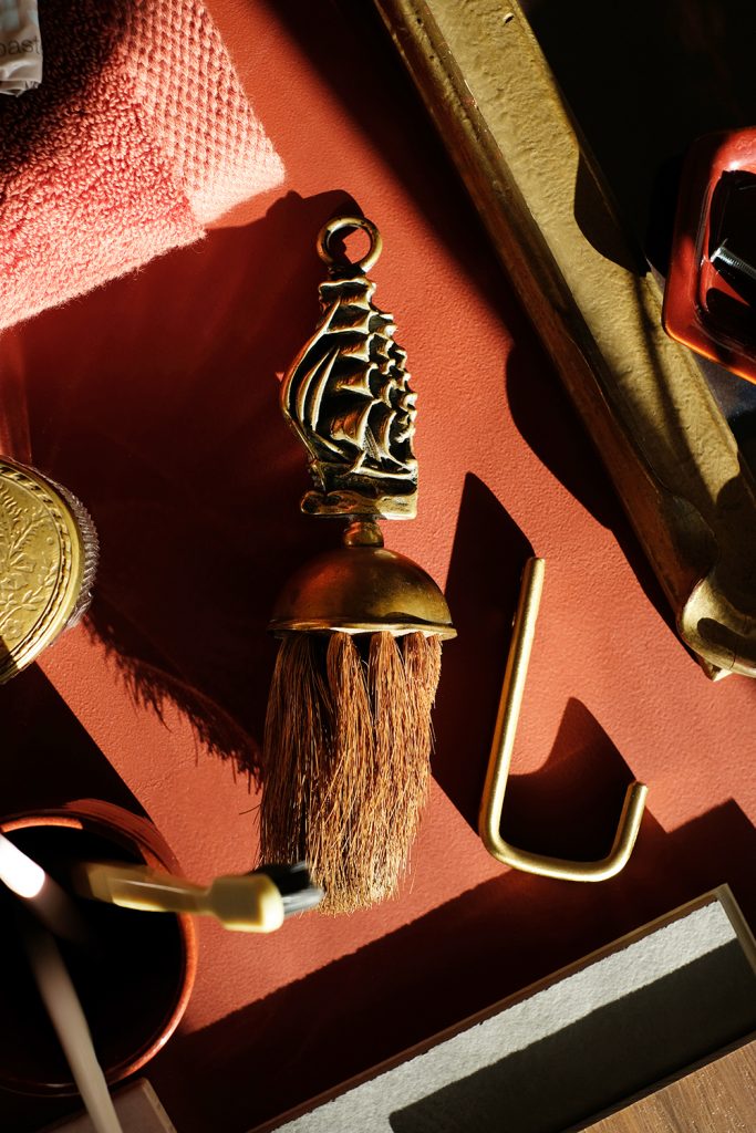
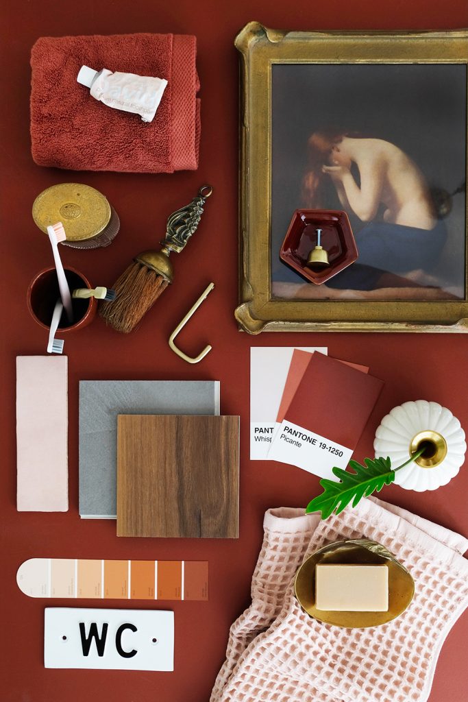
There’s one room in our home that gets very little screen time, our primary bathroom off of our bedroom. It’s a lot of “90’s remodel” vibes. Peachy/Pink walls, so many mirrors, shiny cheap brass fixtures, broken metal mini blinds and rust colored stone are just a few of the extra special features. I’m honestly just not ready for a full gut reno of this bathroom and really I don’t think it’s necessary. There actually is some great storage in this bathroom. So, I think I’m going to keep the updates to just upgrading the floor, painting EVERYTHING and then adding some art, accessories and new hardware. As much as I’d like to replace the dated (and not the date of our house dated) bathtub and retile the shower, it’s really the floor that needs some attention.
Carpet One Floor & Home has analyzed products in every flooring category to introduce their Trending Ten products of 2021. Carpet One Floor & Home is a trusted advisor when is comes to flooring trends, products and the latest flooring features. They sent me a sample box with the Trending Ten and I was immediately drawn to 2 of their flooring selections for our bathroom – Concrete Look in Power Grey by Bel Terra Tile and Ralston Creek in Charleston by Invincible XT(seen in the mood boards).
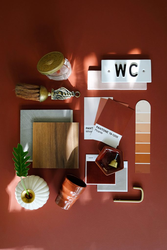
I decided to lay out a mood board of my vision to get a better feel for the space. Some of you might be really surprised by all the saturated color I’m infusing into this space. This is a little bit of a departure from my norm. But, I’m wanting to take some risks and have a little fun outside of my comfort zone when it comes to design. I’ve been all for keeping a space somewhat neutral so that you don’t end up with a design decision you don’t love in a couple years. But, there is something to be said about diving all in on a look that you REALLY love in the moment. Who knows what you’ll like in a few years. You can kind like it for quite a while or really LOVE it right now. I guess I’m liking the idea of living in the moment instead of playing it safe for some future time. So, let’s paint the cabinets a bold color and play with a brand new color palette!
I decided that just embracing the rust colored stone counter tops was the best way to go. So, I believe the plan will be to paint all the cabinets a rich rusty red color and maybe even keep the walls a pink tone. The Carpet One samples I was drawn to the most are quite different, but they both work so well with this palette. The wood grain feels warm and more like all the hardwood that is already in the home and the grey concrete look feels like a nice juxtaposition to all the warm reds. Because we live in a old house and I want to honor it’s age, without living in a museum. So, I’m always designing with a mix of vintage and modern. I think finding that balance with a little old and some new is what keeps our home feeling fresh.
A modern material on the floor, but lots of vintage touches when it comes to art and accessories – that’s my game plan.
If you had to pick, which would you go with, the grey cement look or the warm wood grain?
This post is sponsored by Sherwin Williams. A big thank you to Sherwin Williams for helping provide paint for this project. And a thank you for supporting the brands that help make this blog possible.
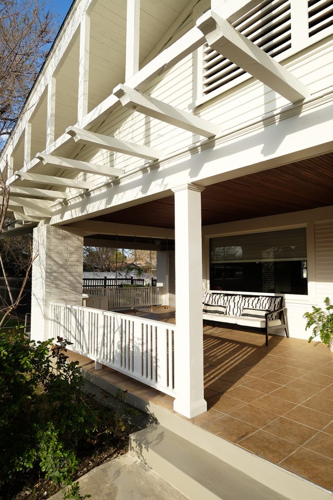
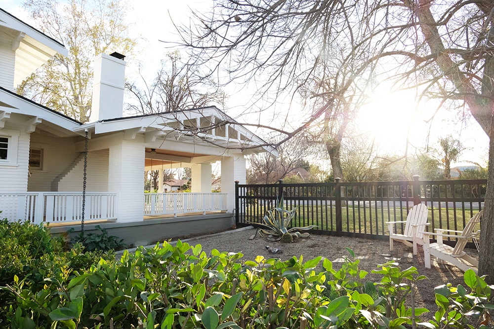
AND…. a very big shout out to my brother, Ash (who helped us run the lift and kicked off our first week of painting), my dad (who helped us problem solve the sprayer on more than one occasion and rebuilt new railings on my porch to match the rest of the house), my mom (who helped keep us fed and full), and last but definitely not least, Lonnie, my husband (who worked more hours then we can count prepping and painting this giant house).
Before
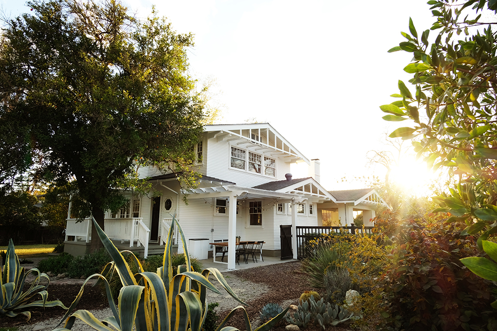
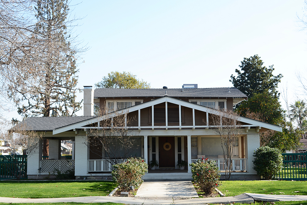
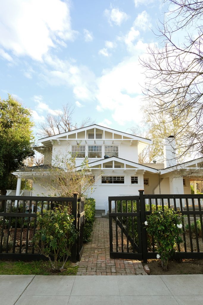
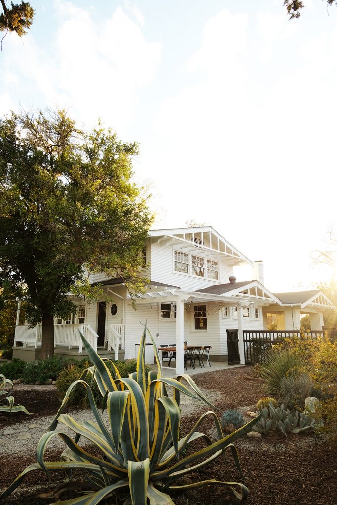
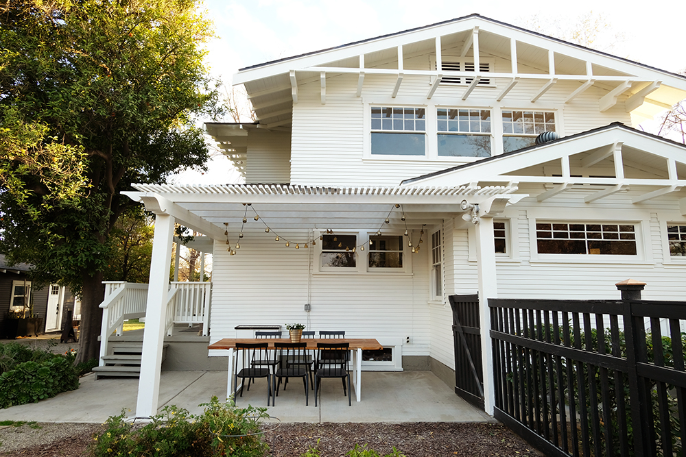
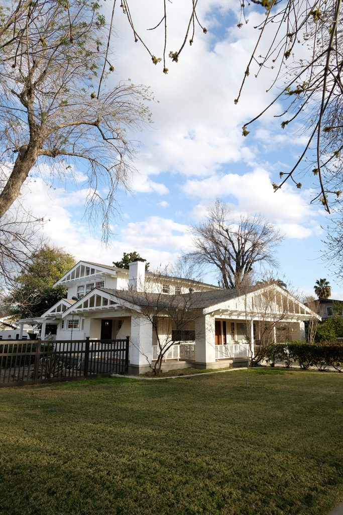
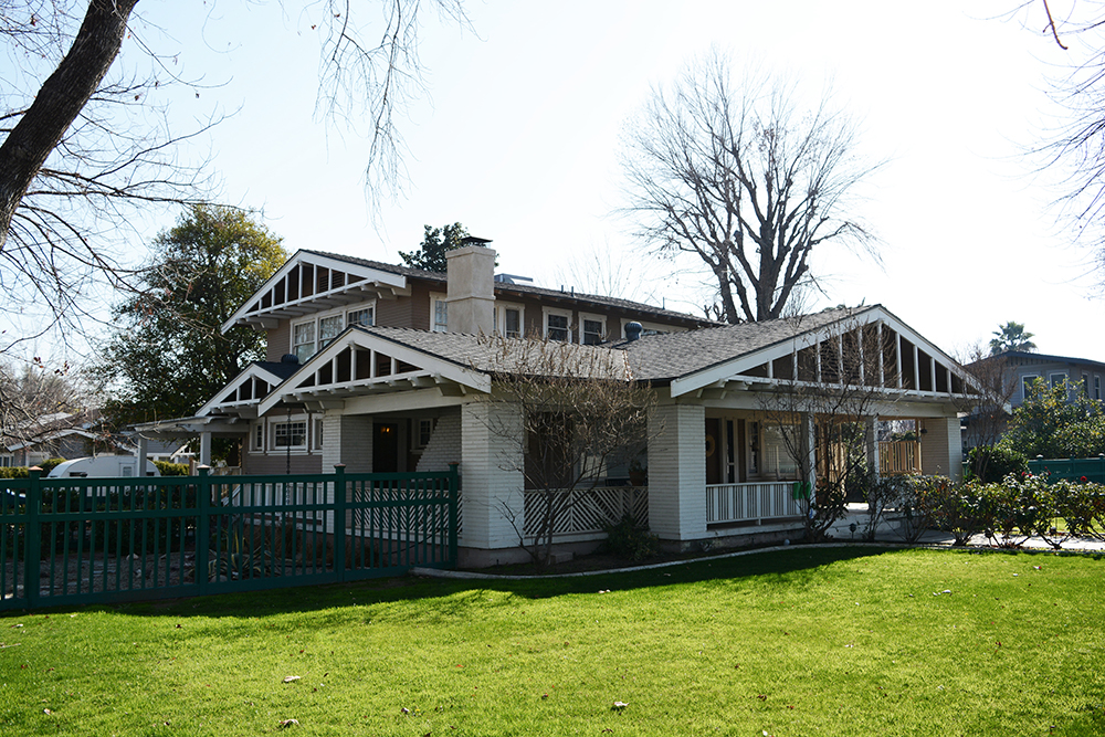
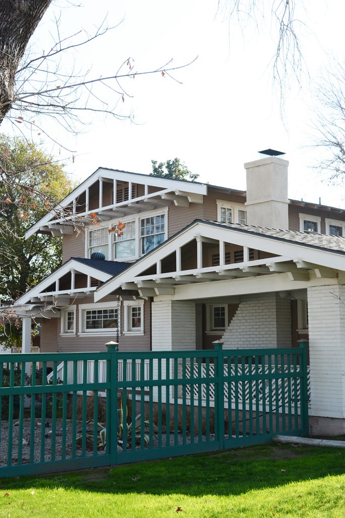
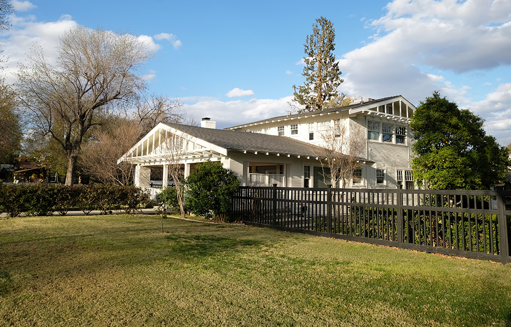
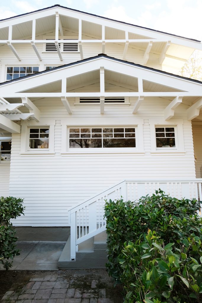
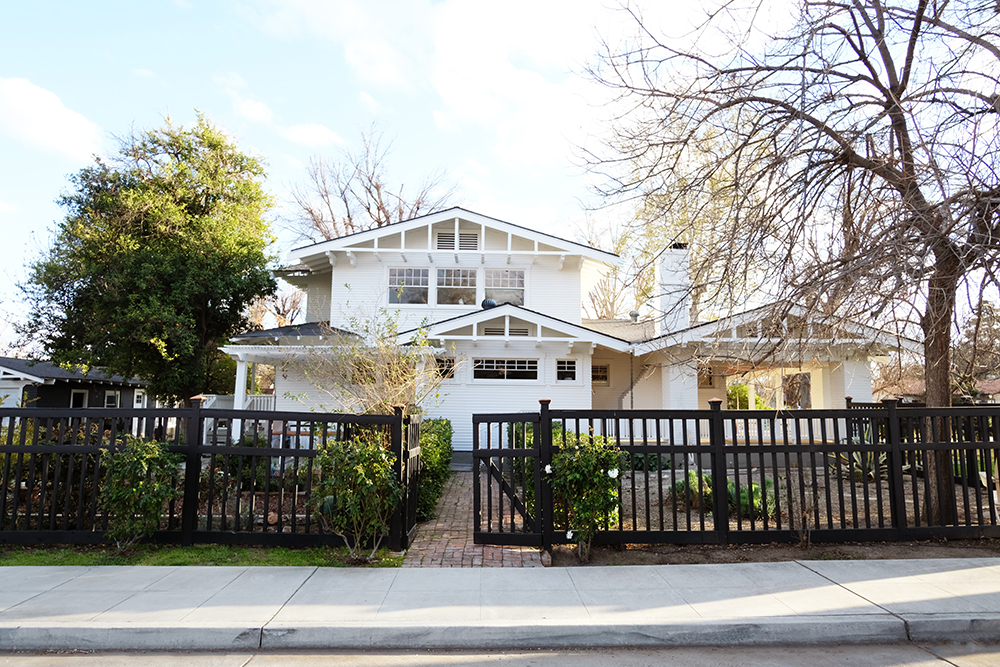
It’s a big day for the McConnel house, WE PAINTED THE EXTERIOR OF OUR HOUSE! This is going to be a doozy of a post, so buckle up. Painting an old house is a BIG deal. Oh man, this feels like it was a long time coming. If you are new here, we own a 1918 two-story craftsman. I LOVE our house! We have only lived in Oleander neighborhood in Bakersfield, California. It’s our hood! I always knew that this is the house I wanted to own eventually. So, when it came on the market we listed our house the very next day.
Before
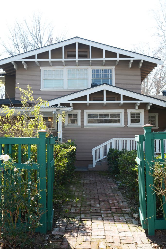
When we bought this house, 4 1/2 years ago, it needed a fresh coat of paint. On the South side of the house, a lot of the siding was down to the bare boards. Even with peeling paint, I loved this house. But, now that it is freshly painted, I’ve fallen in love with this place all over again. It really looks like a totally different house, it’s crisp and fresh, but still feels like a classic old house.
Early on, we figured out how much it would cost to hire someone to paint our house (way too much), so we knew it would have to be a DIY job. And to be honest, my husband started scraping and sanding the exterior of our house over a year ago. He would put in at least 10 hours a week in the evenings and weekends. But when it came time to do the actual painting, we knew it was a job that would need to be done all at once and it would probably time a few weeks to complete. My husband is a high school teacher, so we do have a couple months in the Summer available. But, Summer’s here are 100+F, so that would be a very painfully hot job. So, year after year, we just put it off because we were busy with full time jobs, an airbnb to run and 3 kiddos. And then…. the pandemic hit. And we were here ALL THE TIME! Lonnie, my husband scraped and sanded more and more through the pandemic and right after the New Year, he said, “Let’s do this!”. And he rented a lift and ordered some primer. We probably could have prepped and sanded for the next decade, but once we had an actual date set we knew we had to go strong until it was done.
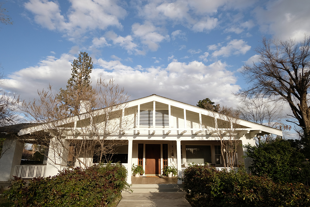
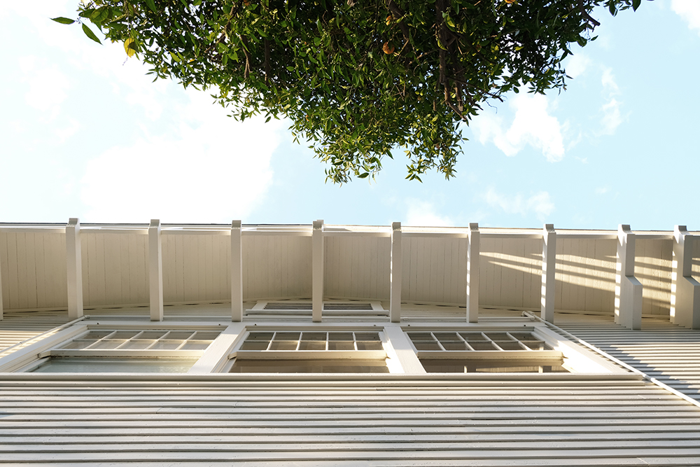
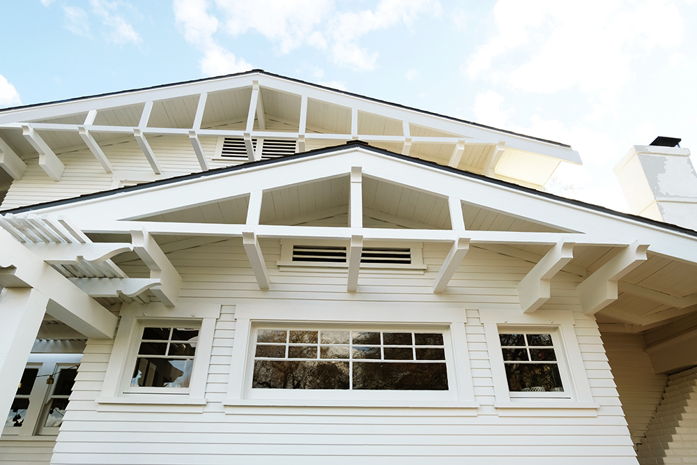
Our house is BIG and complicated with lots of different roof pitches and so, so many windows. And these are original windows, so it’s all wood and they all needed to be painted. We counted, there are over 300 panes of glass!!! (I will get an exact count for you soon).
BeforeBefore
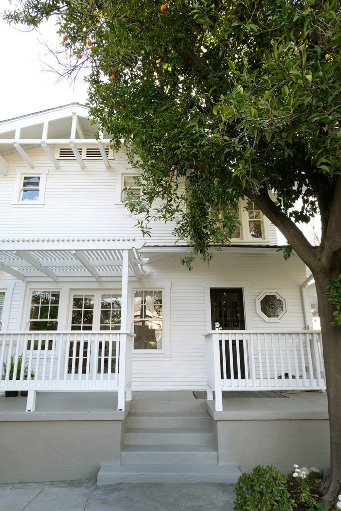
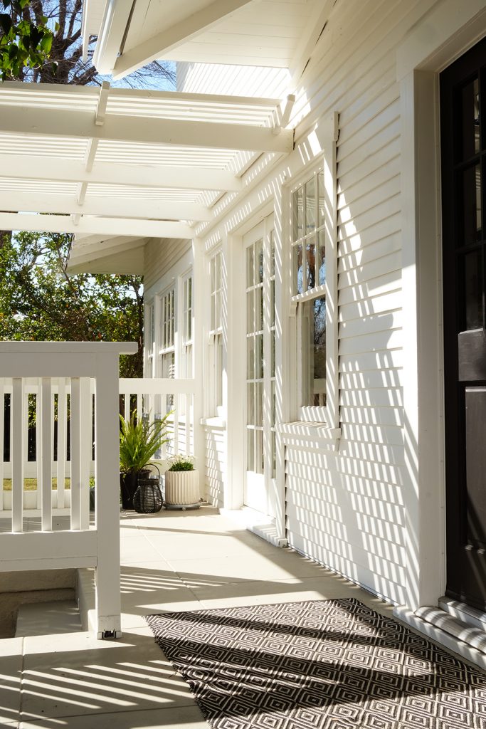
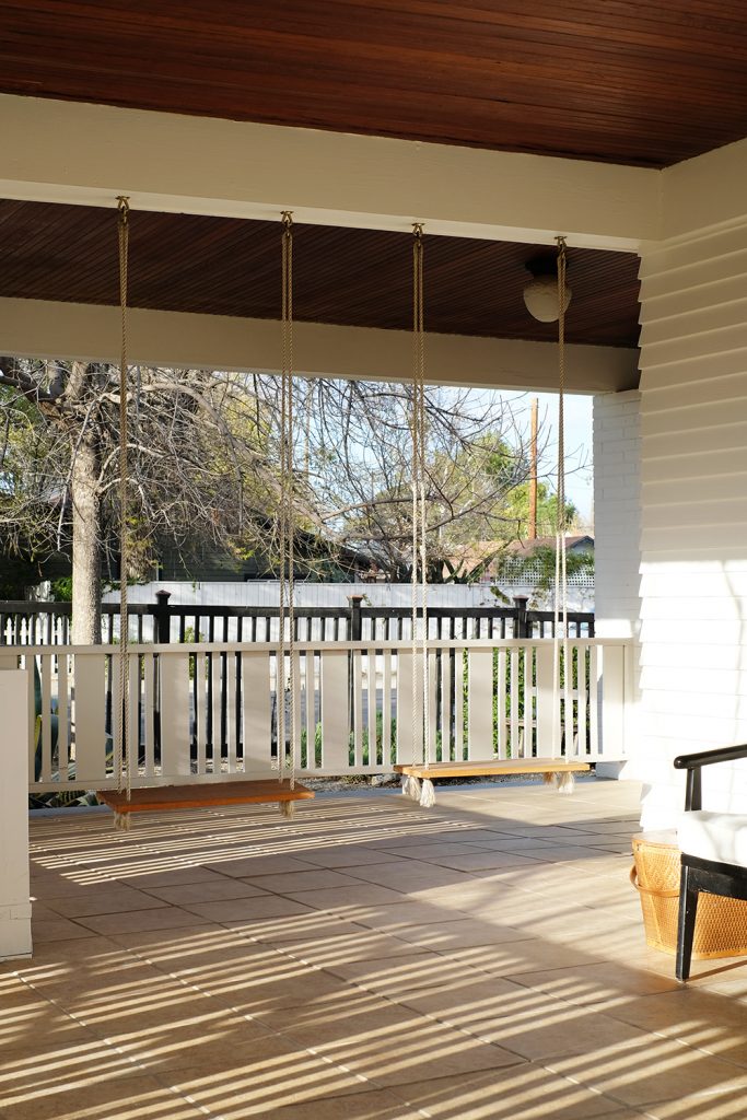
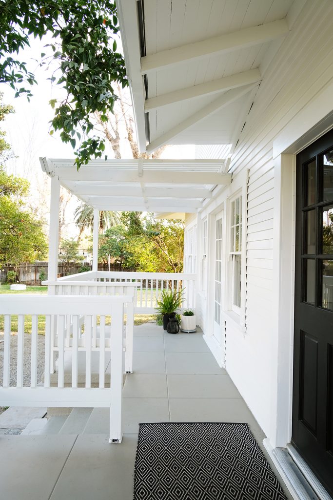
3 years ago I wrote a blog post about painting our house all white. I made my mind up a long time ago that I wanted a white house. Originally, I thought I’d have some black details, maybe on the trim, windows or the airplane wings. I should explain, our house is an Airplane Craftsman. The second story is really only 1/2 a story and it comes up out of the middle of the house, with windows on all sides, making it feel like a cockpit. And then all the oversized eaves and exposed rafters resemble the wings.
Anyways, the more I looked at our house once the primer was on, I decided that the black was just not needed. My biggest worry was that the rafters in the eaves (which are a really unique detail to our house) would not be as visible as they were before. With the house being a darker color and the rafters being white, they really stood out. So I thought the rafters needed to be a contrasting color. But, when I saw them all white, it just made sense. It really is all about the light and all the shadows that are cast at different times of the day. The details were not lost when everything went all white.
Before I give you all the DIY steps and details, let’s talk color. While we went with no color, picking the right white really is important. If you have been around here for a while, you know that Sherwin Williams Alabaster White is my GO-TO white. I’ve painted all the trim and many walls in my last two houses this same warm white. I chose it 17 years ago for our built-ins in our first house, and I’ve been using it ever since. It’s warm without being yellow, and crisp without being cool and flat. It really is a perfect white for an older home (in my opinion). So, we HAD to go Alabaster with the exterior.
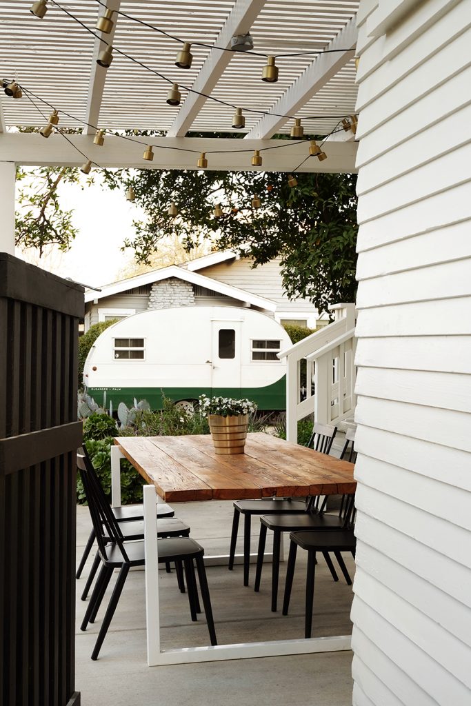
At the beginning of the pandemic, we had the kids paint the fence. Yep, we were those parents. But honestly, it got them out in the fresh air and doing something when there was absolutely nothing to do. The fence was a bright emerald green. and while I love the color green, it felt too bright and brought way more attention to the fence then the house. We went with Sherwin Williams Black Magic and it is absolutely perfect with our all white house.
Ok, from start to finish, it took us just over 6 weeks. That was every afternoon, evening, weekend and even some days we both took off work to paint. Yep, it was a lot of work, but I honestly think we did a better job than any painter we could have hired. We were perfectionists and took care of every inch of this exterior.
Do I think you should paint your house? YES! If we can do it, you totally can! But, you’ve got to really want it. Because you are going to be frustrated and tired and covered in paint at times. And you aren’t going to have any down time for quite a few weeks. But, SO SO WORTH IT! I feel so much pride and accomplishment with finishing this project.
Well it turns out I had a lot to say and a lot of pictures of our house to share, so please come back tomorrow for the full how-to. I have all the supplies and details on how we did this job start to finish.
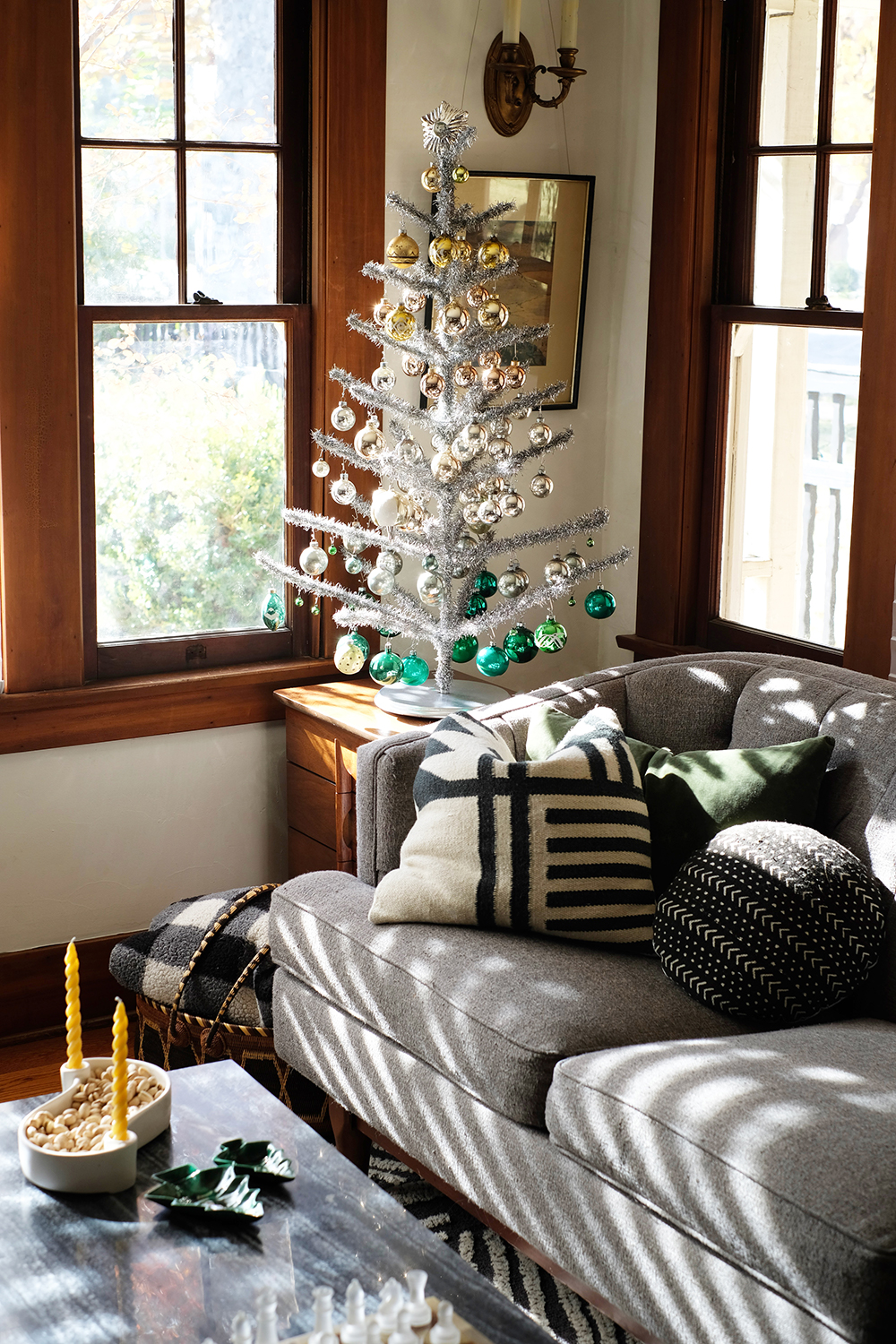
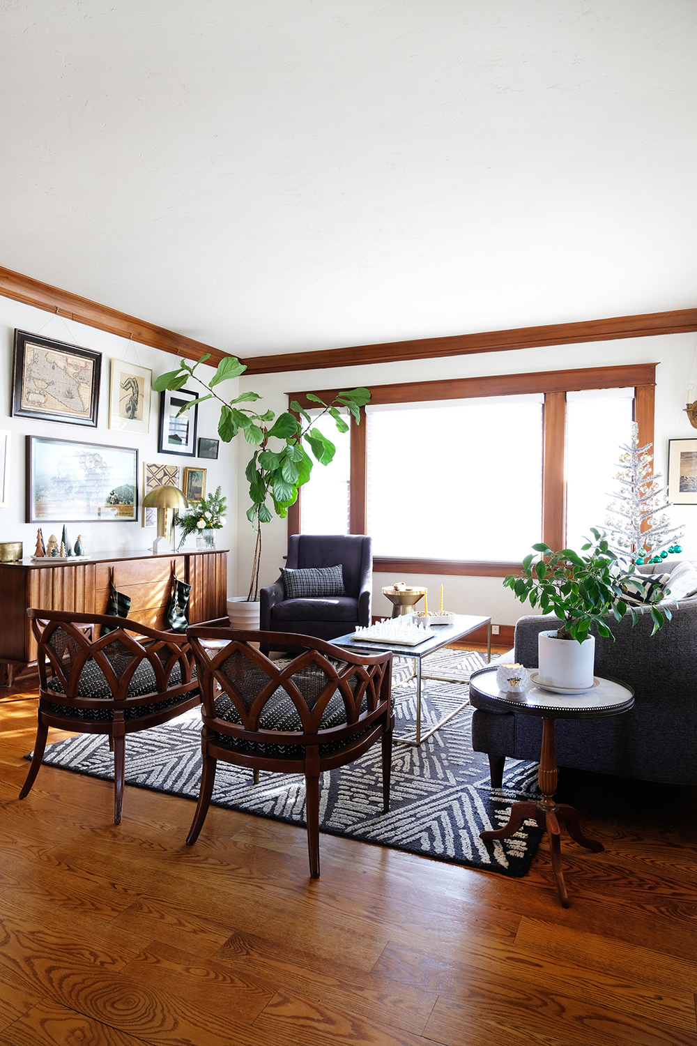
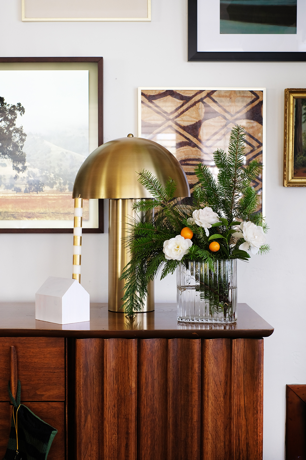
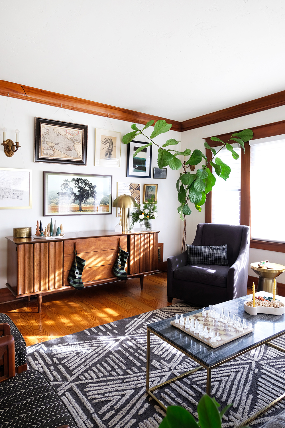
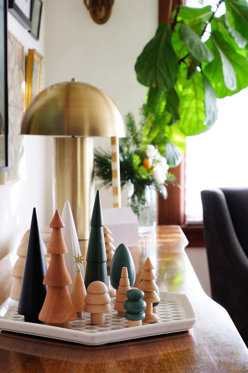
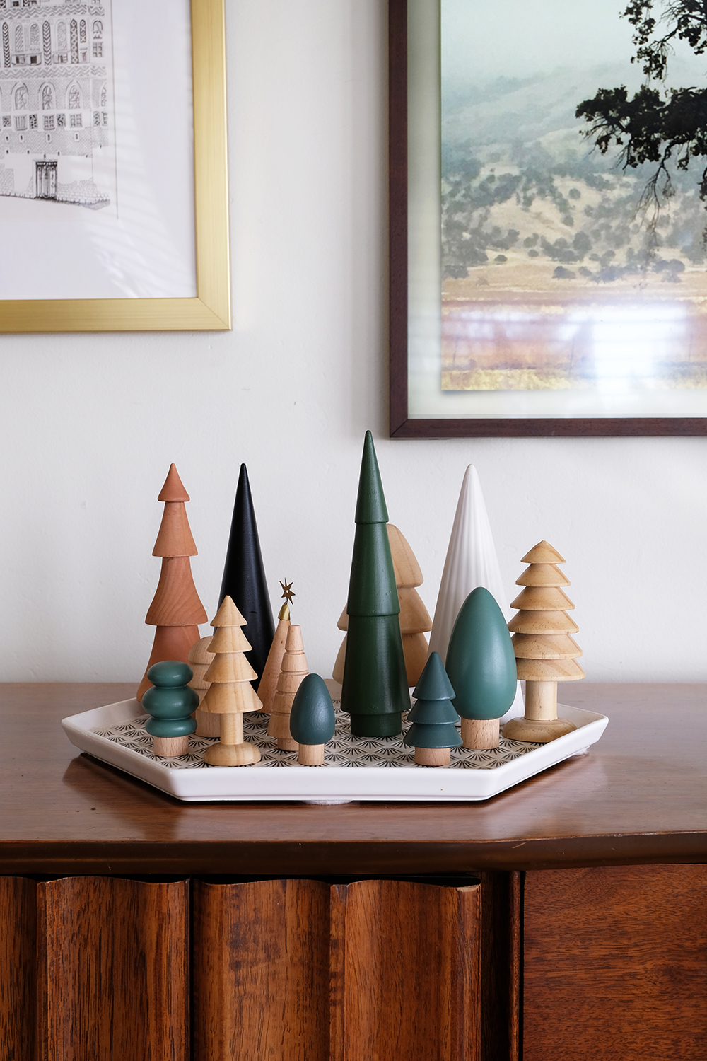
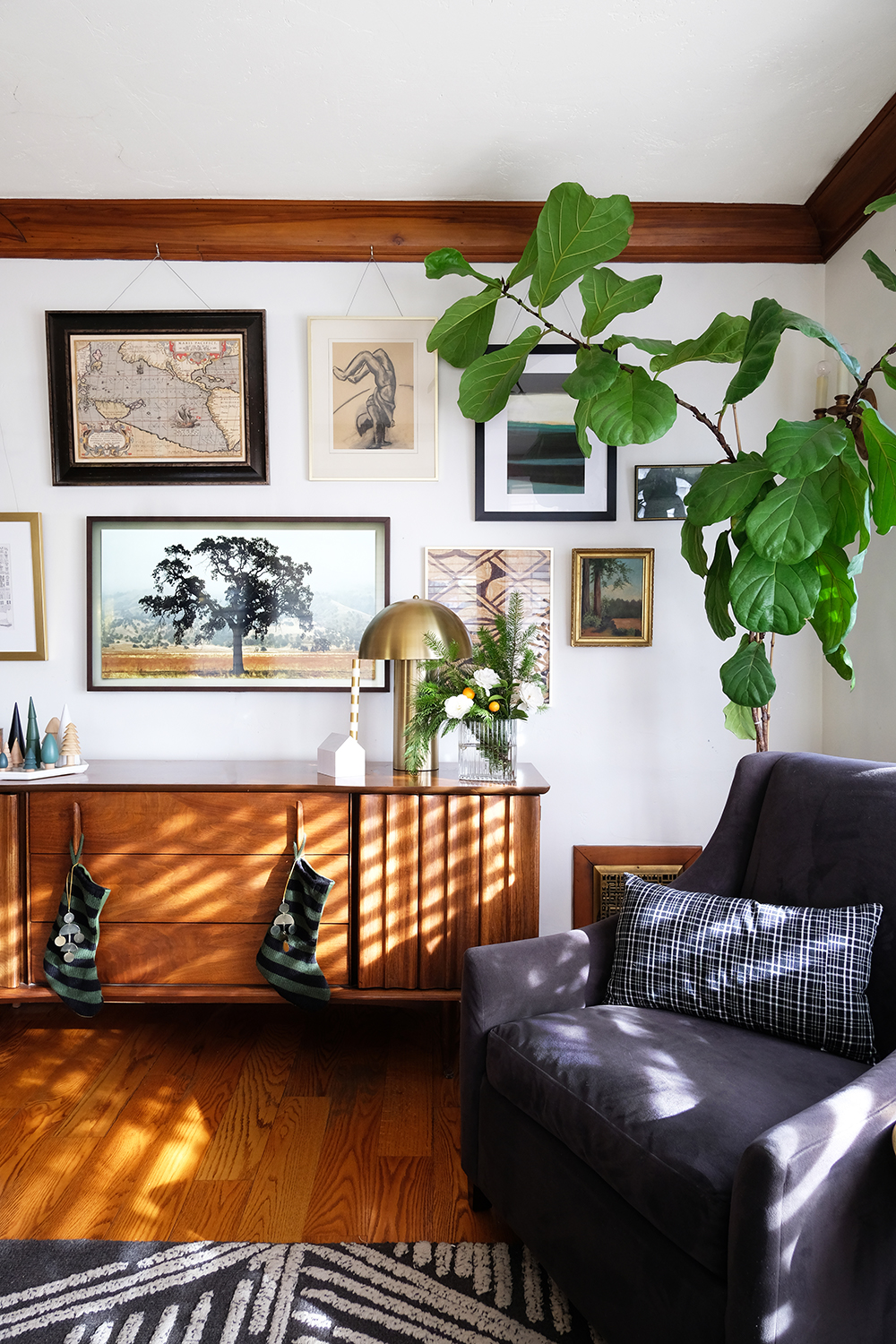
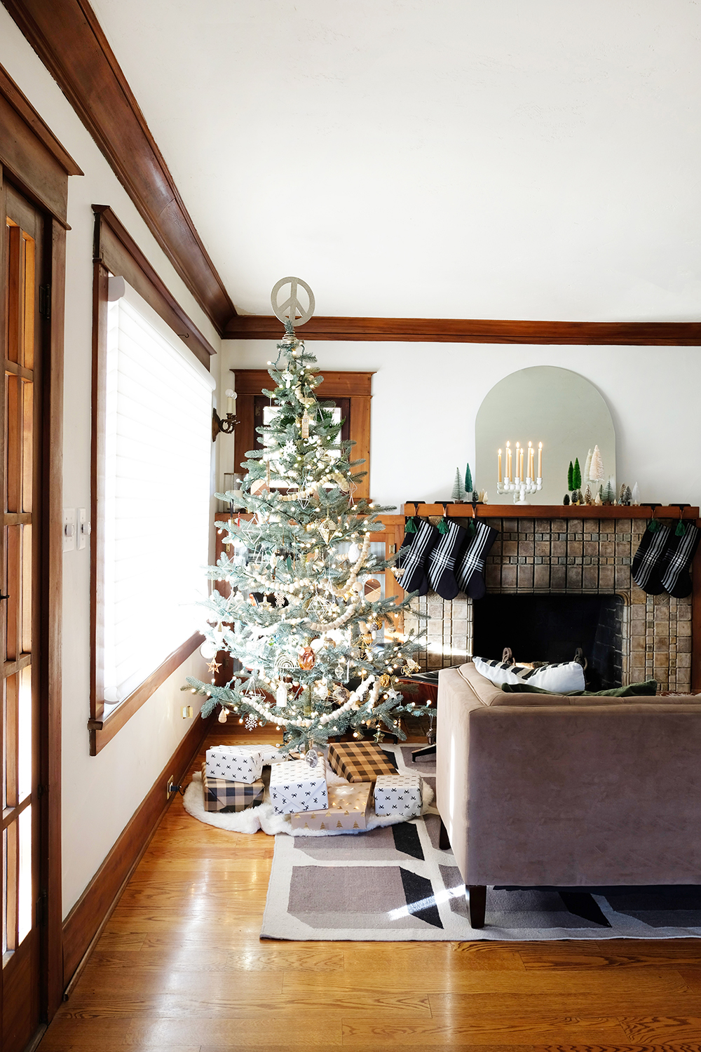
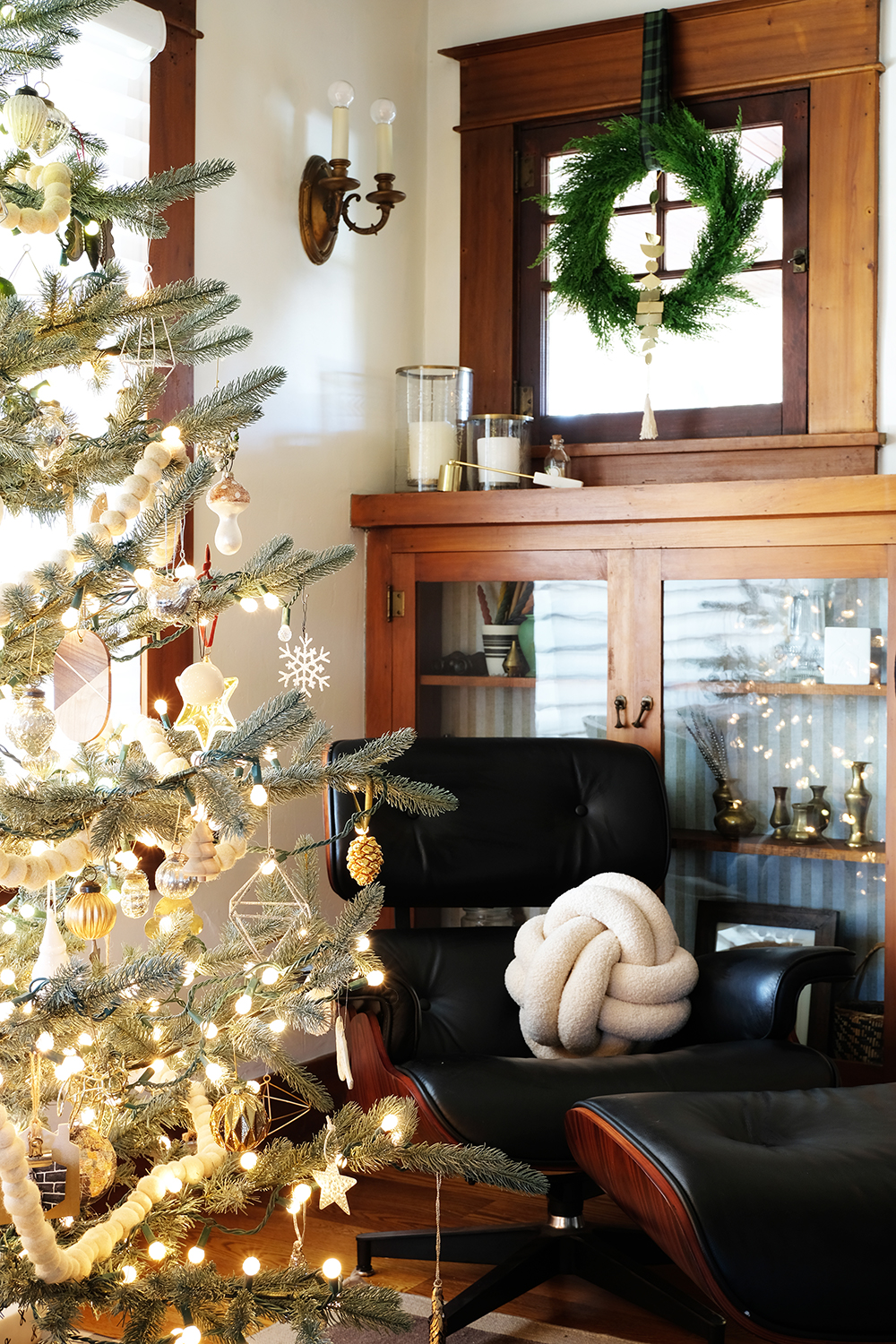
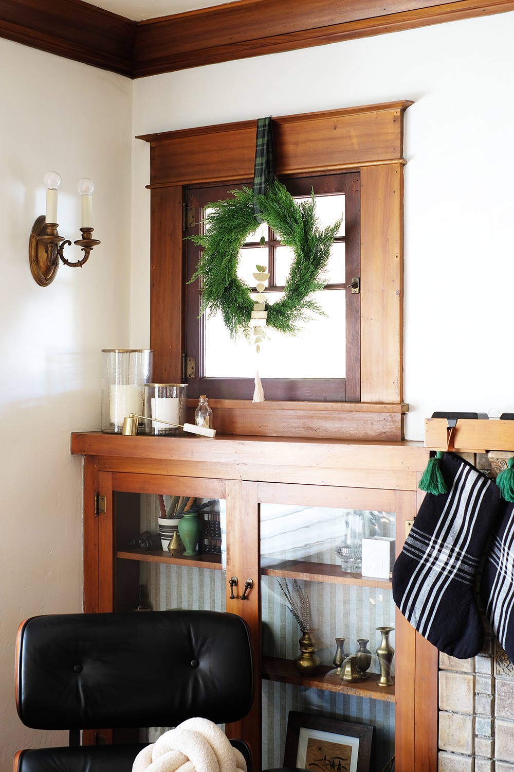
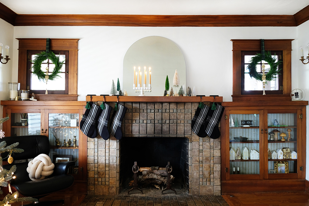
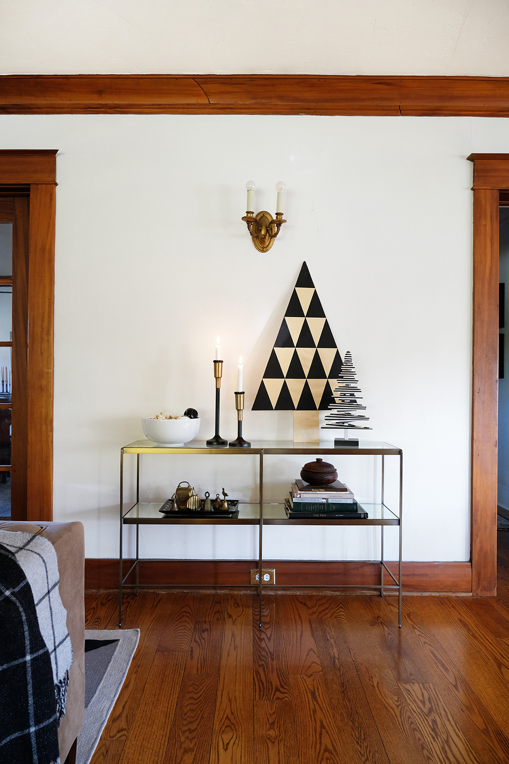
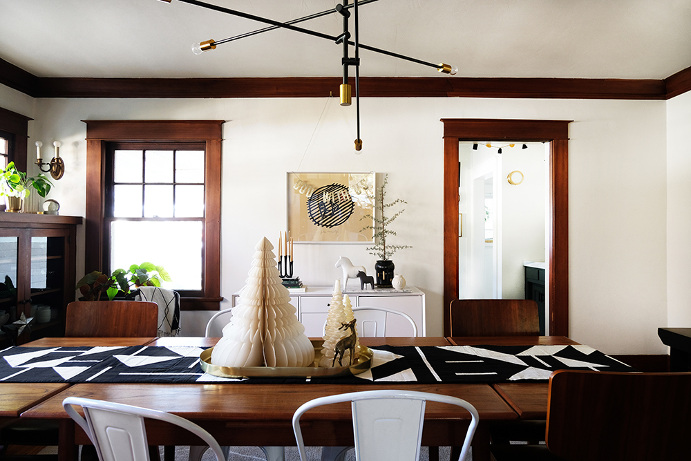
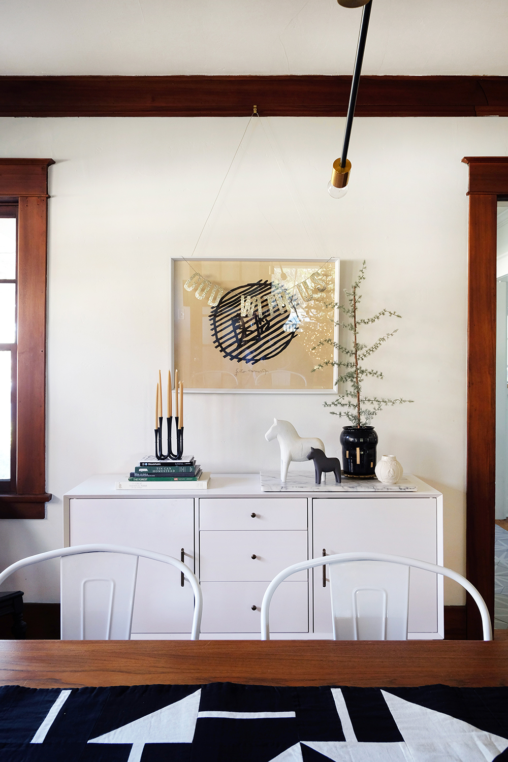
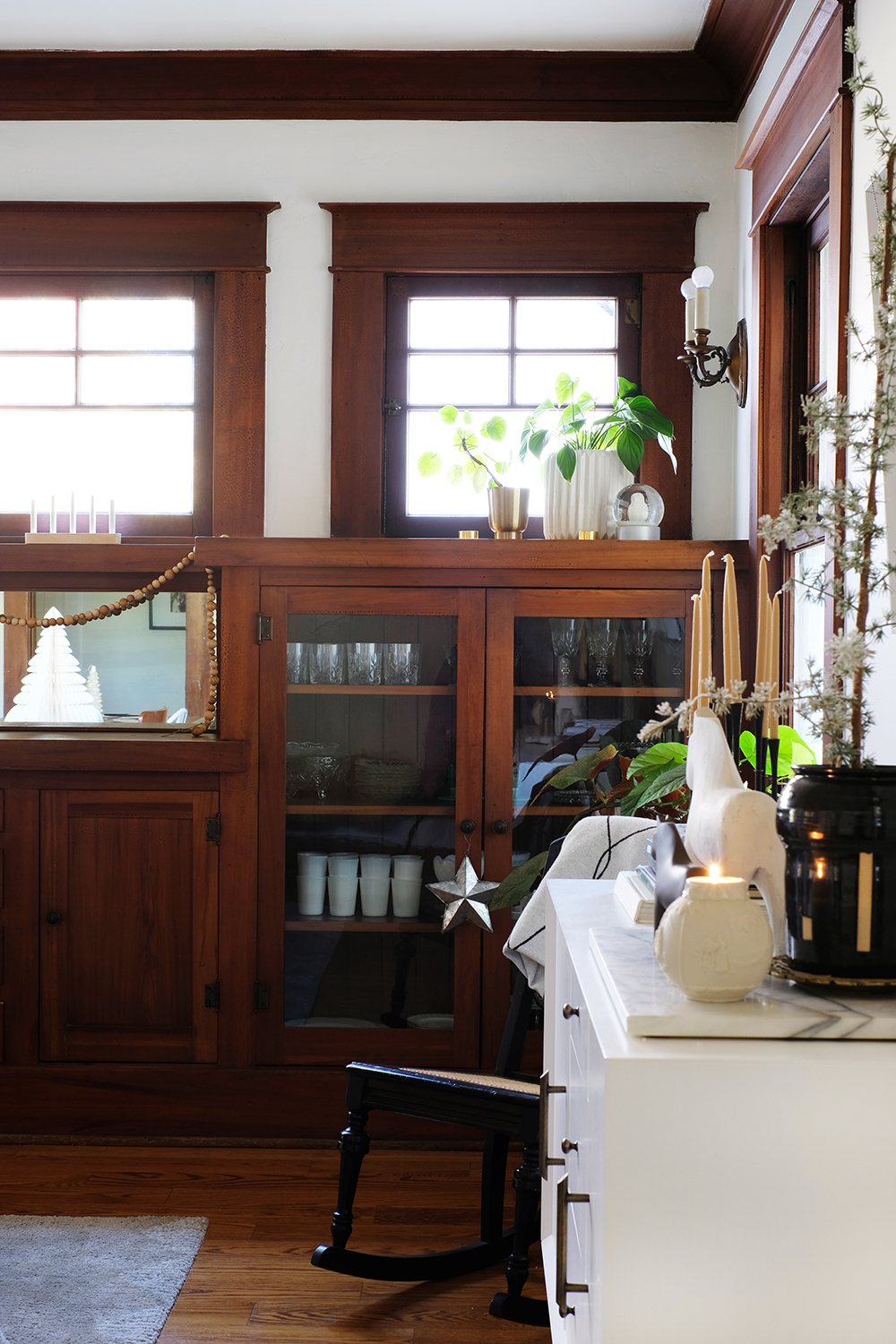
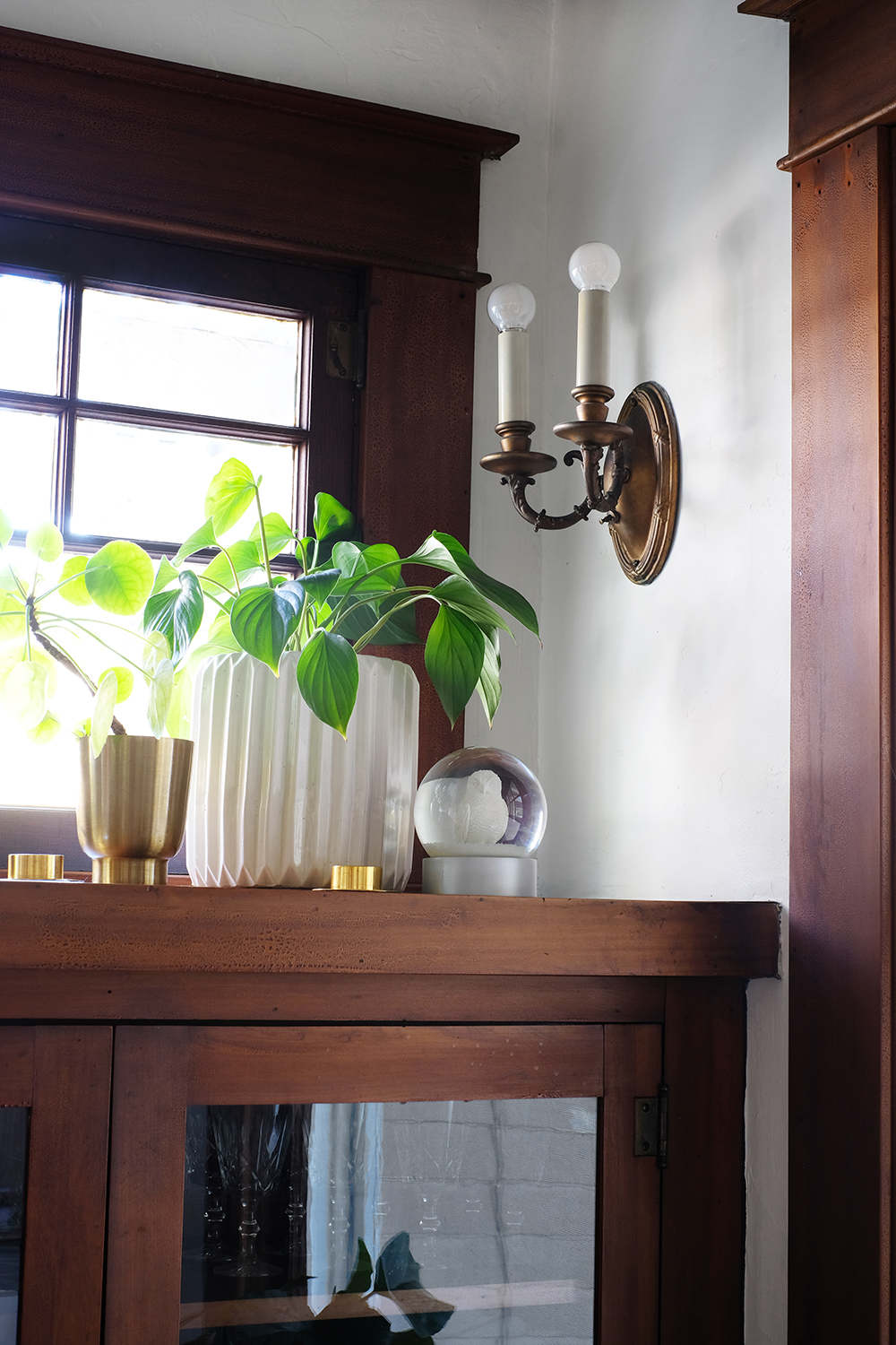
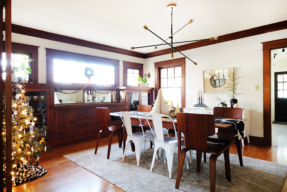
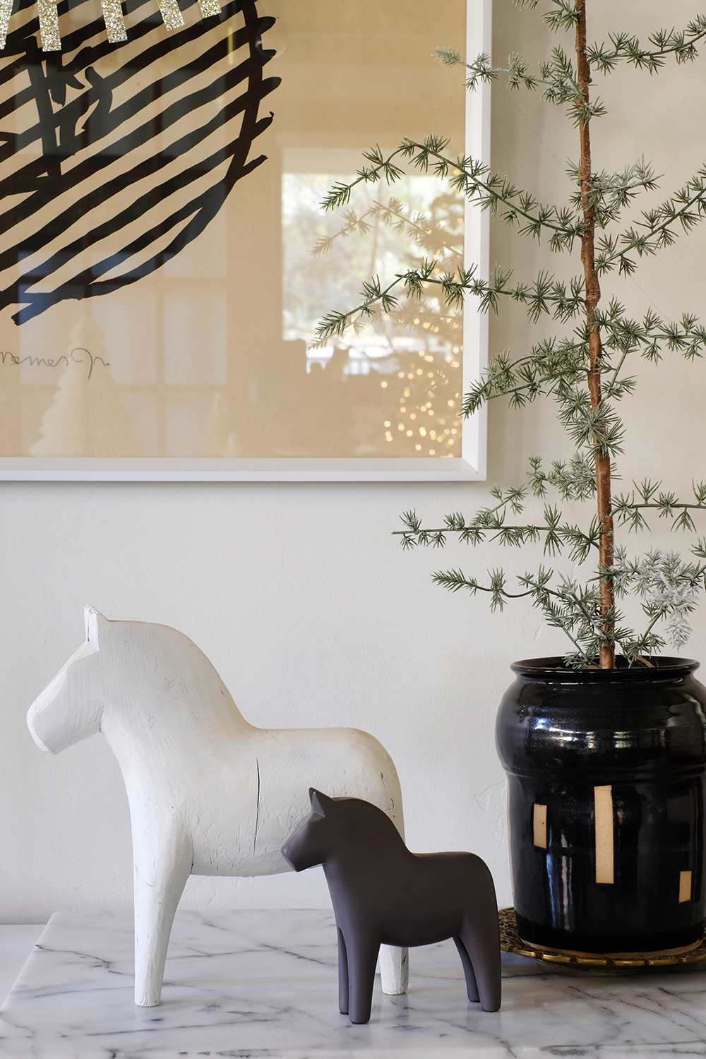
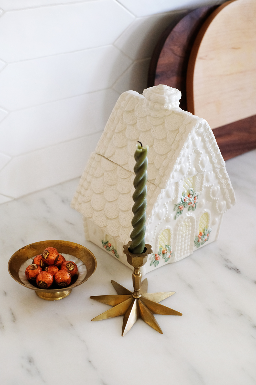
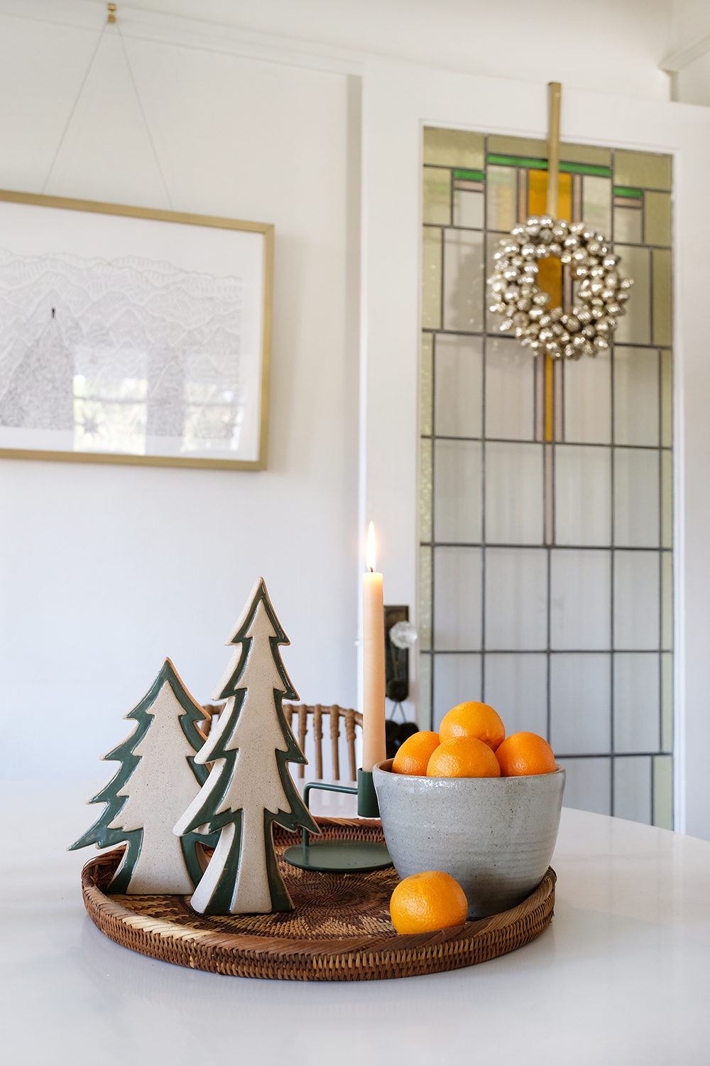
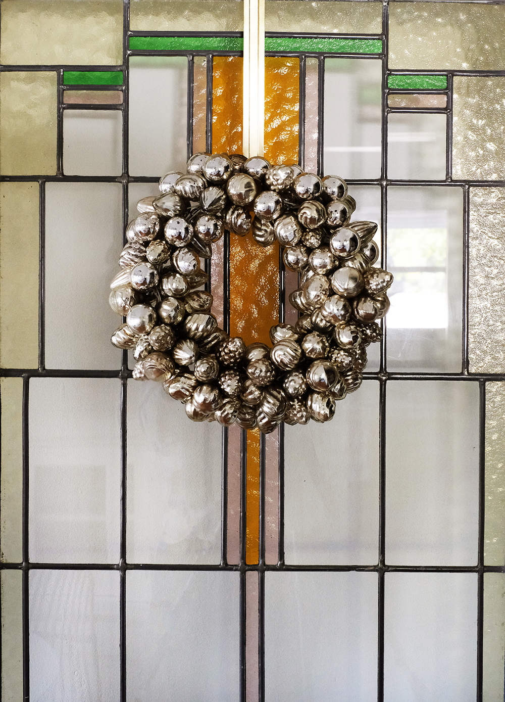
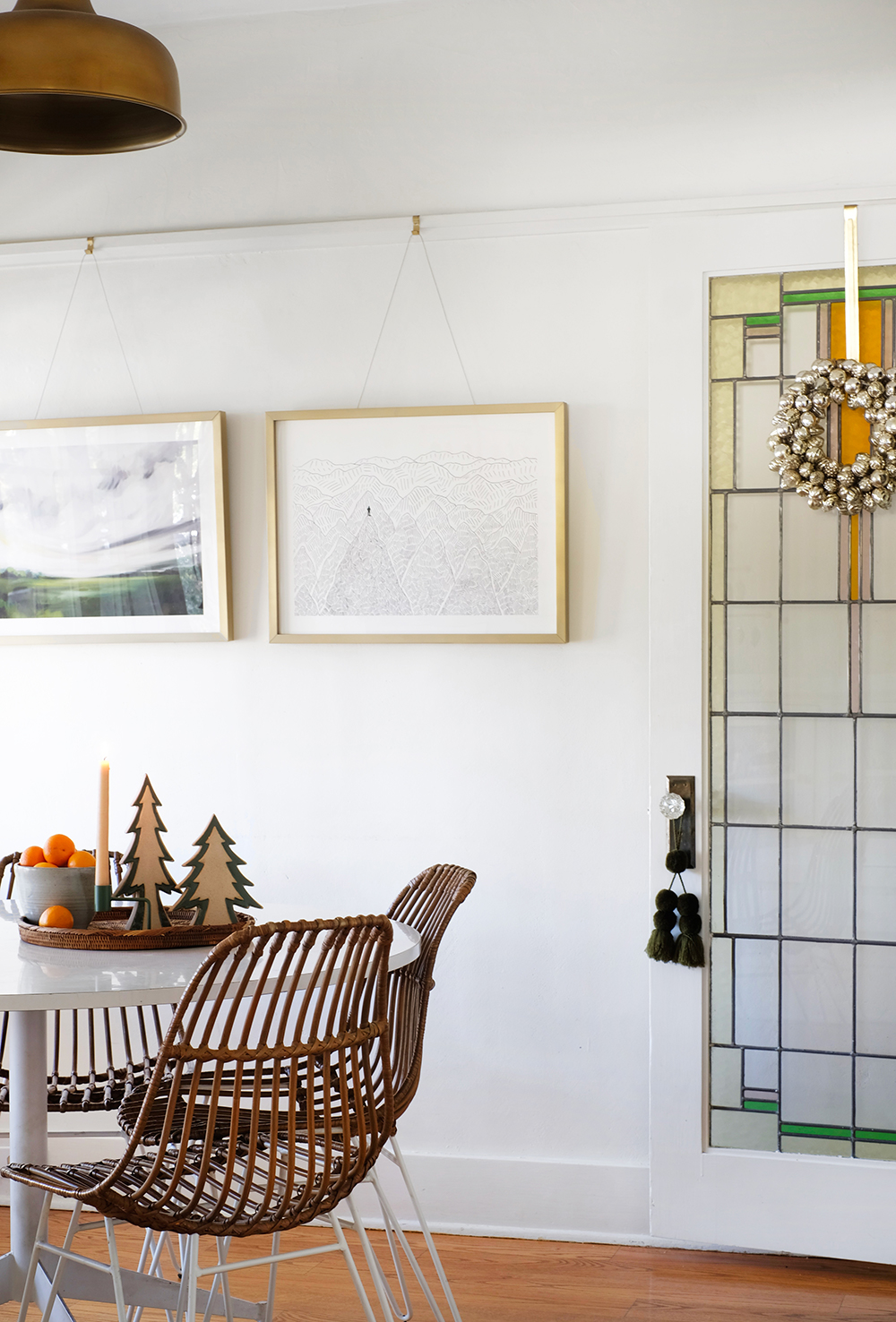
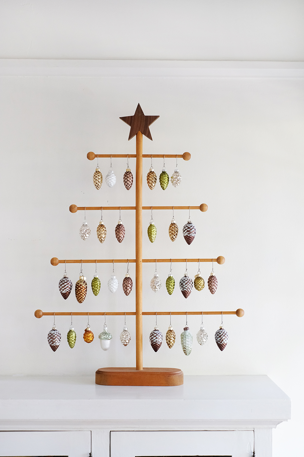
I know we are almost all the way through the first month of 2021, but I wanted to post these holiday pictures of our house here on the blog. So, it’s a “better late than never” blog post situation. And honestly, next year when I pull out my Christmas decorations, I’ll be happy to have these as a reference. Because, I can never remember how and where I use my decorations from year to year.
Also, even though there is Christmas everywhere, this is still a great way to have a little tour of our house. I won’t go into the details, and I definitely won’t link anything (because most of my holiday decor is old stuff I’ve had for many many years or I thrifted it), I’ll just let you scroll.
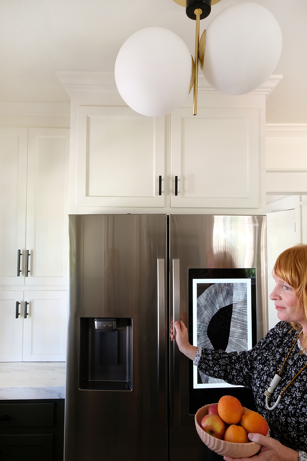
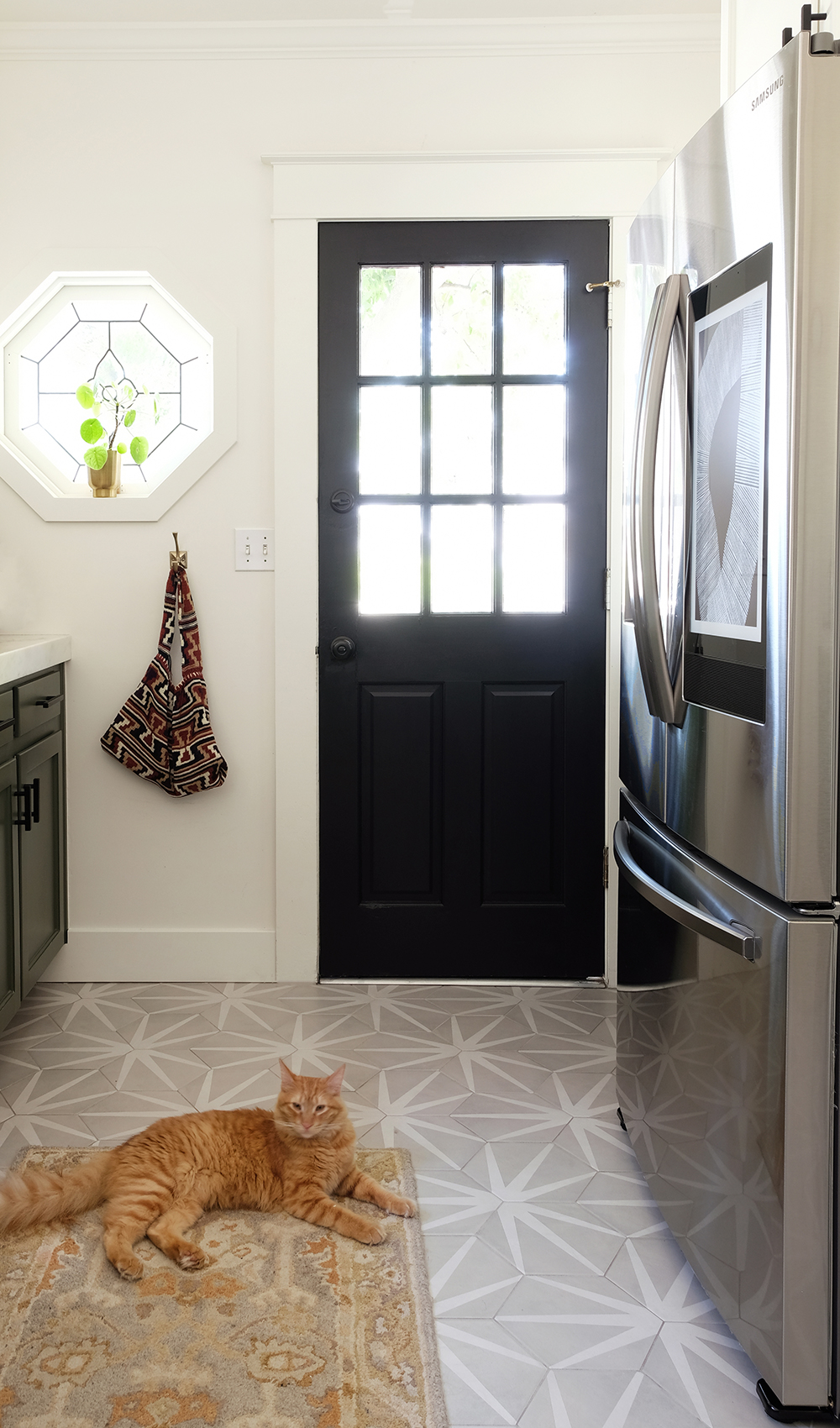
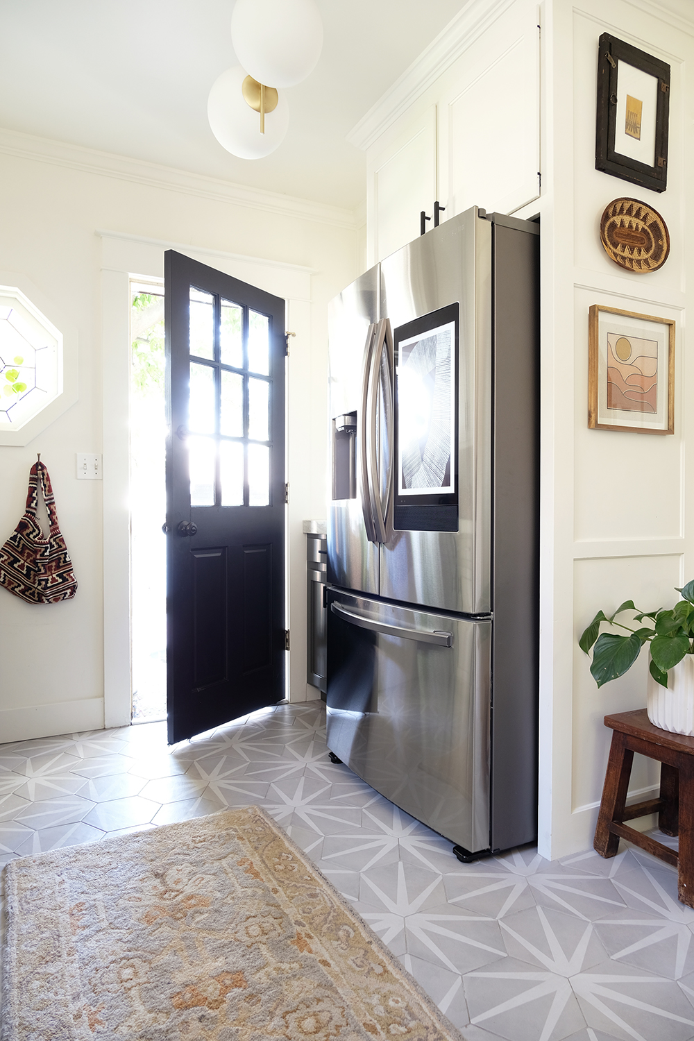
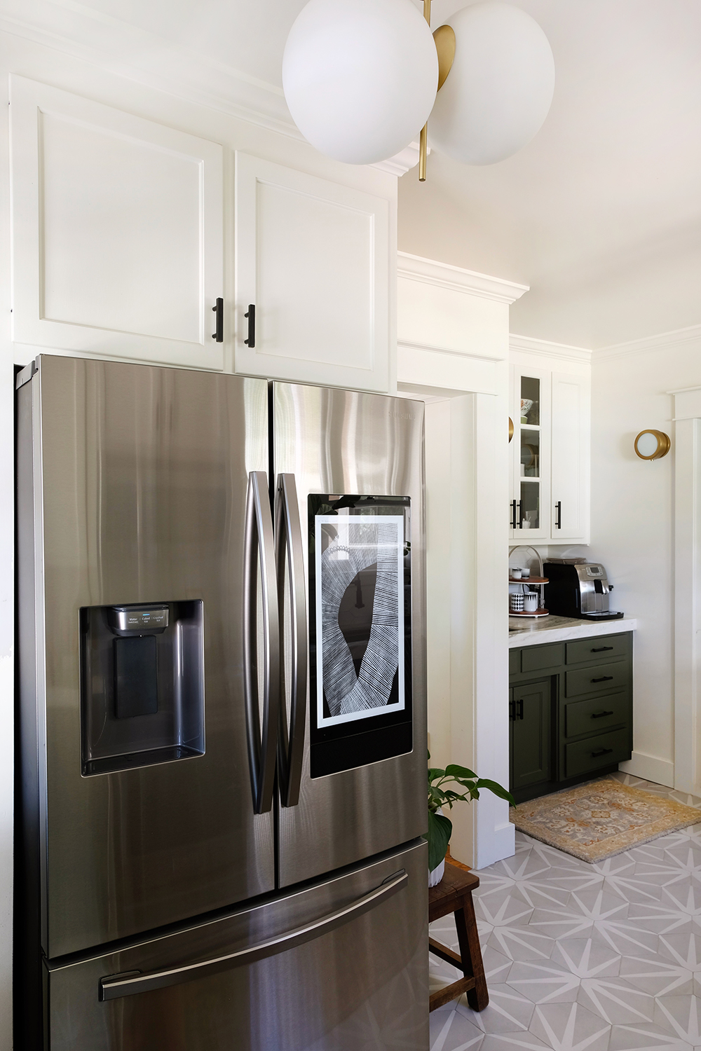
This post is sponsored by Samsung. Thank you for supporting the brands that help make this blog possible.
Our kitchen got a HUGE upgrade during quarantine. To be honest, it couldn’t have come at a better time. We have been cooking and eating so (too) much lately. If the kitchen is the heart of the home, I think the fridge is the heart of the kitchen. Good cooking only starts when you have yummy fresh food, and your fridge is to credit for that. We upgraded to the new Samsung French Door Family Hub Refrigerator and we are so pumped.
We previously owned a Samsung 3-door French Door Refrigerator, and we loved it. But it was almost 12 years old and we needed a little more space. And the new Samsung models literally provide you with 10% more storage space for groceries. The new design is very clever and I’m especially happy with all the generous storage there is just in the doors. The new fridge fits beautifully into our new kitchen that we renovated just a year ago. We kept all our old appliances during the renovation and we just holding out to upgrade the appliances to match the rest of the space.
Besides offer even more interior space, there are a couple really cool features that I’m loving. This fridge has fingerprint resistant surfaces!!! What? Yes, beautiful stainless steel without the mess of kid fingerprints ANYWHERE. And the new LED lighting is so bright and crisp, there’s no more lost leftovers somewhere in a back corner of the fridge.
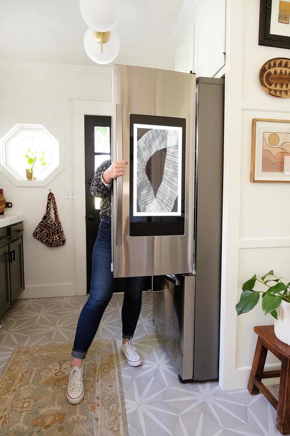
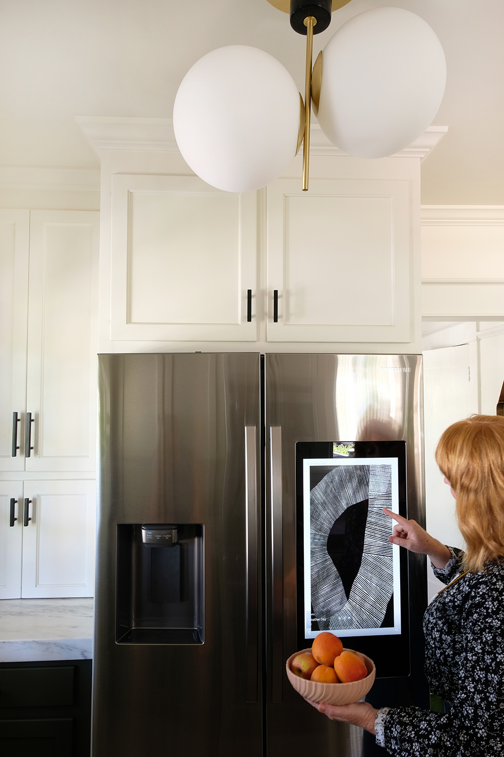
And now, let’s address the fact that this is THE FUTURE when it comes to fridges. You guys might have noticed, there is a touchscreen on the front of my fridge!!!!!!!! This is the Samsung Family Hub ™. Yes, I can access calendars, music, all my favorite apps like Pinterest and Instagram, I can leave messages for my family, display photos and videos from our last trip and I can even view what’s in my fridge when I get to the store. Yep, all that and more! I already spend so much of my day in the kitchen, this very SMART refrigerator is my new assistant. The Samsung Family Hub ™ is keeping my life in order.
I can search and pull up all my favorite recipes. I even make shopping lists and I can access them on my phone through the SmartThings app. We are still discovering new tricks this fridge has daily. And I love being able to listen to music or watch the news while I’m cooking.
So, what’s for dinner tonight? Yep, we are still at home, still cooking all those meals.
This post is sponsored by Article. Thank you for supporting the companies that help make this blog possible.
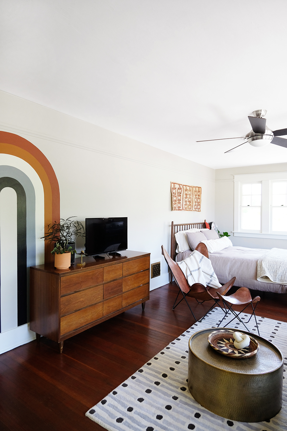
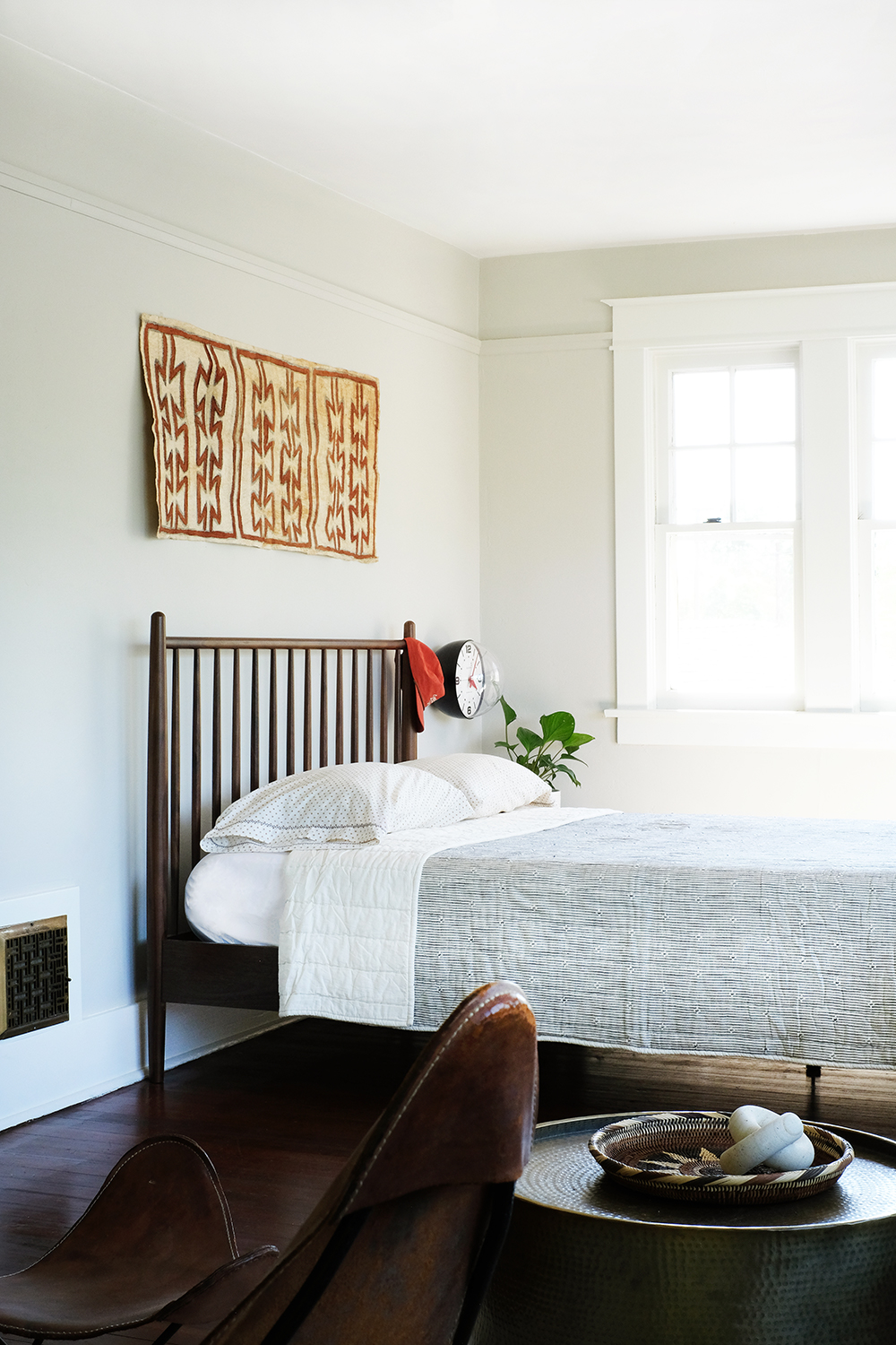
Well, we are finally at the AFTER, after all of it this time. I shared the painted 70’s style arch last week, and now I’m back with the full room reveal!
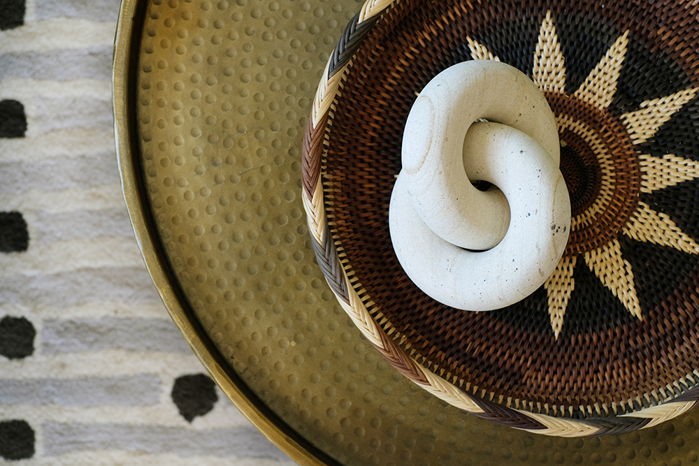
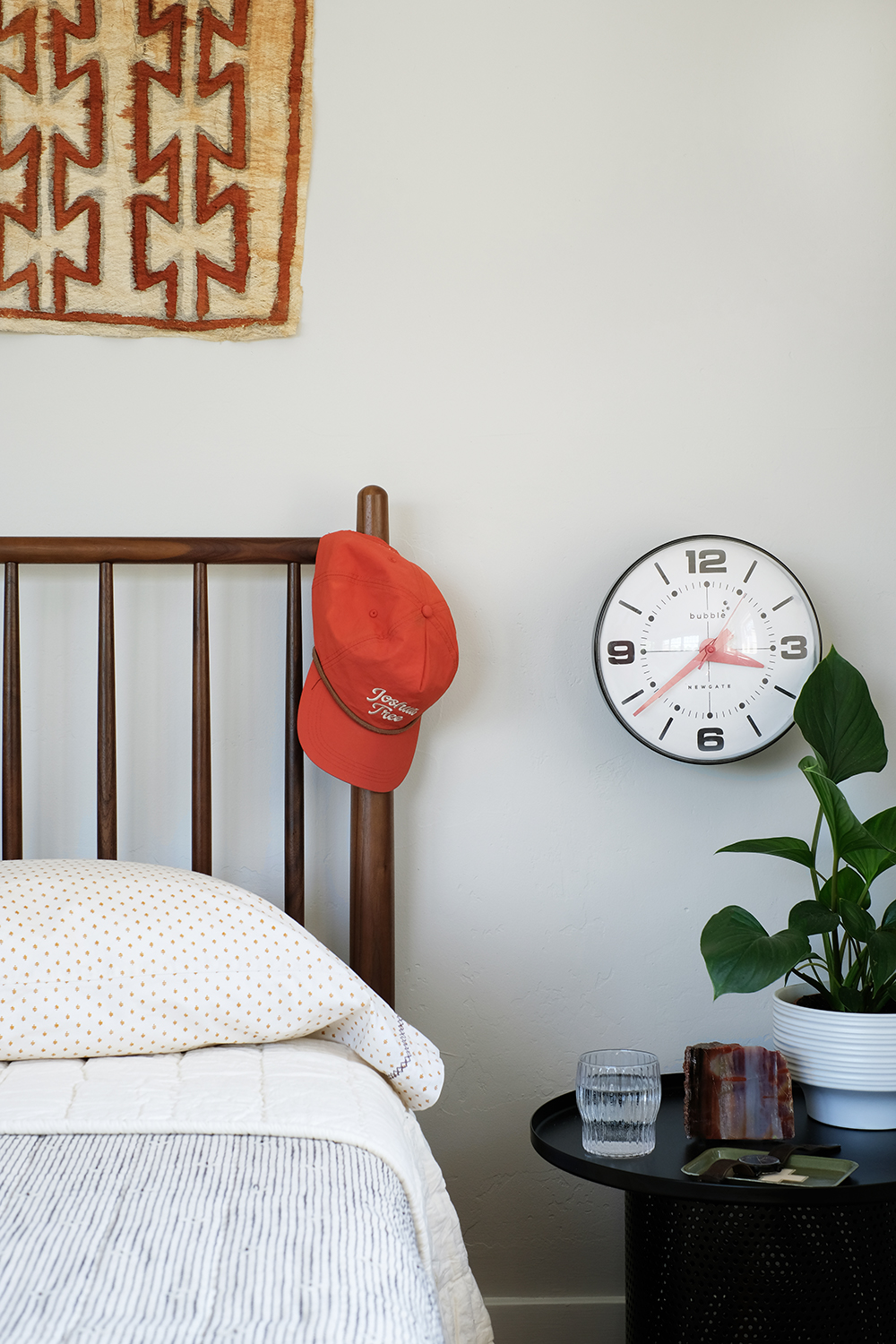
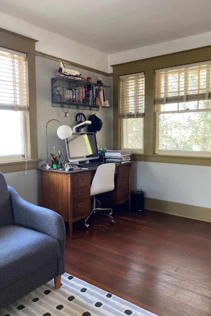
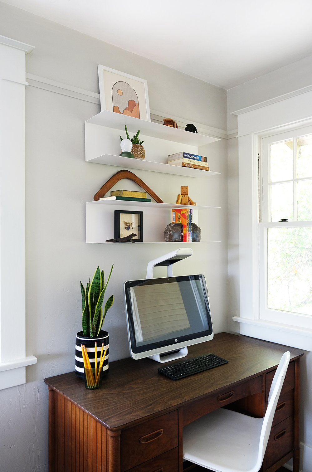
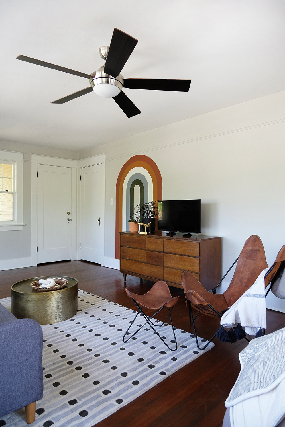
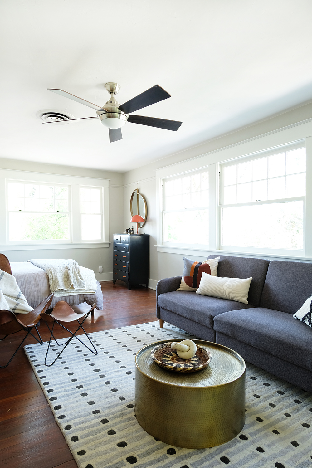
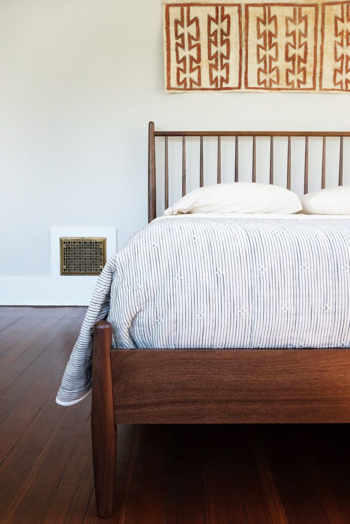
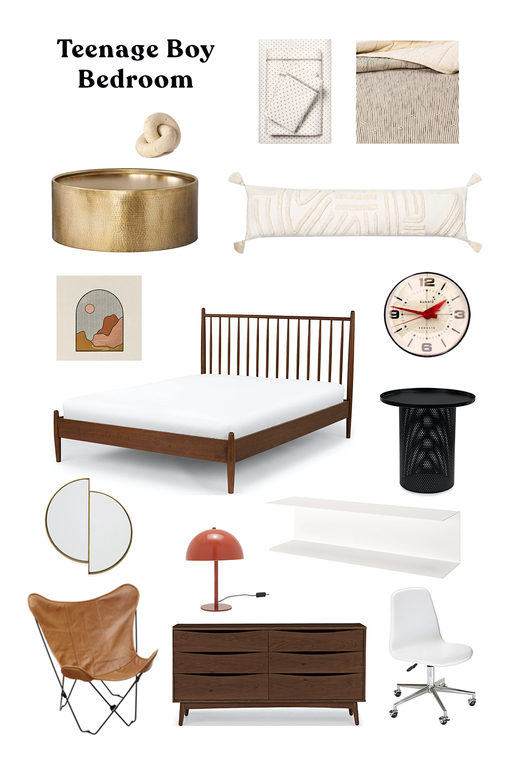
I really thought I might not be able to finish this room, with Covid-19 quarantine. I found it hard to source items to finish this space that way I really wanted to. It turns out, I am not a great online shopper. I like to see and touch things in person. While I didn’t love all the accessories I found online, I did make one really good decision and that was Dylan’s new bed and night stand. Both pieces are from Article and I am so impressed with the quality and design. We chose the Lenia Walnut Queen Bed and the Equa Side Table in Black. These two pieces were the only new additions to the space. The desk and credenza are both midcentury pieces I bought at yard sales over the years and the black high boy dresser is a piece that was my Grandma’s. I knew we wanted to keep those furniture pieces, but the bunk beds had to go! I was on the hunt for a bed and nightstand that would work seamlessly with the midcentury shapes I love so much. I also wanted to make sure that the new pieces felt timeless (because eventually this room will become our guest room), yet still young and masculine for a 16 year old boy.
Dylan’s room is very spacious, so he has room for a desk/homework area and even a mini living room of his own. And because we just have a formal living room, Dyl’s room also serves as the “family room” or at least the room all our kids hang out it to watch a movie or play video games. It’s funny how different this room looks, and really almost every piece of furniture is in exactly the same place, even the new bed fit perfectly on the wall where the bunks used to live. But, with a little (actually a lot) of paint and new queen sized bed, this space feels so much more grown up.
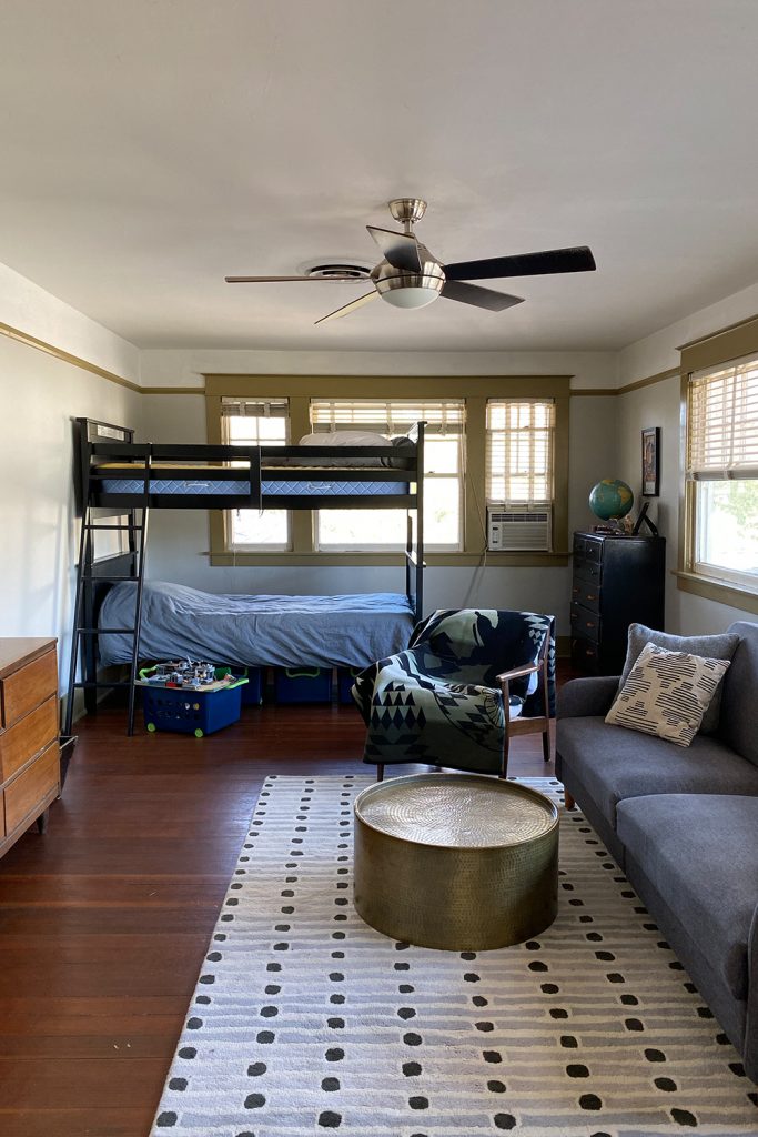
Should we go back and look at some “befores” again?
And not let’s come back to the AFTERS. Because they are a lot prettier.
The desk got a little update with some new slick metal shelves.
During this very weird Covid-19 season of life, it’s really nice to know that Article is offering contactless delivery in a lot of areas. The also offer free ground shipping on orders over $999, and for order under that Article offers a flat shipping fee of $49 (or $19 for small shipments). And if you are like me and are just not a confident online shopper, Article offers a 30-day satisfaction guarantee so you can try out the new furniture in your home. If you’re not completely happy, they’ll pick up the furniture and provide a refund, minus the delivery and pickup charges which is $49 in most cases.
And now, I want to try to give you are many sources as I can for this room. Because, I didn’t really buy too many new things, I tried to source similar items for you.
So, while this isn’t exactly how I’d like the room to look, I feel like it’s very close. And as soon as this quarantine is over, I’m sure I’ll make a few tweaks and re-shoot the space.
Here’s the deal with owning an old house – it’s always a work in progress! It’s room by room, and getting spaces to a place your are happy with can take YEARS. I am not complaining, I just want folks to know that I’m not Emily Henderson (who I adore) and I don’t have a “team” working on my house. Most of the time it’s just me tackling these projects (and roping in my brother and husband from time to time). Sometimes, I wish that everything was just DONE and then we could start living and enjoying this house. But, the truth is, I probably wouldn’t be happy with nothing to do, I love the process and having a “project” to work on is kind of my way of living and enjoying. So, even though they are a lot of work, old houses are kind of my jam.
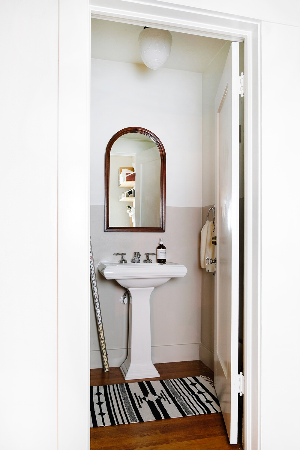
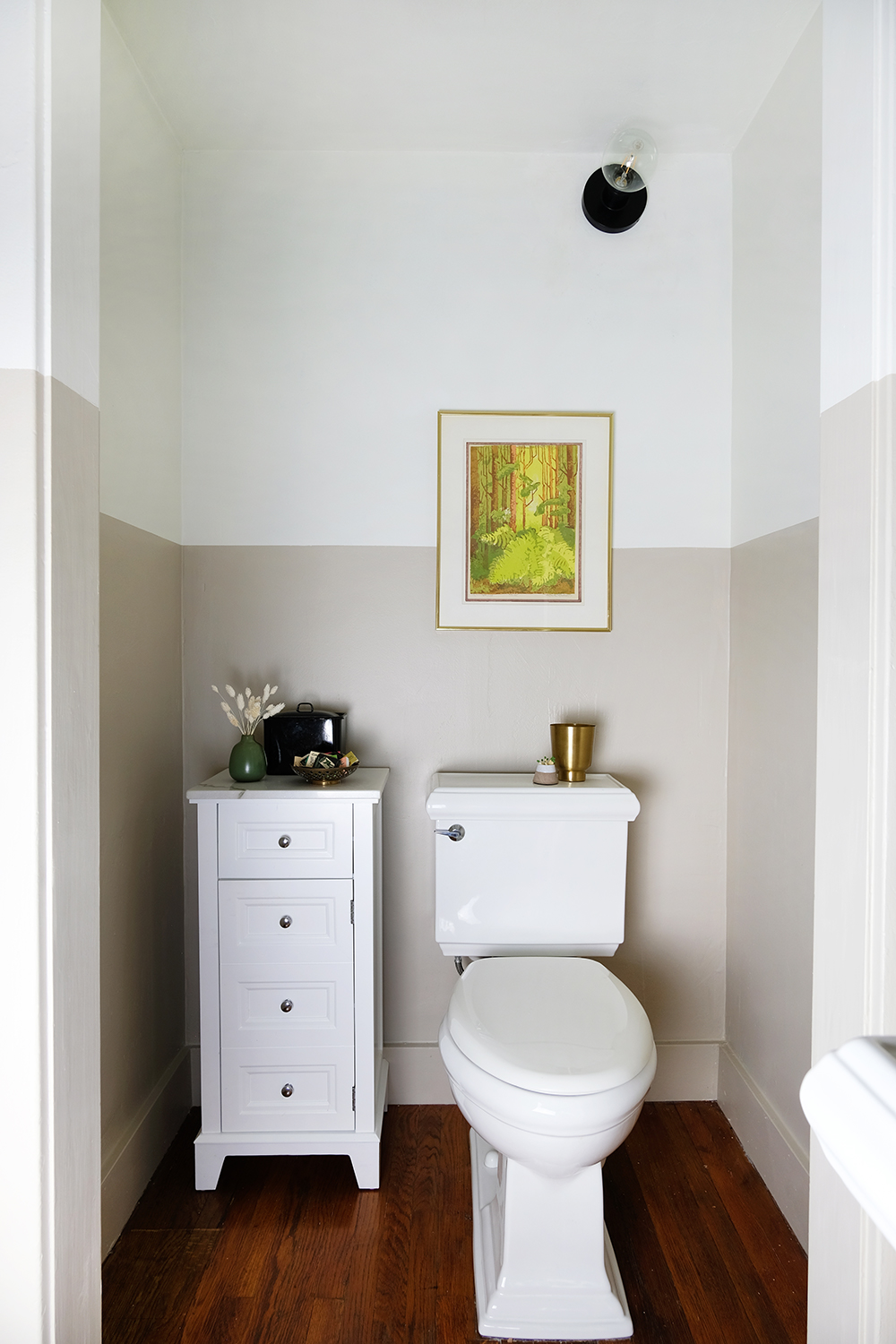
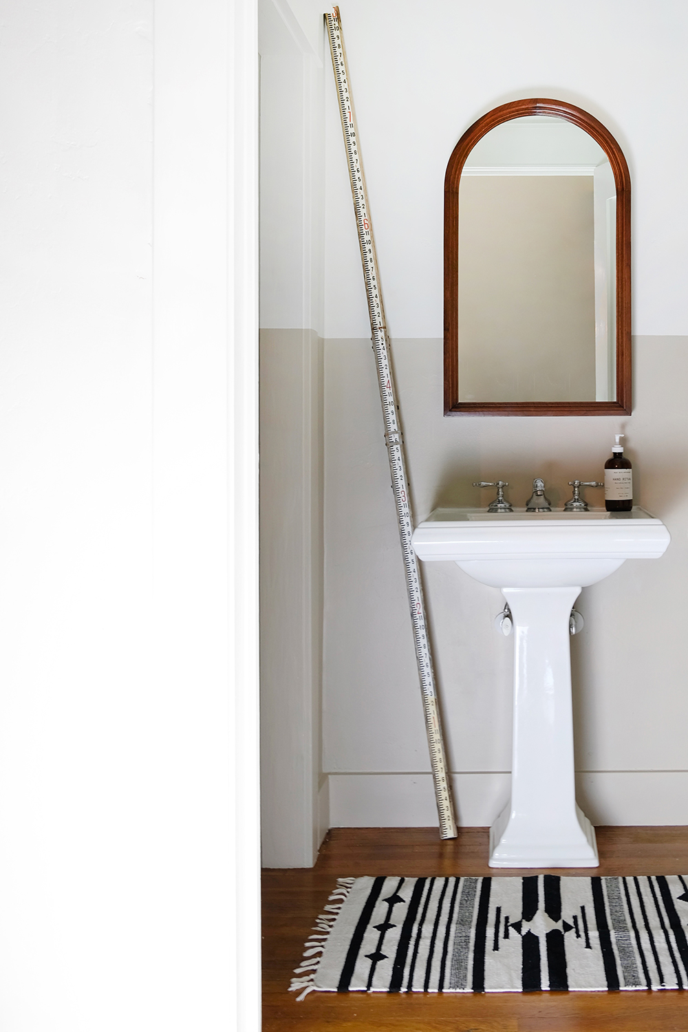
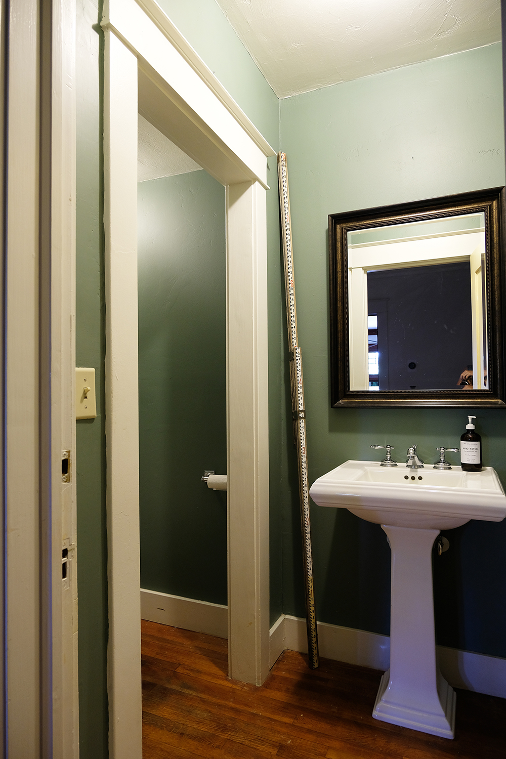
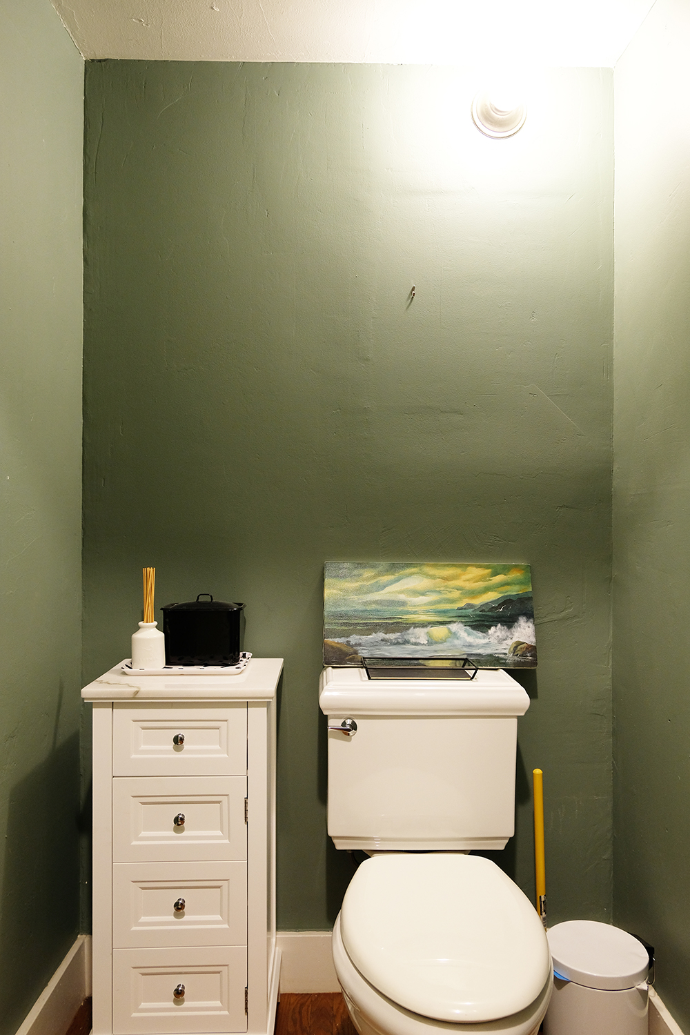
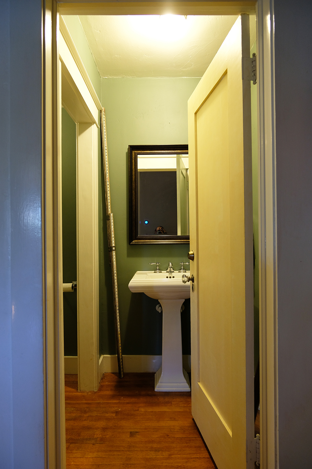
We have been in this house for almost 3 years, it’s hard to believe. But, I kind of thought this bathroom would be one of the first rooms I would tackle. This is the powder bathroom or guest bathroom off of our main living area. It really has a great Kohler toilet and sink, but the room was dark and outdated and really needed a little more pep-in-it’s-step. Originally I thought this would be a great room to add some tile. But, I priced that out. Next a considered adding wallpaper, so I ordered wallpaper samples over 2 1/2 years ago. But, have you priced out wallpaper lately, even for a tiny space? Then I thought about adding some sort of chair rail, bead board or board + batting. There was no shortage of ideas, I just didn’t have the budget to execute those plans.
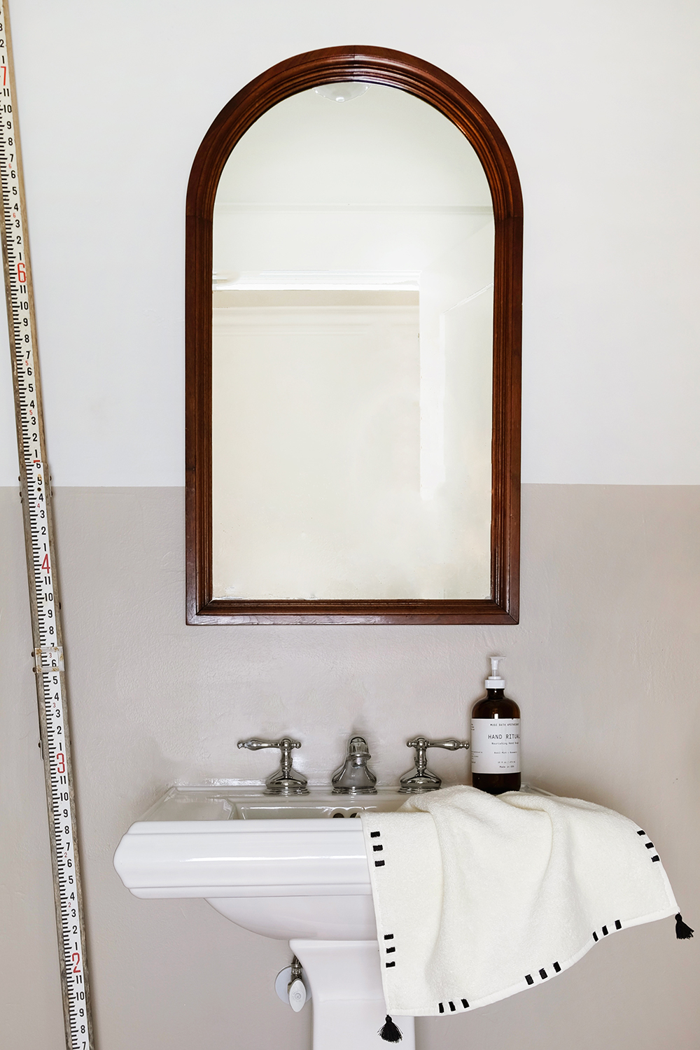
Before I go on, can we please appreciate this $30 mirror that I bought at a thrift store over a year ago? It’s sooooo good.
So, this week I decided to take on this little bathroom with the tightest budget possible. It felt like a fun challenge to use what I had already, buy some paint and see if I could make this a space I was proud of. And you guys, I am so proud! It’s a space that feels modern but still honors the 1918 vintage of our house. And I even took a “risk” and surprised myself by painting the walls BEIGE!!! What the heck? We call it mushroom or putty now to be fancy, but let’s be honest, it’s BEIGE (and I don’t hate it).
Let me make a quick note, these are NOT my best photos. But, this room gets ZERO natural light and I really only shoot with natural light. It’s also a tiny space to maneuver around. So, I borrowed some camera lights from a friend. So, if the shadows and colors seem a little off, it’s because they are. But, I hope you can get an idea of what the room looks like even with these crappy images.
So, let’s talk about the room. I decided that I wanted to try a two-toned paint situation. This room has two doorways with wide baseboards and trim. I decided that if I took this straight line of paint all the way around the room, even across the trim, jams and doors that it would make the room feel a little less choppy and small. And it worked! When the door is closed, seeing that straight line go across the door and the door jam is really very pleasing to look at. It’s a little unexpected and quirky and I think that’s why I like it.
I had always thought I would either install a dark moody wallpaper or paint the walls half black. But, after I got the first coat of white on the top half of the walls, I knew I needed to go with a brighter color. With no access to natural light in this space, I wanted to be done with dark and dingy for good. BEIGE for the win! This color is called Shiitake (so we really can be fancy and call it mushroom) and it’s by Sherwin Williams and I’ve paired it with the only white I ever use, Alabaster.
This room also had some sad, very basic, lighting, like just boing builder grade fixtures. It also has a light in a weird spot – up high over the toilet. Because it’s a weird spot for a light, I figured a simple, industrial light would be the best fit. The light over the sink also needed some upgrading, so we installed the light that used to hang in our kitchen before we renovated this Spring.
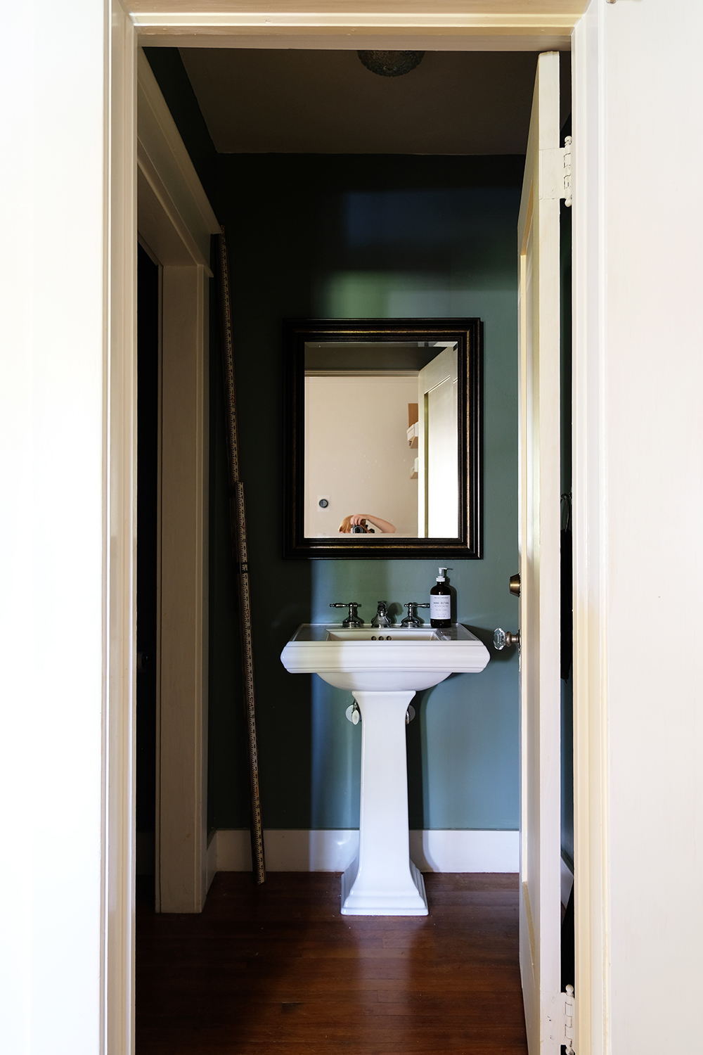
Ok, and so that you can fully appreciate the AFTER, let’s look at the before.
So, sooooo dark. Right?
This angle gives you an idea of how much trim there is in this room. It’s a lot going on, especially with the dark walls and white trim.
Oh and the door and outside trim in the hallway was still a very yellowy off-white, so I finally go those painted as well!
Now it’s your turn, is there a room in your house that could benefit from a quick coat of paint? You just don’t HAVE to have a giant designer budget to get some great results.
I really can’t put into words how excited I am to be headed to PNG in just a couple of days. (Before I go any further, if you don’t know where Papua New Guinea is, you aren’t the first to ask. But, if you want to know more Visit PNG is a great site). Chances are though, if you’ve been around here for any length of time, you will know that I grew up in Papua New Guinea and actually Lonnie and I lived and worked there for 2 years when we were first married. And…..our oldest, Denali, was born there. We haven’t been back in 12 years, so this trip is a BIG deal! The last time we visited, it was the Summer before we moved to Yemen, and Denali was about to start Kindergarten. It was time to go back and take our graduated senior so that she could experience and see a little more of her roots.
I’m so excited to take along my O+P friends with instagram and IG stories. PNG is such a big part of who I am, and I feel like this is my chance to really share ME by sharing the place and the people I love so much. If you have ever met anyone who has lived in PNG or even visited, I’m sure they spoke of this magical place with deep affection. Papua New Guineans are the BEST! They are passionate, generous, and really just fun loving people. The land is lush, wild and untouched. Air Niugini, the national airlines, used to have a slogan that describe PNG perfectly -“Land of the Unexpected”.
We will be in Papua New Guinea for 3 weeks (really not long enough). We are headed there with my parents, my youngest brother, Ash, and a couple of friends. While we are there, we have two projects planned. First, we will be helping Lae Christian Academy. It is the school my parents started just over 25 years ago and this is where Lonnie and I worked. The school is located on the banks of the Bumbu River and actually the river is washing away their property. Some of the building are actually hanging over the river bed already. We are going to help them come up with a plan to stop further erosion and possibly even relocate one of the buildings. We will also be doing some children’s programs at the school and helping with some teacher in-services. The second part of our trip is more on the medical side, we will be flying out to the village of Imane in the Morobe Province. This is a village I spent a lot of time in as a child. We will (mostly my mom who is a nurse) hold a clinic there and we will also be doing some repairs on the church building that was built when I was a teenager.
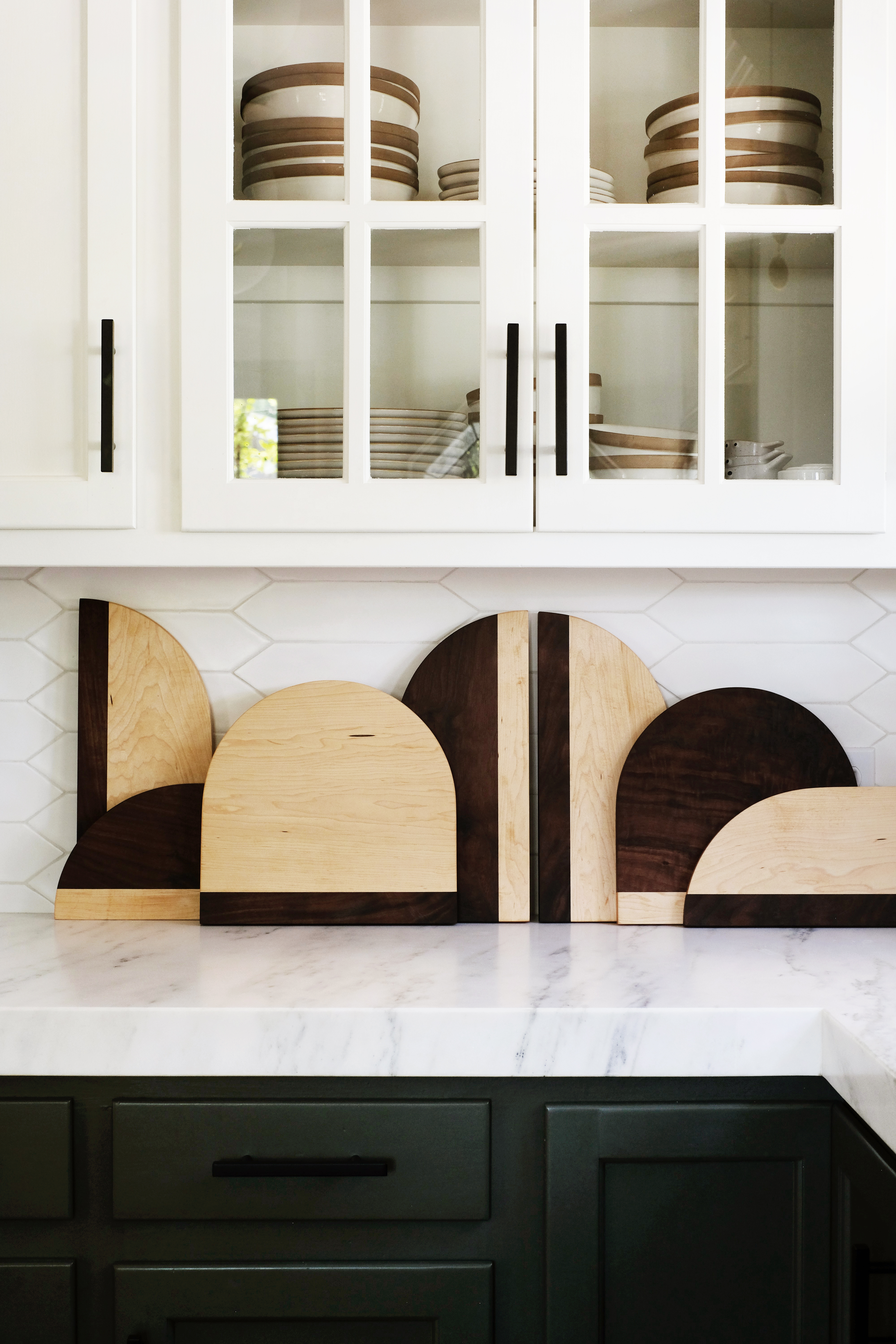
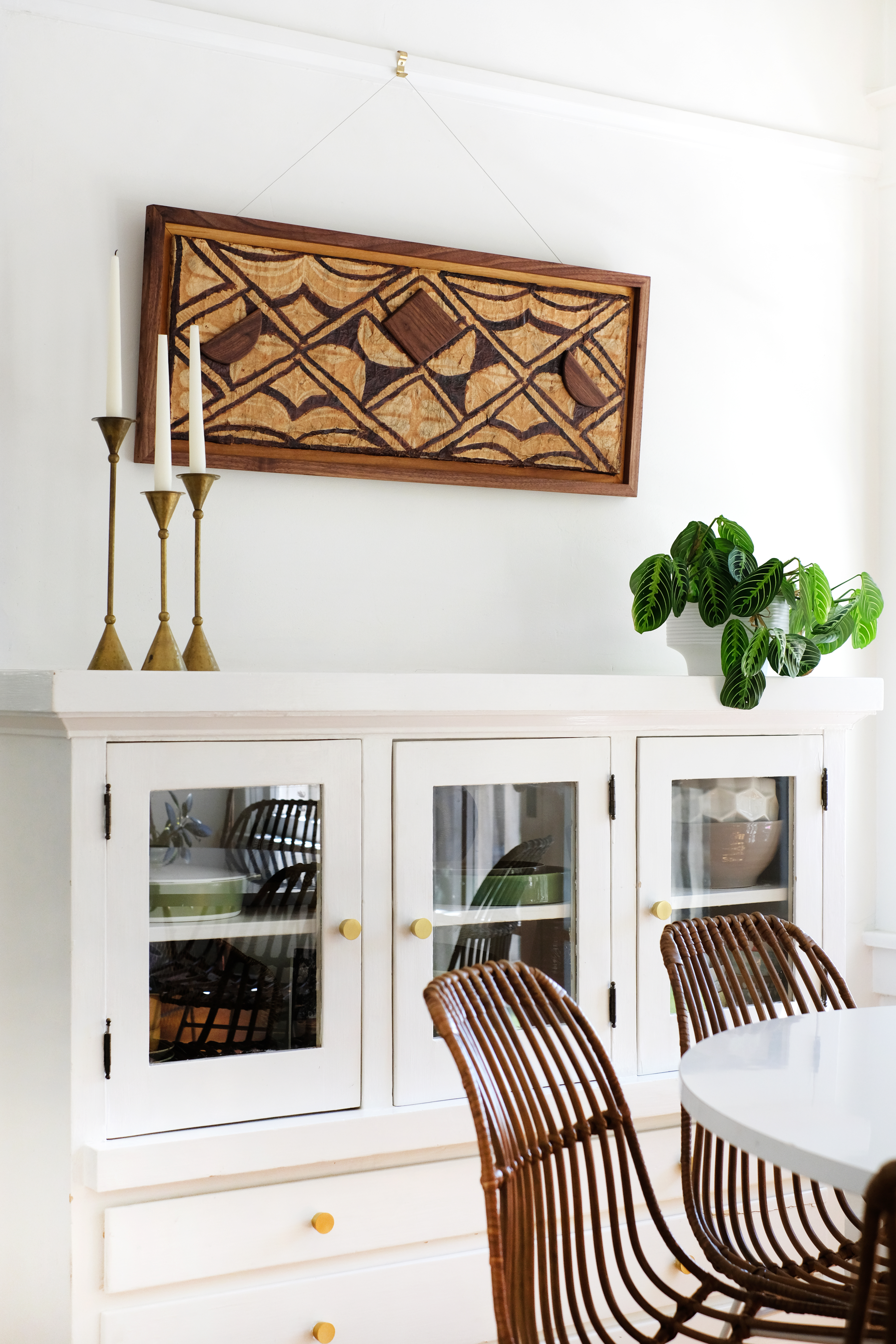
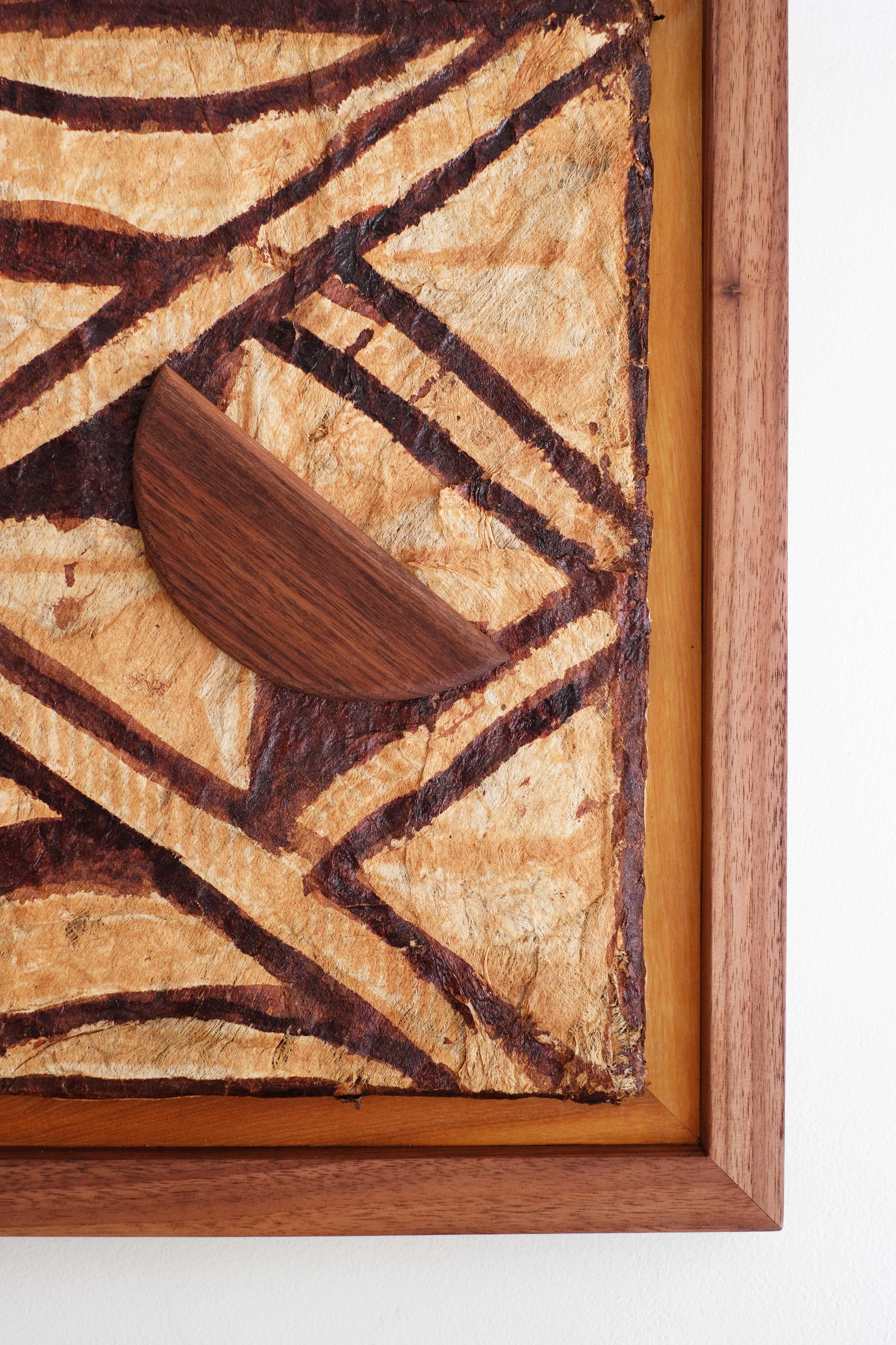
Over the last couple of weeks we have been hustling to raise funds for the projects we will be working on in Papua New Guinea. I sold a bunch of Bakersfield Bags and my brother, Ash, has made some beautiful pieces that I’ve been selling on Instagram. He made some gorgeous walnut framed Tapacloth art pieces. Tapacloth is a bark-like fabric from PNG that is painted with natural dyes. These Tapacloth pieces he framed were actually from the 60’s. He stretched the Tapacloth, framed them in walnut and then added some geometric walnut details.
We sold all but two of them, so if you are still interested, please send me a message. He also made another run of cutting boards and all of those sold out in one day!
We are extremely overwhelmed by everyone’s generosity in making purchases to help support the work we will be doing in PNG.
If you didn’t get a chance to buy one of our handy crafts and you wanted to help with these projects, I have a couple ways you can still give.
We have a GoFundMe page (which also has more info about the school is Lae) and you can also give through The Church of the Nazarene with THIS LINK (this is a charitable donation for tax purposes.
We would really appreciate your prayers for our safety and health over the next month. And pray that we can be a help to the people of Papua New Guinea. And now, follow along on IG, I’ll share whenever I can find wifi!
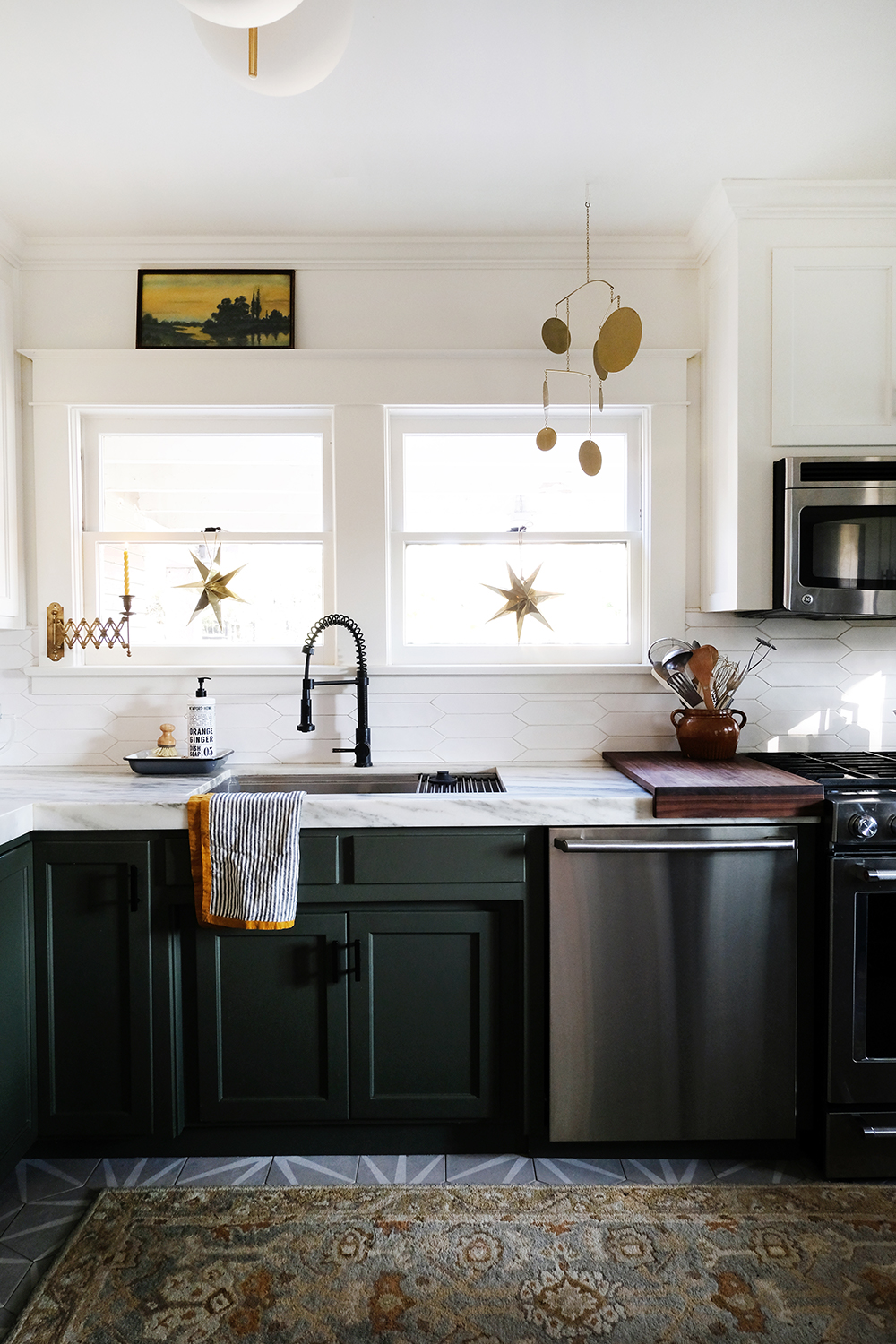
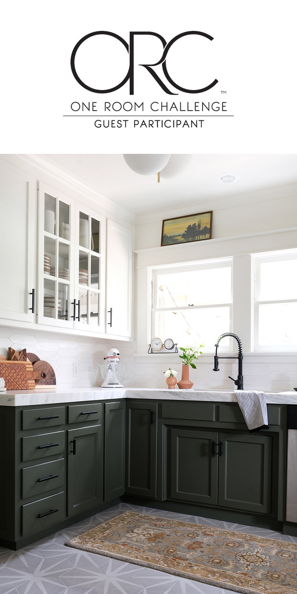
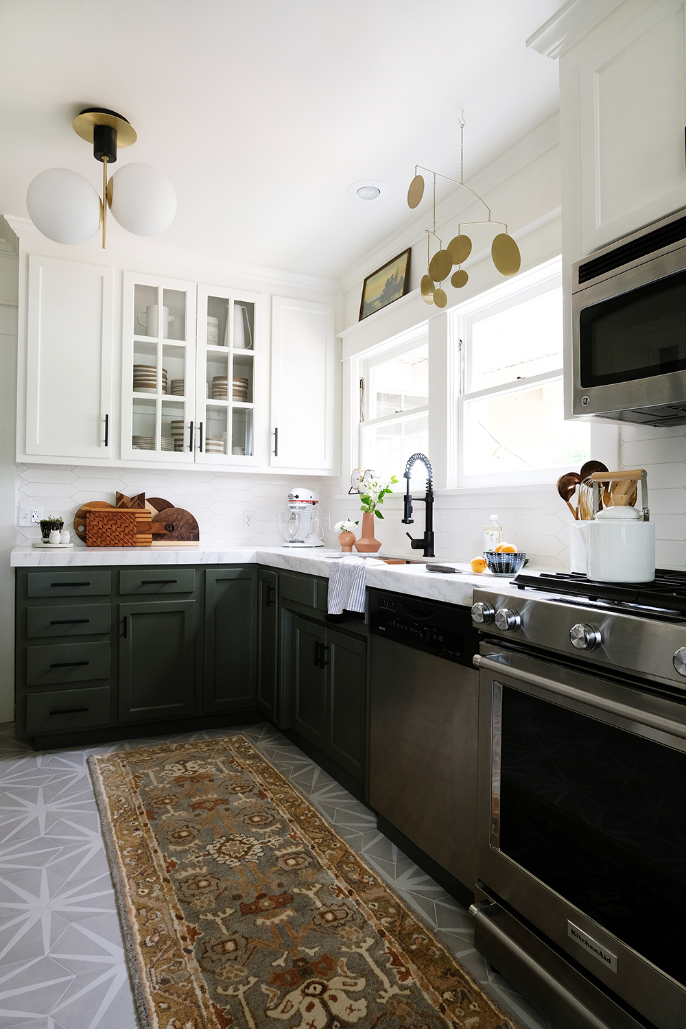
Well, we made it! I can’t really believe we have a brand new kitchen and we got it done in less then 6 weeks. I’m so glad we took on this One Room Challenge, at times I thought it wasn’t possible, but gosh this room is gorgeous. I’m hoping my pictures do it justice, because it’s really so pretty in person.
Before we look at all the afters, when I say “we” and the work, I mostly mean my brother, Ash. Lonnie and I have been his assistants, but Ash has led this project’s work load and I really can’t thank him enough. The guy is a perfectionist and a jack of all trades (oh and today is his birthday) and this room shows his handy work all over the place.
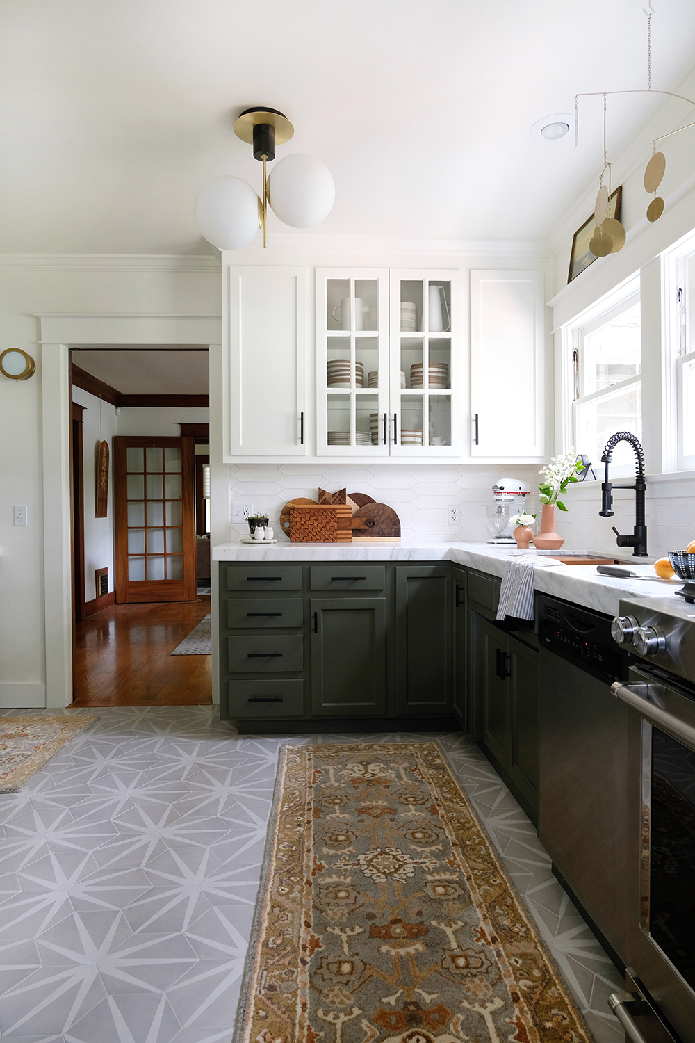
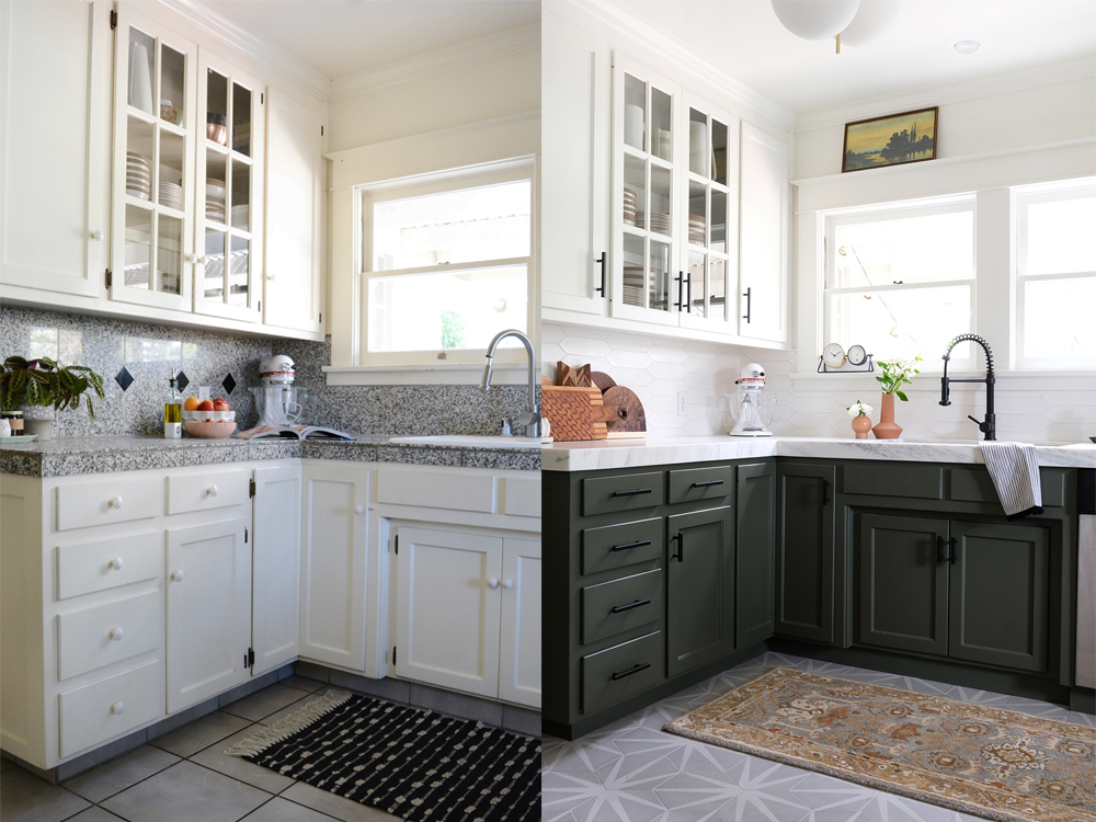
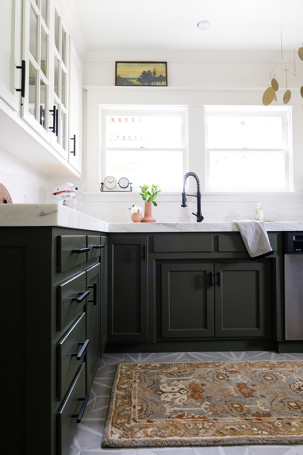
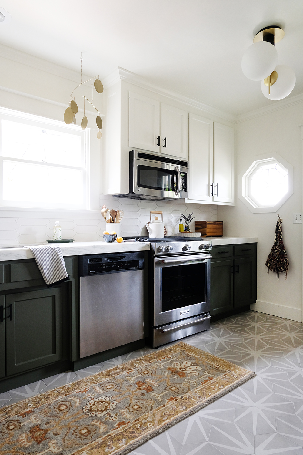
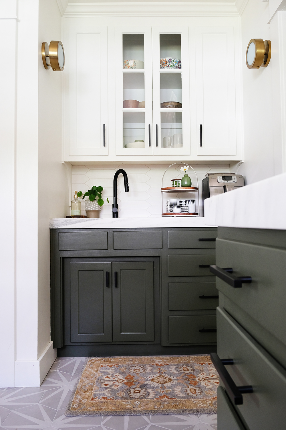
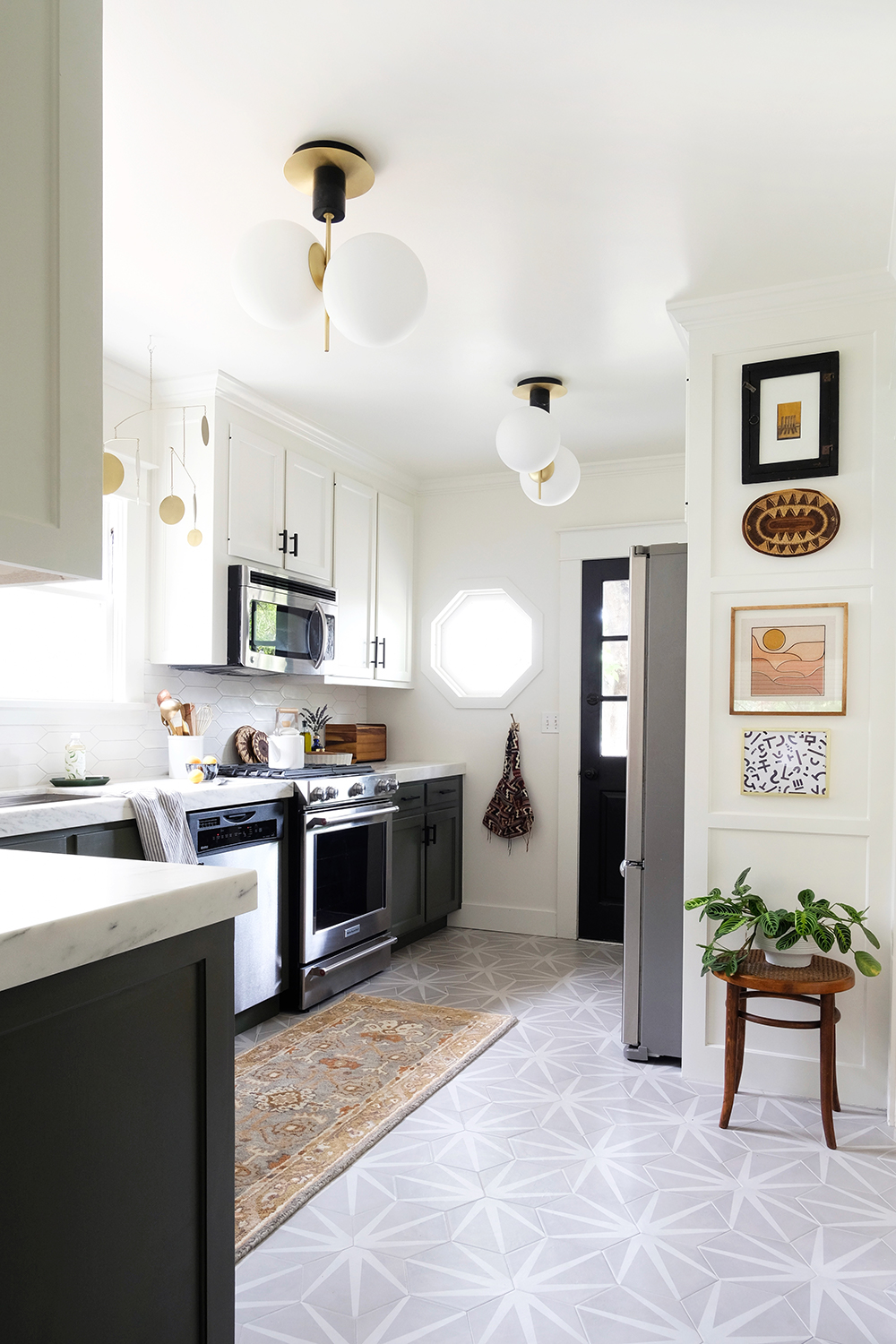
And now for the “afters”. I will try to link everything, but this post also has a lot of the sources too. This room really is exactly what I wanted. It feels modern and fresh, but still fits into my 100 year old house. When we started with week 1, I was positive that the lower cabinets had to be black. But, now I can’t imagine anything but this gorgeous green in this space. The room is so much brighter. I think it’s the combination of the fresh white paint, the lighter marble countertops and the white backsplash. I just can’t wait to shoot some recipes in here. No more hauling everything to the sunroom and shooting on a large marble cutting board. I now have over 12 feet of marble to shoot on.
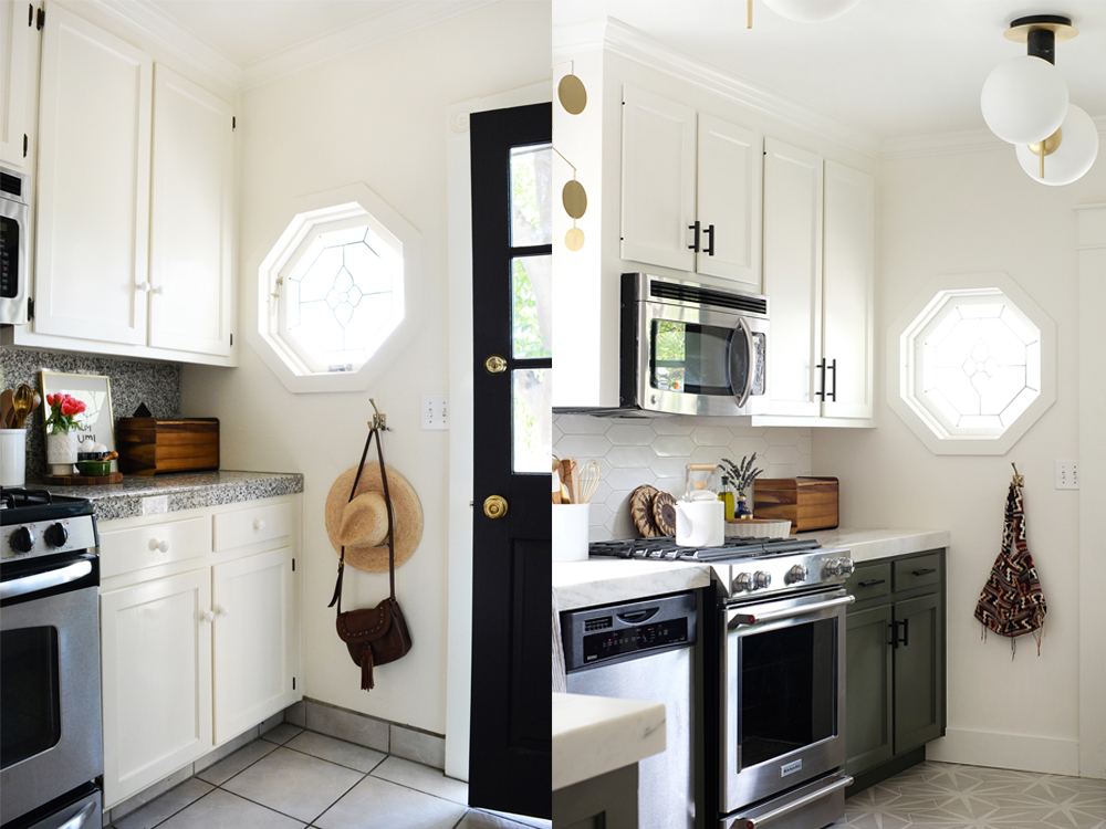
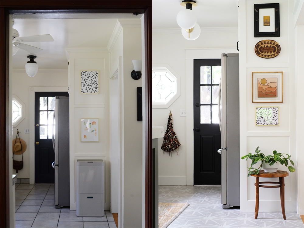
Ok, before I go into all the details, let’s look at some side by sides of “befores” and “afters”. Just in case you forgot what our kitchen looked like just 5 weeks ago.
As you can see, we did not change the floor plan, foot print or cabinets at all. This was really a cosmetic makeover. But, finishes can bring a lot of style to a space.
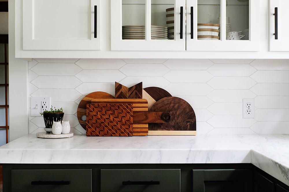
I teamed up with Bedrosians Tile and Stone on this room makeover and they have been a dream to work with. The team here in Bakersfield are the best! I couldn’t have found better floors, countertops and backsplash anywhere. They have so many options, but I think I went with the best! This honed marble is pretty much the prettiest thing I’ve ever owned. I’ve been wiping it down and polishing it over and over.
We hired Pat Callahan to fabricate our marble counters and install the tile. These guys are the best of the best and we are so happy with the work they did.
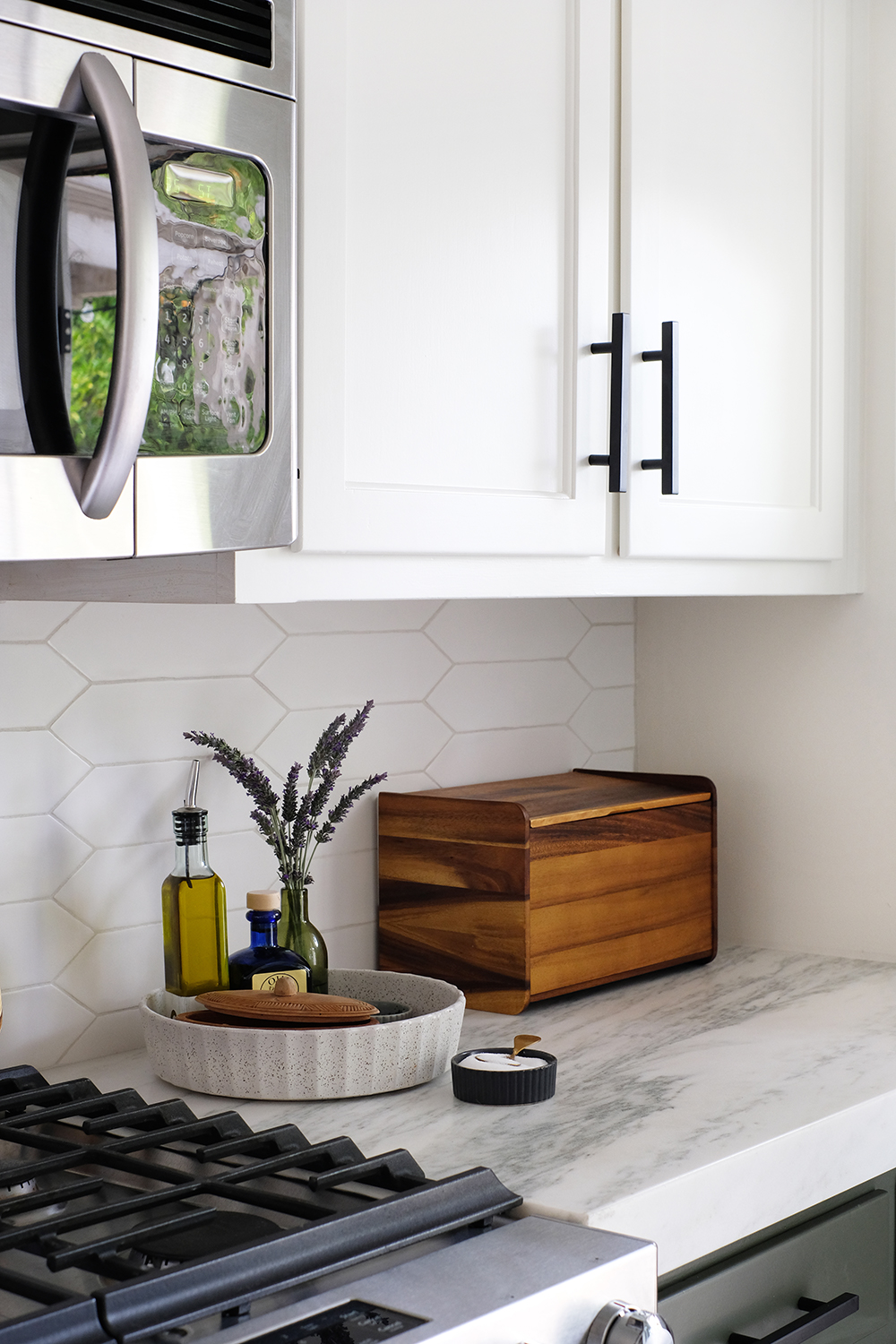
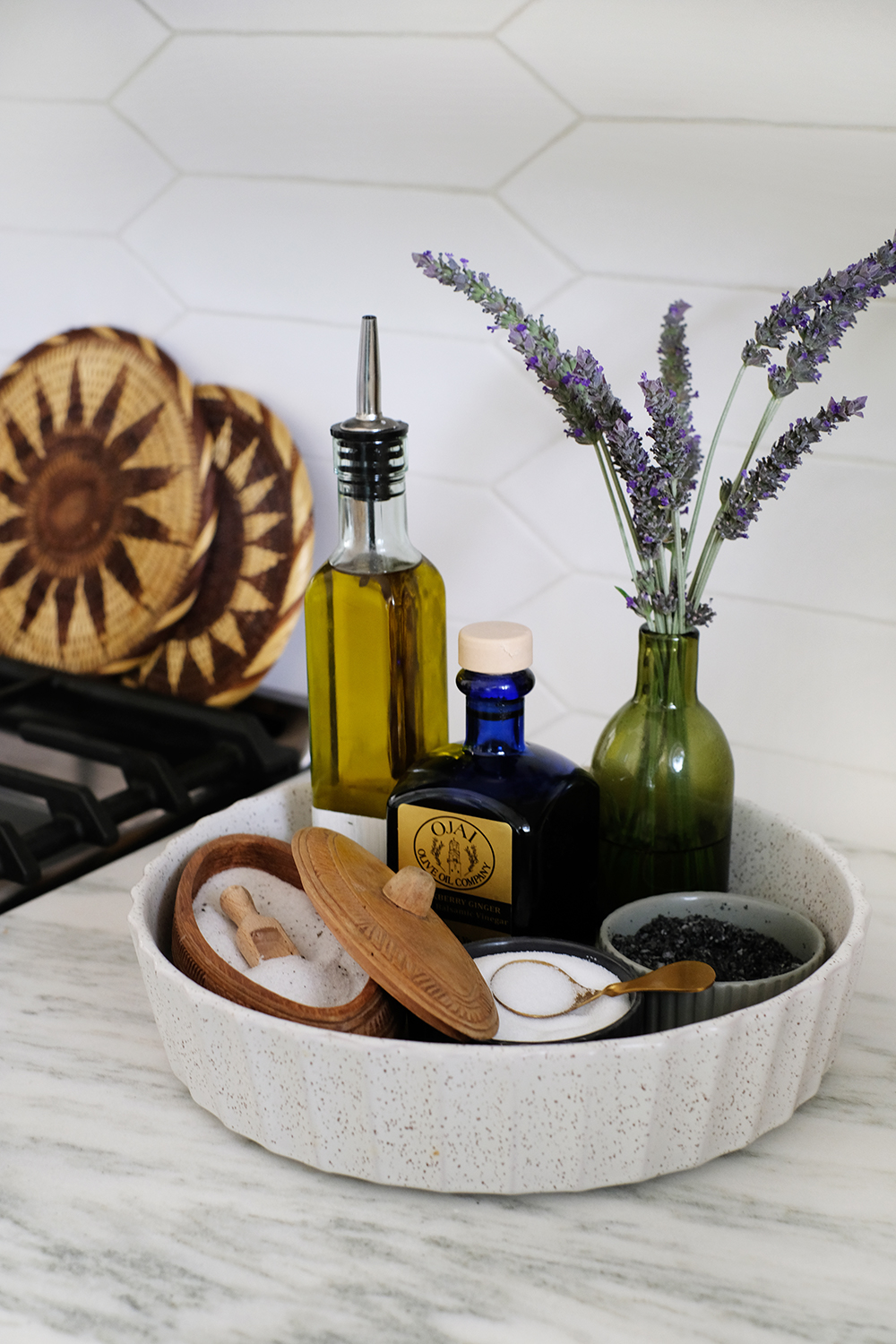
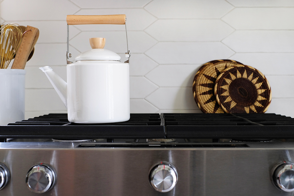
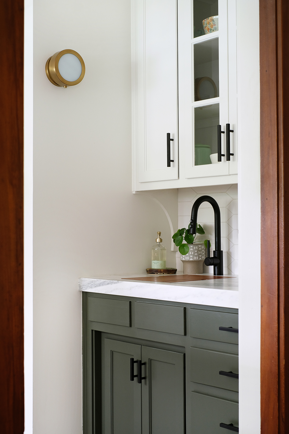
In our first house, I went with a very bold backsplash, it was avocado green glass. I LOVED it, but I’m excited to have a neutral, clean back drop. And while subway tile is a classic, I wanted to play with something with a little more pattern. So, this Reine 3″ x 12″ Wall Tile feels like a nice updated version of subway tile.
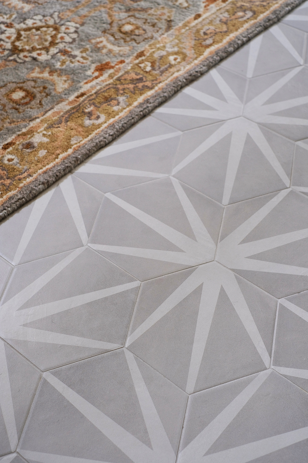
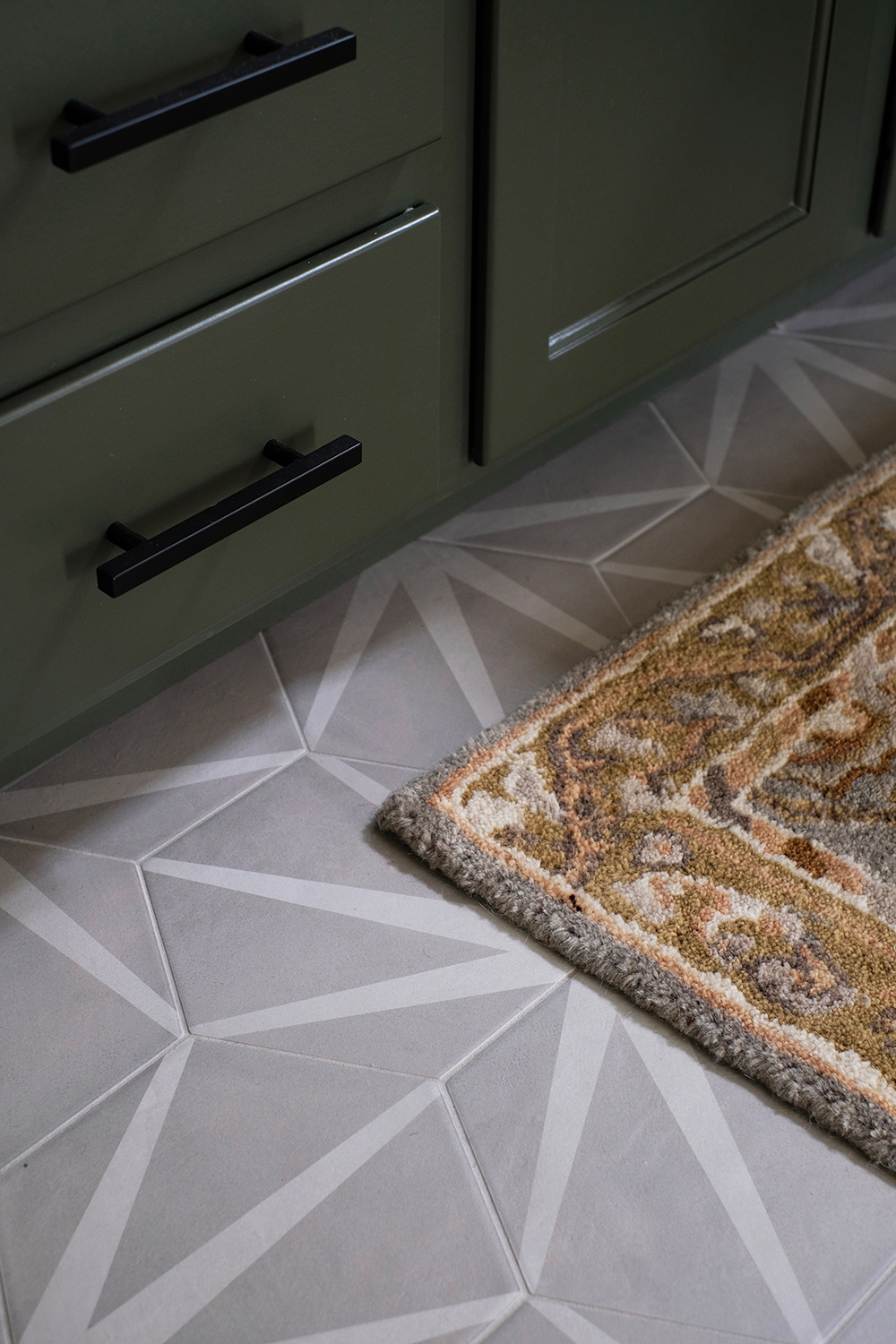
I think the floors make this space. And early on in the process I wasn’t sure if we would replace the floors or not. Oh gosh, I’m so glad we pulled the trigger and added the floors. I paired this modern starburst tile floors with a very traditional style rug and I think it works. I would have loved to have found a vintage rug, but I’ll be on the hunt. And until I do I actually really love this runner I found. It’s comfy under foot and it’s all the right colors. Often these Persian style rugs have a lot of reds and blues, which are colors I do not use very often. I love mixing old and new styles and I never wanted this kitchen to feel tooooo modern, so I think to rugs check all the right boxes.
Every inch of this room got a fresh coat of paint. I think we spend about 3 full weeks just sanding, filling, priming, painting and then sanding and painting some more. The walls and cabinets were a very yellow/cream color. We primed everything with UMA primer and then painted the walls, ceiling and upper cabinets Sherwin Williams Alabaster White and the lowers a Benjamin Moore color, Dark Olive. We used Sherwin Williams, Emerald Urethane Trim Enamel Trim Paint in Satin. I actually had a hard time deciding between a semi-gloss or satin finish, but I’m really glad I opted for something with very little sheen. The paint sprayer saved the day! We just wouldn’t have gotten this awesome, professional finish with a brush or roller.
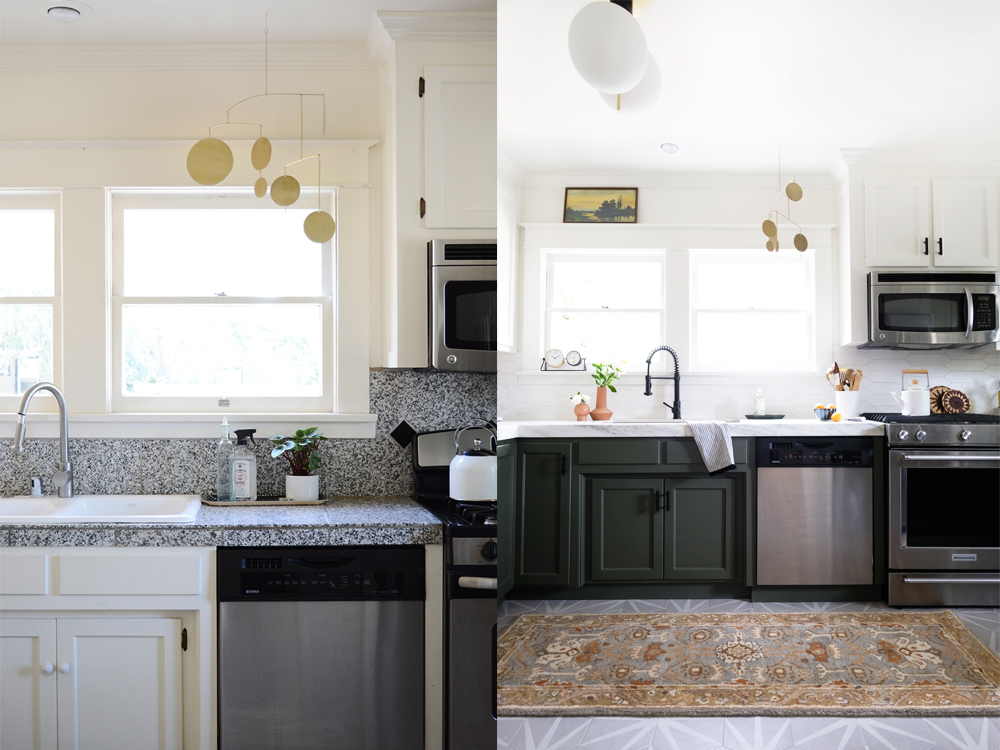
A friend came over last week and thought we had replaced our windows. I was flattered, these 100 year old windows look fantastic because we sanded and filled and sanded some more. It’s really amazing the power of a fresh coat of paint.
You can see here that having a paint sprayer really paid off. Everything came out looking like brand new cabinetry.
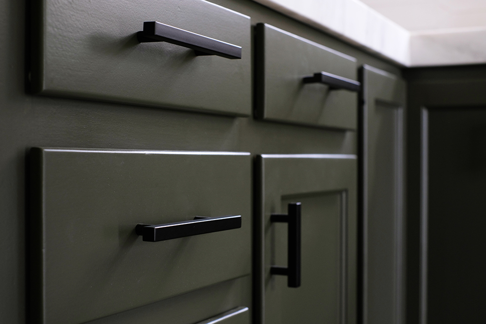
Changing the hardware on the cabinets had a really big impact as well. I actually think these matte black handles really add to the Craftsman feel of this space.
We also changed out all the hinges on the cabinets. If you look back at the befores, you can see that the hinges were exposed on the outside of the cabinet doors. It took some research to find the right hinges, but I think this was a really a great investment for our kitchen.
We kept all our old appliances. Just the stove is semi-new from what is in the “before” pics. We got this new stove last Fall. The old stove was very inefficient and actually heated up the entire house whenever I baked anything – hence no cookies in the Summer. The only appliance I would like to replace in the near future (but probably won’t happen until it dies) is the fridge. It’s a great fridge, it is just too big and sticks out too far from the cabinets. We brought it from out old house. Ideally, I’d probably like a counter depth fridge at some point. This isn’t a huge kitchen, so those couple extra inches might be nice to gain. But, until that day, I’m totally a-ok with my fridge sticking out a bit.
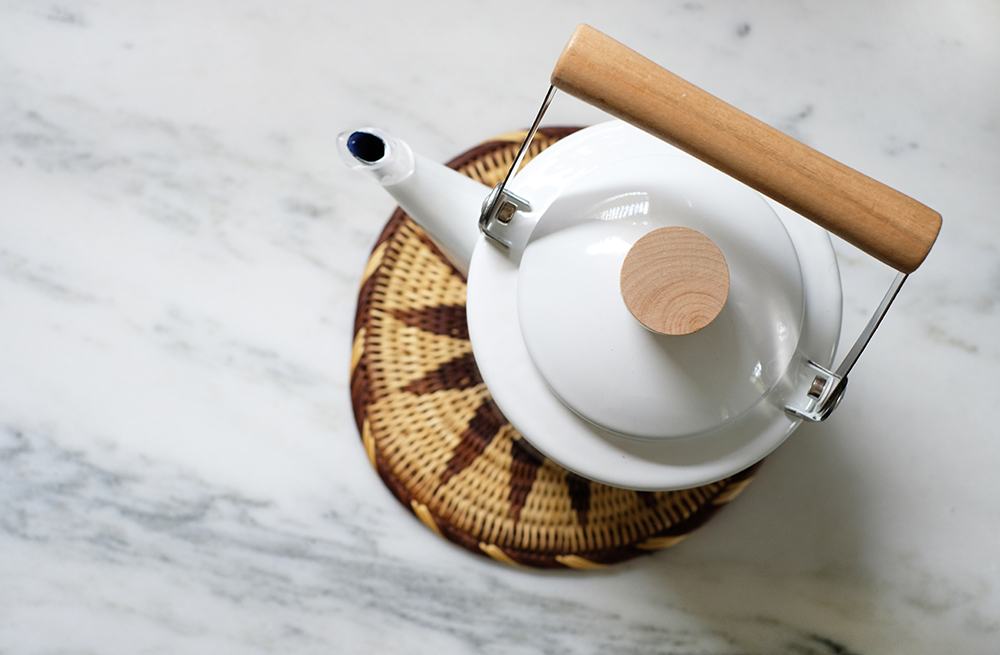
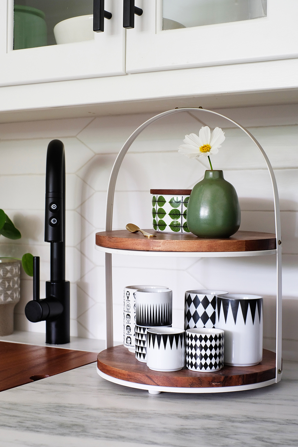
A new kitchen needs a new kettle. I love this simple Japanese one I found. I really didn’t buy any other new accessories for the space, all my old stuff just looks new in this space.
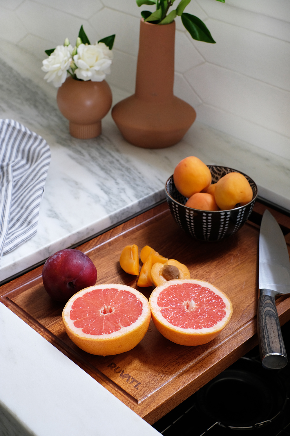
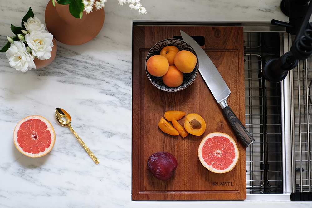
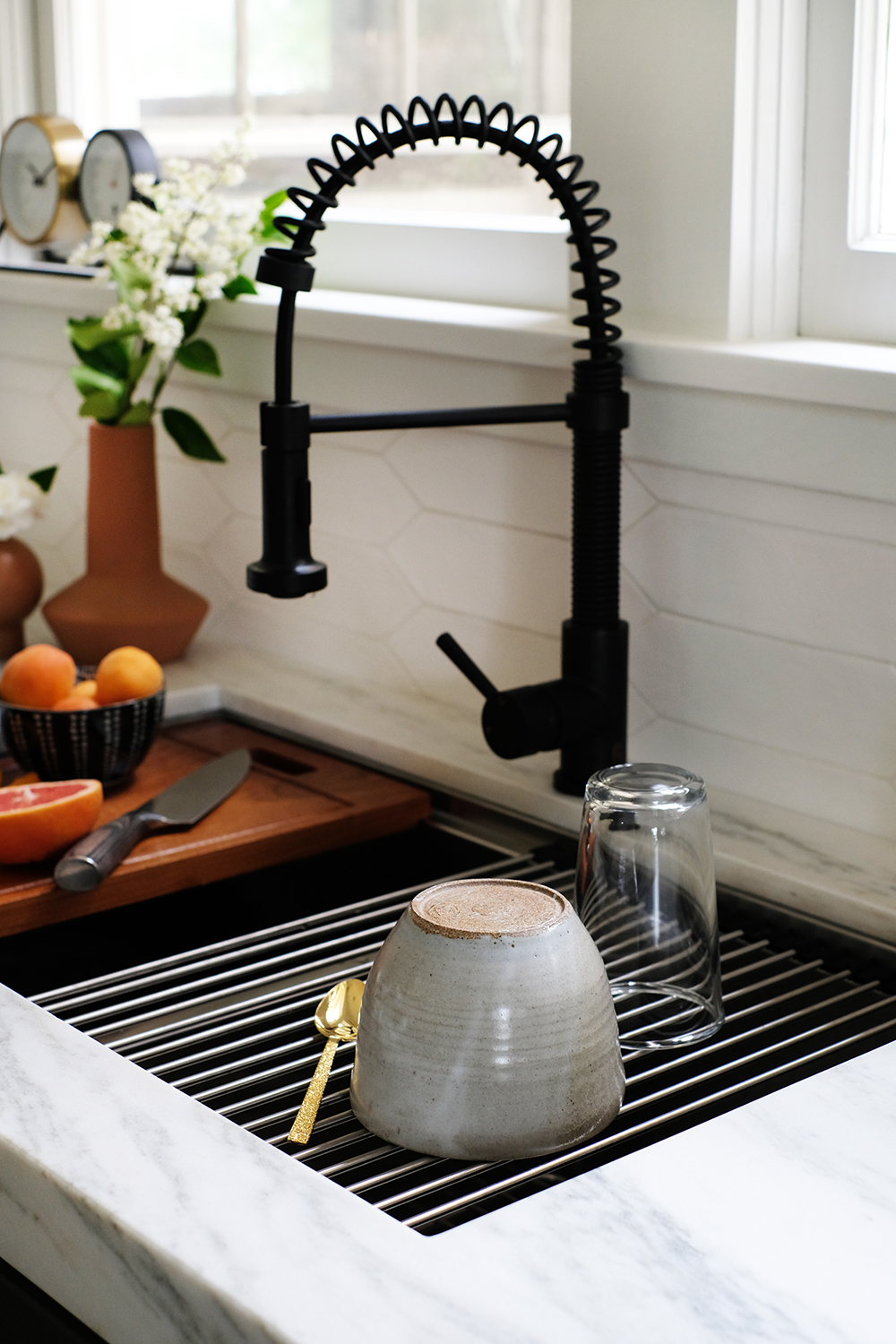
The sinks we installed are amazing, they are big and deep and have cool components like cutting boards, drying racks and colanders. The bar sink is huge and has a cutting board and the main double sink has a ton of cool accessories.
No more dish drainer taking up real estate on my counters, this drying rack is one of the coolest features.
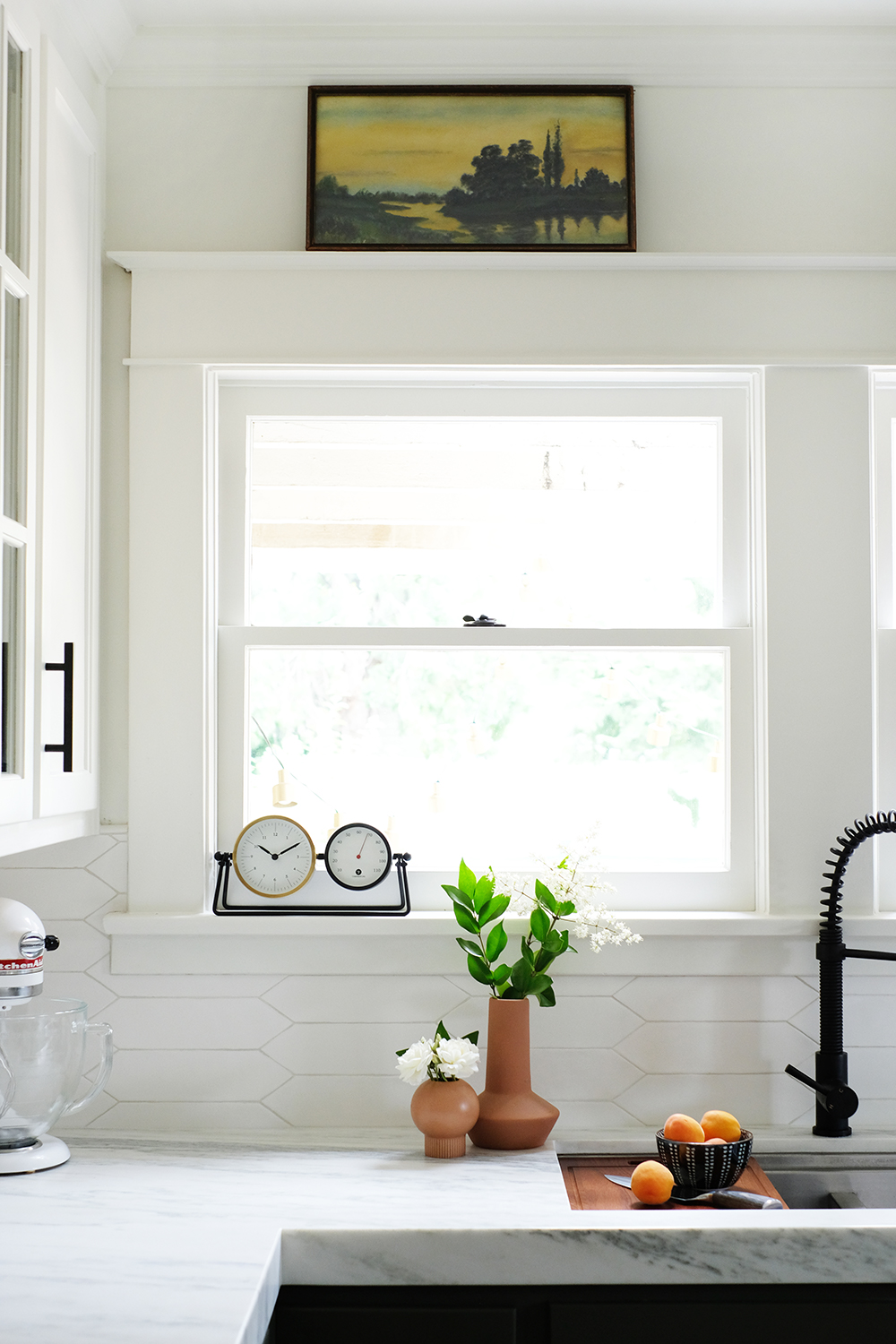
The little wet bar, or as we refer to it as the coffee bar, looks fantastic with the new lighting and the two-toned cabinets.
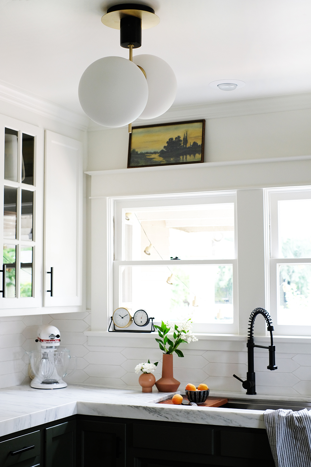
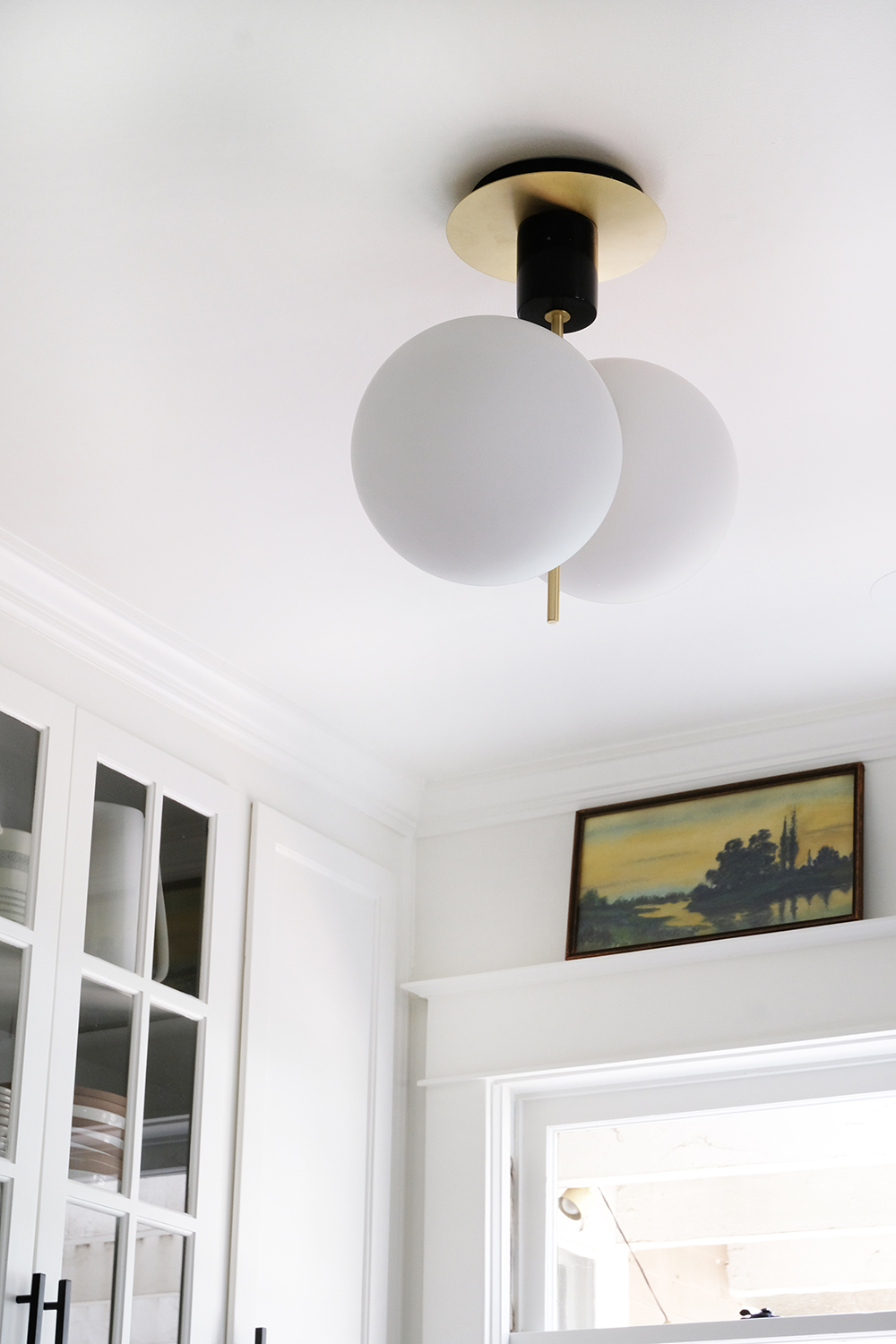
We also got rid of the random lighting combinations and the “boob” light fan and replaced then with two really cool globe pendants.
We hung them in different directions for a little interest. Nothing about this kitchen is very symmetrical, so we decided to play a bit.
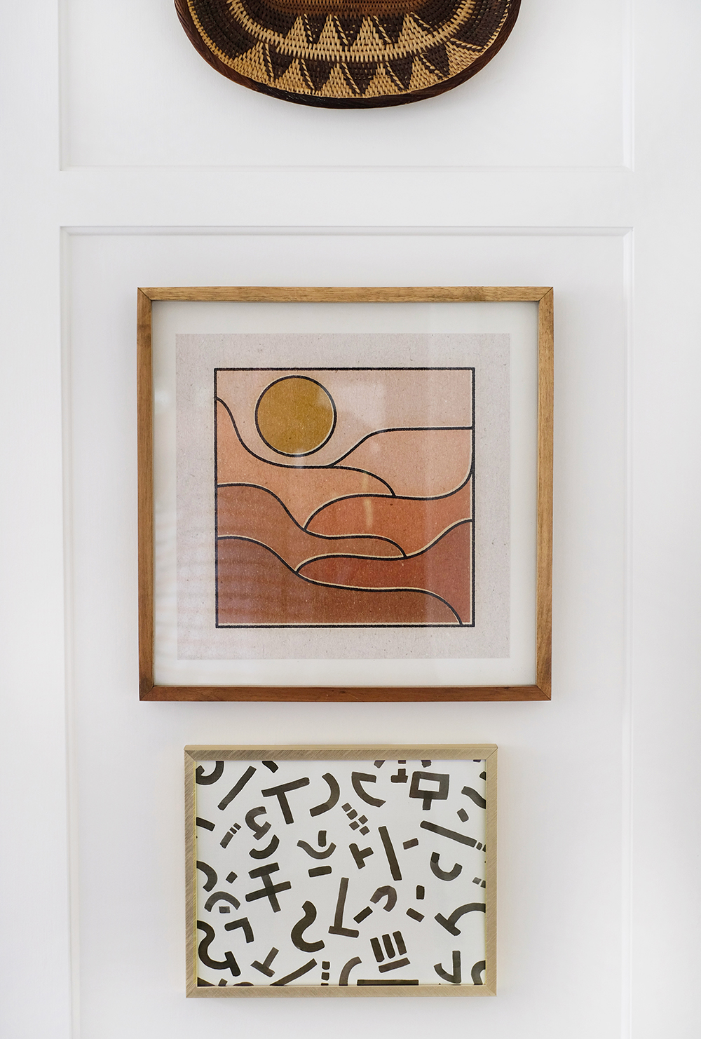
I also changed up the art that was on the wall a bit and added a little more color and pattern.
This is one of my favorite before/after pairs.
Well, that’s our new kitchen! What do you think? I wanna know. And if you in the neighborhood, please stop by for a cup of coffee (I mean it).