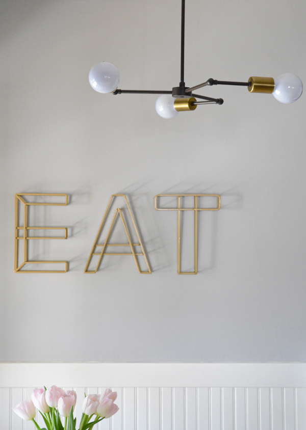
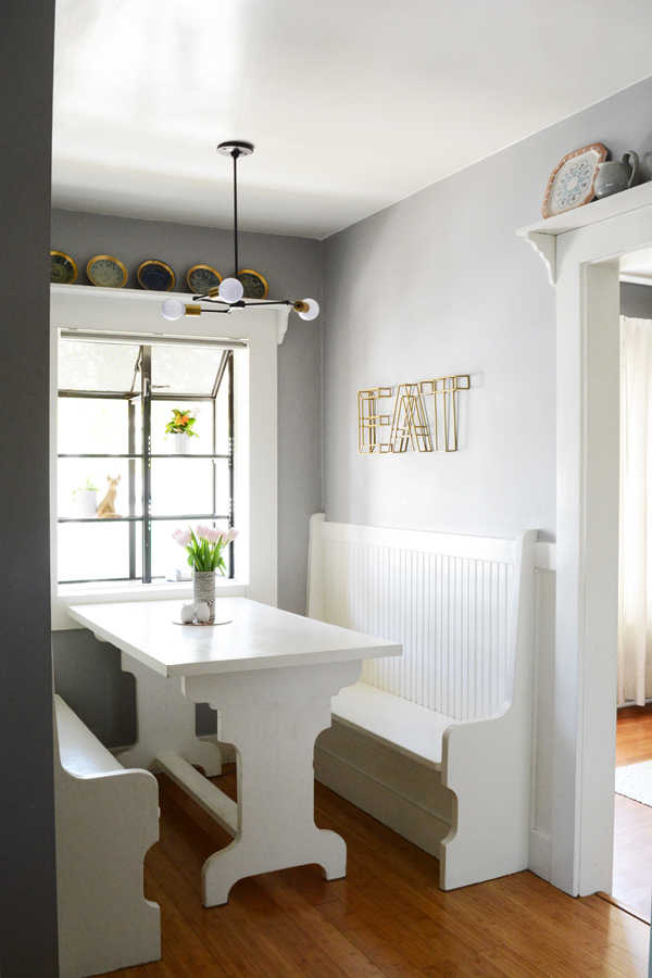
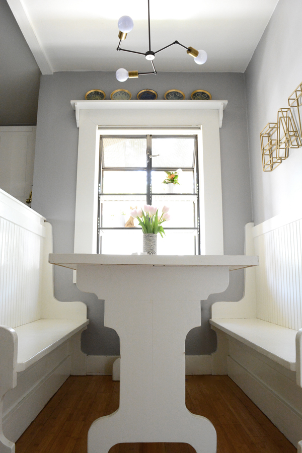
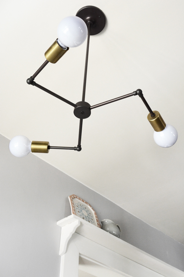
This is a long overdue post. If you remember and shared quite a while ago that I wanted to replace our kitchen breakfast nook light. Here where some of the options I considered. I love everything Schoolhouse Electric & Supply Co. makes. Their aesthetic works so well with our home and my style. Schoolhouse Electric is clean and minimal, but with a fun vintage vibe. Because we live in a 1920’s bungalow, things can be quite cute and quaint. A prime example is the absolutely adorable nook we eat almost all our meals at in our kitchen. And while I love cute things, I don’t want to be stuck in a time warp and live like I’m in the 20’s. So, to balance the adorableness of our home, I like to play with more modern fixtures and clean lined pieces. That’s why I went with the Vega 3 fixture. It was probably the most risky design choice, but I think unexpected objects like this help me keep my home looking young and fresh.
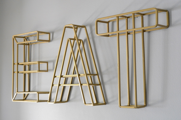
I have been wanting to change up the art on the wall as well. The Vintage Seed Packets (beware, this is O+P old school style) needed to go. When I came across these fun 3D metal letters at Hobby Lobby a couple weeks ago, I knew I’d finally found the replacement I had been looking for. They are light and airy and spell out what we love doing the most.
So what do you think? Too quirky for your taste or just the right amount of funk to liven up my kitchen. So much better then what we had though, right?

gorgeous! i struggle with the line between cute and sophisticated in my own house too…your lighting solution is perfect.
Did you buy your benches or have them built?