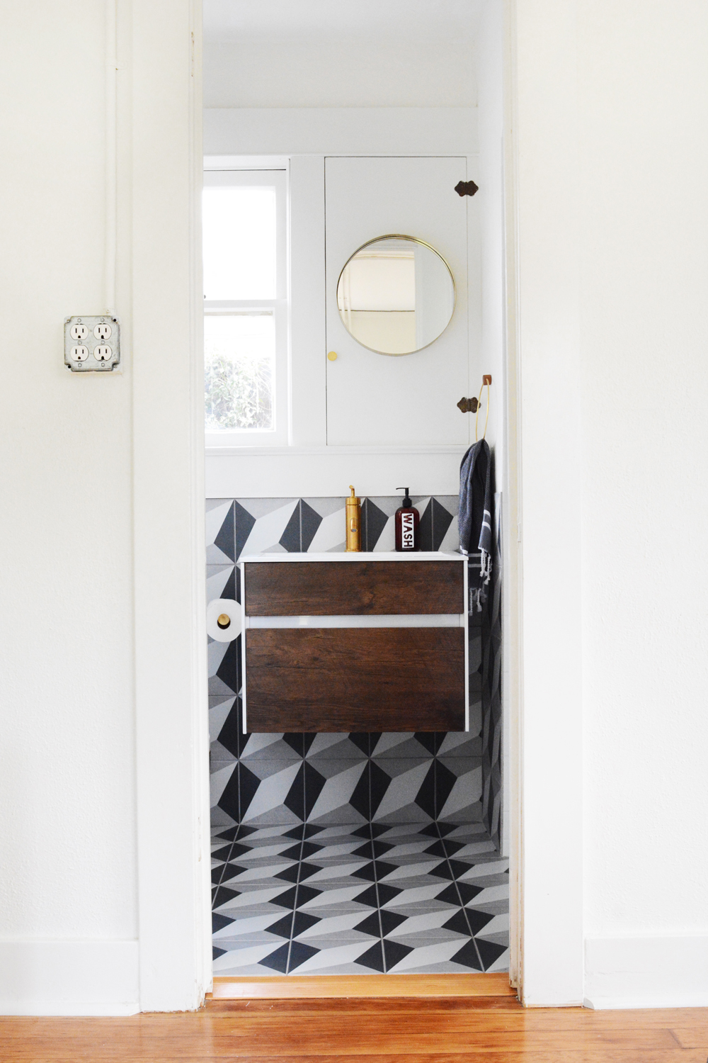
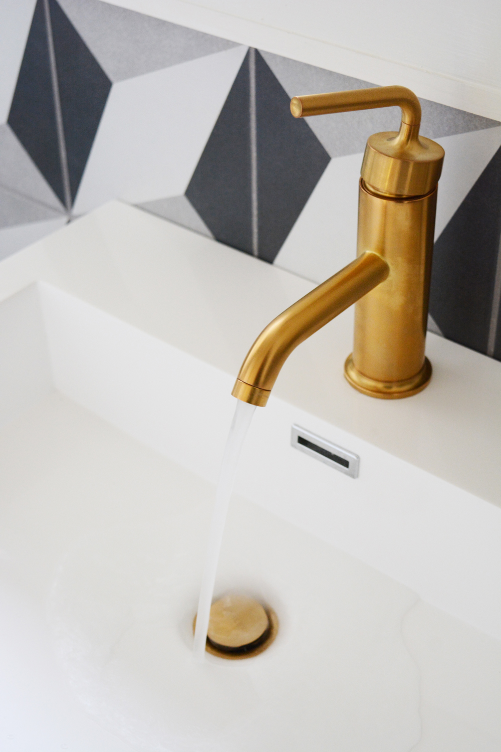
I’m so excited to share our guesthouse bathroom reveal with you today. It might be the smallest room in our house, but I’m pretty sure it packs the most style. All the gorgeous fixtures, fabulous tile and modern decor came from one store, AllModern. This bathroom makeover has been months in the making and I’m so grateful to my brother, Joash for all his help in seeing this project through. Our little Airbnb guesthouse will be open for business very soon!
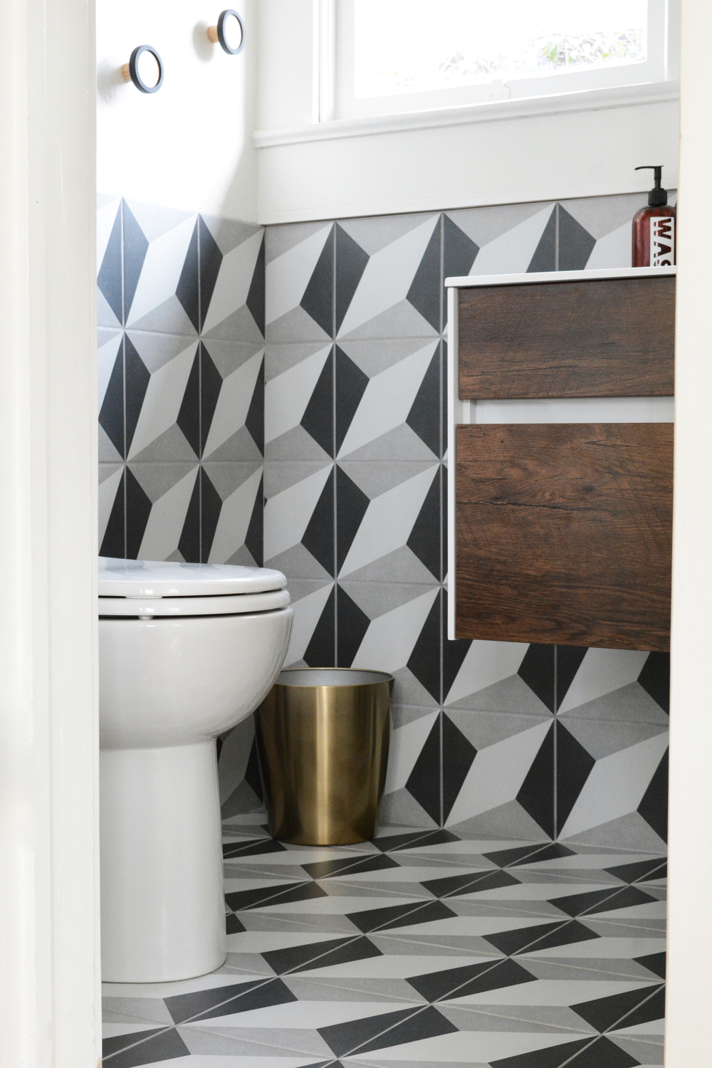
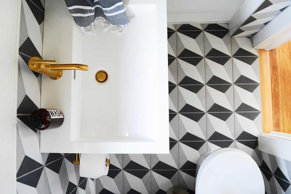
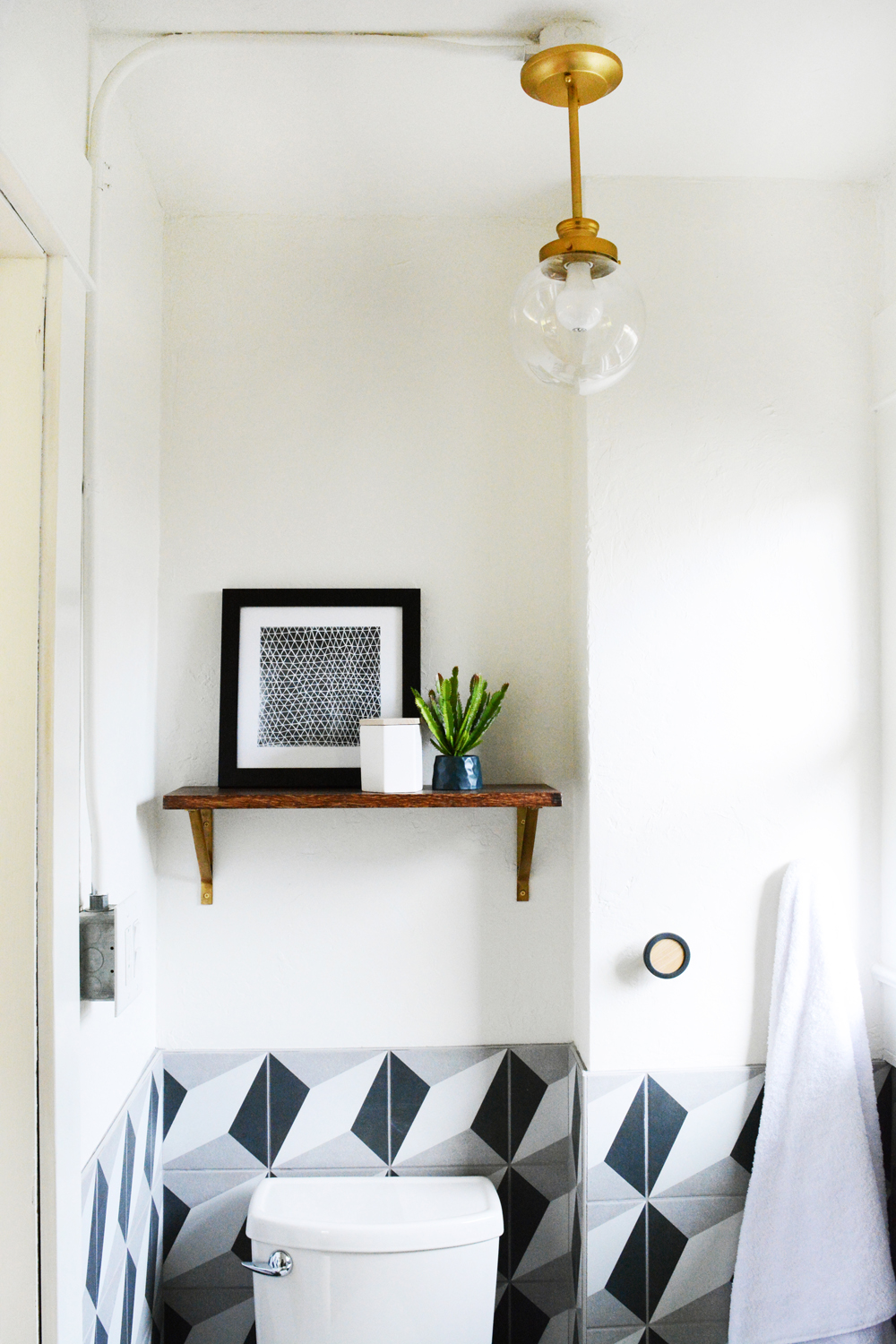
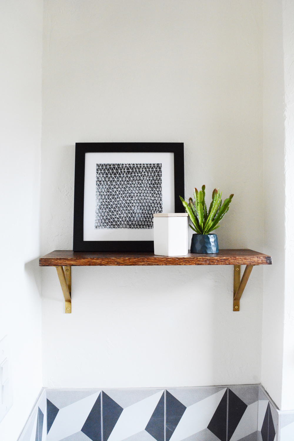
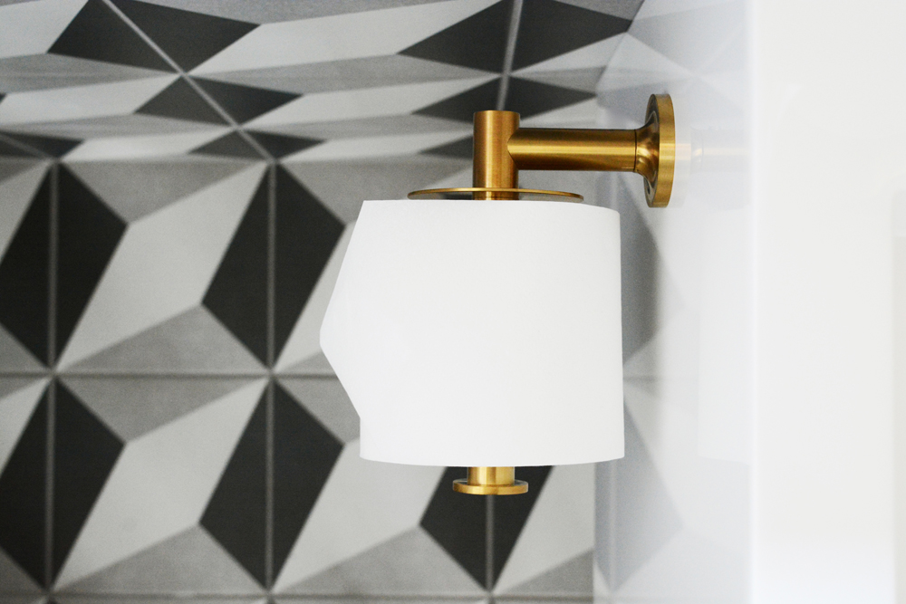
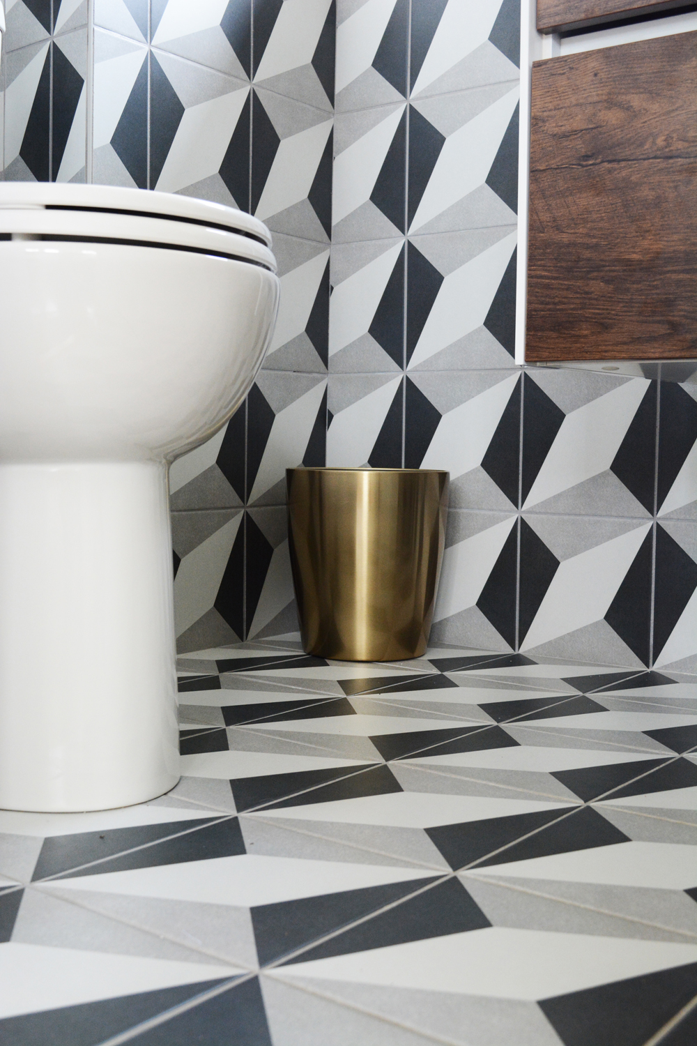
I’m sure I broke a whole bunch of design rules when I chose this very bold, geometric tile and not only put it on the floor but also up the walls. But, that’s what makes it fun and exciting for me, trying something new and taking a risk. And even though this is some very loud patterned tile, the color palette is very neutral.
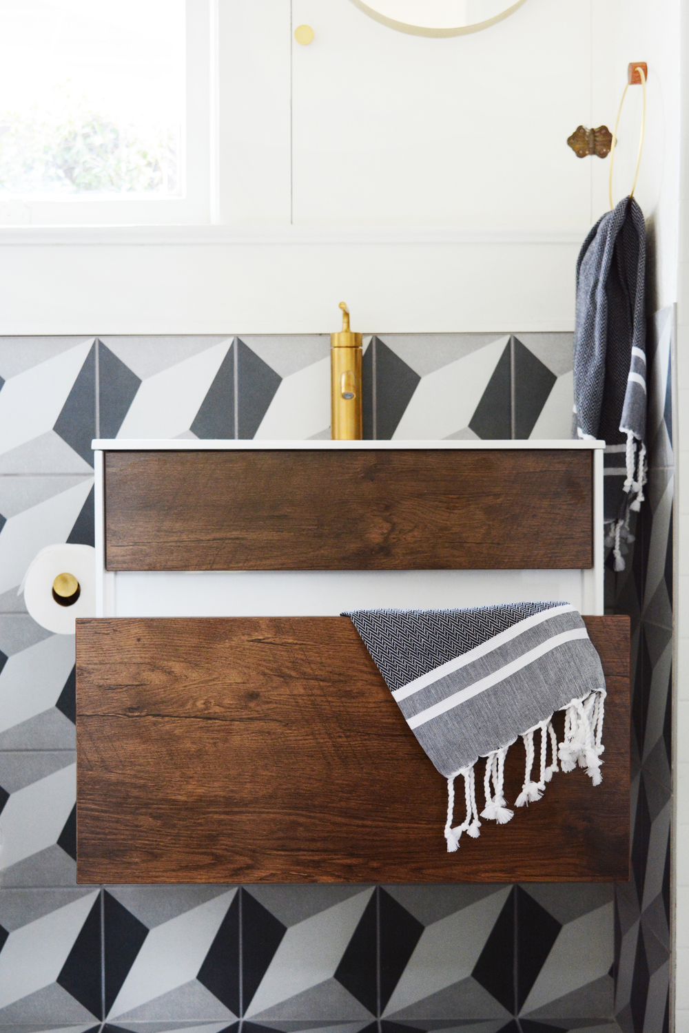
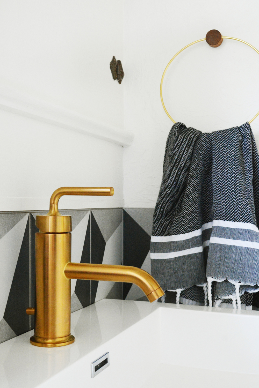
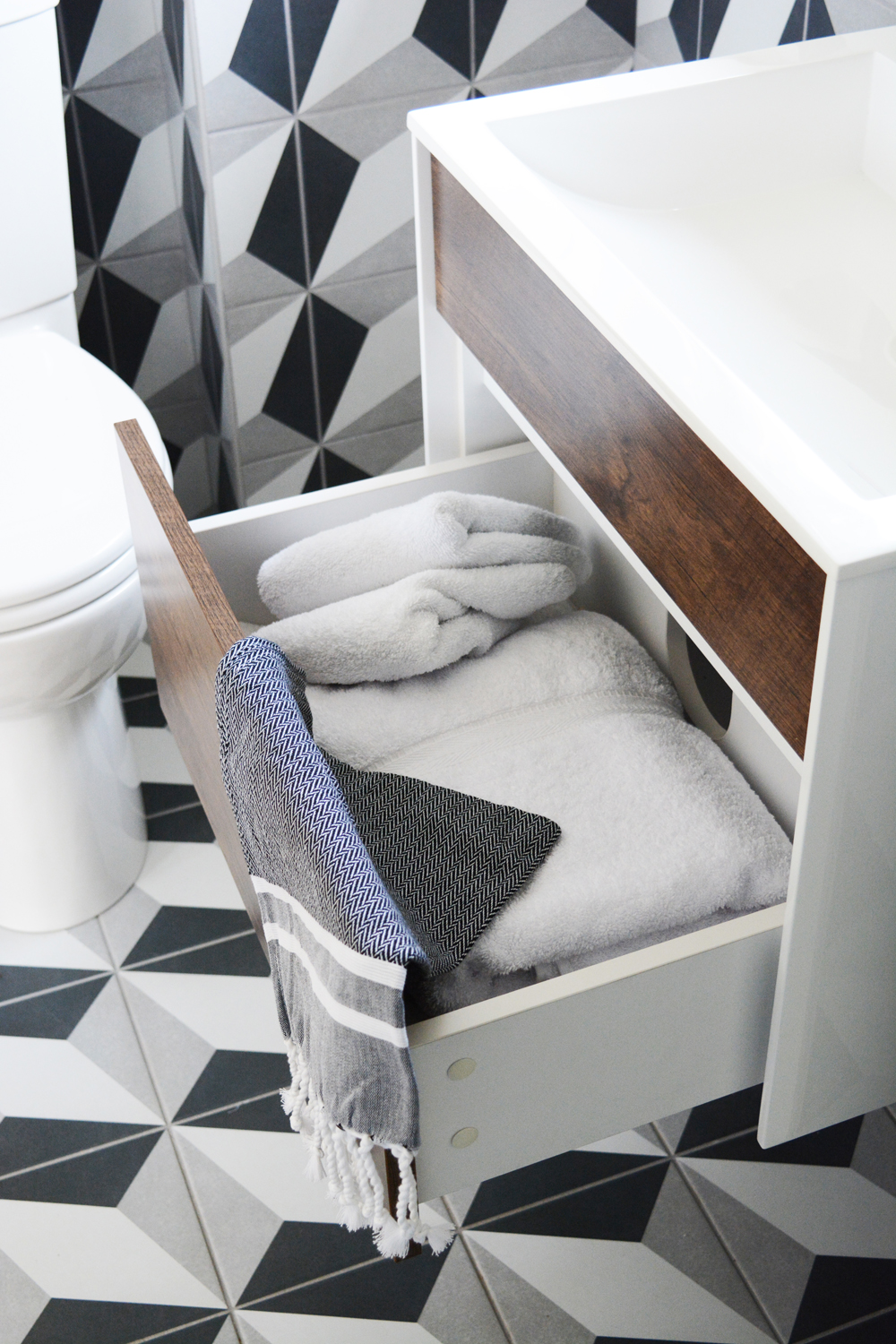
The room was mostly grey and white, so I chose to warm up the space with some warm wood tones and brass finishes. This free-standing vanity is the perfect space saver for this tiny bathroom. With no legs or a pedestal base, it feels light and not cluttered. I love the view of this space from the doorway. Seeing the tile seamlessly transition from the floor to the wall creates an illusion of the space a little being bigger then it is.
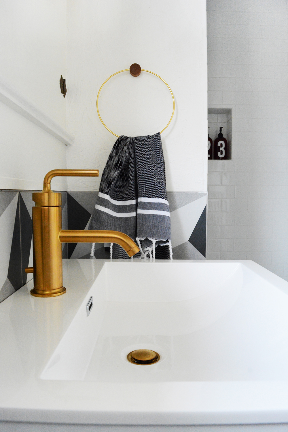
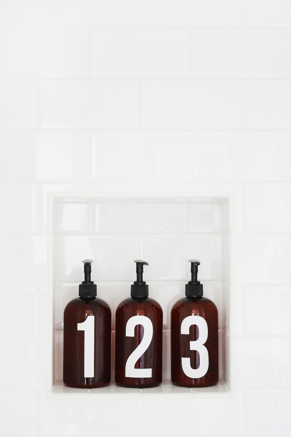
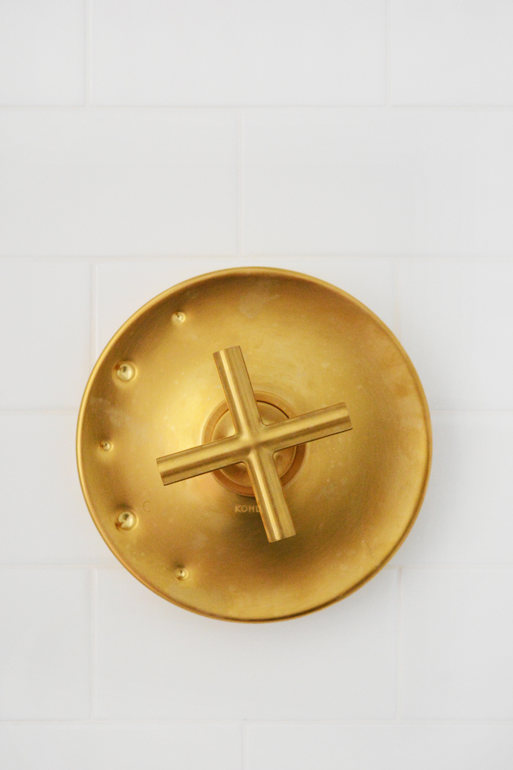
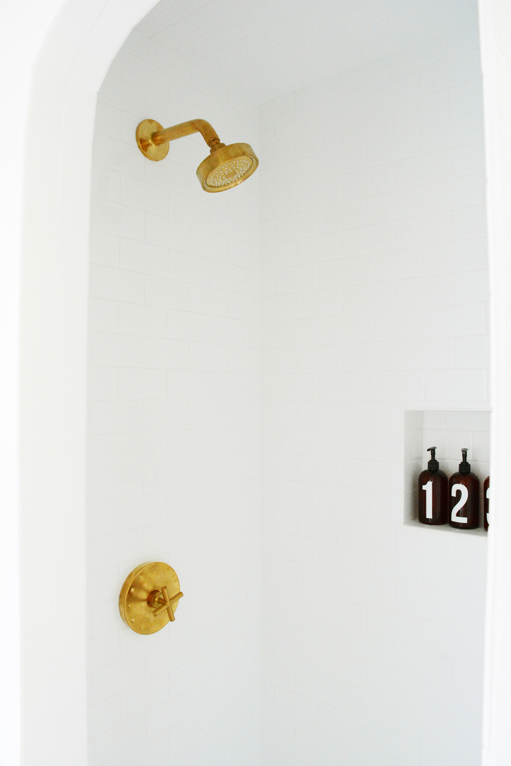
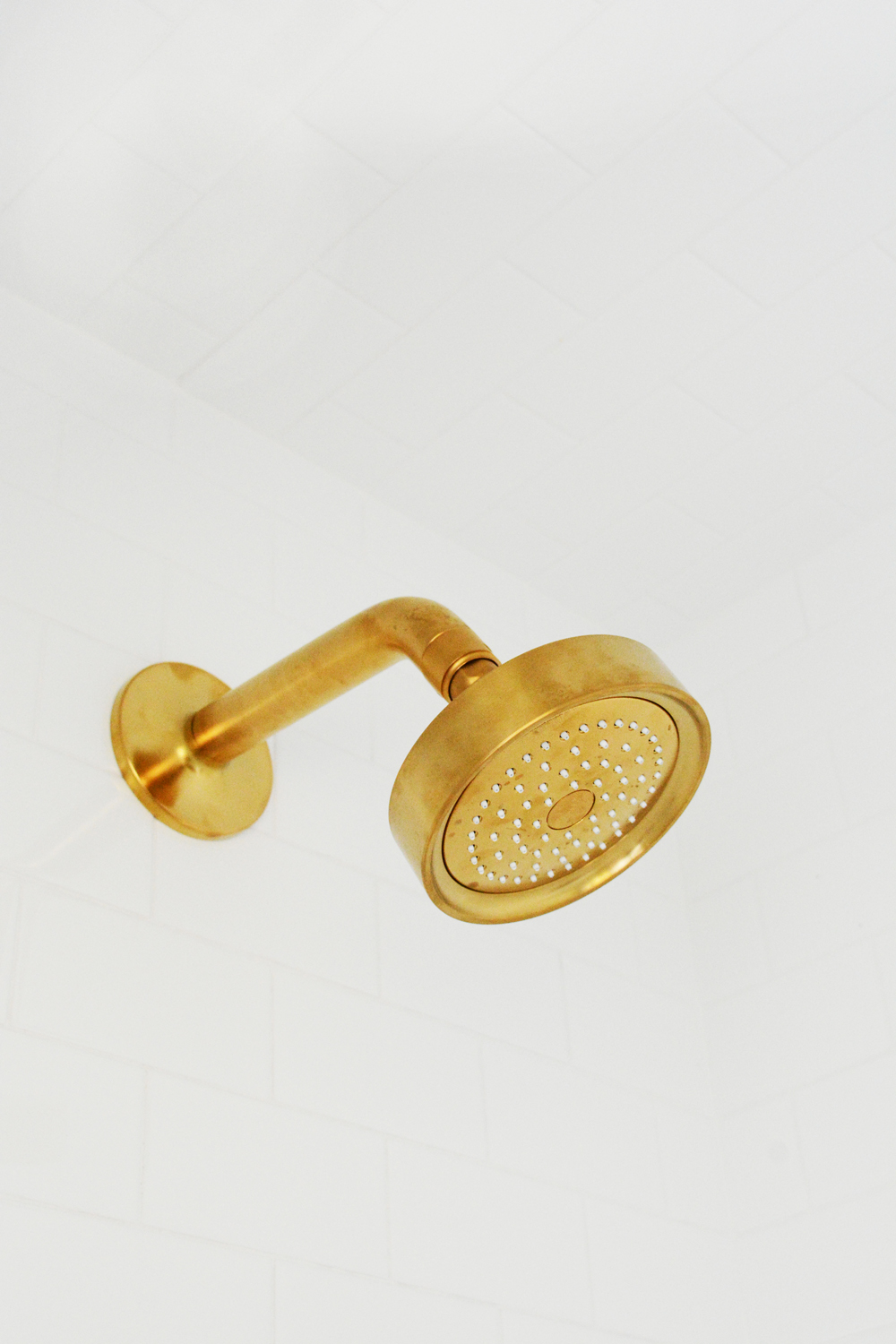
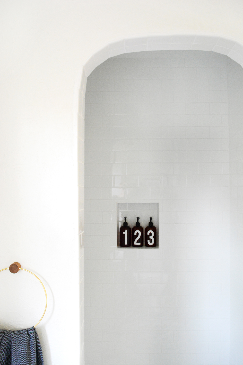
If you can be in love with a shower fixture, I definitely am! This gorgeous shower handle is about the prettiest piece of hardware out there and instantly give the space a luxurious feel with out being too stuffy. We kept the shower classic and clean, with pretty white subway tiles. And there is definitely no missing those gorgeous fixtures in that all white space. (I also added a set of my numbered shower bottles to the little nook in the shower.)
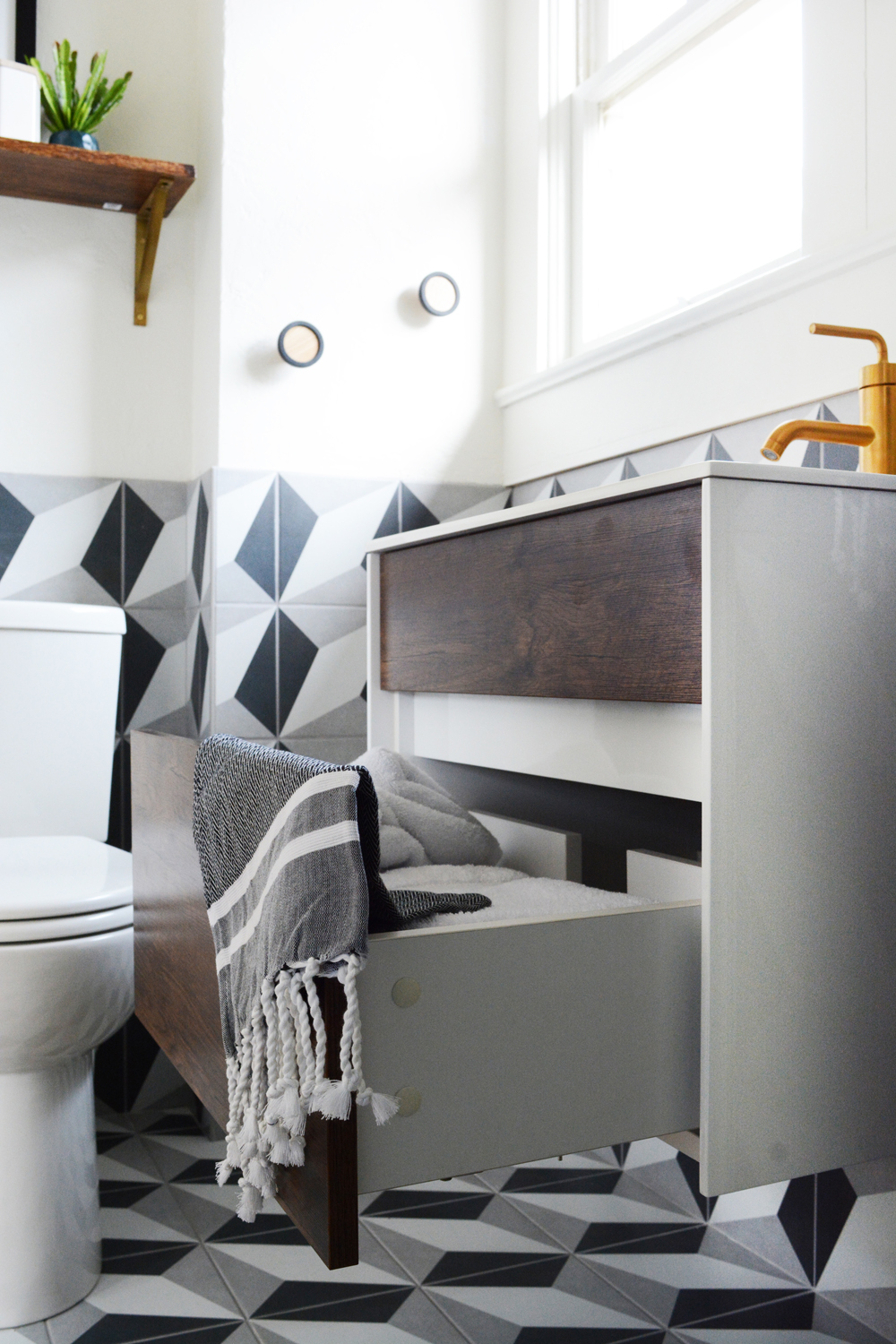
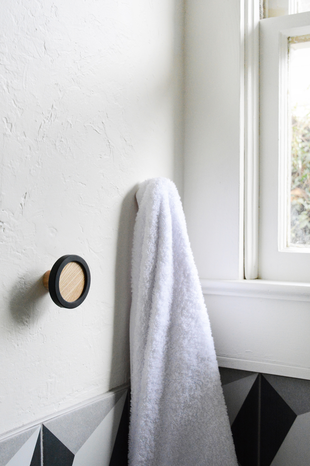
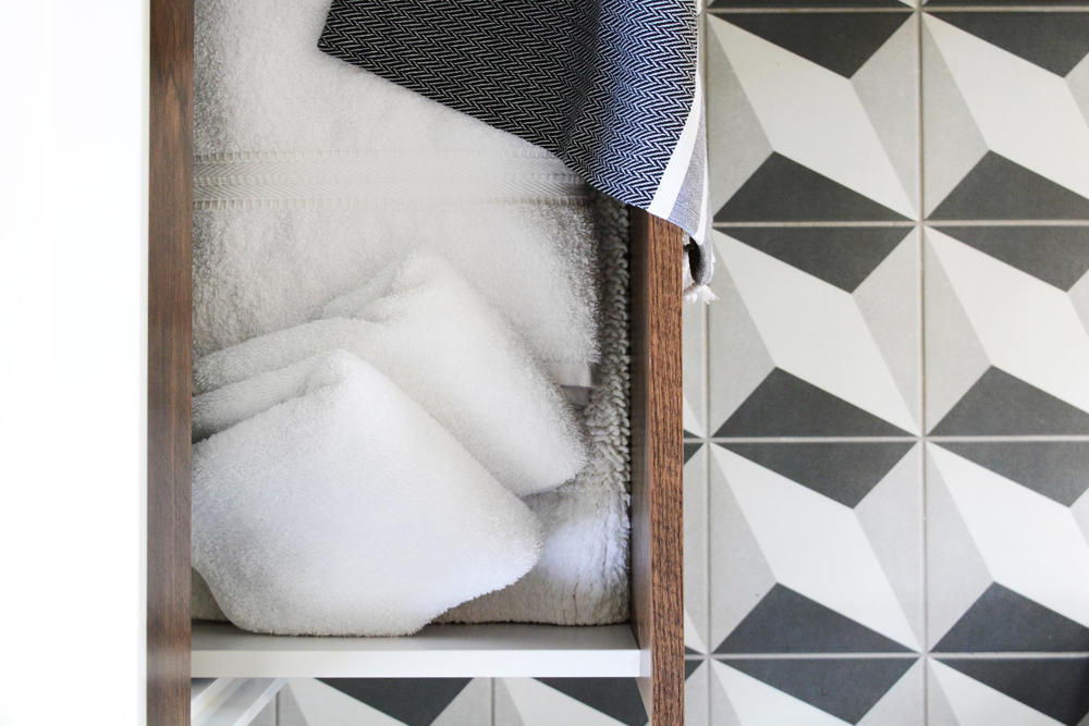
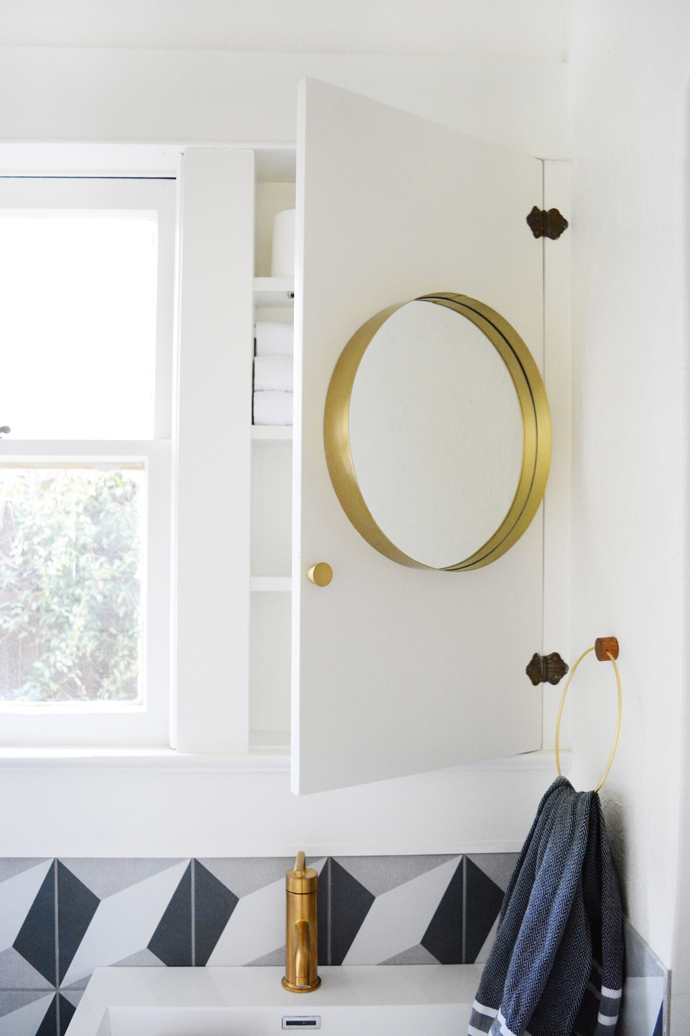
Limited wall space meant being a little creative with towel racks. We opted for two large knob hooks for guests to hang their towels to dry. Extra linens are tucked away in the large drawer under the sink. We also kept the original medicine cabinet because it offered so much fantastic storage. We found a simple round mirror to add to the long narrow cabinet door, and it broke up all the straight lines in the space.
This guesthouse was built in 1918, so we wanted to try to keep as much of the original charm and character as possible. The arched entry to the shower was one of the details.
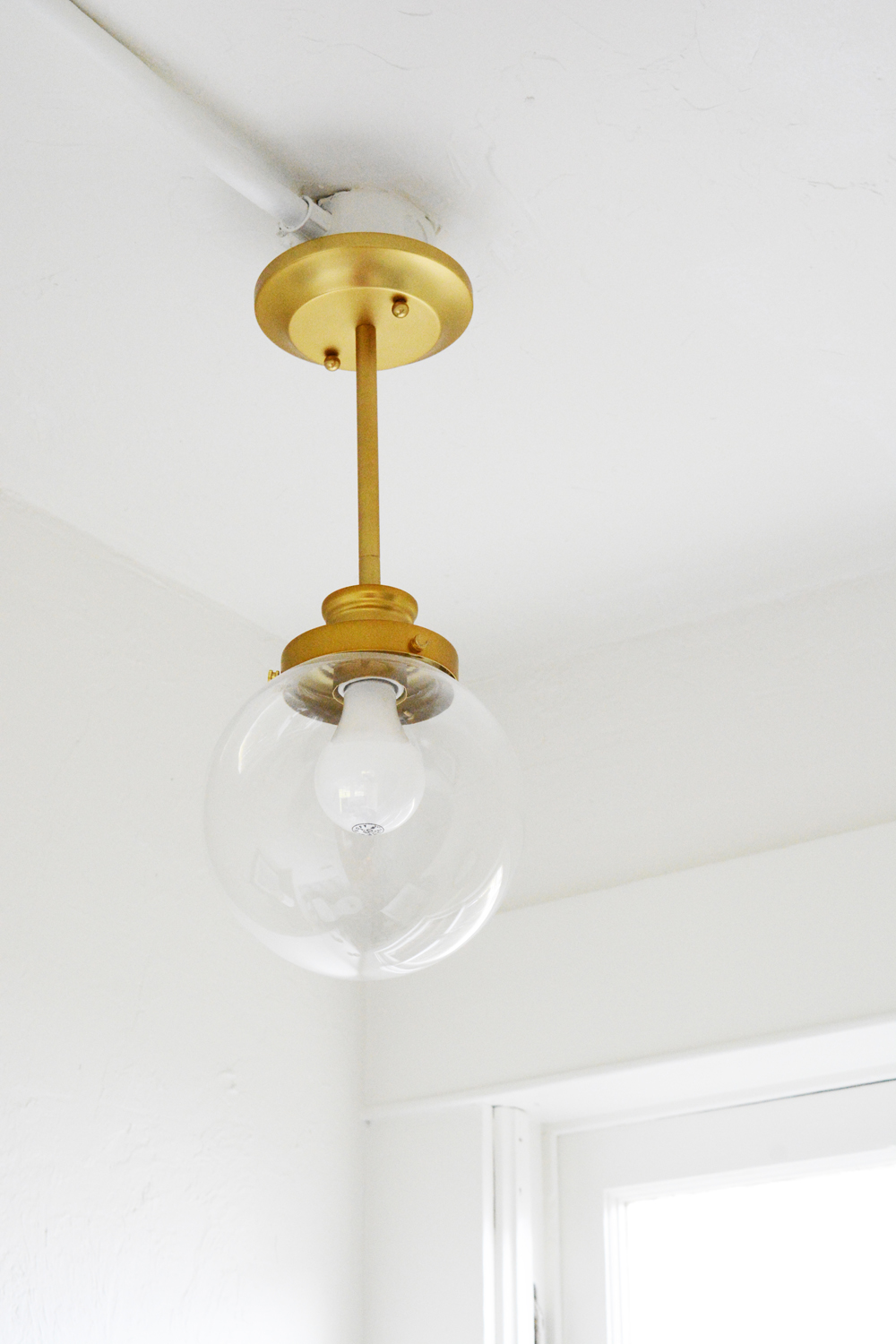
Years ago the room was re-wired and conduit was added instead of dealing with the lath and plaster walls. While this can feel a little industrial or even unfinished, I kind of feel that it adds a fun layer to the space. A shiny new brass globe pendant light mounted to the exposed conduit is a playful juxtaposition.
There will be more room makeovers and reveals coming your way soon. Thanks friends for sticking with me. So, what do you think? Is the tile to wild for you? Are you in love with the pretty brass fixtures as much as I am? I’d love to hear what you think about our new and improved guesthouse bathroom.
This post was sponsored by AllModern. Thank you for supporting the companies that help make this blog possible.

Wow! It is beautiful! I love it when people go bold and dramatic in small spaces. There is something about it that is so perfectly balanced without being overwhelming. You did a lovely job and the pieces from All Modern are ah-mazing!
I can’t even wait to stay!!! List that puppy so I can book it!!!
It’s beautiful!!
Soooo dope!
It looks INCREDIBLE!!! Beautiful, creative work, I love it!
This bathroom is INCREDIBLE. It doesn’t look that much smaller than our main bath (it’s tiny, I hate it) which we still need to redo, so I’m gonna do some major pinning for inspiration!
Hi, I just saw your live instagram post and your lovely house. I am from Bahersfield too but now living in Southern California. I wanted to comment on your master bathroom, I like you sink ( it is very different and unique) and I would just change to white marble counter tops. Take all the mirrors of around the tub and just drywall. Shower is tiny but generally one always spend less time In shower ( maybe 10 min in a day). You will have to spends thousands to make it bigger. Spend your money on hexagon flooring, marble countertop and change the tiles in the shower and frameless glass door
Thanks for tuning in. Ya, we don’t have the budget to take on a huge renovation. I like the idea of just changing out the floors and counter tops. And yes, the mirrors have to go!!!!!!
So pretty! I love, love, love that tile! And while I’m more of a chrome gal, the brass looks beautiful! Do you have a source list, by any chance?