I’m still a big fan of the gallery wall. It’s a fun way to display a large collection of art. If you have a few smaller pieces, once they are grouped together they create one larger statement piece. I’ve partnered with Mixbook for another fun post. I’ve got how-to’s and free downloadable art, what more could you ask for in life?
I’ve come up with 5 easy-to-install gallery wall layouts for you.

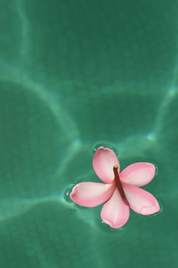
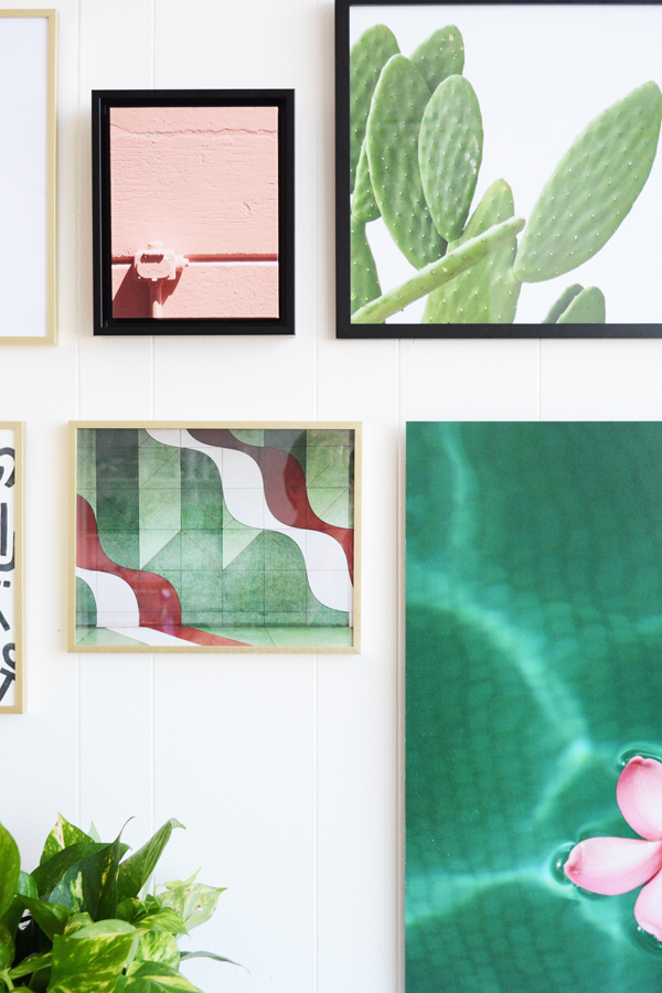
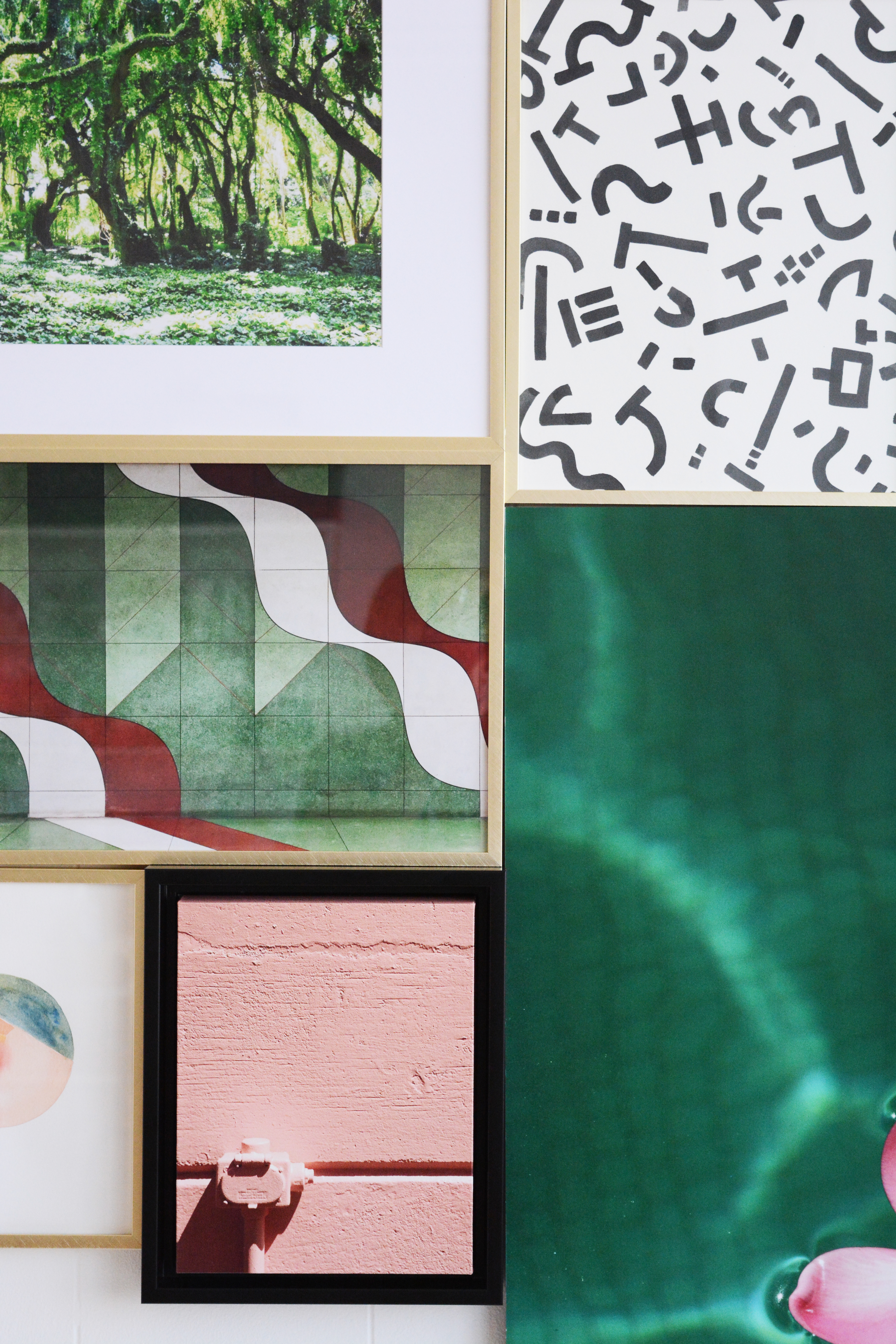
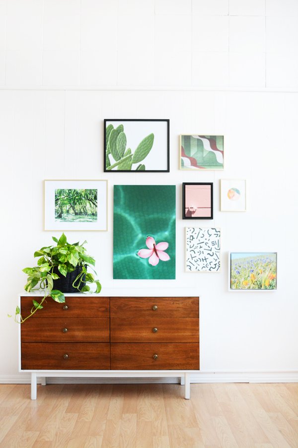
As promised, I’ve got lots of fun FREE downloadable art for you. I printed some of these as inexpensive Poster Prints and also a had a couple made into Framed Canvas Art at Mixbook. The plumeria flower floating on the water is a mounted poster print. I actually really love it. It’s so much cheaper then getting something that size framed, but It’s also a little more formal look then just hanging a poster (which is cool too). I’ve ordered a lot of art from Mixbook now, and every time I am totally impresses with the quality.
And if you want The Plumeria on the Water image, I’m going to give that one as a free downlaod to all my newsletter friends in a couple days. So, if you’ve got your eye on that one, simply fill out the form in the right hand side of my blog and I’ll send you this exclusive download right to your inbox.
Now let’s talk through these layouts and find one that’s right for your art and your home.
WALK THE LINE
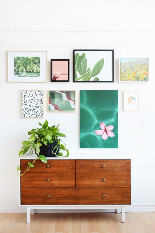
This layout takes frames of all shapes and sizes and brings some order to them with a center line. I taped off a line in the middle of my wall and then hung frames exactly 2 inches above and below the line. If you are a fan of symmetry and order, this lay might help you feel better about the mismatched frame colors and sizes.
STUCK LIKE GLUE
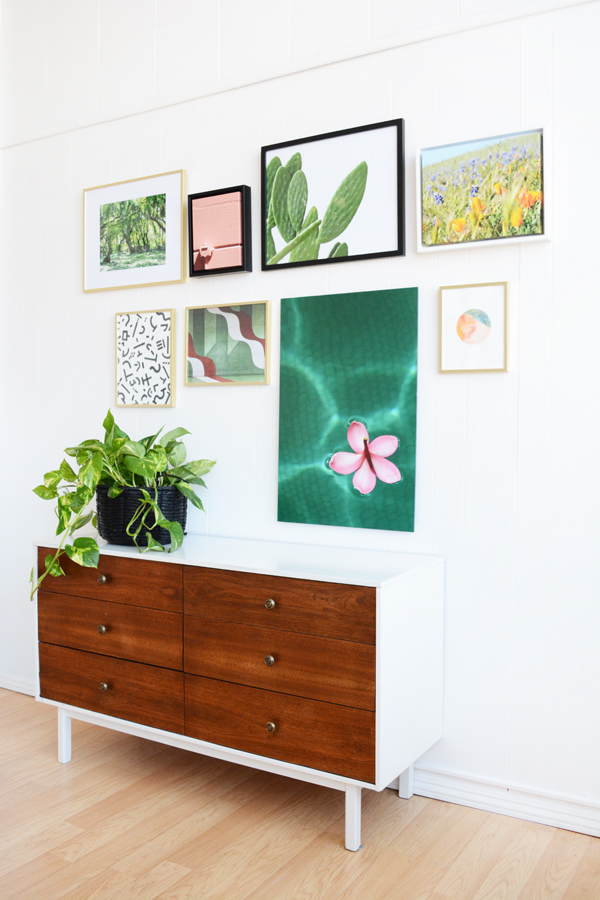
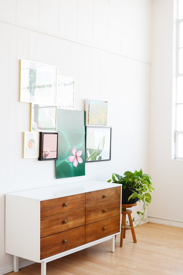
This layout takes all your pieces and creates one big assymetrical shape. Start by hanging the center piece first. Often this is the biggest frame. I hung the plumeria as my anchor frame. From there you can start hanging pieces on all the sides of the anchor piece.
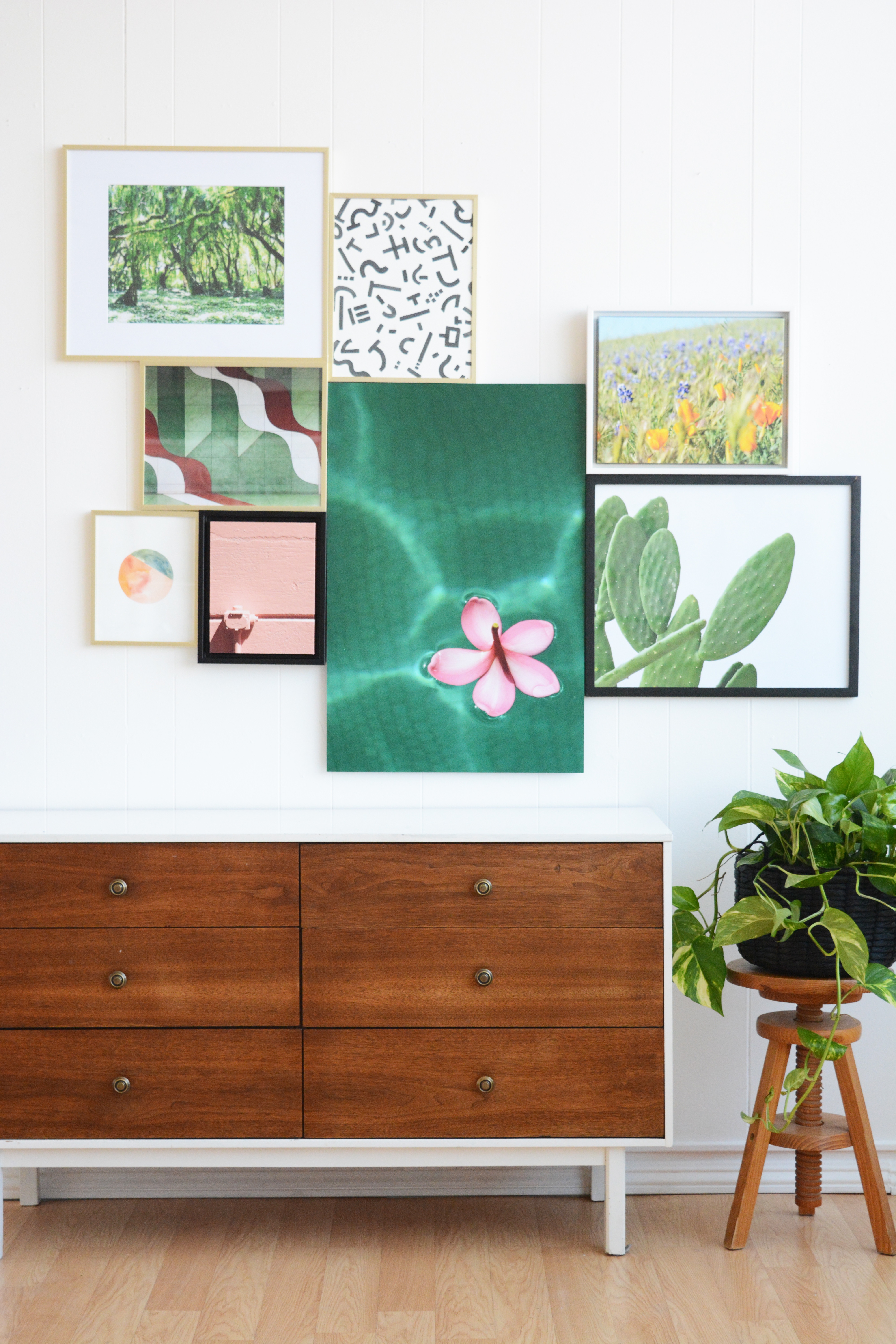
THINK INSIDE THE BOX
This is probably my most used layout. I’ve hung a gallery wall using this method. Start again with your tallest piece and anchor it on either the left or right side. Then, like fitting a puzzle together, pair smaller pieces together keeping them all inside an imaginary box or rectangle.
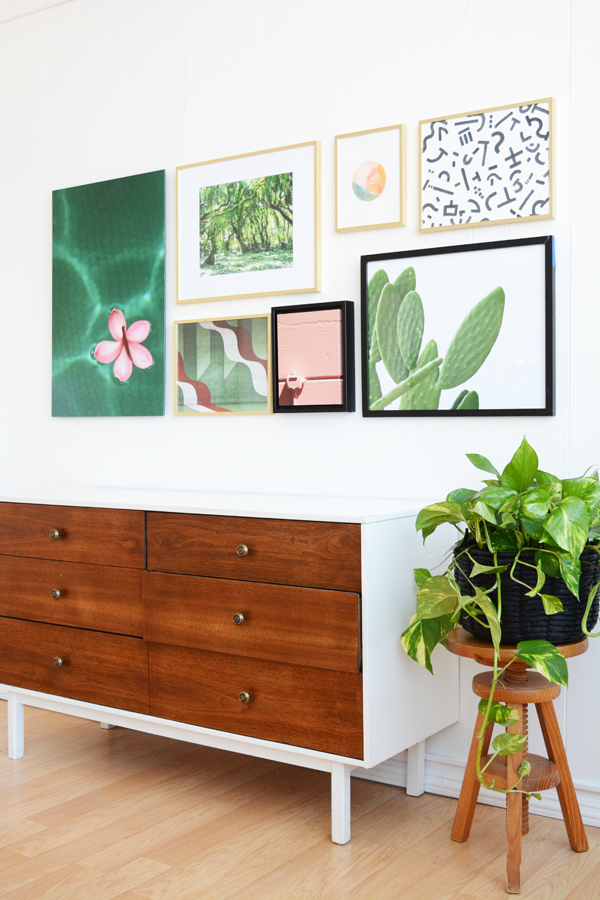
LOPSIDED
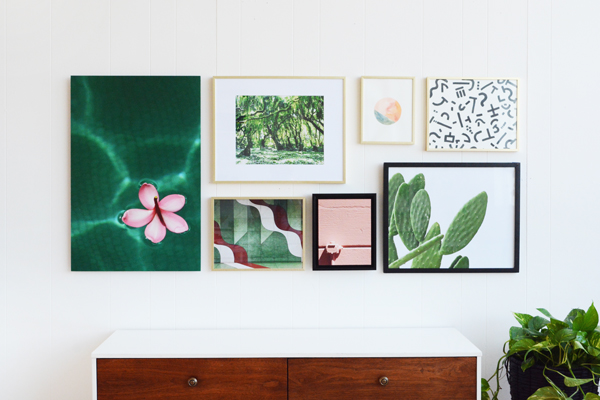
If I was to choose a favorite, it would definitely be this lopsided version. This feels the most organic, light and breezy to me. For this layout there are really no rules expect that you should space the frames about equal distance from each other. It doesn’t have to be exact, but a little breathing room around each piece will feel nice. And ya, make it lopsided, hang more pictures on one side than the other and don’t be afraid to let them trail down the side of the wall as well.

THE LAZY LEAN
I know this is a no brainer, but I thought it should be included. If you are afraid to put holes in your walls, then The Lazy Lean is for you. This option also gives you the opportunity to change your art often. It’s a casual, no commitment kind of relationship with your art.
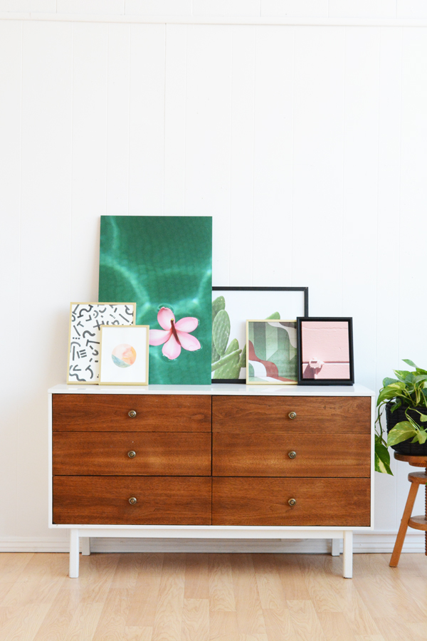
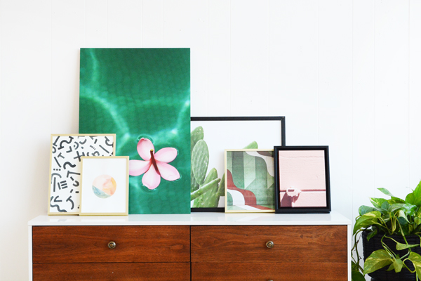
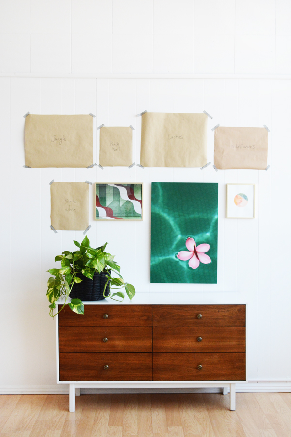
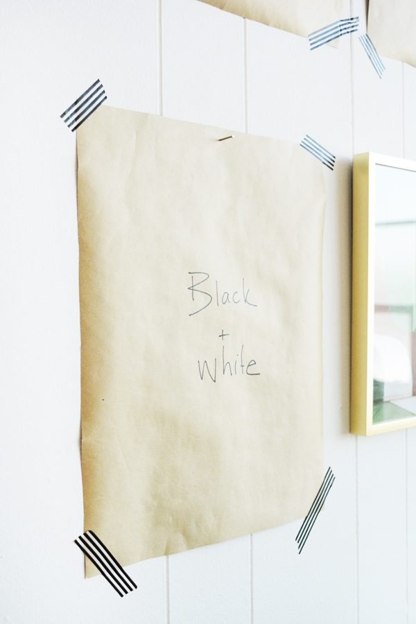
I hope you guys find this helpful. I give you permission to make lots and lots of holes in your walls. But, if you want to get it right the first time, definitely do the butcher paper cutouts first. It takes all the guesswork out of hanging art.
This post is sponsored by Mixbook. Thank you for supporting the awesome companies that help make this blog possible.

I love this post! Lopsided might be my favorite ?! Gallery walls stress me out, so I will have to gather some art and try one! Thanks, Jeran!
Yay! Lopsided is my fave too with these piecses. I’m glad you liked this post. I had a lot of fun putting it together. Send me a pic when you get one up on your wall, I’d love to see it.
Great post with such useful information! Thanks for breaking it all down. I love gallery walls and tend to go with the lopsided look, but I am now going to try the “walk the line”.
Yay, I’m glad this was helpful! The “walk the line” feels a little more ordered and less haphazard.