Here’s the deal with owning an old house – it’s always a work in progress! It’s room by room, and getting spaces to a place your are happy with can take YEARS. I am not complaining, I just want folks to know that I’m not Emily Henderson (who I adore) and I don’t have a “team” working on my house. Most of the time it’s just me tackling these projects (and roping in my brother and husband from time to time). Sometimes, I wish that everything was just DONE and then we could start living and enjoying this house. But, the truth is, I probably wouldn’t be happy with nothing to do, I love the process and having a “project” to work on is kind of my way of living and enjoying. So, even though they are a lot of work, old houses are kind of my jam.
We have been in this house for almost 3 years, it’s hard to believe. But, I kind of thought this bathroom would be one of the first rooms I would tackle. This is the powder bathroom or guest bathroom off of our main living area. It really has a great Kohler toilet and sink, but the room was dark and outdated and really needed a little more pep-in-it’s-step. Originally I thought this would be a great room to add some tile. But, I priced that out. Next a considered adding wallpaper, so I ordered wallpaper samples over 2 1/2 years ago. But, have you priced out wallpaper lately, even for a tiny space? Then I thought about adding some sort of chair rail, bead board or board + batting. There was no shortage of ideas, I just didn’t have the budget to execute those plans.
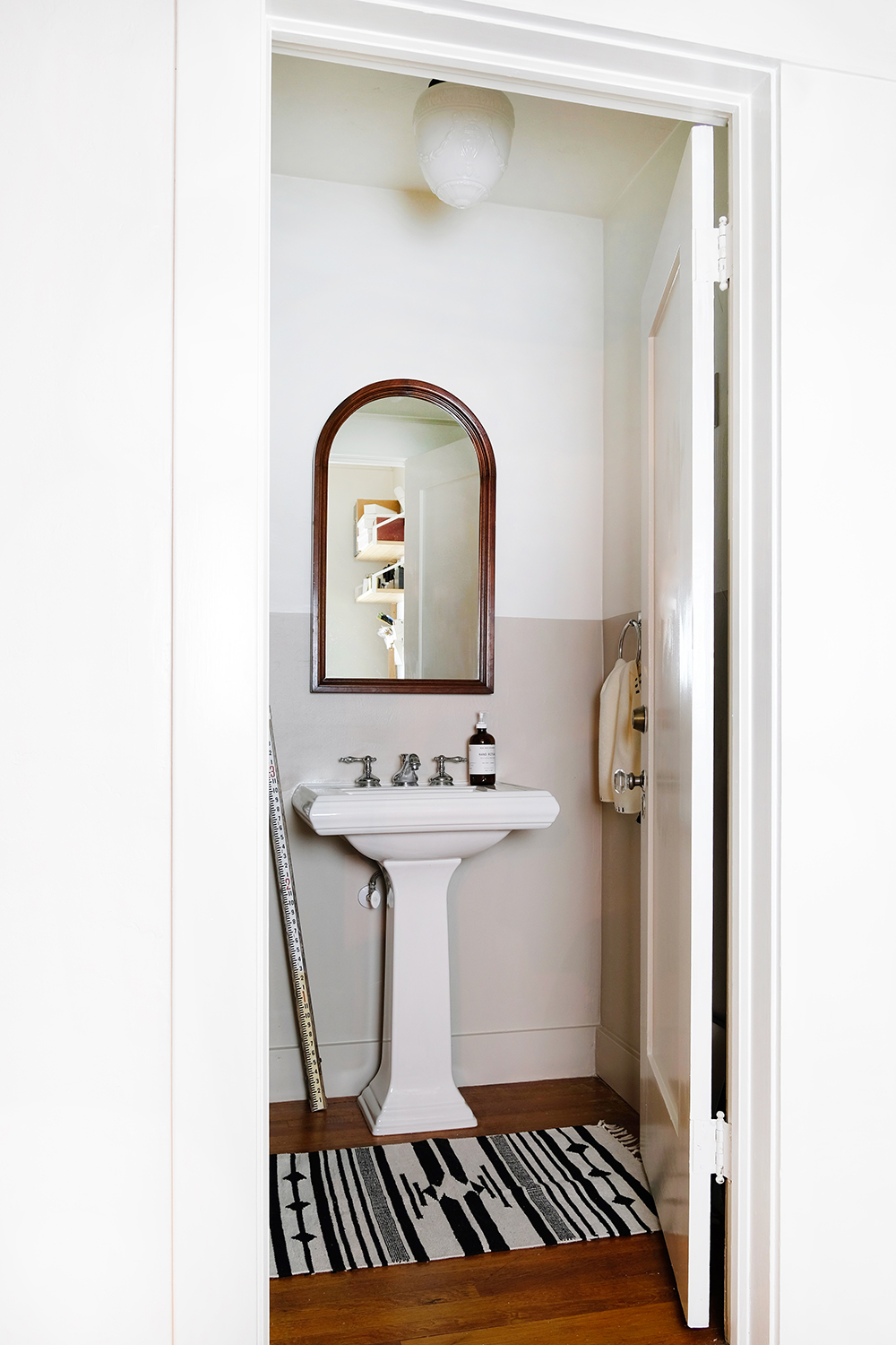
Before I go on, can we please appreciate this $30 mirror that I bought at a thrift store over a year ago? It’s sooooo good.
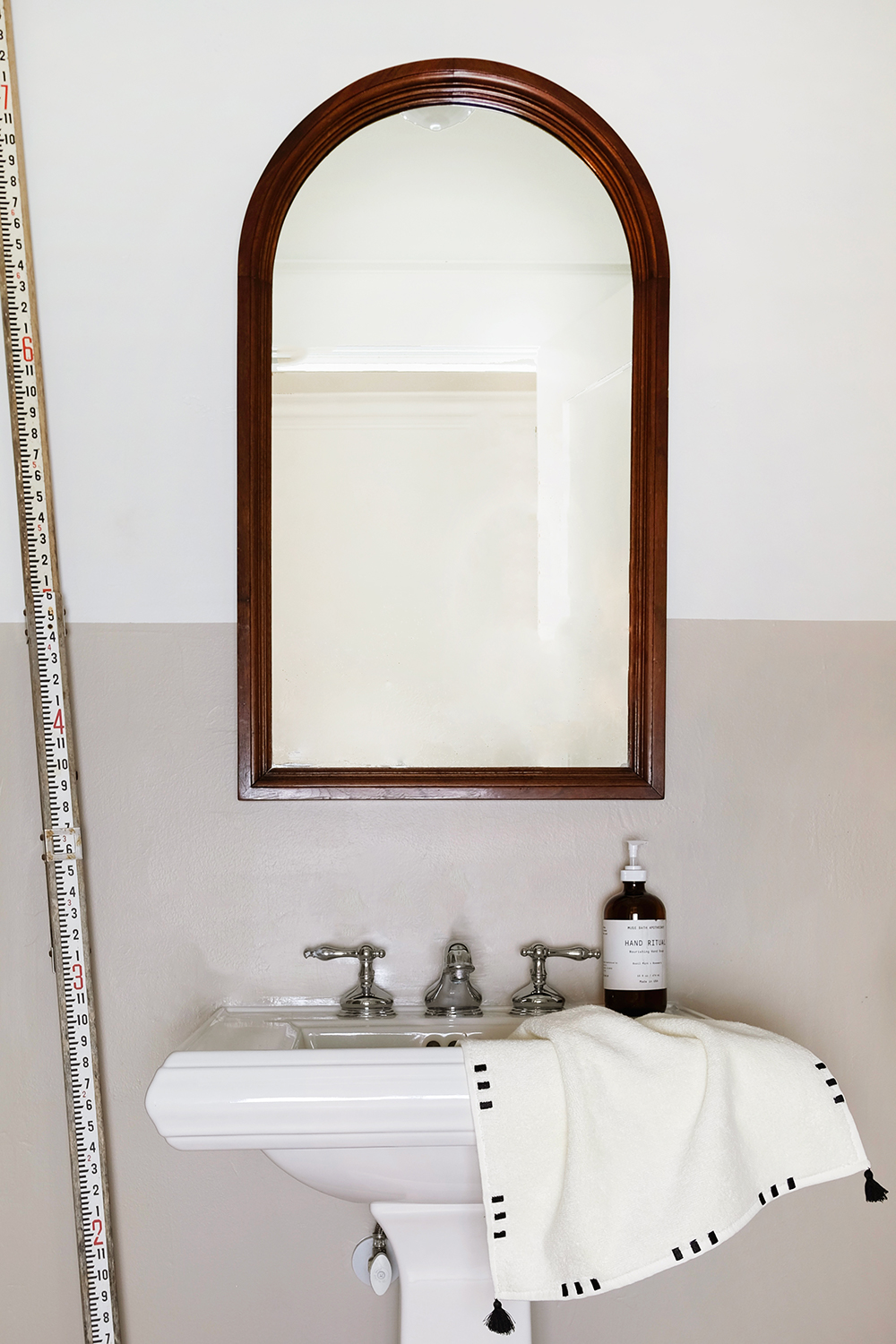
So, this week I decided to take on this little bathroom with the tightest budget possible. It felt like a fun challenge to use what I had already, buy some paint and see if I could make this a space I was proud of. And you guys, I am so proud! It’s a space that feels modern but still honors the 1918 vintage of our house. And I even took a “risk” and surprised myself by painting the walls BEIGE!!! What the heck? We call it mushroom or putty now to be fancy, but let’s be honest, it’s BEIGE (and I don’t hate it).
Let me make a quick note, these are NOT my best photos. But, this room gets ZERO natural light and I really only shoot with natural light. It’s also a tiny space to maneuver around. So, I borrowed some camera lights from a friend. So, if the shadows and colors seem a little off, it’s because they are. But, I hope you can get an idea of what the room looks like even with these crappy images.
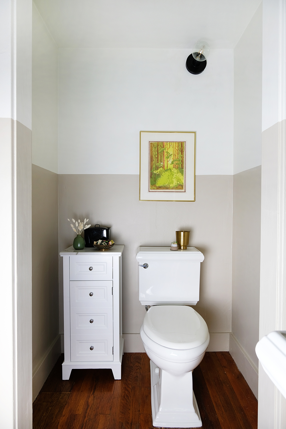
So, let’s talk about the room. I decided that I wanted to try a two-toned paint situation. This room has two doorways with wide baseboards and trim. I decided that if I took this straight line of paint all the way around the room, even across the trim, jams and doors that it would make the room feel a little less choppy and small. And it worked! When the door is closed, seeing that straight line go across the door and the door jam is really very pleasing to look at. It’s a little unexpected and quirky and I think that’s why I like it.
I had always thought I would either install a dark moody wallpaper or paint the walls half black. But, after I got the first coat of white on the top half of the walls, I knew I needed to go with a brighter color. With no access to natural light in this space, I wanted to be done with dark and dingy for good. BEIGE for the win! This color is called Shiitake (so we really can be fancy and call it mushroom) and it’s by Sherwin Williams and I’ve paired it with the only white I ever use, Alabaster.
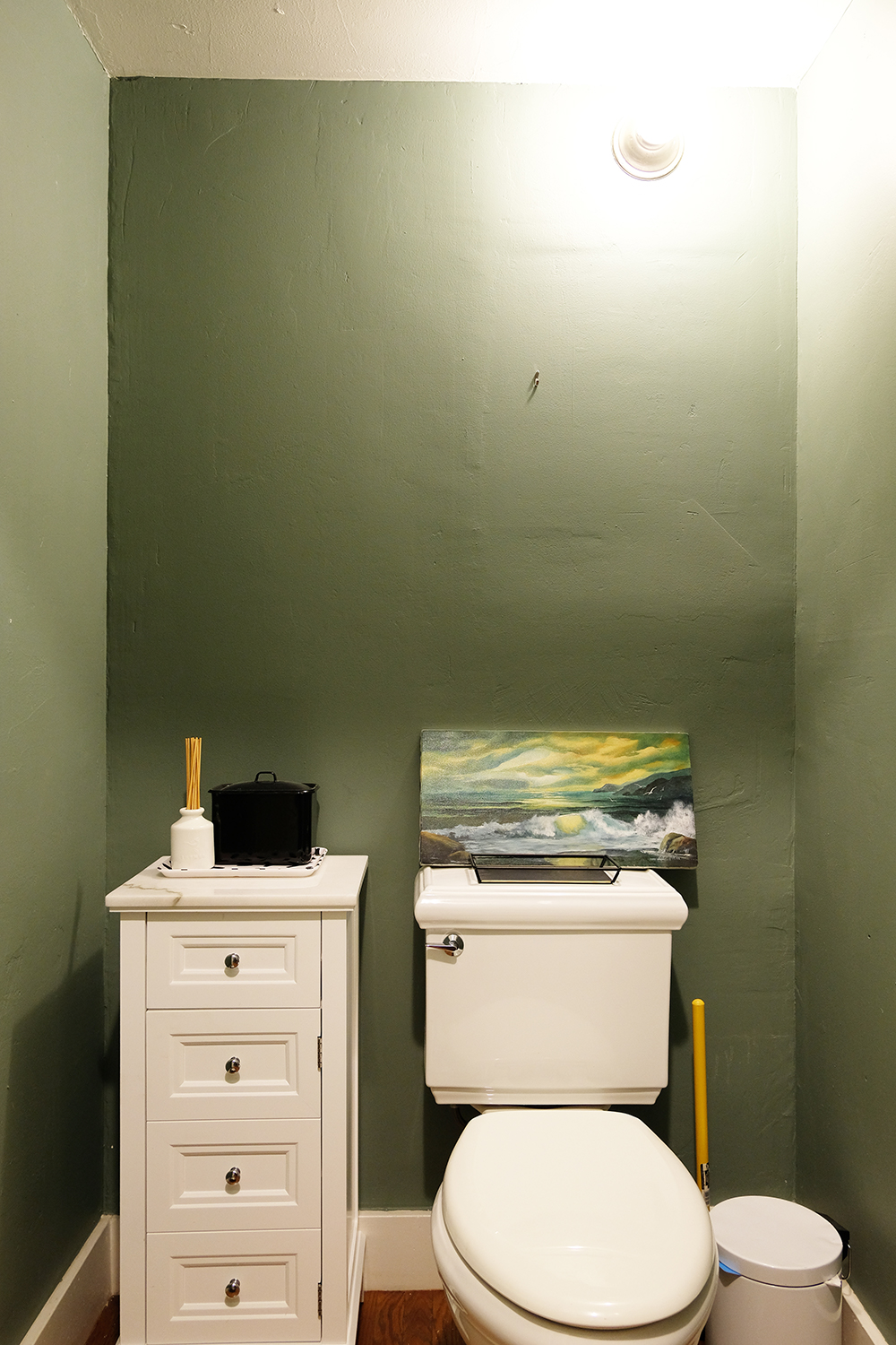
This room also had some sad, very basic, lighting, like just boing builder grade fixtures. It also has a light in a weird spot – up high over the toilet. Because it’s a weird spot for a light, I figured a simple, industrial light would be the best fit. The light over the sink also needed some upgrading, so we installed the light that used to hang in our kitchen before we renovated this Spring.
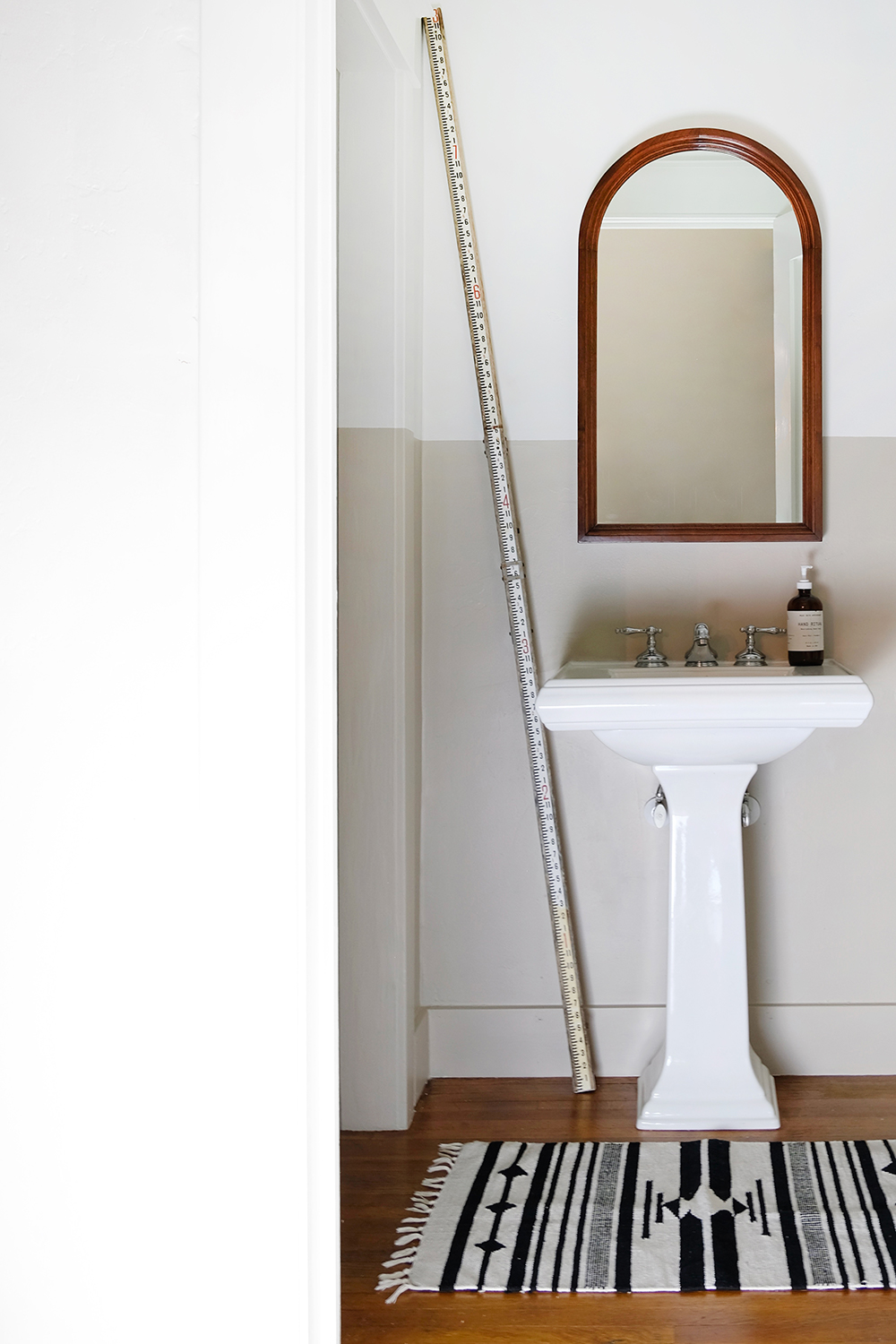
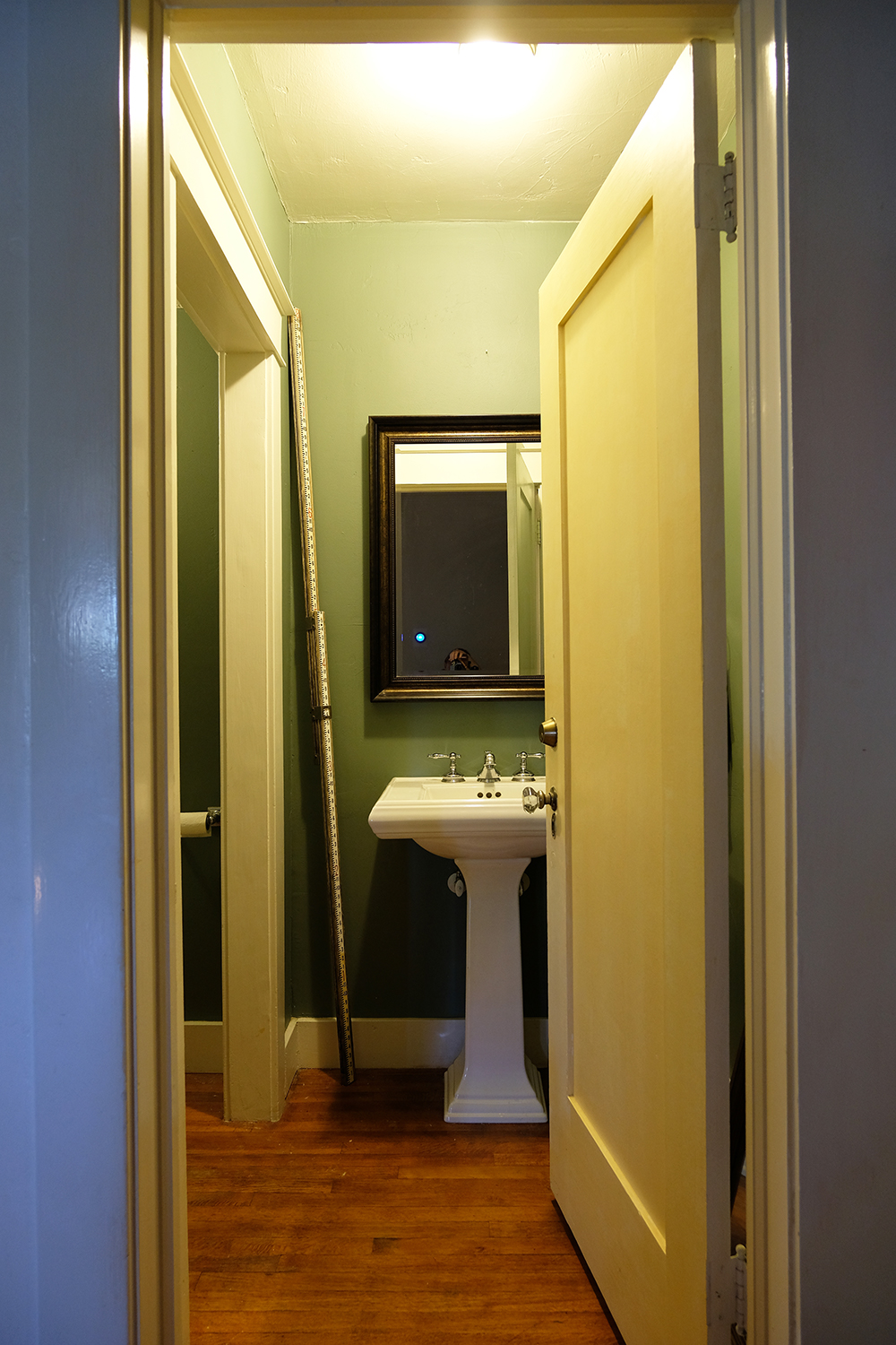
Ok, and so that you can fully appreciate the AFTER, let’s look at the before.
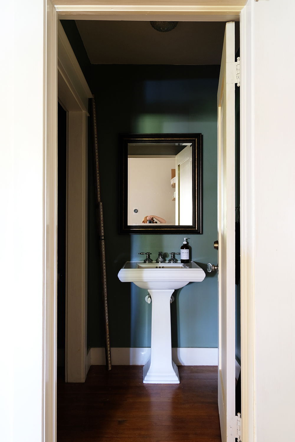
So, sooooo dark. Right?
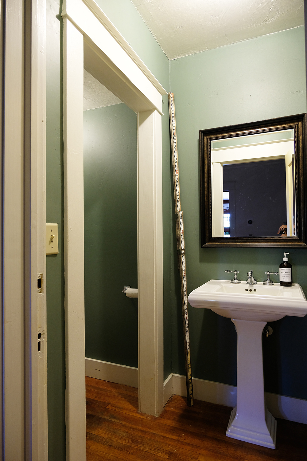
This angle gives you an idea of how much trim there is in this room. It’s a lot going on, especially with the dark walls and white trim.
Oh and the door and outside trim in the hallway was still a very yellowy off-white, so I finally go those painted as well!
Now it’s your turn, is there a room in your house that could benefit from a quick coat of paint? You just don’t HAVE to have a giant designer budget to get some great results.

Successful transformation! What a difference a couple cans of paint can make in a space. I love the light and airy feeling now … Hard to believe it’s the same space. And the thrift store mirror, that’s a great addition. Well done. ?
Ahhh thank you. Ya it sure does look better! And the mirror totally steals the show.
Thanks