O + P Color Palette 2015 – Gold
March 30, 2015

March 30, 2015
March 24, 2015
 |
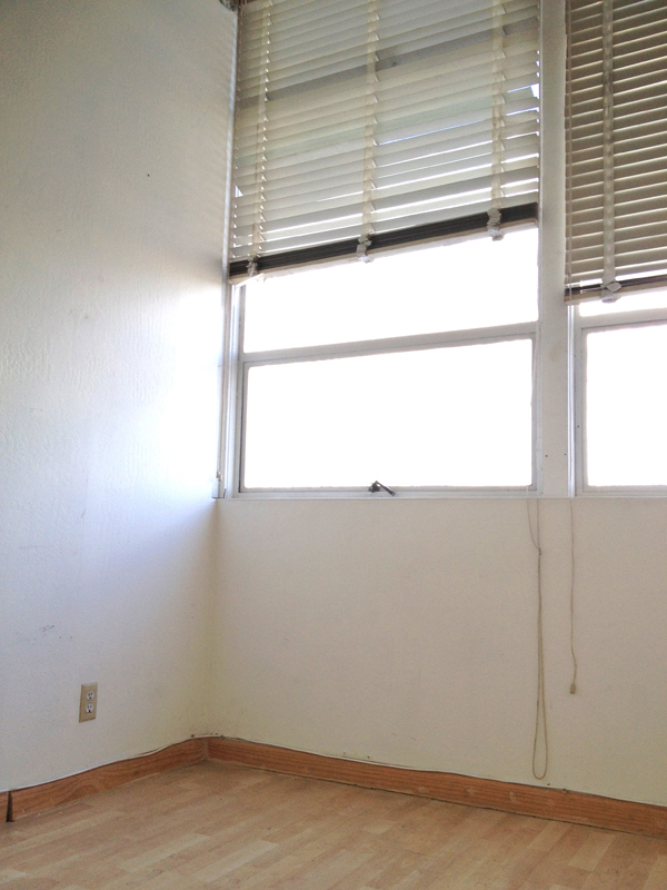
| This is the larger of the two rooms and the one with all the great light. |
 |
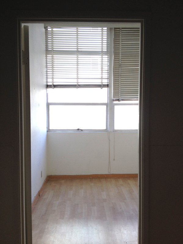
| This picture is taken from the first room, where I will have my storage and desk space, into the second room. |
 |
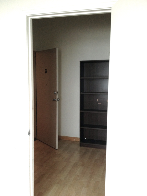
| This is the first room and the entrance door. This picture is taken from the second room, the room with the windows. |
I hope that gives you a better idea of the space. I will show more of the progress as the space begins to take shape. I hope to find sometime this week to put a fresh coat of paint on the walls. I’m keeping them white, but there are a lot of scuff marks and smudges that need to be covered.
March 14, 2015
March 3, 2015
Phew, that was a lot of pictures for one post. I’d love to know what you think? And if you have any questions about the details from this space, please ask.
February 24, 2015
February 18, 2015
Number 2. is probably the safest with it being just grey and white. But, the touch of blush/pink in the others makes for a bit more unexpected and edgy design for a living room. Is there one of these rugs that speaks to you more then the others? Are you loving the trends of this season? I think geometric shapes and pastels are still here for a while.
February 17, 2015
February 7, 2015
And yes, I realize its’ actually Saturday that I’m posting this Friday Fab 5, but yesterday was a busy day. Better late then never, right? I hope you have a fabulous weekend.
January 7, 2015
November 30, 2014
2. I used a graphic black and white platter and added a small antler, a mini potted fiddle leaf fig, and my favorite white ceramic fox (that I got at Target a couple years ago).
3. I started with an inexpensive silver charger from the dollar store and then add a couple mushrooms and my little squirrel light.
Which coffee table look do you like best?
Oh, and be sure to check out Glade’s Pinterest page, it’s packed with inspiration for creating cozy and inviting spaces.