Category Archives: Design

Design / etc.

Floor Poufs

November 21, 2014

I’m a huge fan of floor poufs.  They are an inexpensive way to add color, pattern and texture to any space.  Not only are they a great place to rest your feet, they also can serve as an additional seat when your home is full for holiday get togethers and parties. 
As I’m decorating my home for Christmas, I find myself adding more and more metallics. There’s something about the holidays that makes me want glitter and shine on every surface.  This gold leather pouf is just the sparkle I was looking for.
I’ve found 5 Great Floor Poufs that you might want to consider for your space. 
If you are in the market for a floor pouf, nows the time to shop for one, from now until November 24th, Wayfair is offering 15% off ANY Pillow, Pouf or Throw!  They have an amazing selection of poufs, these are just 5 of my favorites. At checkout, enter the code: WFPTP15

Design

Inspired by: Black and White Plaid

November 14, 2014

I can’t get enough of it – Black and White Plaid or Buffalo Check.  Maybe it’s the grunge, 90s child in me.  I’ve got a whole Pinterest board devoted to it.  It’s definitely apart of my wardrobe, but I’m loving it in home interiors as well.  And I don’t think it feels too country or cutesy in these three rooms.
Plaid Wall (I wish I knew the source, if you do please share)
Plaid Table Cloths (be sure to check out the whole restaurant in this post, it’s amazing)

Is there a pattern or trend that you are leaning towards this season?  Are you wearing plaids and buffalo checks?  Could you see this bold pattern in your home, how would you use it?

Design

Small + Unique Chandeliers

October 29, 2014

I love our kitchen.  It’s big and efficient, but still stays true to the style and era of our 1920’s house. When we renovated the kitchen, we chose to keep the original breakfast nook.  The built-in benches and table are where we eat most of our meals.

After replacing the dining room chandelier, I knew the fixture over the breakfast nook needed to be updated. For years, I’ve overlooked lighting, thinking it was not a very notable part of design. But, now I think it is vital and is a huge opportunity for making a statement. You can set the vibe for a space with the lighting that is installed.

I’ve been searching for a unique fixture that is not too big, but would bring light and interest to one of our favorite spots in our home.  I’m obsessed with Schoolhouse Electric & Supply Co.  I love there mix of period style lighting (turn of the century through 1940’s) and quirky unique pieces. As a vintage and thrift shopper I love their whole aesthetic. They mix patterns, textures and shapes to create spaces that feel loved and lived in.

Here’s 5 small + unique chandeliers that I think would look fabulous over my breakfast nook.

Is there one that appeals to you?  It’s all-of-the-above for me.  Which one do you think would look good in my kitchen? 

Design / etc.

Fall Curb Appeal

October 8, 2014

I teamed up with Wayfair to give my front porch a little curb appeal just in time for Fall. Be sure to check out my home and 4 other fabulous front porches on Wayfair today.

With a few new accessories, a diy, some herbs, white mums and white pumpkins, I’m ready for Fall. I’m on a black and white kick.  It was grey for so long, and black and white is not a far departure from that colorless palette, but I believe it’s classic and timeless. With this very neutral palette, the plants are in the spotlight and your eye focuses more on the shapes, patterns and textures.

I’ve got a lot of pictures, so I’ll let them do most of the talking. But, I’ll tell you quickly about my two favorite new elements. I added a herb wall to the left of the front door. Using ceramic wall planters hung in a square, the plants created a clean and unique focal point for our porch. The second thing I did was paint a “WELCOME” sign on the first step (found the idea here). I cut a simple stencil out with my Cricut Explore on some vinyl (but, this could be done with an x-acto knife as well) and then spray painted the letters bright white. I love these blocky letters, so just like my YOU + ME poster, I left the centers of the letter out.

I kept my existing chairs and just freshened them up with new pillows, a great side table and a gorgeous outdoor rug.  

I added a few white pumpkins and the Southwest Pumpkins I made last year, and I’m ready for Fall. It doesn’t take much, I have to remind myself often that LESS IS MORE!

Here’s the sources:
Wall Planters – Wayfair
Pillows – Wayfair and Wayfair
Rug – Wayfair
White Metal Chair – Wayfair
White Metal Side Table – Wayfair
White and Copper Planters – DIYed, I just spray painted old ugly green ones I had
Bird Feeder – Homegoods about a year ago
Mailbox – DIY
Southwest Pumpkins – DIY
And if you want a look at more of the inspiration for the space, I have a whole Pinterest Board
Technically it’s still in the 90s here, so it really doesn’t feel like Fall yet, but I was ready for a change.  Have you decorated your home for the change in Season?  What’s your go-to Fall decor piece – pumpkins, mums, leaves, corn stalks, hay bails?  

Design / etc.

Home Library Inspiration Board

September 29, 2014

I’ve got a fun week ahead. Over the past couple of months, I’ve been working on putting together this home library for a client. My first two room designs, the Coral and Kelly Green Home Office and Global Backpacker Bedroom rooms where well received by the homeowners, so I’m trying another full room makeover. 
I wanted to share the inspiration board for this library living space with you.  It all started with the Stockholm Green Sofa from IKEA. It’s definitely the star of the space. I want this sofa in my home – soon. I’m a big fan of neutrals when it comes to big furniture pieces, but this is just too fabulous not to take a huge color risk on. 
I’m pairing this lovely emerald green with splashes of gold/yellow and strong navy blues. I’ve thrifted lots of really cool items to go alongside the books in the shelves. I’ve got lots of pattern and some great textures. It’s going to be a perfect space to curl up with a great book and a cup of coffee. 
If you’d like to know more about the sources and inspiration pieces in this board, just leave me a comment below.  
What you think about adding color in a large piece of furniture versus just in accessories?  What color are you willing to take risks with?  I never can go wrong with green, it’s in every room and every shade in my house.  

Design / etc.

Dining Room Reveal

September 23, 2014

I’ve been making a few changes to my dining room over the last couple of months. It’s really taken me longer then I thought. But, that’s really the thing with designing and decorating on a very small budget. You have to be patient. You’re not always going to find the deal immediately.  Remember, I sold my table before I had a new one. But, then I scored an amazing Danish mid century one from Craigslist in San Diego. And the chairs were also difficult. It ended up that I had chosen West Elm chairs that had be discontinued. So I had only one and ended up finding 3 more somewhere in Texas and had them shipped to me.

But, the final piece made the space – my new Lamps Plus industrial chandelier.  I chose this gorgeous 28″ wide, 12 edison bulb chandelier. I feel like a real grown up with a real chandelier in my home. It’s big and bold and super sophisticated. I think it’s really important to add just a splash of high end decor to any space. For the most part, my look is very thrifted and diy-ish, so I believe this gorgeous chandelier elevates my space.

This room represents my personal style so much better now. My old table was just fine, but the lines and shape of my new/old table are so much better. We’ve already had lots of company over and we can easily fit 8-10 folks at this table. I think it all plays well with my 1920s built-ins as well. And maybe it just looks disjointed and amateur, but that’s probably because I am both. Either way, I love it.

This is a very hard working space. That little black cabinet is my blog office or as some bloggers call it, their studio. And the opposite wall from the desk is my photo studio, I’m sure you recognize the grey paint color from most of my pictures.  
I love that you can see the new chandelier as soon as you walk into our home. Here’s the view from our living room. 
Here’s a list of a lot of the other details from the space: 
The paint color is Benjamin Moore AF-705 Cinder.

Design / etc.

How to Put Together Perfect Pillow Combinations

September 5, 2014

I have a pillow problem, well that’s what my husband calls it. But, they’re are such a great way to add and little color and pattern to a space. You just can’t have too many, right?  
Pillows are a great way to break free of the matchy matchy sets of furniture and decorating of the past.  But, with so many choices out there, it can be hard to put a perfect pillow combination together. I recently discovered that Tiny Prints has AMAZING pillows that can be personalized with monograms, initials, names, dates and even photographs. The Happy Home pillow needed to be on my couch.  My pillow choices can sometimes look random, but here’s how I usually put them together. I’m basing this on groups of 3, because odd numbers in design are so much better. So, here’s what you need to look for when grouping pillows. 
1. A solid (or something very close to that).
2. A large scaled pattern.
3. A small scaled pattern.
And as far as color goes, pick one accent color.  That color should show up in each of the three pillows (unless the other pillows are completely neutrals – black, grey, white, tan, or brown).  So, if you look at my examples, in the first combo, green is the accent and the other two are neutrals.  In the second combo, gold/yellow is the accent color. And in the third combo, coral is the accent.  Other colors can appear in the pillows, but there needs to be one color that ties them together.  
I’m sure there are a lot of formulas that designers have put together before, but this usually works for me and seems like a plan others could try as well.  
1 + 2 + 3
1 + 2 + 3
1 + 2 + 3

I hope this makes sense. To clarify a little further (not because you’re not smart), but because I might be stretching my own rules a bit, here’s what I consider a solid, small pattern and large pattern in the combos above.

Solid + Large Pattern + Small Pattern
Small Pattern + Large Pattern + Solid
Large Pattern + Solid + Small Pattern
The beauty of this formula is you can take any pillow away and it still works.  Try it, take one of the pillows away from one of the combos and the pair remaining still look fabulous together. You can add more to the mix as well and you should be golden.  

Design / etc.

Global Backpacker Bedroom Reveal

September 4, 2014

Ok, this is truly one of my favorite spaces. I would happily move into my nephew’s new big boy bedroom (and I do when I’m in town because it doubles as a guest room).  This almost 4 year old’s room is all boy, but not a toddler space. I think this will be a room that he can grow up in.  It’s a mix of old and new and has just the right amount of color and pattern.  I spoke to my brother and sister-in-law about the look they were going for and we decided that the space would be outdoorsy, adventurous and global.  It’s really a room that embodies my brother Josh and his adventurous life and spirit.  
Remember this inspiration board for a Global Backpacker Big Boy Bedroom.   I know, it was a long time ago that I posted this.  Warning: I might start rambling here, feel free to skip over this and just look at the pics. And really, the room has been done for quite awhile, I’ve just been stuck on taking the plunge to share this project. It’s weird, I’m really proud of this space, but I’ve been anxious about weeding through the pictures and sharing the finished product. It’s been on my to-do list every week for months and I keep leaving it there. I don’t know why I’m sharing this. But, I am frustrated with myself lately. I’ve had a lot on my plate, and as a result I’ve been very absent with my blog, and I really love this part of my life (blogging). I don’t want to be like this, I just have trouble sharing posts that I think are less then perfect (that’s pretty much everything on this blog). The truth is, I’m not a photographer, even though I have to take pictures for my blog almost daily. I’m self conscience of the quality of my images. I know this room looks good in person, but I want it to translate to your computer screen the same way. I just don’t do anything half-hearted, and therefore as a result, sometimes I put off and put off things. I don’t know if this makes sense or if you care to hear my ramblings. I just want to share a little bit more about this one-man-show. But, I do love to take risks, so here’s my little risk for today, I’m finally sharing the room I designed for my nephew. I hope you like it as much as I do, and if you don’t, that’s ok. 

Over the next week or so I’ll share more of the details and resources for this space. So, today just browse through the many pics and feel free to ask questions and I’ll try to answer them all in the posts to follow.  
The little grouping of art over the dresser is one of my favorites. I love to put smaller prints and pictures together to make a statement as one piece. The awesome Minted art (Bear and Mountains) were the starting place for this grouping. I love that you can buy their gorgeous prints framed and ready to hang. And white mattes and white frames are so crisp and clean. 
The huge black world map decal from Wallums, is perfect in this space. The black map looks so sharp with all the black furniture. I’ll be telling you more about this piece. It was so easy to put up and the results are so dramatic. 
And let’s be honest, I can’t really love a room with out a little Land of Nod here and there. Nod products work so well with vintage and thrifted pieces. The red library cart, the adventure art, the plaid storage cubes, the first aid box, the chevron pouf, the bear pillow, the & storage bin, the black and white striped sheets, and the D for Discover pillow were better then perfect for this space.  
I also made a couple pillows to throw into the mix. Logan is named after a Mountain in Canada, so the mountain was a must and the blue camping fabric had to make it’s way into the room somehow.  Canoes and canteens, come on now.  

Now, I’m sure I’ve said favorite already, but the little desk really is the highlight of the room and the kid’s favorite spot. My talented brother, Joash, made this desk out of all found and reclaimed supplies.  It’s a gorgeous piece, that’s unique and perfect for little kiddos to play and color at.  This was truly a custom piece.  My parents got all the grandkids these sweet little antique folding chairs a couple Christmases ago, so I asked Joash to make a table that would fit the chairs perfectly and sit right under the window in this room.  The top of the table is an old redwood diving board. Joash sanded it just enough to reveal the beautiful grain, but also left hint of the painted surface. He made this entire piece without any nails or screws, it’s all doweled together. The legs he found somewhere, along with the filing cabinets and cubbies that he added the center of the table.  

I used the same sheets on both the top and bottom bunks, but used different blankets. The bottom bed sports a vintage Hudson Bay blanket (that I bought for my brother for Christmas a couple years ago at the Pasadena Flea Market) and the top bed I gave a splash of color with a yellowy-mustard quilt from Target

I refinished a little mid century nightstand by leaving some of the original wood on the drawer and top and painted the rest a high gloss black. Then I made a really simple black shelf with some very inexpensive supplies and hung a vintage backpack under the shelf for stuffed animal storage.  
Keep checking back, I’ll have more details about the room in coming posts. And if you want the sources for anything you see in the space, please just ask.  

Design / etc.

Industrial Dining Room Chandeliers

August 22, 2014

Now that I have a new table, I feel like a few other things in this room that need updating.  The chandelier is number one.  I think they are really important to a dining room.  It’s a chance to make a statement and this is one room that I feel can be a little more formal in.  Because the chandelier is the only light source in the room, I think it needs to be one with quite a few bulbs.  The one we currently have, I bought for about $30 and installed it about ten years ago.  It replaced an ugly white ceiling fan.  We’ve definitely gotten our money out of it and a change would be nice.

Because I live in a 1920s house with gorgeous original built-ins and have a mid century table I think an industrial style light fixture might be just the balance I’m looking for.  Lamps Plus has some amazing options in this industrial style.

I’ve picked a few of my favorites and would love your input.  Which one do you think would be best in my space?  I love anything with edison bulbs, can you tell?

1 // 2 
3
4 // 5
6

Design / DIY / etc.

Land of Nod Store Window and Event

August 15, 2014

Last week was slightly busy.  I had the privilege of getting to do two really fun things.  The first was I got to install a whole window display in the South Coast Plaza Land of Nod store!!!  Danielle, the Land of Nod’s fearless creative director, allowed me this huge opportunity.  I kept it simple and clean to let the colors and shapes play.  It’s really better in person, the twigs are constantly moving and rotating slowly. You guys, this was so much fun.  Creative freedom and a place to share it, can I do this everyday? Please….

Ummm, yep, that’s my little blog name in a Land of Nod store window.  Pretty crazy exciting.  

 
I pulled a couple Nod products from the store to finish off the space, a little Nod teepee (of course)  with a couple fabulous pillows and a neon pink squirrel.
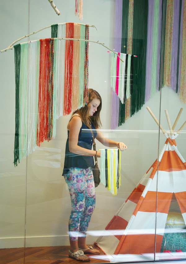
Denali straightening a couple things for me.

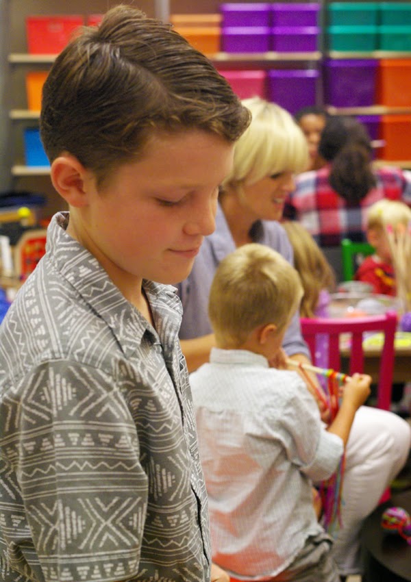
The second fun project was that I hosted a Craft Event at the South Coast Plaza Nod store. Kiddos and their parents came and made their own versions of yarn art pieces.  It was a lot of fun.  It was nice to take the crafts out of the blog and into real life.  There was kids and yarn everywhere, fun chaos.
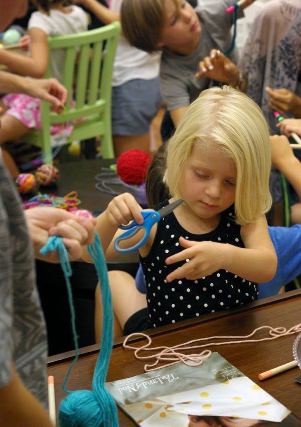
Olivia hard at work.
Dylan helping me out.
The window display will be up till September 8th, so if you are in the area, please check it out.