Category Archives: Design

Design

Minted Mural in Nursery

December 3, 2018

This post is sponsored by Minted. Thank you for supporting the companies that help make this blog possible. 
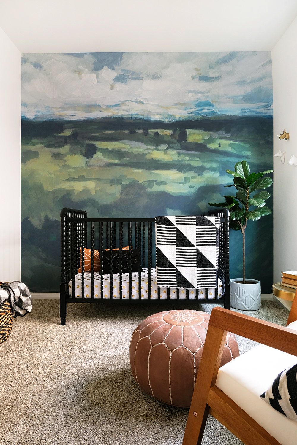
Minted Wall Mural in Naturally Neutral Nursery

I think a lot of you can relate to this if you live in a new build. Often the smaller bedrooms are really just simple square rooms without much for architectural details or interesting moldings. Sometimes these spaces just need a big BANG of color, pattern and texture. I can’t wait to tell you guys about Minted’s new Wall Murals. But, you can see for yourself, these murals are absolutely  STUNNING!

This room definitely went from blank to beautiful!
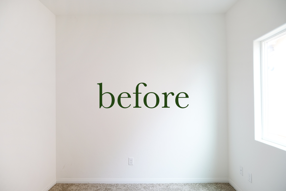
Gender Neutral Nursery Before

I’ve long been a fan of Minted products and when I heard about the launch of this latest product, I knew I had to get my hands on it. Minted curates designs from a global community of independent artists and designers. So, you always feel like you are getting a one of a kind piece for your home. The model homes I have been working on are almost ready, so I decided the nursery needed a punch of color and this Tomah Wall Mural by Lorent and Leif is one of the prettiest things I’ve ever seen. And I’m actually really kind of sad this isn’t in my home.
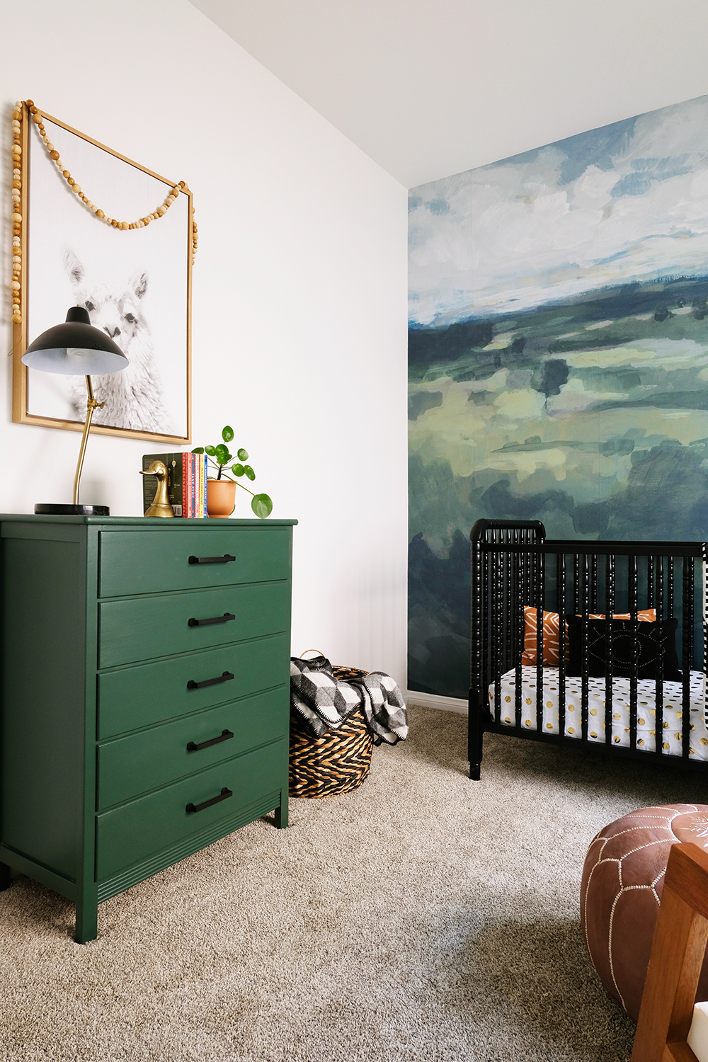
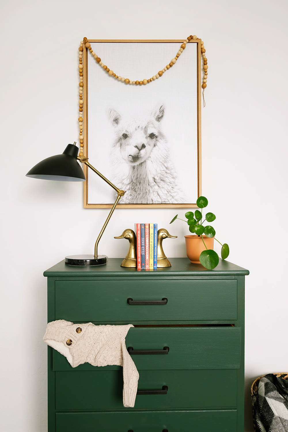
Minted Wall Mural in Naturally Neutral NurseryMinted Wall Mural in Naturally Neutral Nursery

This home has a pretty traditional vibe, and I wanted the nursery to be gender neutral and have lots of nature elements to it. It turns out, I just had to pick some pretty neutrals, a couple vintage brass pieces, a few black + white patterns and the wall mural did the rest of the job for me. Walking into this room really changes your mood, it definitely transports you to a lush green landscape. And instead of just having one window, it’s like the whole room is a picture window now.
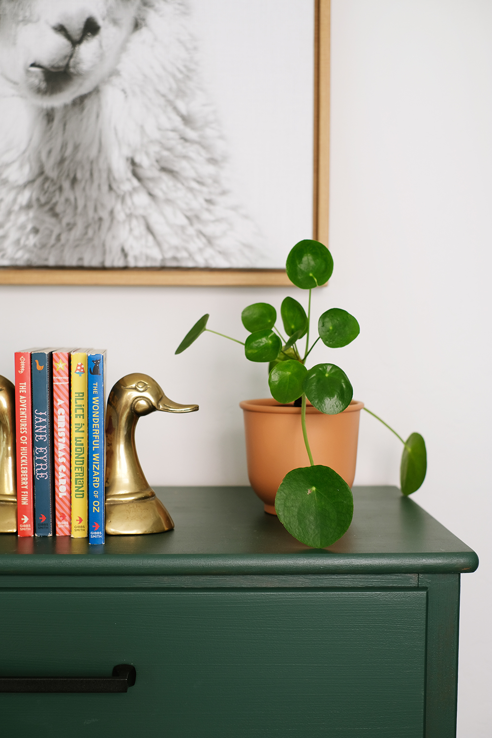
Naturally Neutral Nursery

The mural was so much easier to put up then I thought. It came in 5 long panels and I had visions of messing up one of them or putting it on crooked. But, really it went up like a breeze and the material was so easy to work with. It laid super flat, was easy to readjust if I needed to reposition it a bit and the seams came together beautifully. I do recommend having a friend to help, you could definitely hang it by yourself, but a second set of hands is really helpful when you are going up a down a ladder. Minted’s site also provided awesome step by step instructions, but I’ll list a couple things we figure out along the way.

Tips + Tricks

  • My assistant Bree helped my put this mural up, her motto is, “When in doubt, squeegee it out!”. And a simple shower squeegee was a handy tool to have, you could work from the center of the panel out and get any bubbles or folds out very easily with a little squeegee action.
  • For the first panel, you can’t trust the the corner of the wall is a totally straight line. So, we measured an inch shy of the width of the panel and used a level to draw a straight line down the wall. They we had a true straight line to follow and if the corner wasn’t completely straight, we had an inch that could be cut away at the end. After that first panel was in place, we just followed it as a guide for the rest.
  • Before we removed the backing at the top of each panel, we first used a little painters tape and taped it in place where the pattern matched up the length of the panel. Then we would peel back about 6 inches of the backing from the top and adhere it in place. The the weight of the panel wasn’t pulling on the top, and we knew that it would line up perfectly even when we got to the bottom.
  • We had a few inches to spare on the both the length and width of our panels. So we didn’t started right at the very first edge of the mural, we gave ourselves 2 inches of play. This way if the ceiling line wasn’t totally straight, we would end up with a gap on one end. They we just trimmed away that excess at the end.

One thing I haven’t mentioned yet is that this wallpaper is completely removable. So, if you are a renter or just afraid of permanent installations, this can be taken down in minutes with no damage to the walls at all.

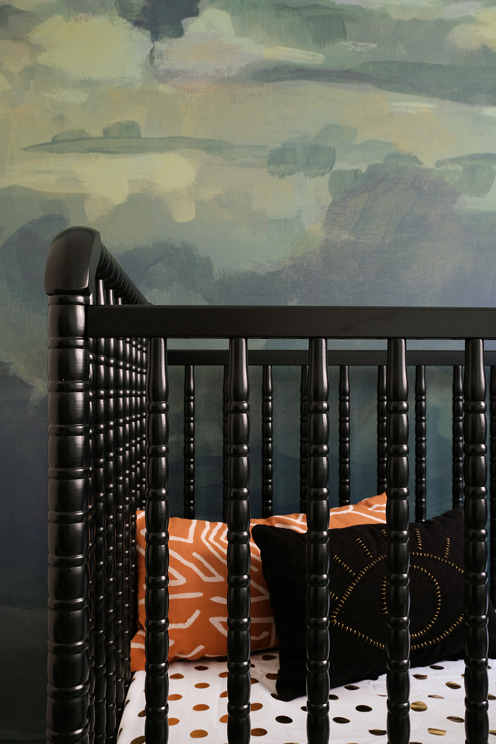
Minted Wall Mural in Naturally Neutral NurseryTomah Minted Wall Mural

And even once all the panels were up, it was so simple to trim the excess. The lines in the corners, baseboards and ceiling all came out really straight with just a simple x-acto blade cut.
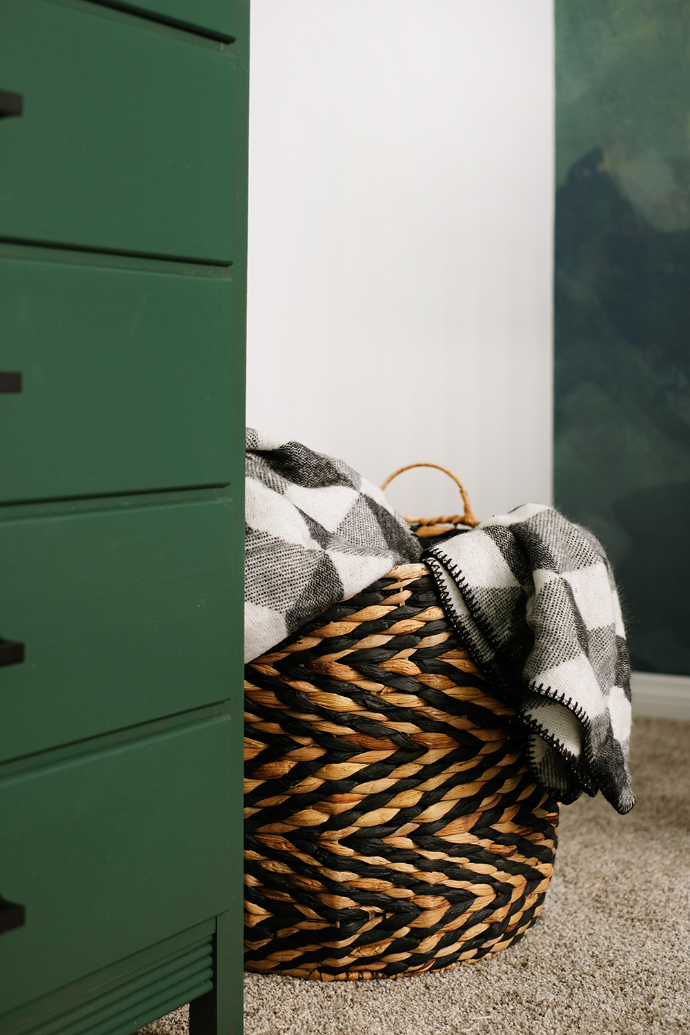
Gender Neutral Green Nursery

I kept the rest of the room pretty quiet with a couple of black and white prints. A simple alphabet chart and an adorable llama was all the room needed. The dresser I bought at a second hand store for $30 and my dad gave it a fresh coat of paint for me. Originally I thought I would put gold hardware on it, but the black pulls just looked so sharp and played nicely with the pretty Jenny Lind black bed.
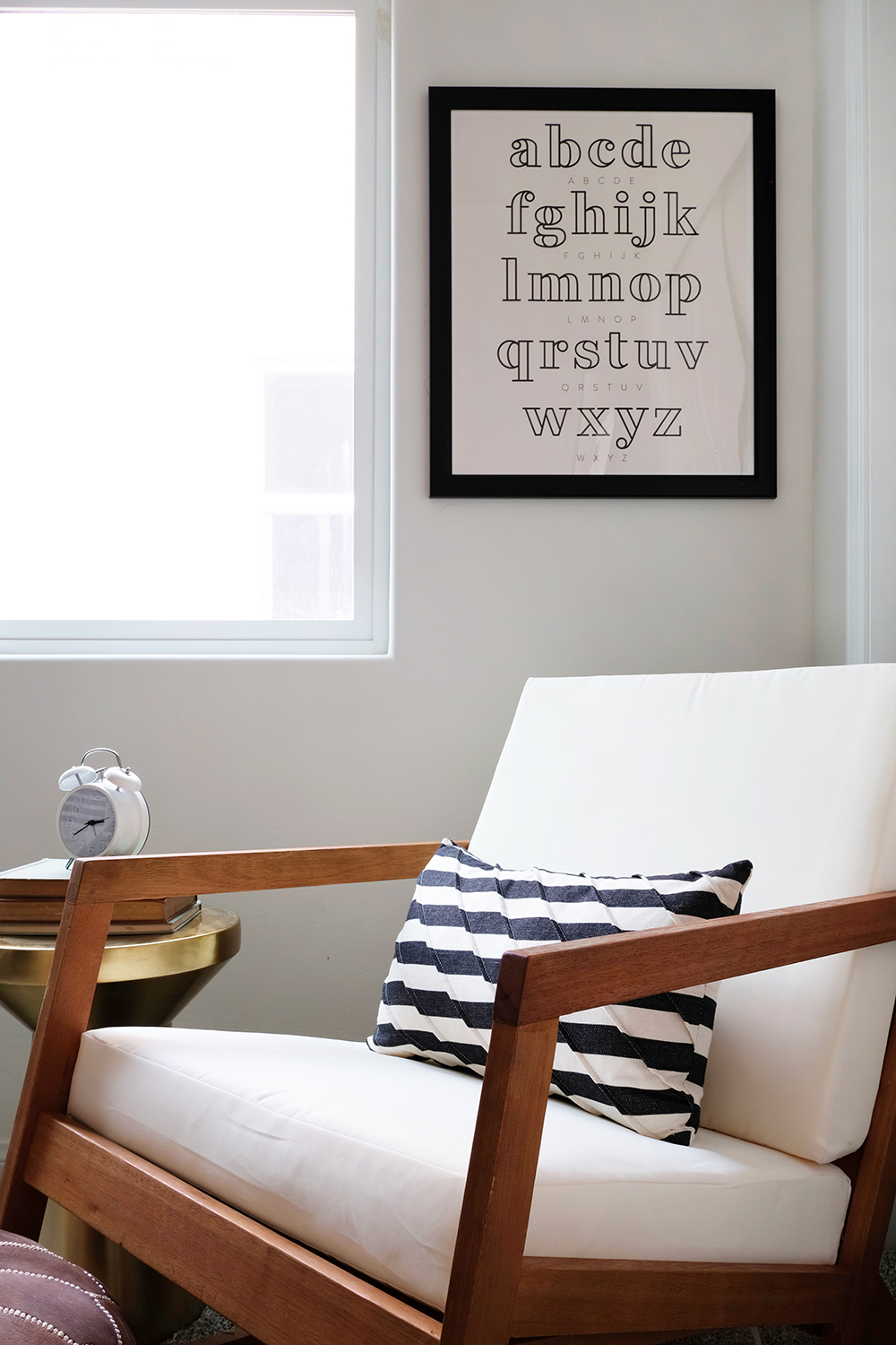
Gender Neutral Nature Inspired Nursery

I also feel like this is a mural that a child can grow up with. Even though this is a nursery now, it’s not a necessarily a baby-ish scene. I could easily see this being a very cool teenager’s space. Gosh, I want this mural behind my bed.
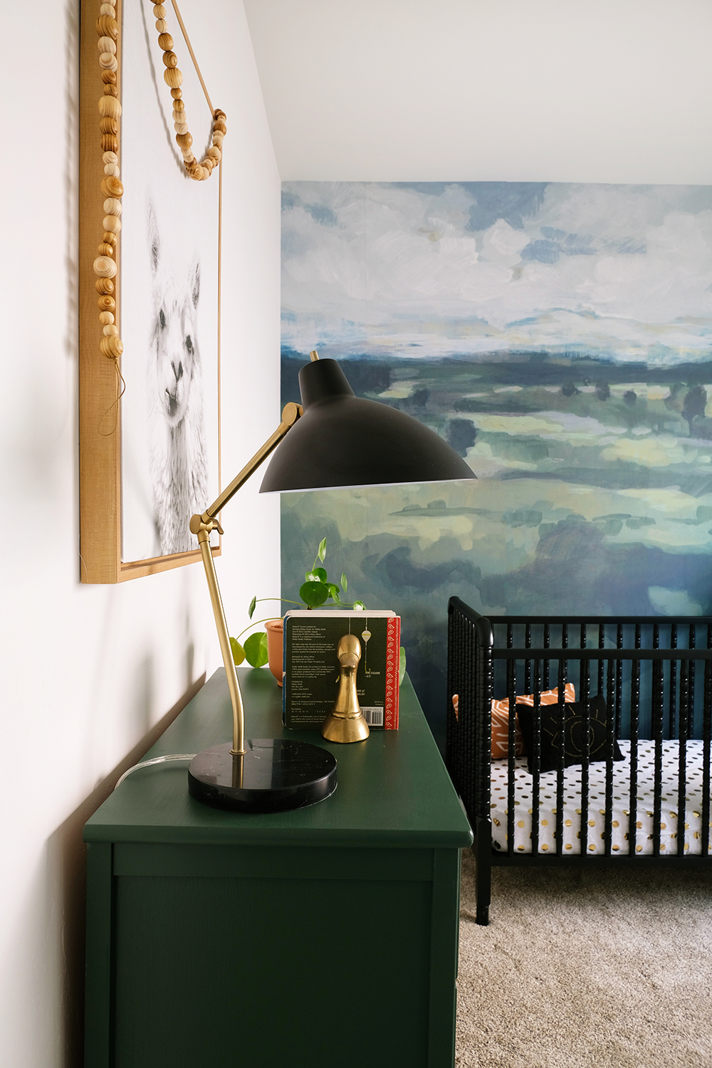
Gender Neutral Nature Inspired Nursery with Minted Wall Mural

So, the question is, what do you think? Would you put a mural in your home? Is there a room that is just begging for a bold statement wall? You should definitely go check out Minted’s selection of murals, there is literally a color, pattern, and style for any space.
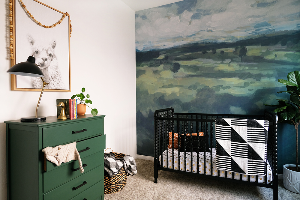
Minted Wall Mural in Naturally Neutral Nursery


Design

Naturally Neutral Nursery

December 2, 2018

How about a little sneak peek of what is to come tomorrow morning. I miss this blog. I’ve been so busy with projects and client work here in town that poor O+P hasn’t seen any love in a while. But, finally one of those local projects is getting a little closer to completion and I can start sharing the finished product with you. Remember the Tarina Homes Inc. model homes at Shamrock Hills I’ve been talking about for over a year? Well……. I have one room ready for you to see, and it’s a pretty darn cute one.

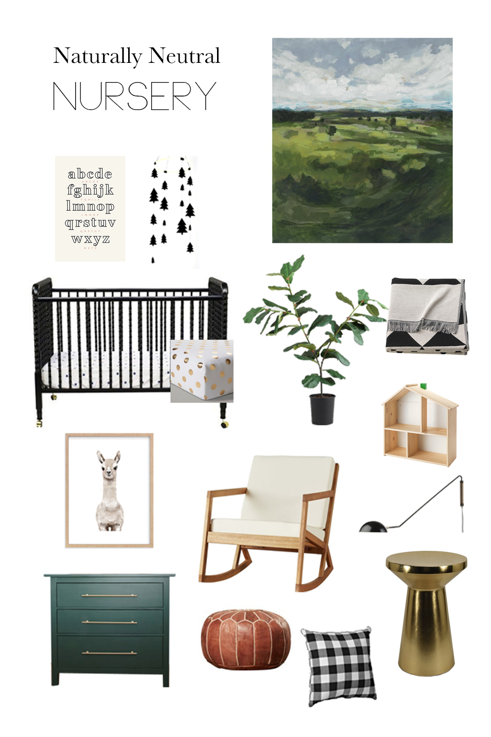
The nursery is almost DONE! The full reveal is coming soon, but I thought I’d share the mood board with you first. Just to give you a little taste of what’s to come. And don’t fret, all the sources will be linked as well.

But, without a doubt, the Minted Wall Mural is the star of the space. Those rolling green hills and puffy clouds are going to be the backdrop for the crib. What baby wouldn’t want to live here.
Thanks for stopping by and I hope you enjoy what is left of your weekend.

Design / etc.

Dark Green Kitchen Cabinets

October 4, 2018

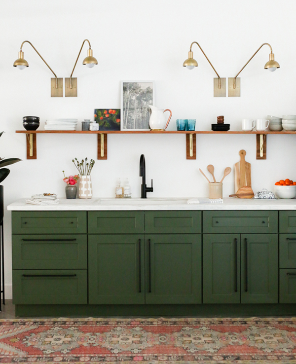
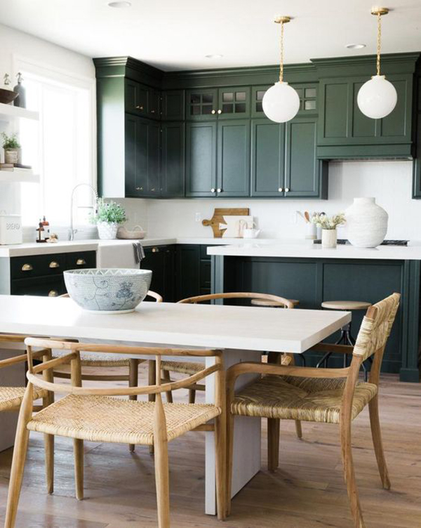
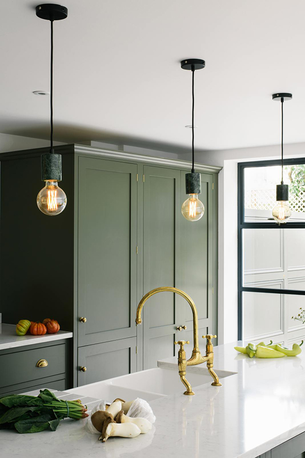
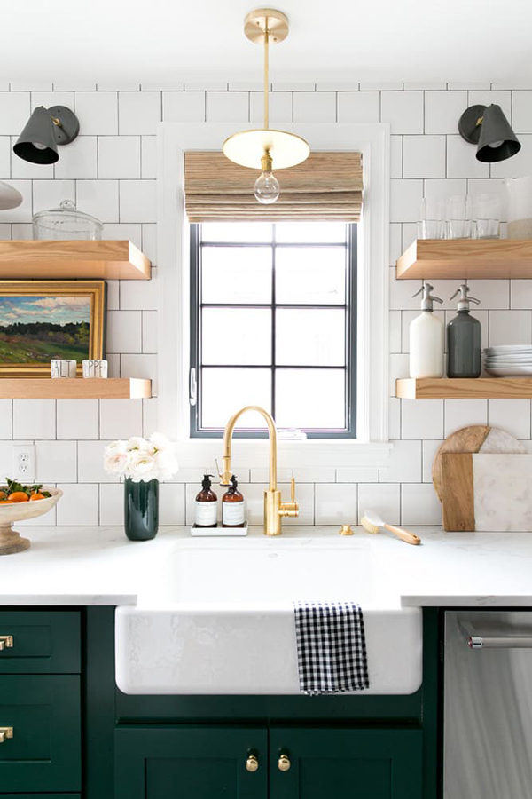
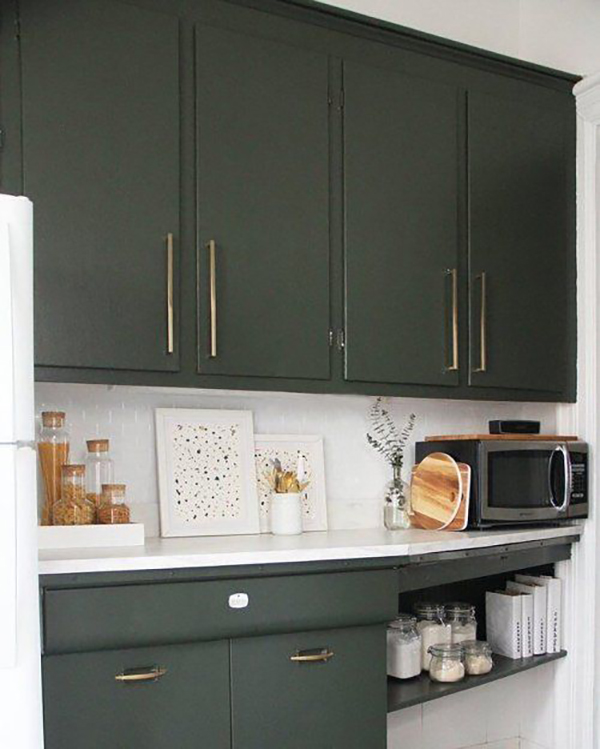
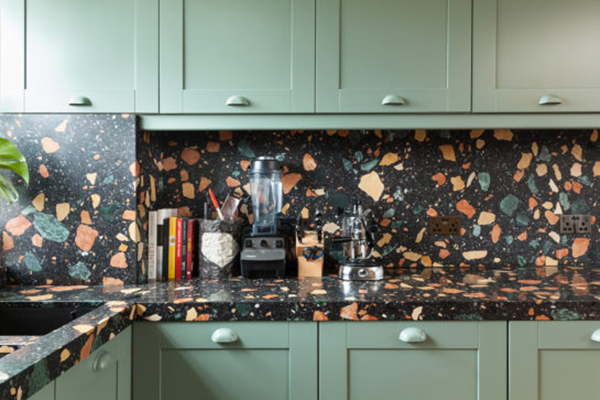
I’ve been itching to do some updating to our kitchen. The cabinets are really in great shape, they could just use a fresh coat of paint. For being a small kitchen, it really doesn’t have terrible storage and there really are a lot of cabinets. I’m thinking a dark green color, on at least the lower cabinets, is the route I’m going to go.

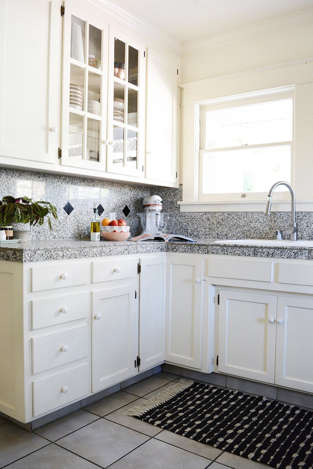
The counter tops – now they definitely need to go ASAP. It’s not just that it’s an awful dark granite, but it’s actually granite tiles with grout lines and food gets stuck in ALL THE TIME. It’s really gross, and after 2 years of working with this kitchen, I’m ready for a solid surface for baking and cooking on. I’m thinking quartz probably.

But, before we get ahead of ourselves, lets just take a look at some great examples of green kitchens. Oh, and I did paint The Moore Apartments kitchen cabinets green, so I’m feeling pretty comfortable and confident with this color choice. In my book, green is a neutral color. I’m not talking about lime green or even olive – just a good classic forest green or dark sage. What do you think?

source

source

source

source

source

Anyone else ready for a change from all the white cabinets our there? Don’t get me wrong, I still LOVE painted cabinets, I just think a darker color might be fun to play with.

Design

The Moore Apartments

August 26, 2018

Ok, and I’m back with more of what I’ve been up to lately. This next project I’m going to share about has been in full swing for the last 5 weeks and it’s really consumed A LOT of my time and energy. But gosh, this is literally the best job for me. It checks off so many boxes for me. So, let me tell you about The Moore Apartments. (Oh, and I’ve been sharing a lot of BTS of this project on my Instagram and even have an account for The Moore Apartments as well).

Oleander + Palm - The Moore Apartments - Bakersfield, CA

I have been hired to design and do some project management for the renovation of The Moore Apartments. These are not going to be the run of the mill rentals. They are going to be high-end living with all the modern luxuries like brand new appliances, a new HVAC system, a laundry room and lots of custom details and touches.

The Moore Apartments are less then a mile from my home. Built in 1919, the building has 2 apartments on the top level and 2 on the bottom. The apartments are packed with cool original character, details and charm. And you know how much a love old houses! They are also in my hood and just a block away from the High School Lonnie teaches. They need a lot of love, so I’m excited to be apart of improving to my neighborhood.

I’ve brought on my brother, Ash, and also my dad (who just retired a couple months ago, so I thought he had a little time on his hands) to do most of the work. This project would not be possible without them. We are renovating, but also trying to preserve and restore these apartments as much as possible. It is very hard to find tradesmen that understand the value of keeping something that is 100 years old. And as soon as we mention that these are going to be rentals, folks want to tell us to lay down some beige tile and call it good. But, that’s just not the O + P way. We are being super picky about the quality of work and the finishes we choose.

Oleander + Palm - The Moore Apartments

source // source // source

source // source // source

source // source // source

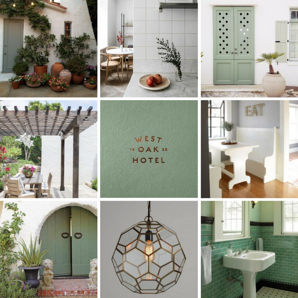
We are just a couple weeks away from having the first unit up and ready to go. We have moved fast and furious and I am so excited to see all of the details come together. So, before we are ready to show befores and afters, I wanted to share a little of the inspiration behind this project. The building’s exterior has a simple, clean, Spanish look. There are lots of fun 20s touches like a banquet in the kitchen, built in ironing boards and mint green tile. We are going to with some sage green on the exterior and nod to that green on the interior as well.

I put together a mood board for the design direction for The Moore Apartments and I also created a logo for them as well. You know I couldn’t help myself, I had to do a little branding.

So, would you like to see more or Moore? I have some before footage I’ll share soon.

Design

No Makeup Home Tour

May 23, 2018

Well, I’m so excited to share this No Make Up Home Tour with you. I’ve teamed up with so many amazing bloggers. We are all pulling back the curtain and sharing a more candid look at our homes. We are all in the business of creating and publishing beautiful spaces. We edit, accessorize, and style to our heart’s content before we shoot and share a room with you. But, to be completely honest, our homes don’t always have flesh flowers on the bedside tables, pillows fluffed, and surfaces free of clutter. So, today I’m sharing pictures of our home with “no makeup on”.

We’ve had this house for a year and a half now. We love this house, but there is really so much work to be done. To be totally transparent, I wish there were a lot more projects completed and more rooms had complete makeovers. But, we are so blessed to have this giant house. So, while this post will be pointing out the flaws of our house, please don’t take it as complaints. I just think it would be fun for your to see all the nooks and crannies of our house (even our master bathroom, which has never been photographed) and hear about the plans and dreams I have for this house.

I spent just a day taking these pictures, that is not a lot of time for a blogger. I would normally take an entire day just to style and shoot a single room. I wanted to keep this post a little raw and as untouched as possible.

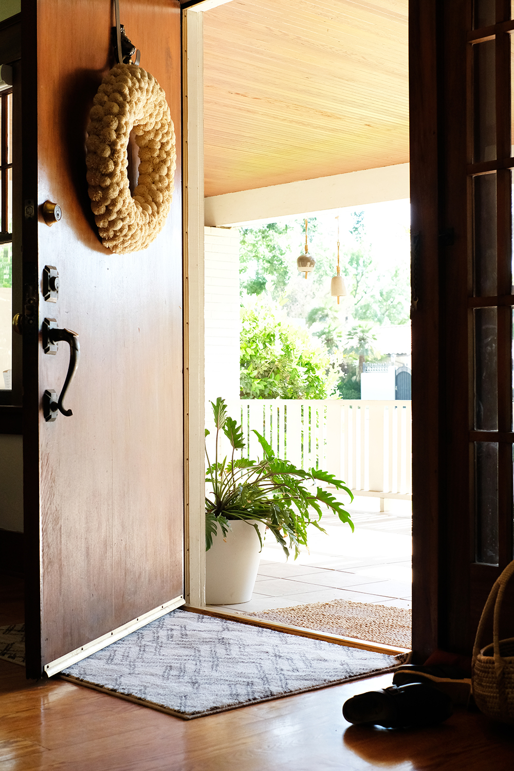
Come on in. We have a huge front door, the original hardware still works (kind of). There is a huge brass lion door knocker that I obviously am trying to hide with a wreath. I would love to replace it, but you would be surprised at how expensive door knockers are.

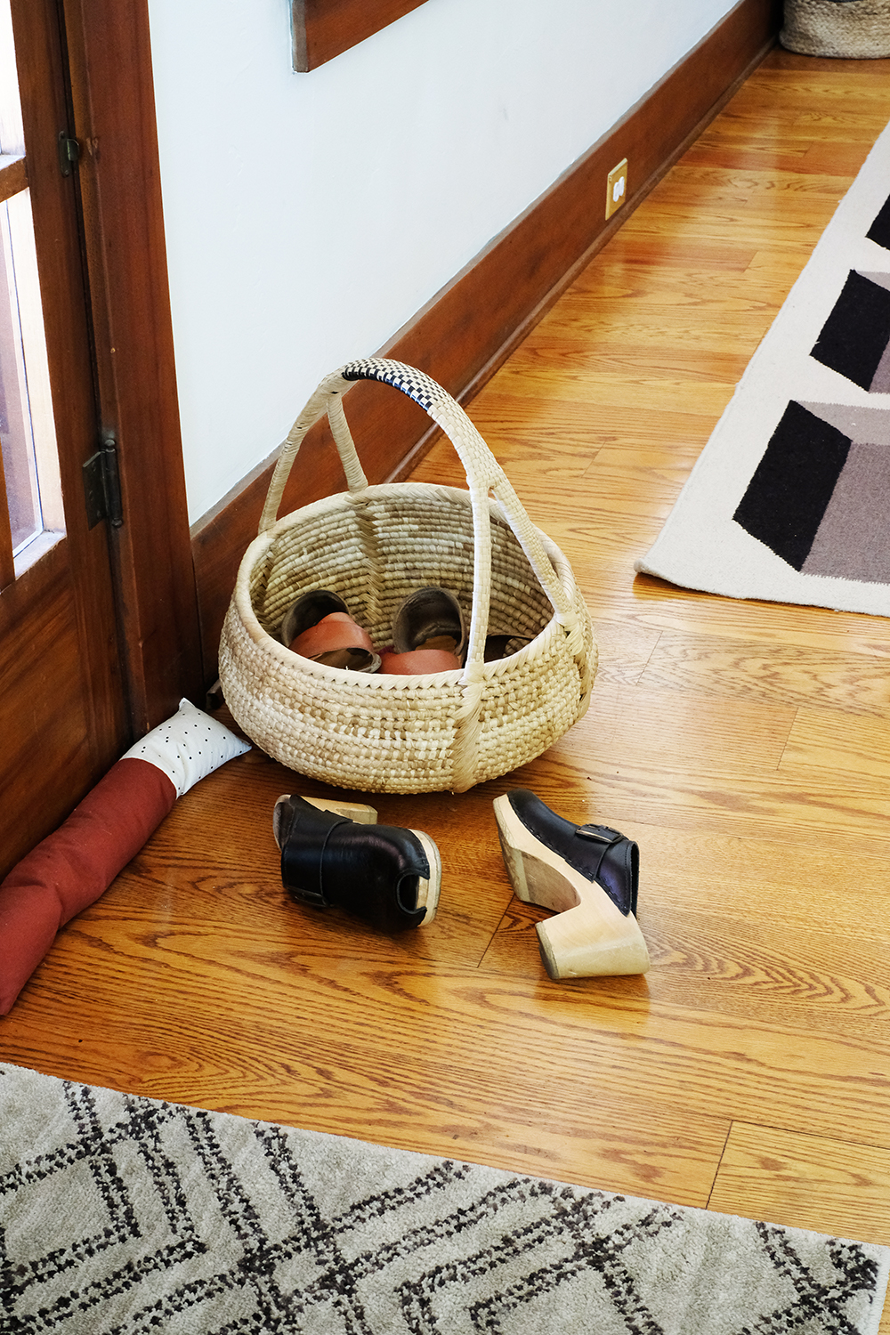
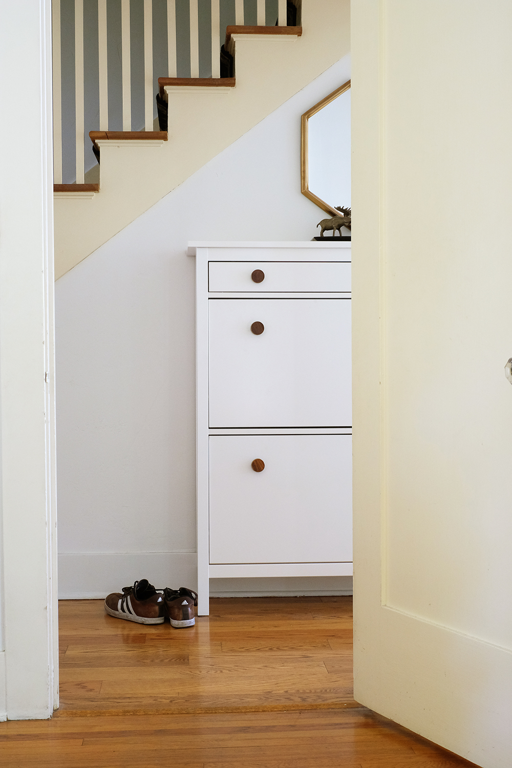
We are a no shoe house. I’m Canadian and my husband is from Alaska, so we both grew up in no shoe homes. So, there is almost always a pile of shoes by both the front and back door. We don’t require guests to take off their shoes, but we do appreciate it. I think it helps us keep our house just a little cleaner.

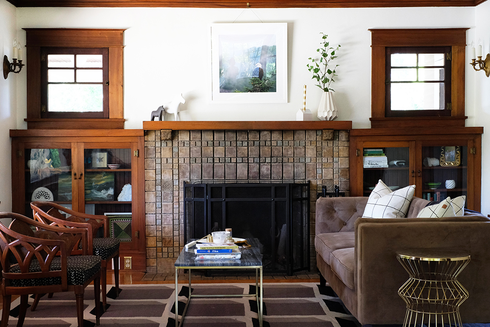
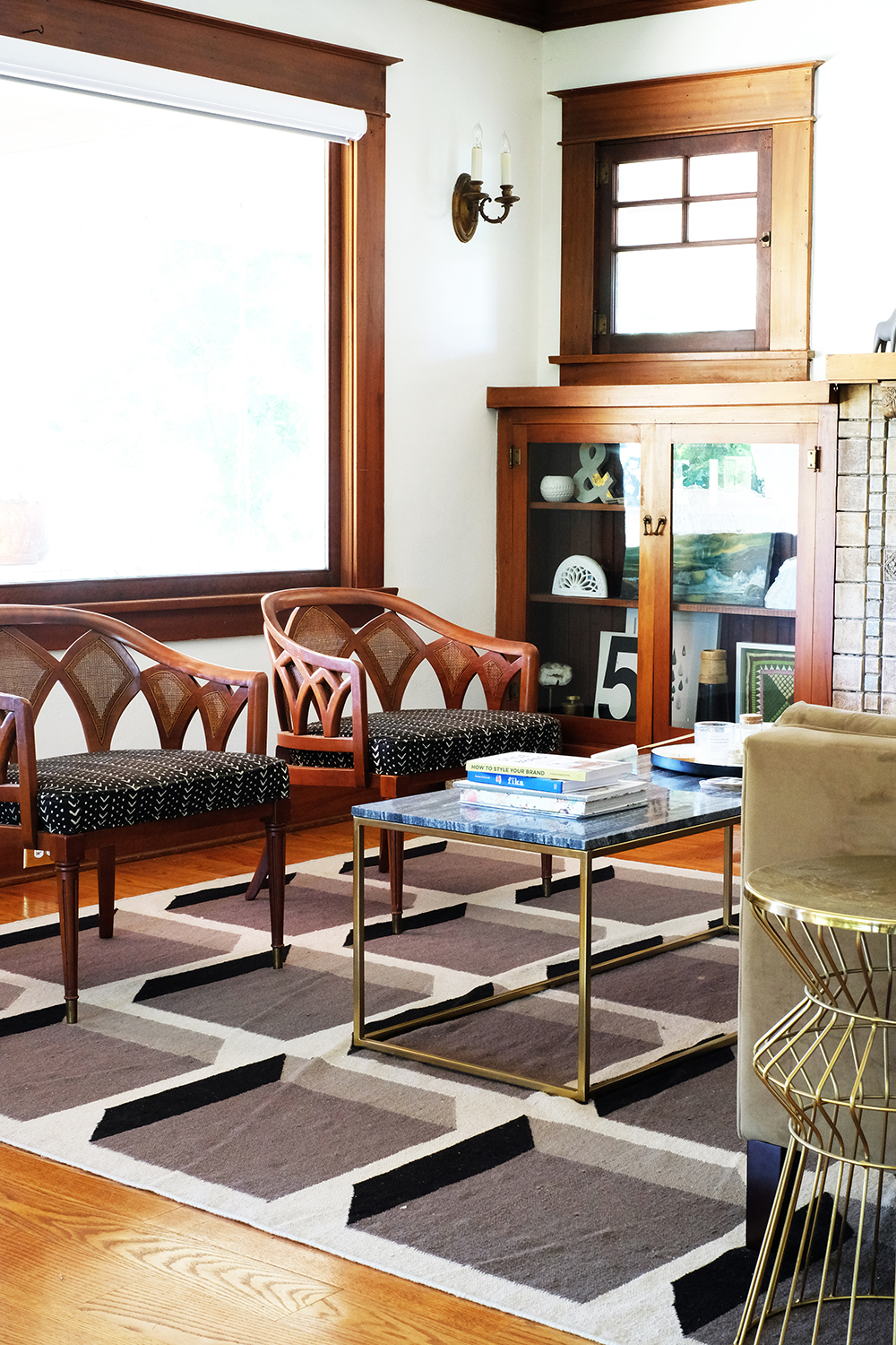
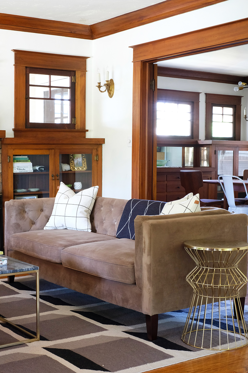
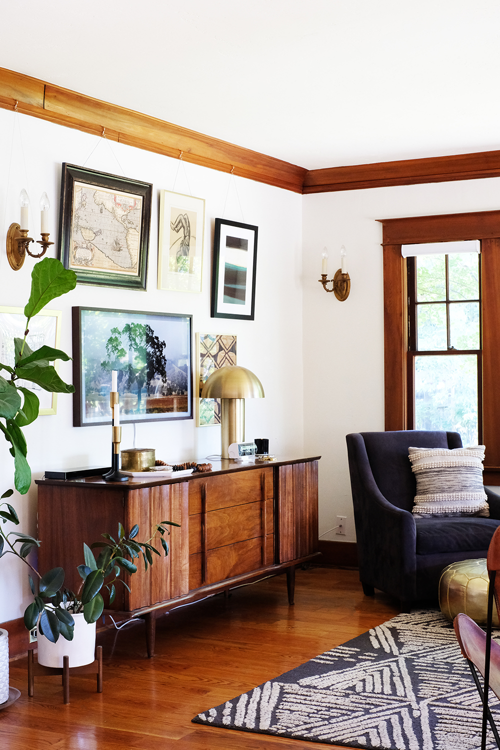
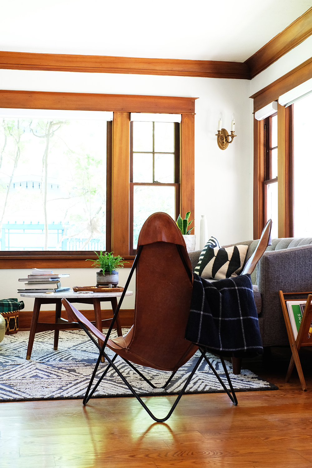
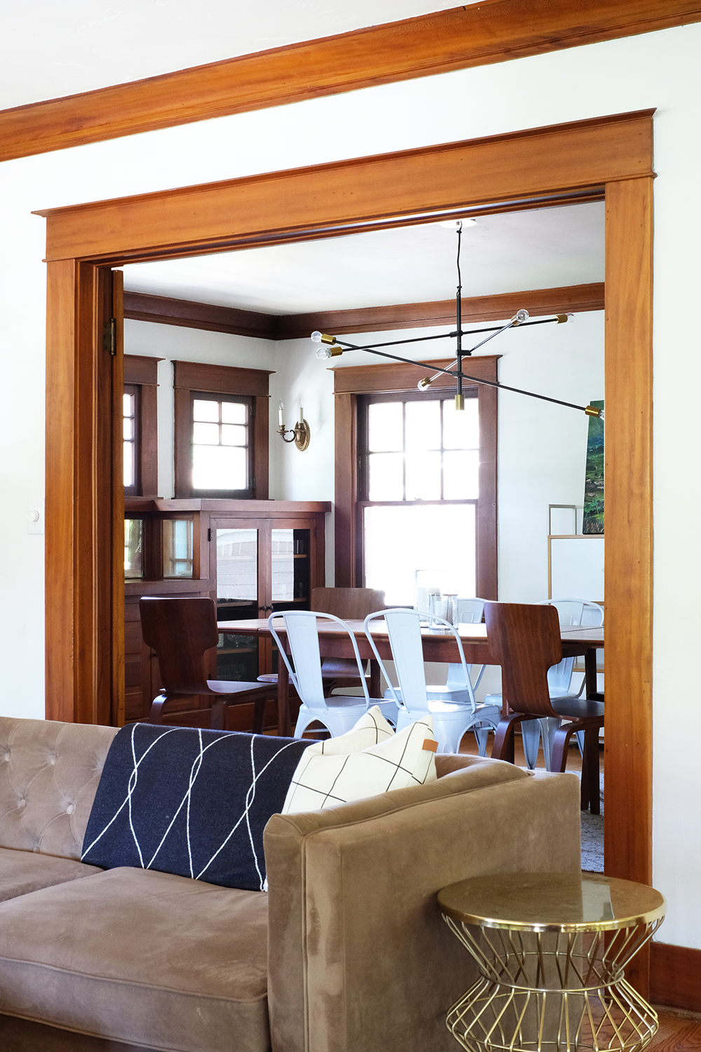
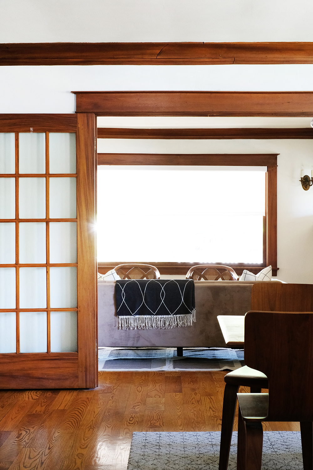
To the left of the front door is our “formal” living room. The front door opens to a very big room, we have divided it into to spaces. And this is what we call the formal side. We have our tv on the other side of the room, so it feels a little less formal. We have no shortage of beautiful woodwork in this house. I also love the beautiful tile that surrounds the fireplace. Our coffee tables are always covered in stuff – mostly piles of books, magazines, and lots of candles. The sofa in this room is not my favorite. It was a very reasonable price, and I thought it was nice to have a sofa versus not having one at all when we first moved into this house. It’s really the color that is wrong. There are too many shades of brown. I think a lot of you might agree that a velvet forest green sofa might be nice for this room.

And here’s a little at the other side of the room.

See what I mean about the piles of books. The top of the pile, is a little hint to where we are headed in a couple weeks. I love styling my coffee table, but as the week carries on more and more things collect on it.

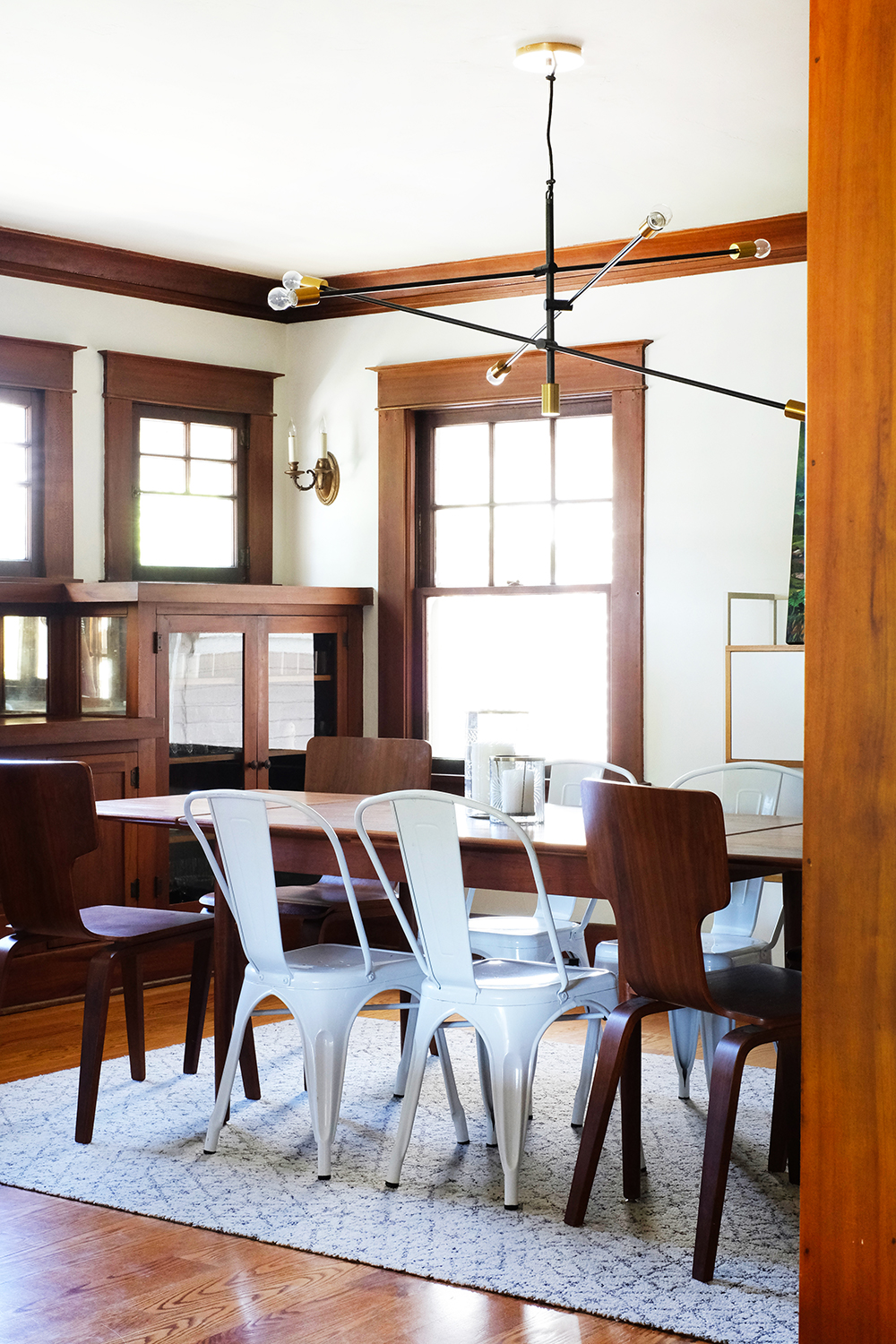
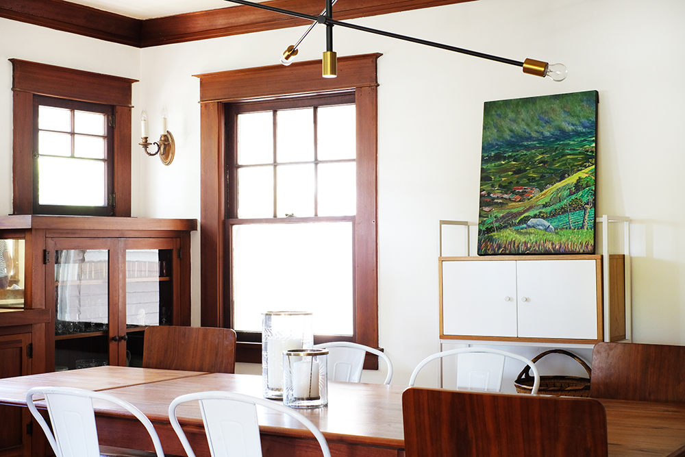
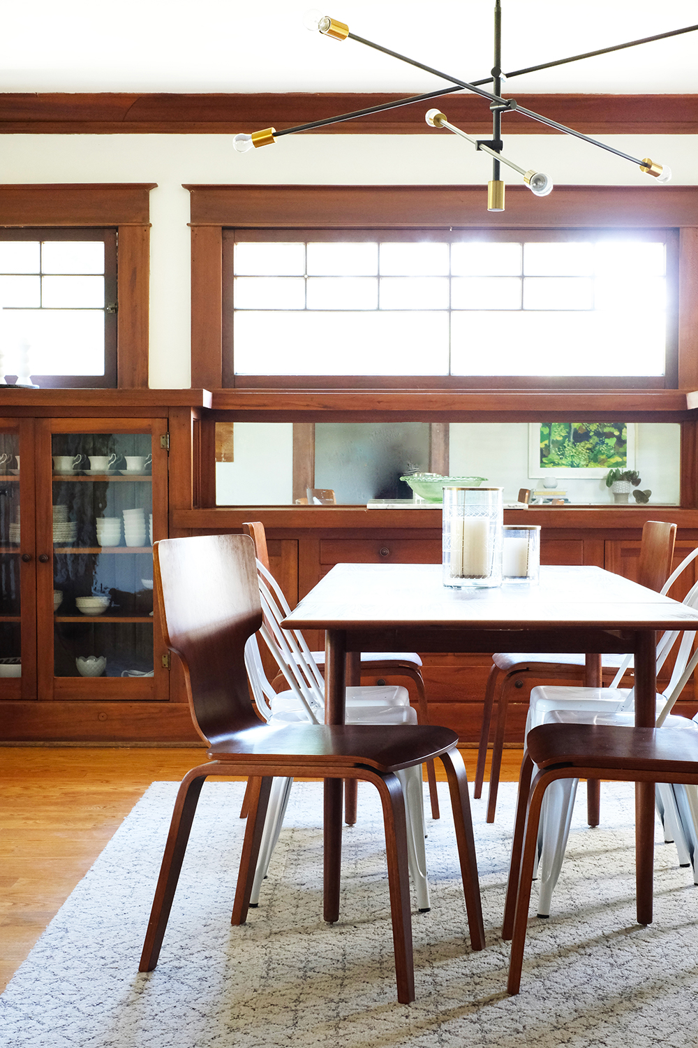
Our dining room is a fantastic room, that we have done absolutely nothing to it. Well, that’s kind of a lie, we did just recently replace the light fixture. the original one was way too small for this room. And I love the scale of this new fixture. I’ve always been a fan of mixing modern pieces with an old house. We aren’t as old as our house, so it’s important for our home to feel young and fresh. Most days I feel pretty young myself.

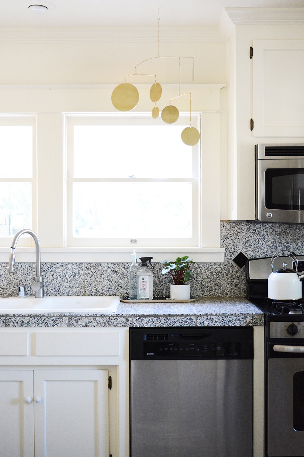
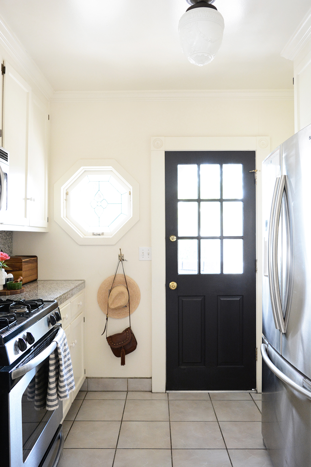
The kitchen is a room that I would love to give a little love to. My main complaint is the countertops. They are granite tile, so there is so much grout that has to be cleaned. I’d love a solid surface, it would make keeping my kitchen clean so much easier.

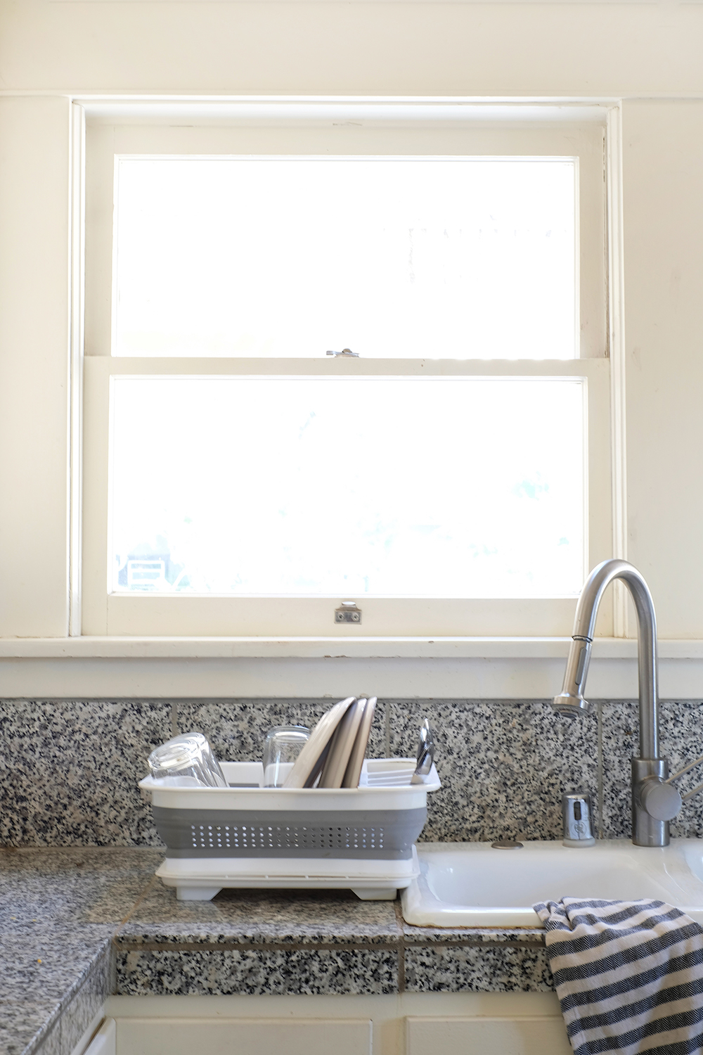
Most days this dish drainer is always full. I bought it thinking that when the dishes were done, I’d put it away and clear off the counter, but it turns out that it’s always filled with dishes and I never put it away (only if I’m taking pictures).

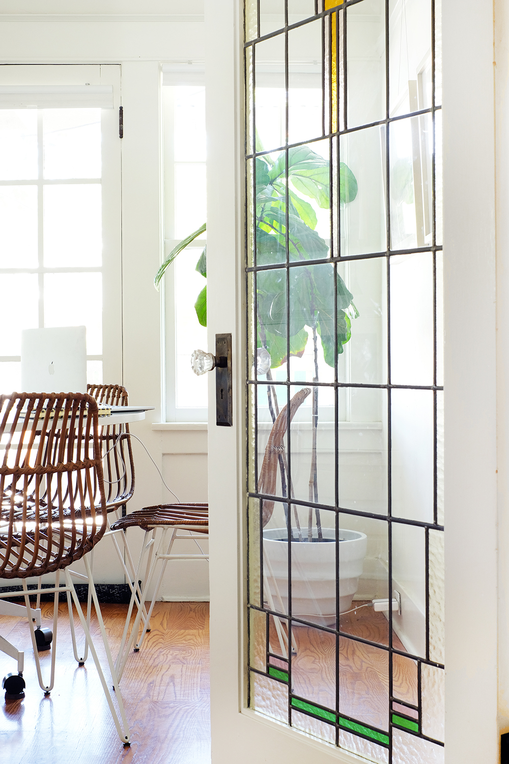
The sunroom is the most used room in our house. It’s also the smallest room, but we all spend a lot of time there. While I do have a little desk in the hallway, it’s very dark and doesn’t have any natural light. So, I often end up in this room with my laptop. This is also the room where I take most of my pictures.

The hallway might look like it needs work, but it used to a lot worse. We spent many nights stripping yellow striped wall paper from these walls. The walls are painted, but all the trim and the banisters still need to be painted. It’s going to be a big job, so we haven’t thought about starting it anytime soon.

Here’s more evidence that we have so many unfinished projects. just look at the half painted trip at the end of this hall. And I’m not going to show you my whole desk, because it’s really a disaster.

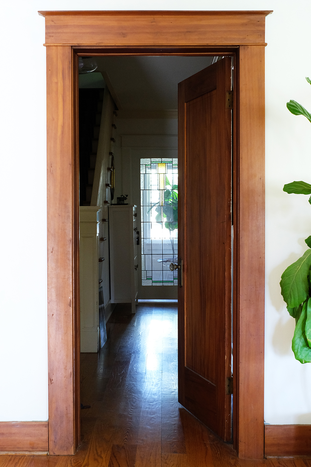
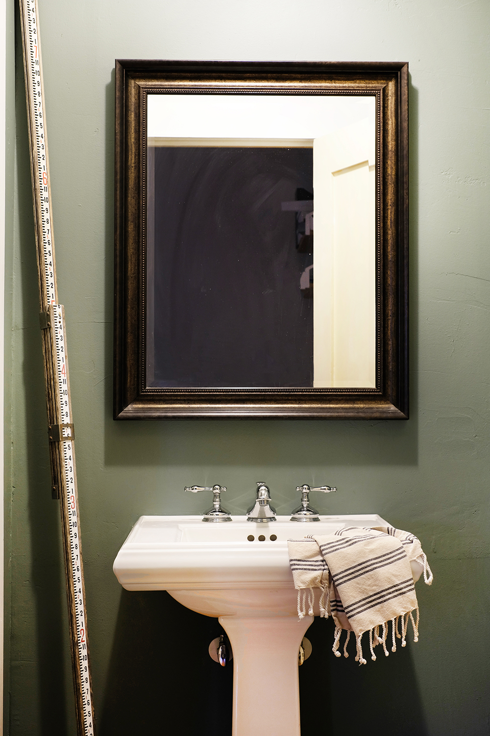
This is the doorway that leads to our living room. And the door to the left is a little powder room. It needs a lot of work. You can see it below. Most of the living areas in this house were this dark green/blue color.

I know I promised a home tour, but this is a big house, so I’m going to stick with just the first floor of this house. Don’t worry I’ll shared the kid’s room’s soon. But, this leaves us with one last room, the master bedroom and the master bath.

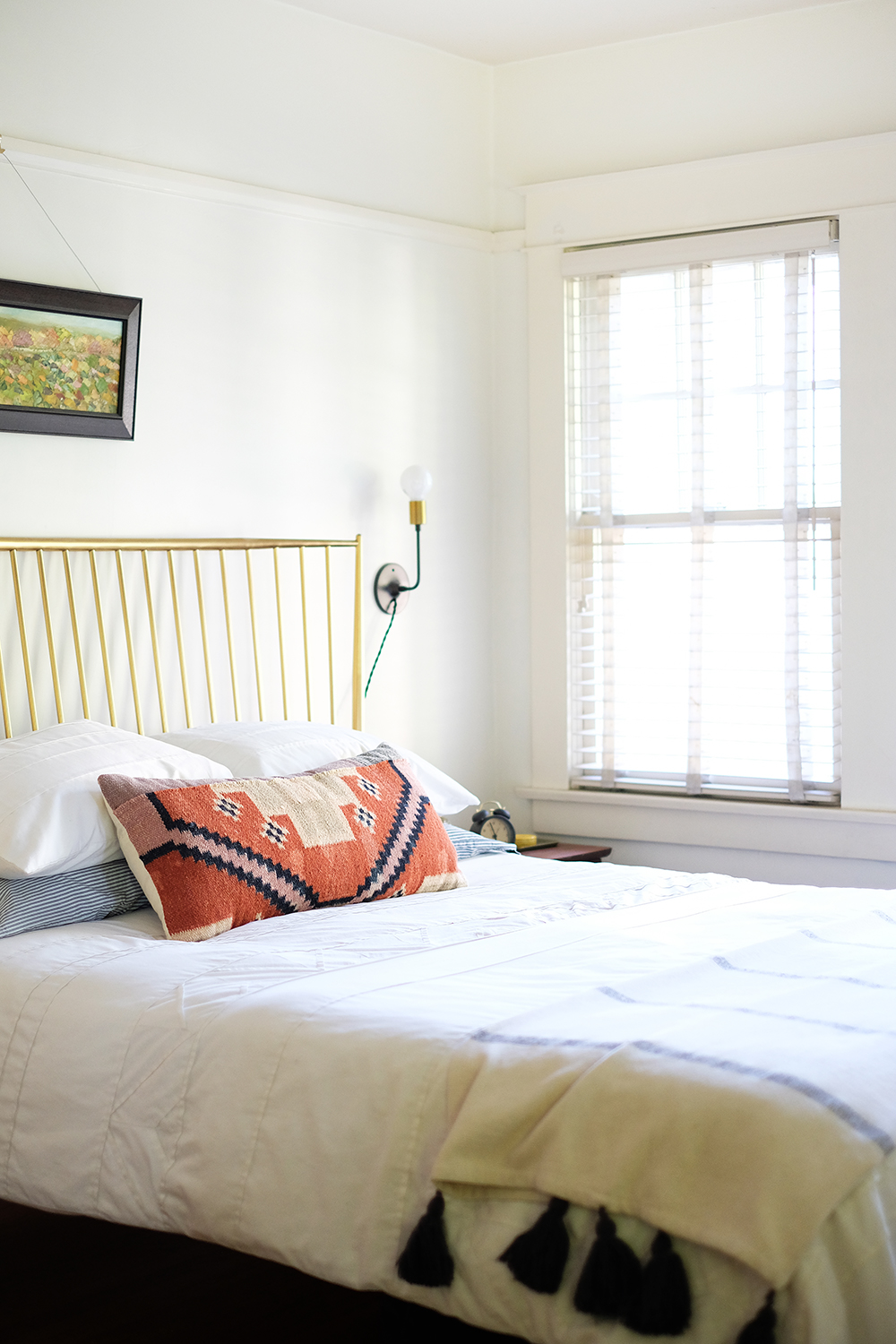
The truth is I really do make my bed most days. There are definitely somedays I don’t, but a room definitely feels clean when the bed is made.

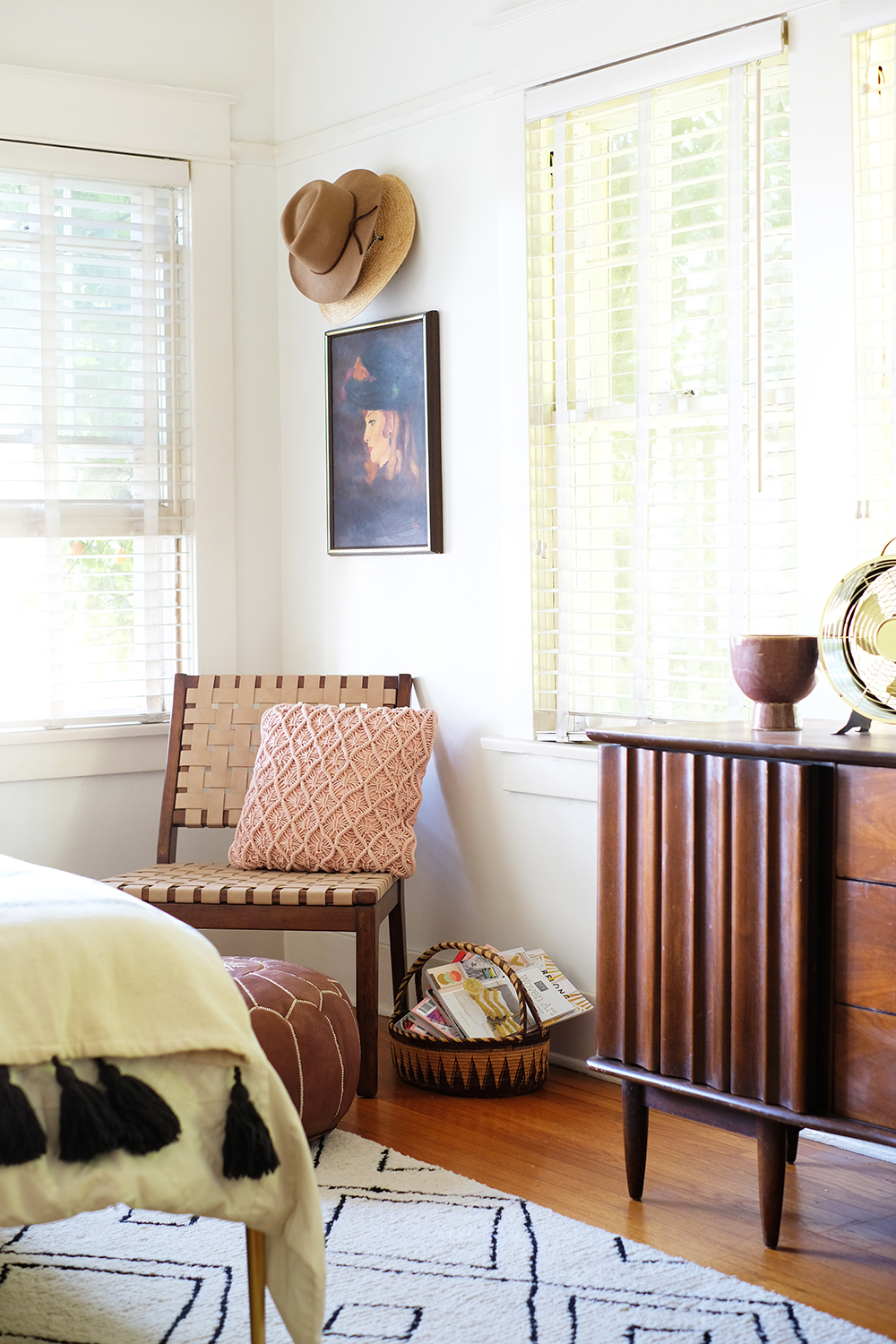
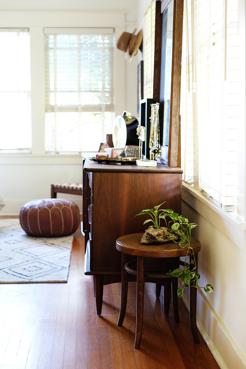
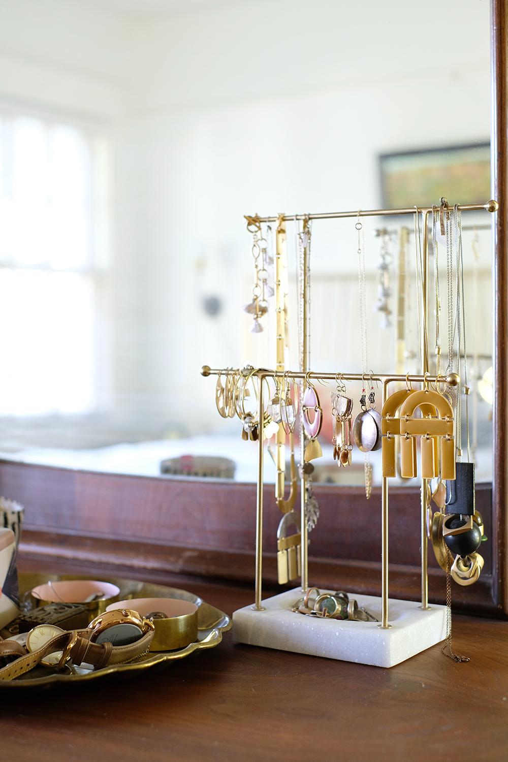
There is almost always a pile of earrings and jewelry on my dresser. Somedays it’s messier then others.

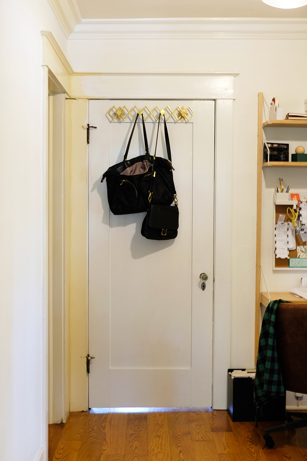
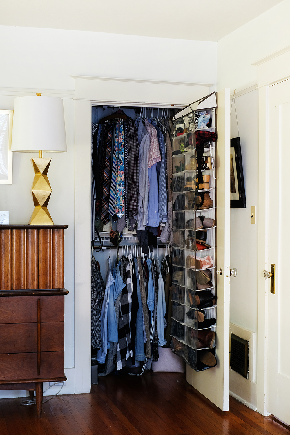
My husband and I share a very tiny closet. It is always left open. Don’t ask ,me why, I don’t want to see this mess. Why do we have bad habits like this? it would be very easy to shut the closet door, but we don’t.

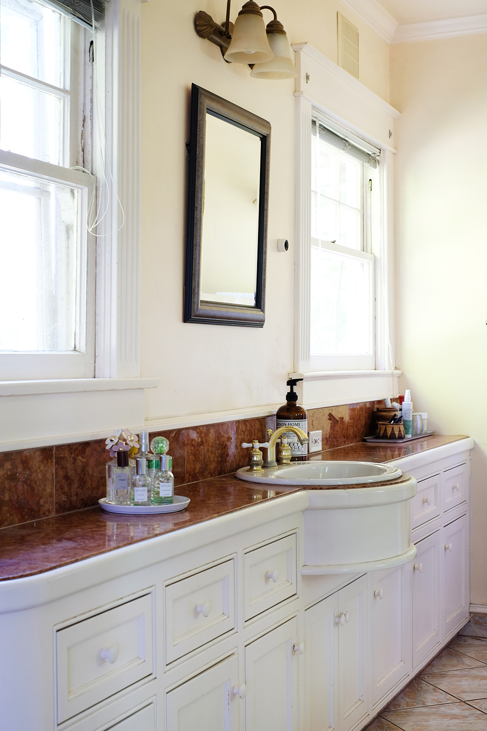
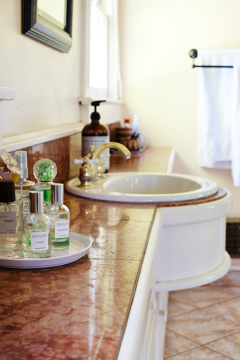
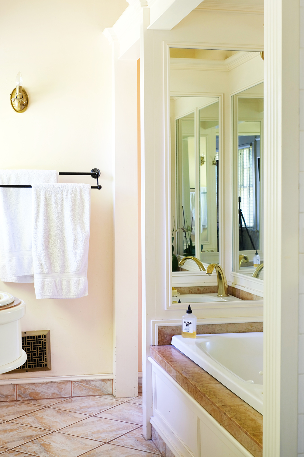
And I’ve saved the best for last, the master bathroom is incredibly tacky. It’s definitely a room where I don’t know where to start. The tub is mirrored on 3 sides, the floor tile and countertops are something awful that only the 90s could provide. But, it does have a lot of storage, and the counter does have a very unique shape.

Now head over and check out all these other fabulous blogger’s homes.


Design

Stylish Alarm Clocks

April 24, 2018

Stylish Alarm Clocks Stylish Alarm Clocks

Parenting is tough, and it feels particularly tough with all the ways our kids can be connected with social media and and just the internet these days. I worry that my kids are too dependent on technology and having access to information ALL THE TIME. We definitely don’t have it all figured out, and we are always attempting to do a little better at this parenting gig. So, we are trying something new. In an effort to try to find a little disconnect from our phones, we have been storing all our phones, devices, and tablets in a cabinet in our living room at night. Our kids need sometime to disconnect, and frankly so do we.

We of course used to use our phones as our alarm clocks in the morning. So, we’ve had to go old school. But, I was pleasantly surprised when I went shopping for alarm clocks. There are some really stylish ones out there that can really act as decor and a great bedside table accessory.

Stylish Alarm Clocks

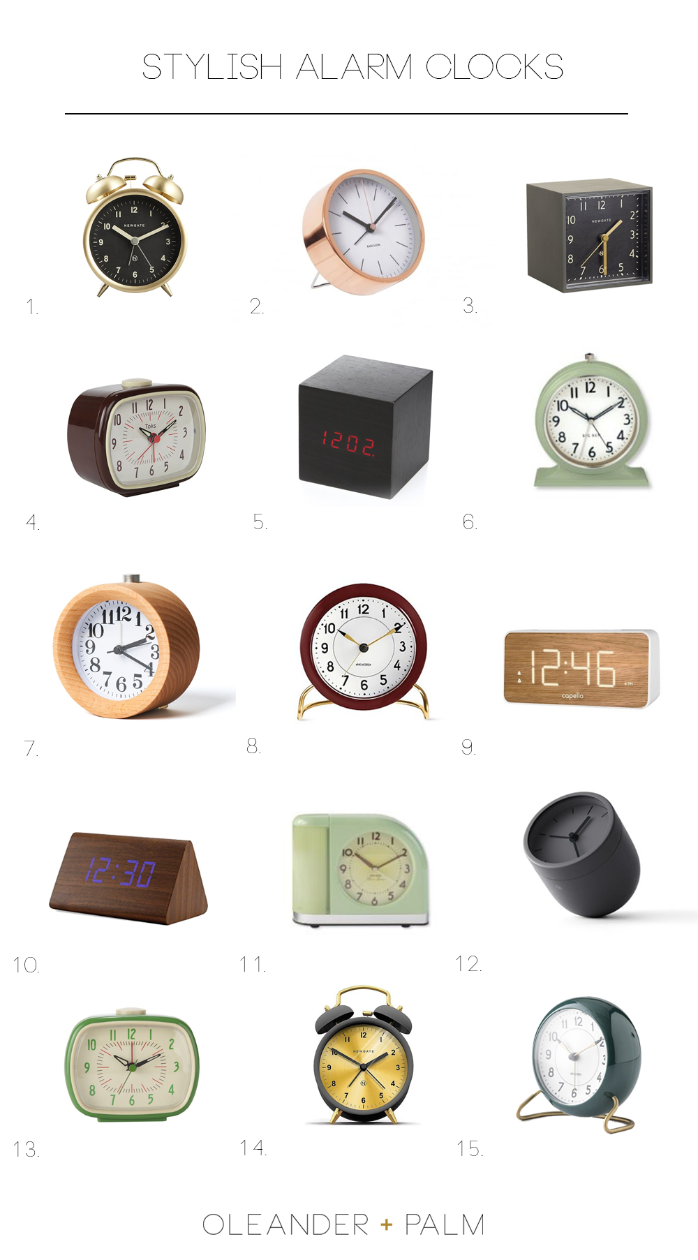
If you are looking to go old school or just want a great looking clock to sit on your dresser, I’ve rounded up some of my favorites.

Stylish Alarm Clocks1. // 2. // 3.

4. // 5. // 6.

7.  // 8. // 9.

10. // 11. // 12.

13. // 14. // 15.

Stylish Alarm Clocks

Ideally, I should go to bed at a reasonable hour and then just wake up with the sun. But, that is not reality. I need a very load buzzing noise near my head and a giant cup of coffee to follow. Now, let’s hit snooze one more time, before we start this day.

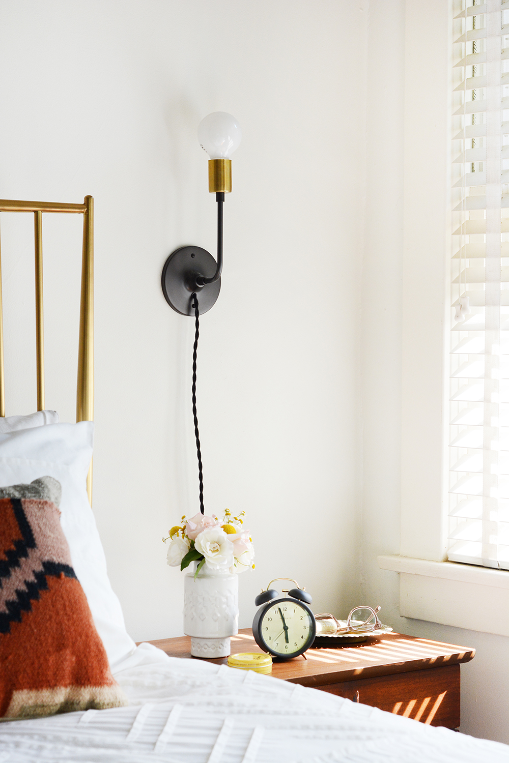
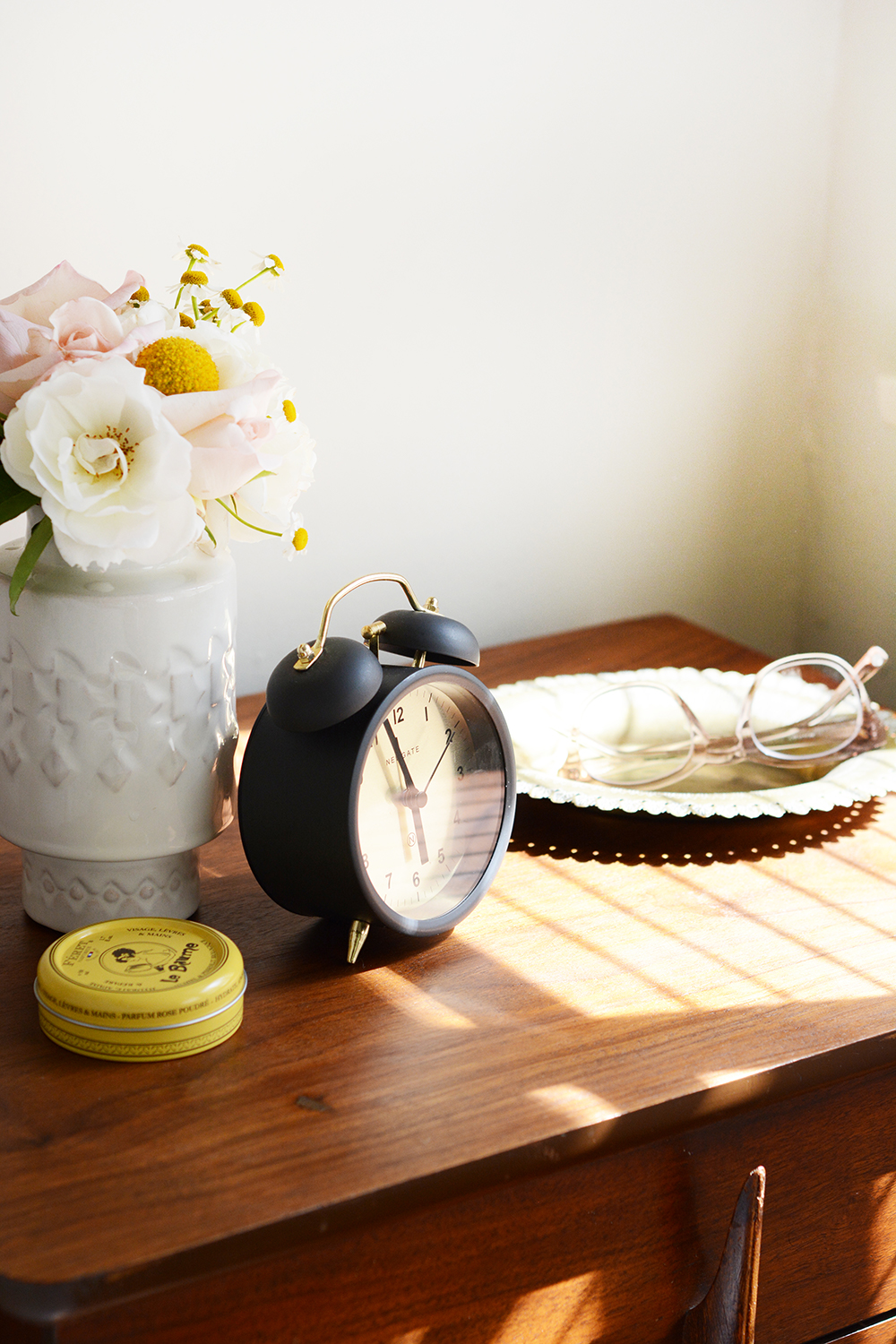
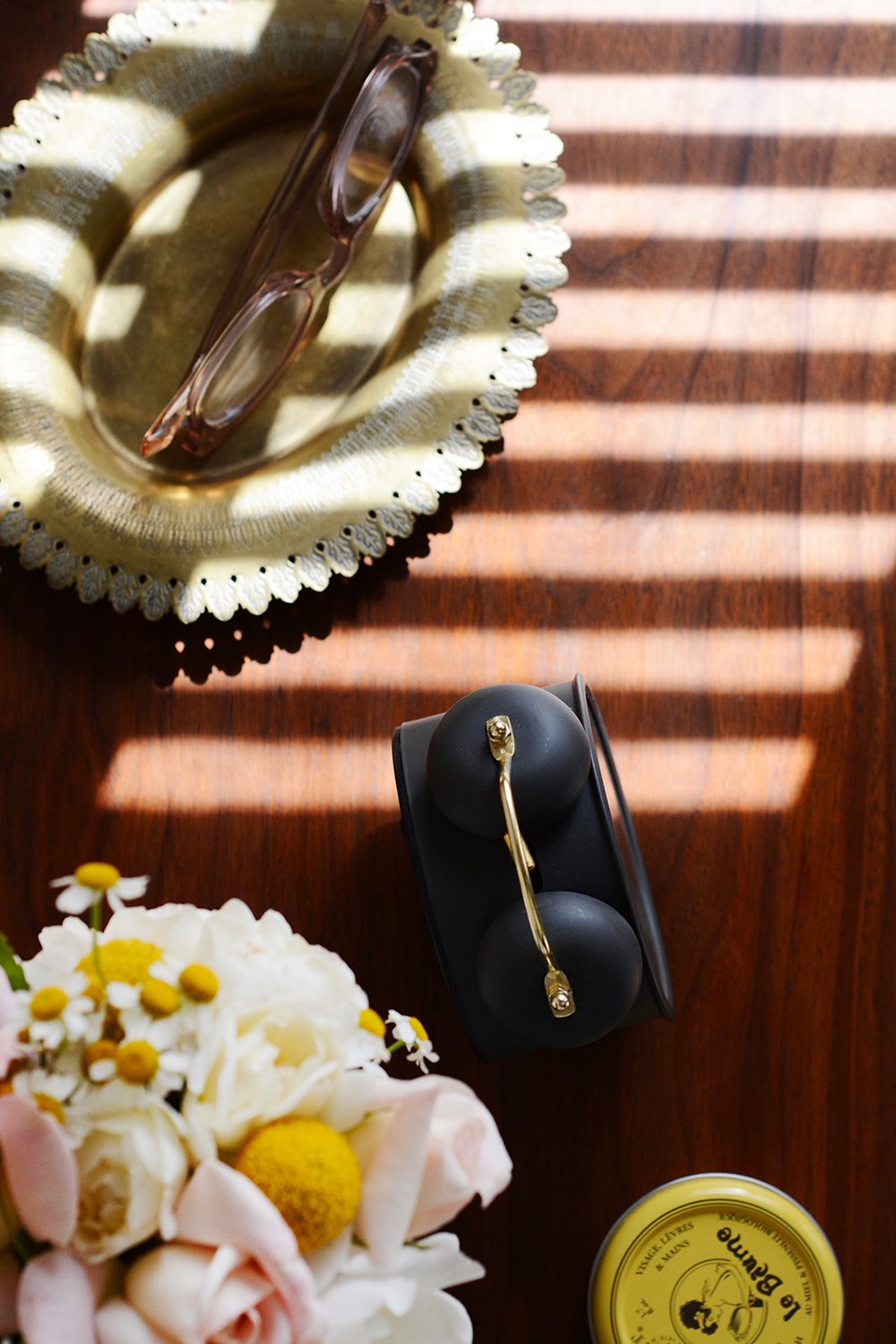
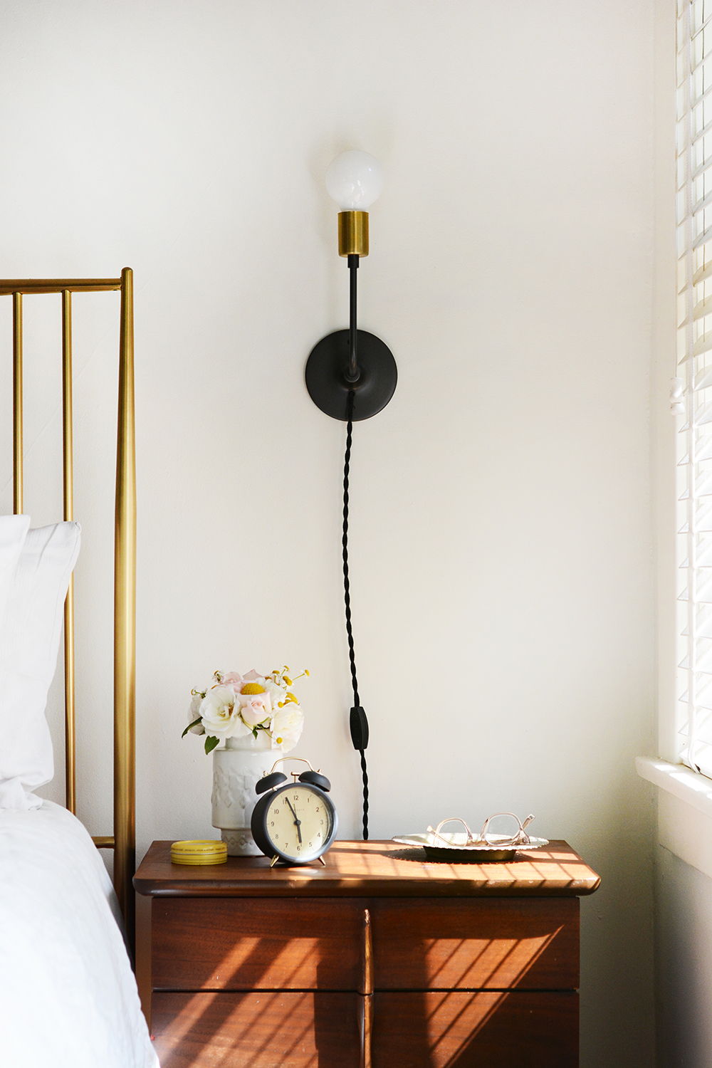
And because I know folks will ask. Here’s some of the sources for the pieces found on my side of the bed.

  • Nightstand – vintage (sorry, I know that’s not helpful at all)
  • Wall Sconce
  • Vase – West Elm (no longer in stock)
  • Le Baume (gosh I love this stuff, you can put it on your lips, face and hands and it smells heavenly)
  • Brass Bed
  • Glasses
  • Brass Tray – Vintage

*This post contains some affiliate links. 

Design

Color Inspiration – Terra Cotta + Green

April 12, 2018

Hey friends, there is so much going on lately. Before we talk about this gorgeous color combination of Terra Cotta + Green, let me give you a little life update.Oleander + Palm Color Inspiration - Terra Cotta, Rust, Cognac, Mint, + Forest Green

I want so badly to share with you all the details of the model homes , but I just can’t yet. Currently it’s a FULL-TIME job. There has been some delays, but the builders have broken ground and everything is going to be moving really fast from now on. I’m pinning, sourcing, buying, hauling, and sorting these days. Stick with me, there will be a lot of share soon.

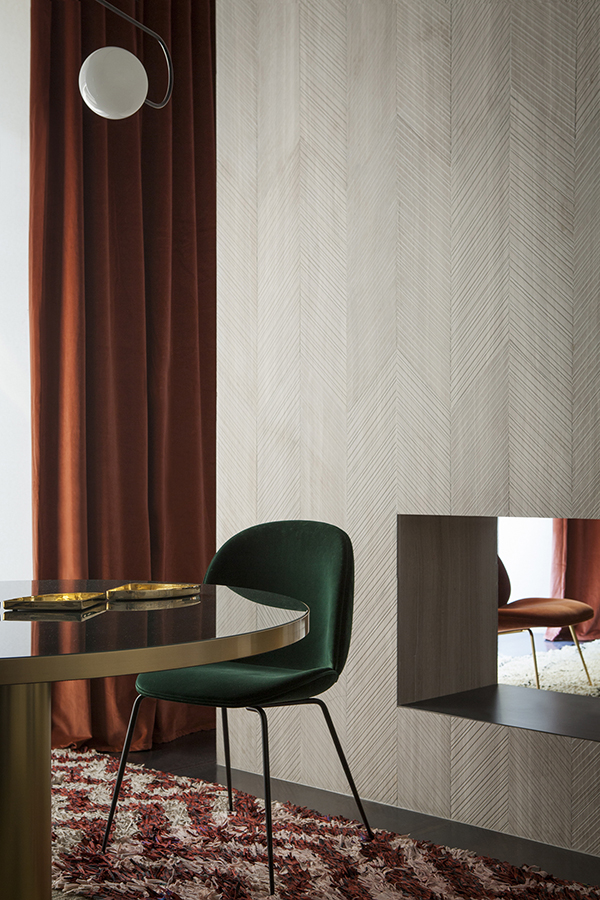
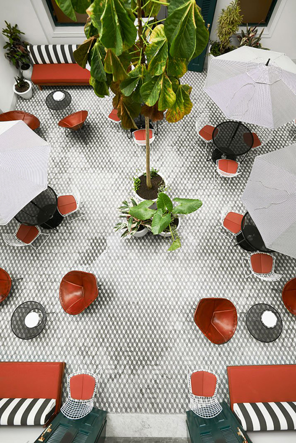
In the meantime, I thought I’d share some color inspiration that keeps catching my eye. If you’ve been around these O+P parts for a while, you know that I’m a HUGE fan of the color green. So, no surprise at all, today’s color inspiration combo is one part green.

kitchen

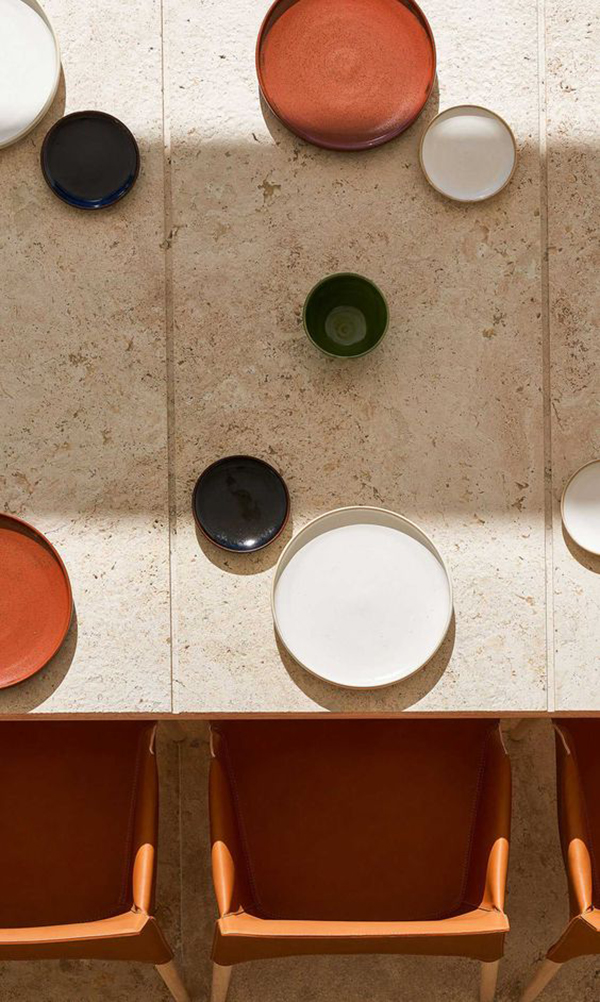
I just can’t get enough of this forest, mint, and rust combination. As a redhead, green is my go-to. But this new found love of rusty, deep oranges surprises me. It feels way too close to my hair color. But, if you think about it as beautiful terra cotta pottery, rich cognac leather, or even beautiful mahogany, then it’s so much better then just a shade of orange. While I will never where an orange top or jacket, you definitely will see me with a purse and shoes this earthy color.

It’s funny how your personal style, as in the clothing you wear, comes out in your interiors as well. When you make choices on style based on your personal taste, and not just on trends, it all tends to work together in the end.

plates on table

green velvet chair

hotel patio

fabric

Is there any color combinations you are loving these days?

Design

Bean Bag Chairs

February 8, 2018

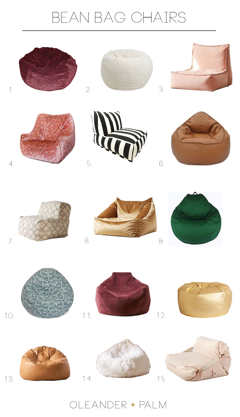
Ok, the girl’s room is PAINTED!!!! Now the fun begins, I get to style and accessorize this space. I really want to create a lounge-like space for the girls to hang out, read and watch movies. Now that we have our new fancy THE FRAME tv in our living room. We are going to move our old tv up to their room for weekend movie sessions. Denali is really loving vintage clothing and especially anything with a 70’s vibe. Bean bag chairs feel like they suite that style spot on. And there are some really cool ones out there now. I searched for options that are grown-up sized, not tiny kid ones. Who knew bean bag chairs could be so darn cute?
1 // 2 // 3

4 // 5 // 6

7 // 8 // 9

10 // 11 // 12

13 // 14 // 15

Is there one in particular that catches your eye? I’m leaning towards No. 8. It’s gold velvet and I love that it has arms for curling up in. No. 4 is to DIE FOR, it’s is vintage and carries a “one-of-a-kind” price tag. And I actually really love the pretty plum color of No. 11 + 1. It’s not a color I would normally gravitate to, but especially in velvet, it feels very lux.

Denali is making plans to take whatever chair we buy, with her to college. EEEK, that’s only a year and a half away.


Design

Getting Ready To Style Bookshelves

February 6, 2018

We have lived in this new house for a year and a half now. One of the first rooms I wanted to tackle was my girl’s shared bedroom. In our first house, the girl’s room was by far the cutest room in the house. If you recall, it was shot for a Land of Nod catalogue. Be sure to check out the full post on Honest to Nod, because little Denali and Olivia are pretty cute.

In this house, they still share a room, but it’s actually twice the size of their old room. BUT, the room needs help, the walls are blue, the trim is beige and the full wall of built-in cabinets are red, cream and beige (ya 3 colors). The built-in cabinets are at least 20 feet long with 12 cabinet doors and shelves to the ceiling. The other 3 walls are all windows. It’s a HUGE painting job, so for the last year I’ve been trying to find a painter (that I could afford) to tackle this room with a sprayer for me. All I want for this space is crisp clean white trim, white walls and white bookshelves. It’s actually a lot to ask. But, it’s finally happening. You guys, I’ve never hired a painter, we’ve always DIYed. But, I was really hoping to leave this big job to a professional.

I found a painter and he started yesterday. It didn’t start out too great. After the first day of priming, I noticed that they had left all the brackets for the shelves in the built-ins and the hinges had just been left on the cabinets (slightly taped). Ya, they had painted over those. The closet had drips of paint everywhere and there were a couple big gauges out of the hardwood floors. I wasn’t too excited about having to address these issues. My first instinct was to fire them and just take on the job myself. But, I decided to offer a little grace, show them exactly what I wanted done and have them fix their issues. Just letting them go seemed like the easiest solution, but I decided to stick it out and hope for the best. By the end of the day I was feeling confident that they could actually do a good job.

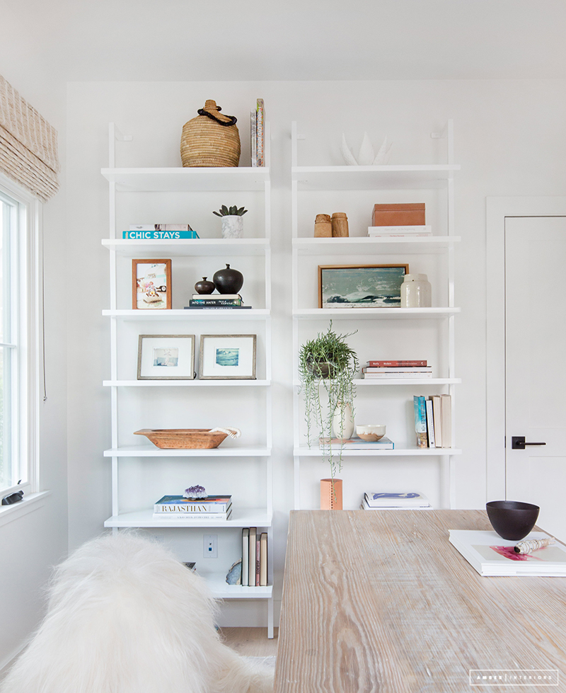
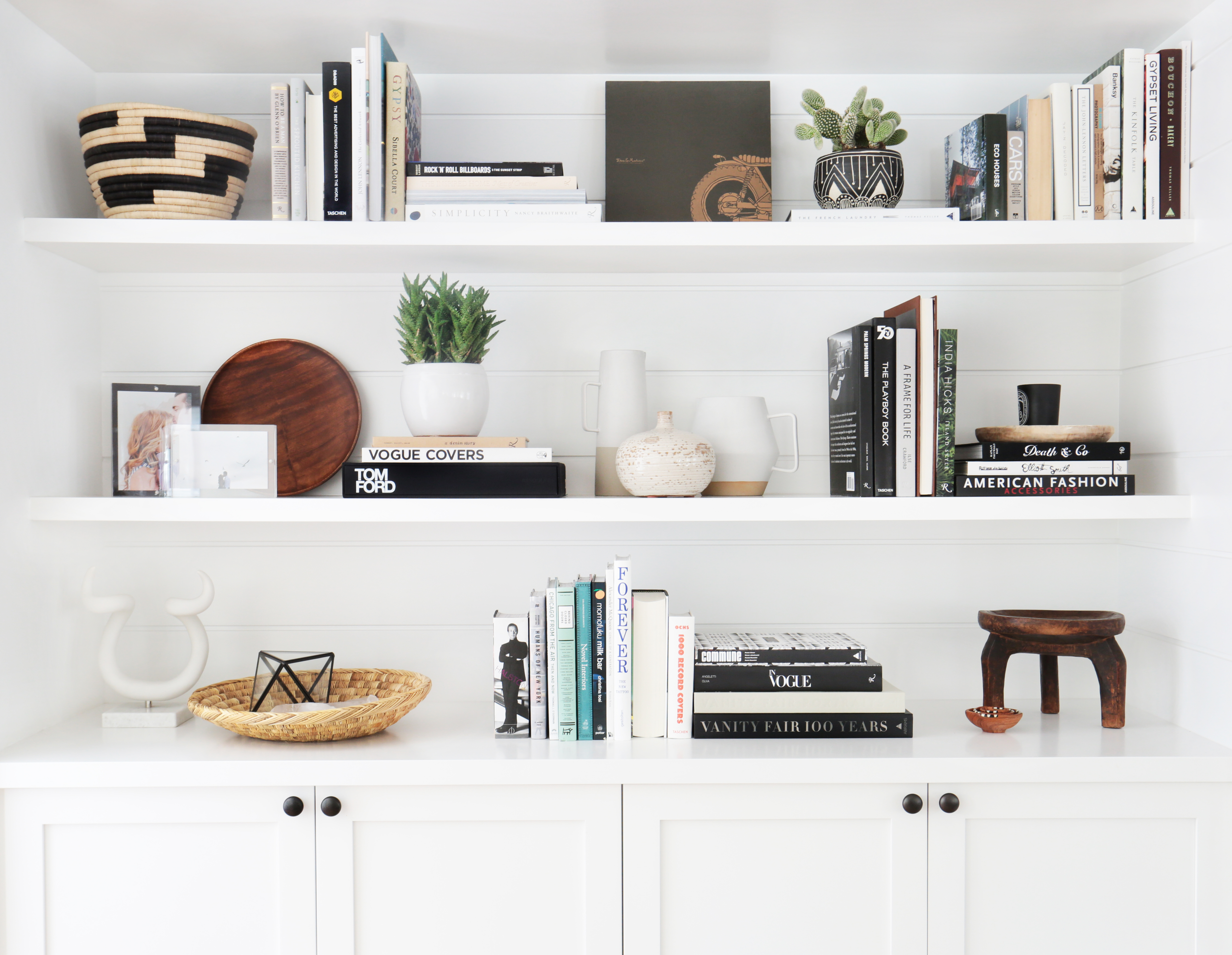
But, seeing this room turn white (Sherwin Williams – Alabaster White) has me giddy to style some bookshelves. Our plan is to go a little more boho and grown up. Denali is 16 and even though she shares a room with her 6 year old sis, I want the space to feel like hers.  So, to get me in the mood for some shelfie styling, I rounded up some of my favorite shelves out there. _spring living room 8

Remember this leaning shelf from our first house? 

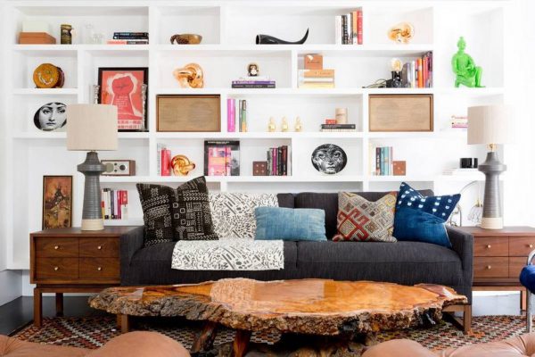
I love the boho vibe of the objects in these built-ins. The don’t feel stuffy and proper, but more playful and young.

source

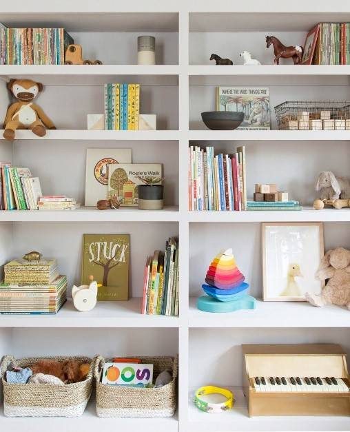
These shelves in a kid’s bedroom are to die for. It definitely has more of a nursery vibe, but I am taking notes for Olivia’s side of the shelves.

source

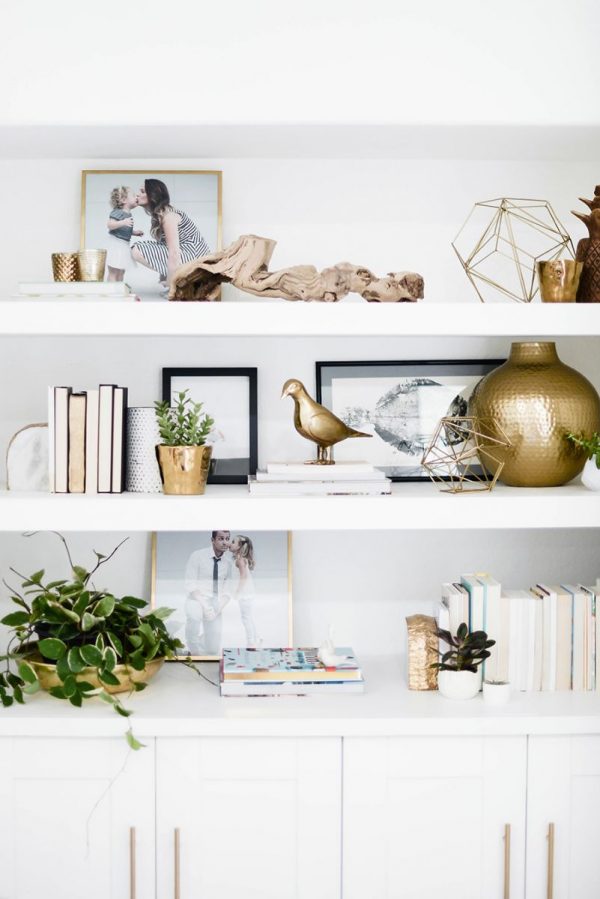
This minimal, modern aesthetic makes my heart happy. I’m always a fan of monochromatic.

source

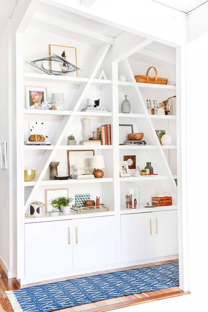
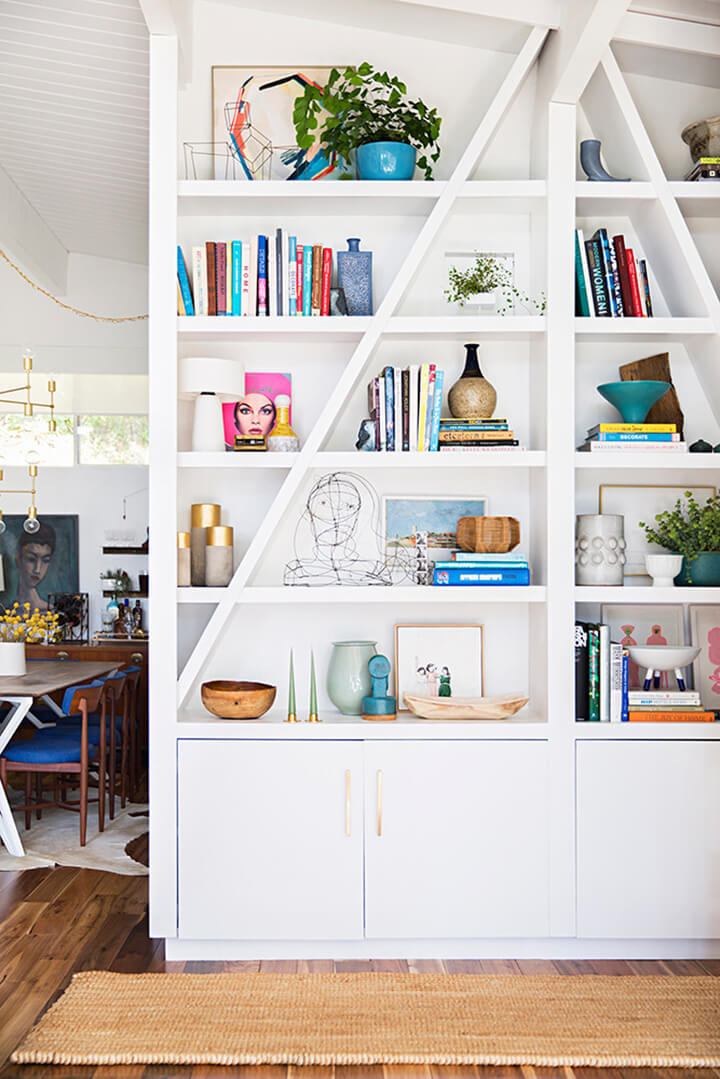
From the master stylist herself, Emily Henderson, these shelves are filled with all the prettiest things possible. I think the second version, with the more saturated objects and pottery feels more like the direction we will take. Denali loves any shade of blue and Olivia love anything in the pink/orange/coral family.

source

These shelves have a light, airy, beachy vibe that I’m sure would speak to Denali.

source

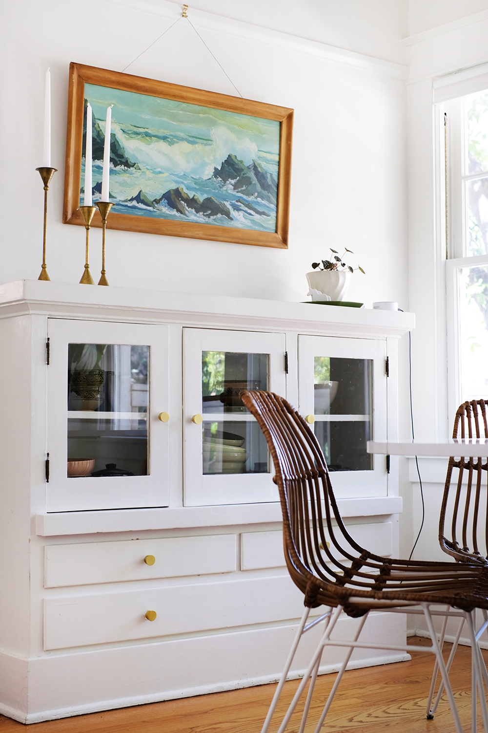
And this last example is really just for my own reference. I can never get enough of black + white, wood tones and natural fibers.
source

Little and big girls, come with a lot of stuff. Here’s hoping we can make it all look cute together. I’m giving one side of the bookshelves for Olivia’s things and the other for Denali’s. It should be a fun challenge to find a way to get their things to work together for a cohesive look.

Design

Houses Painted All White

January 23, 2018

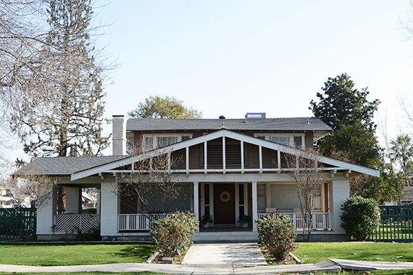
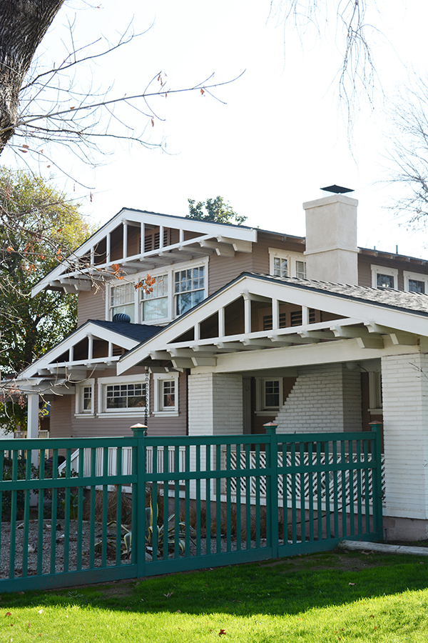
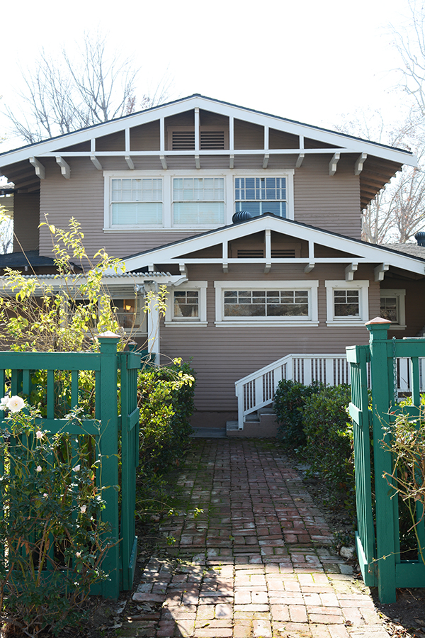
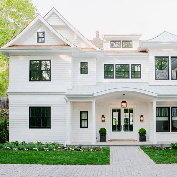
Ok, we bought our house a year and a half ago and we’ve known that it has needed to be painted since day one. It’s just a huge undertaking with a lot of scraping and sanding ahead of us. But, I think we are ready to start thinking about it. Here’s the deal – our house is a 1918 Craftsman. Craftsman are typically painted earthly tones and colors. My gut would be to go a shade of green or grey, but our neighbors on either side are green and grey. I feel like it might just end up looking blahhhh. I want it to stand out. Sooooo, I’m considering something a little controversial for a craftsman house, I’m thinking about painting our house all white! All White Houses are popping up all over in modern builds, and I LOVE the look. I’m hoping this will work with an old home as well. My mission has always been to show folks that you can live in an old house, preserve it’s character, and still have it feel fresh, young and current.
Here’s our house:

Here’s my main concern with painting the house all white – I’m worried that we will lose all the beautiful detail in trim and the different roof lines. It’s not a box of a house, it has a lot of unique shapes and angles.

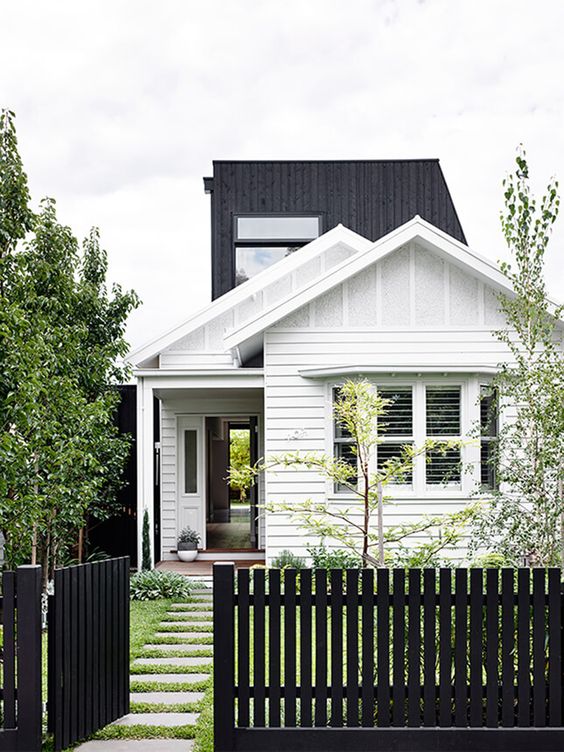
My true heart’s desire is to paint a house, any house,  all black (I’ve shared this desire with you before). But, the husband will not approve that. He wants our house to be as energy efficient as possible. And I have to agree that a black house in the desert is probably not a good idea. So, the plan is now to swing the opposite directions and maybe paint our house all white and add so black details. I’m sure what details will be black yet, but the thought has me pretty excited. I’m really not a beige house kind of gal. Yet, both of our houses have been beige. I didn’t pick the colors, we’ve just never painted an entire house, we’ve only lived with someone else’s choice. Oh, and as much as I LOVE the color green, I think the fence needs to be either black or white as well. A change sounds good right now!

Someone in the neighborhood also told us that she remembers for the house being all white in the 60s or 70s, so maybe we would be taking it back to it’s roots.

All White House

source

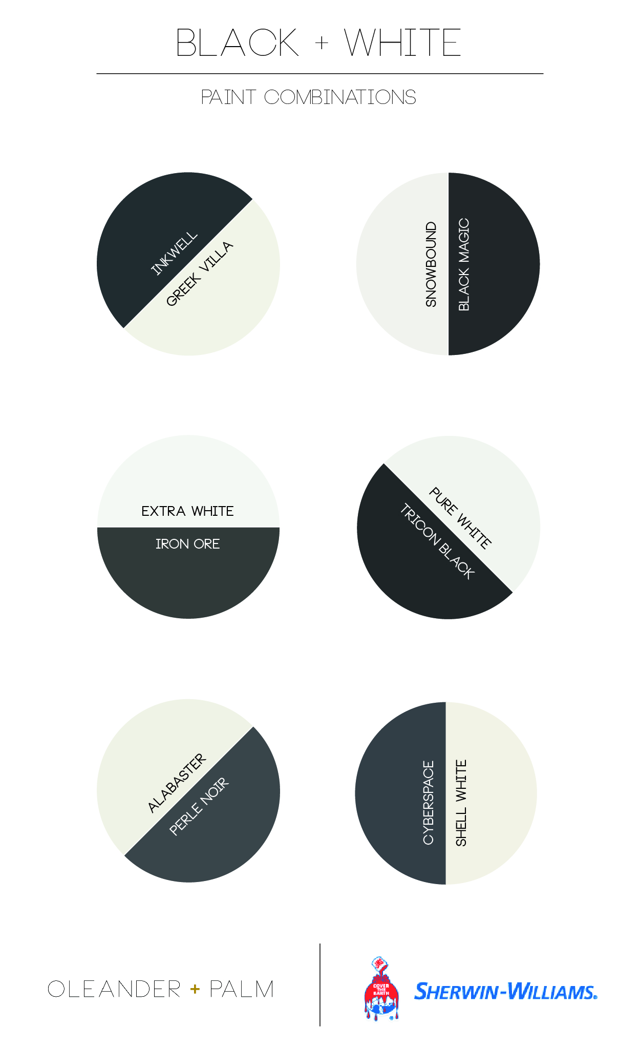
I might be getting ahead of myself. But, I’ve been looking at white and black paint samples and I’ve come up with some great combos. Sherwin-Williams is my go-to paint store, we have had such good results with their products. If you haven’t shopped for a paint color in a while, there are A LOT of blacks and whites out there. I’ve narrowed done my selections, so the next step is to paint them on the house and take a look at the colors in sun, shade and all the times of day in between.

Black and White Paint Combinations from Sherwin Williams

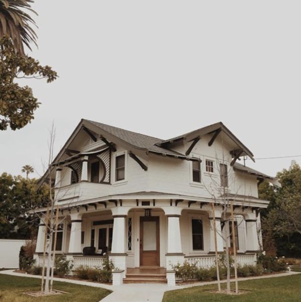
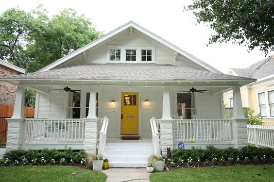
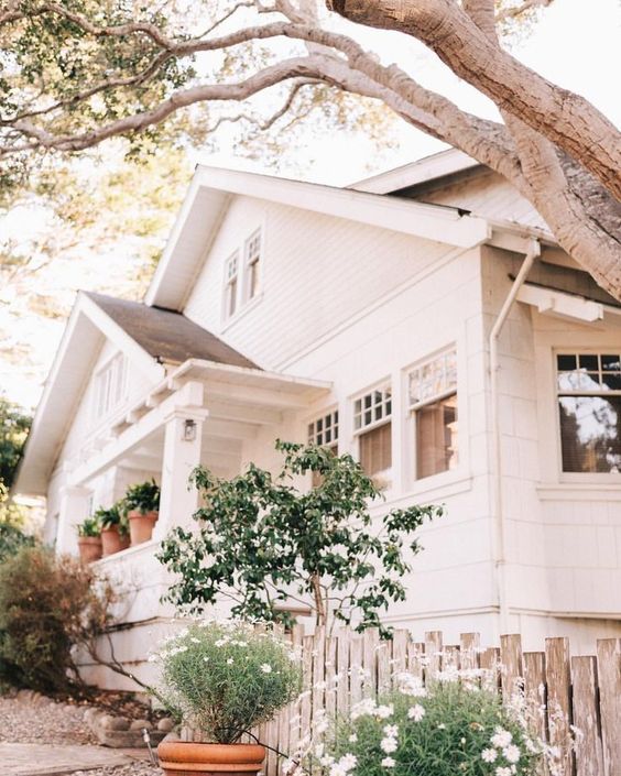
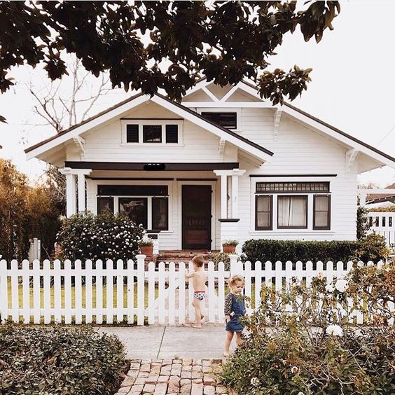
Ok, to backup my all white plan, I did a little searching for some good examples of craftsman and craftsman-like houses painted all white. I’ll tell you, they are not easy to come by. I don’t know if that is a good thing or a bad thing.

Now, go take a peek at what I’ve found and let me know what you think. Do you think this could work for our house? Can a craftsman be white? One thing I know for sure, these examples I’m sharing with you today are total show stoppers. You can’t deny that a white house feel crisp, clean and has a modern edge.

White House, Black Details

source

White Craftsman with Black Trim

source

All White House

source

All White House

source

White Craftsman House with Black Trim

source

All White House

source

All White Craftsman House

source

All White House

source

I’d love to know what you think. It’s going to be a BIG job and one that we won’t want to tackle again in the near future. So, we want to make the RIGHT choice.