Category Archives: Design

Design

Holiday Ready!

December 1, 2017

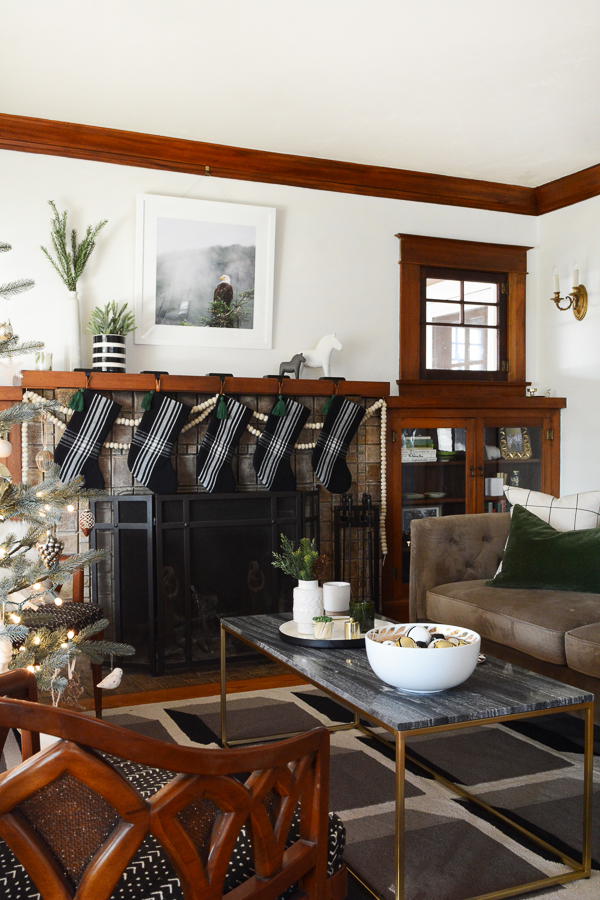
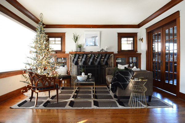
I can’t believe it! Our home is ready for Christmas on Dec. 1st. It’s truly a
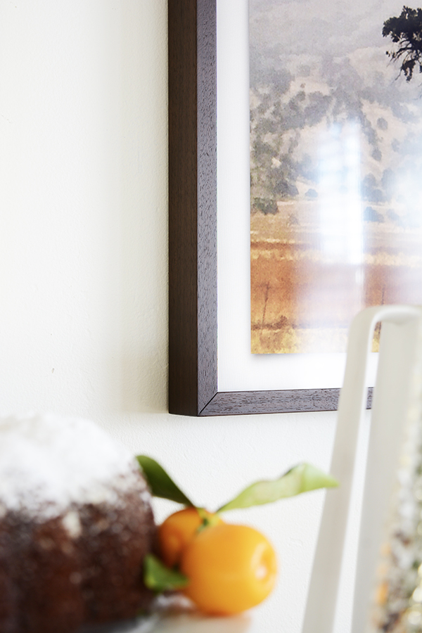
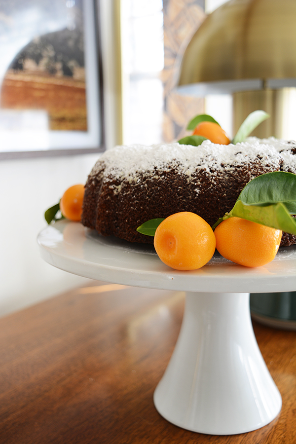
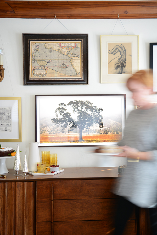
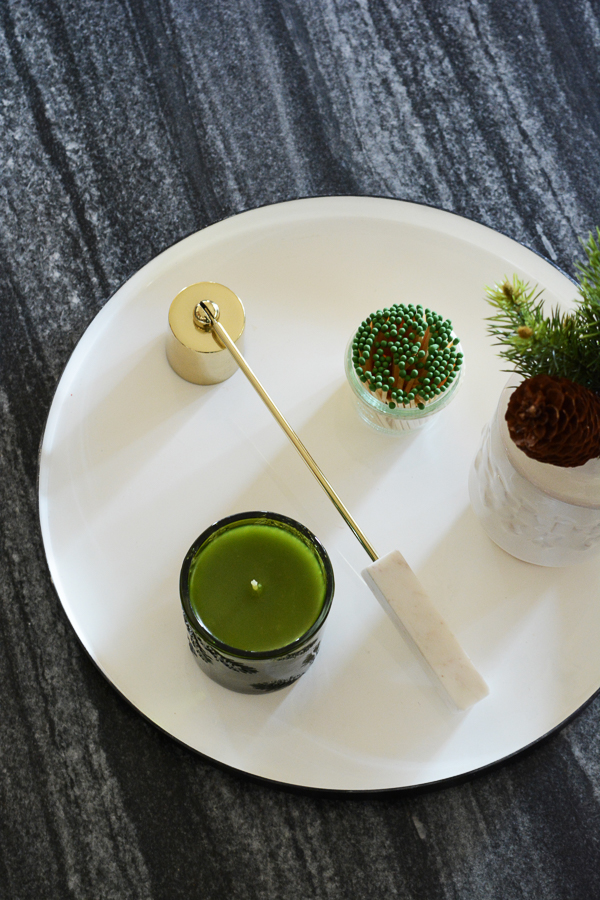
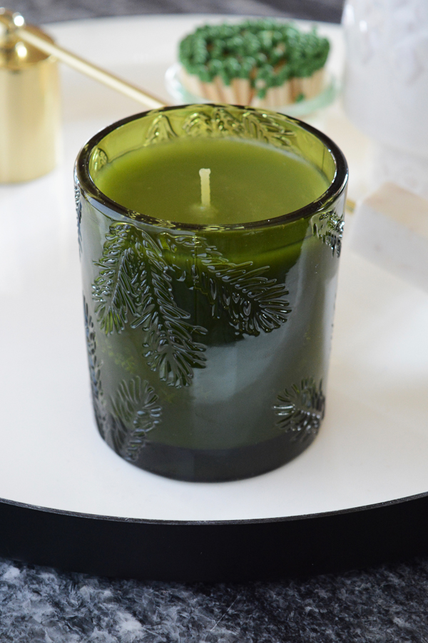
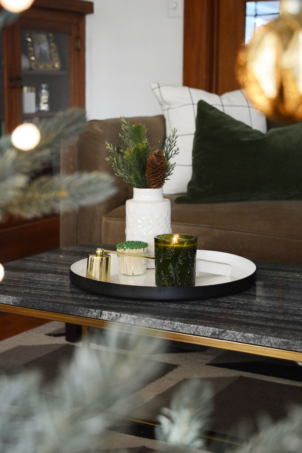
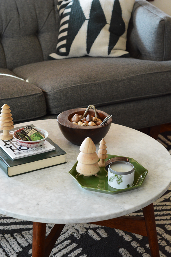
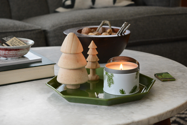
Christmas miracle. It feels so good to have our tree up and all the decorations out. Now, we can sit back and enjoy evenings by the fire and fall asleep by the glow of the Christmas tree. Ahh, this really is the BEST time of the year. This year, we did something new, we bought an artificial tree. We will be traveling for Christmas (like we always do) and we just thought this would be so much easier. Now, we won’t have to worry about our tree dying when we are gone. But, boy do I love the smell of a real tree. So, that we don’t miss out on the full Christmas experience, I have Thymes Frasier Fir Candles is every room! Oh my goodness, these candles smell just like a Christmas tree.
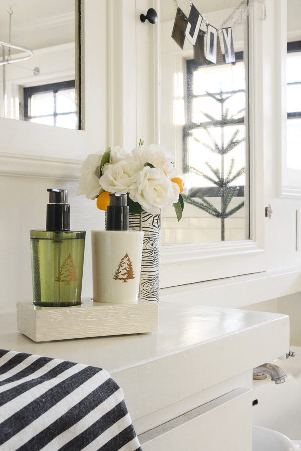
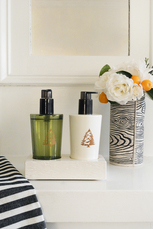
The Thymes Frasier Fir scent comes in a few different collections to go with the style of your home – Gilded, Heritage, Statement, Northwoods, and Joyeux. If you have been following me for a while, you know that I love the color green, so I picked candles and soap dispensers that complimented every room in my house.

Pictures are great, but I think sometimes a video really can bring you into a space. So, I made a little video to show you some of the pretty details and how great a candle can make a room look and smell.

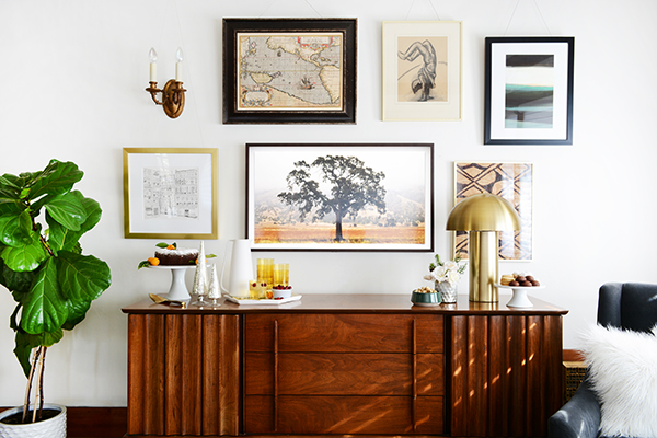
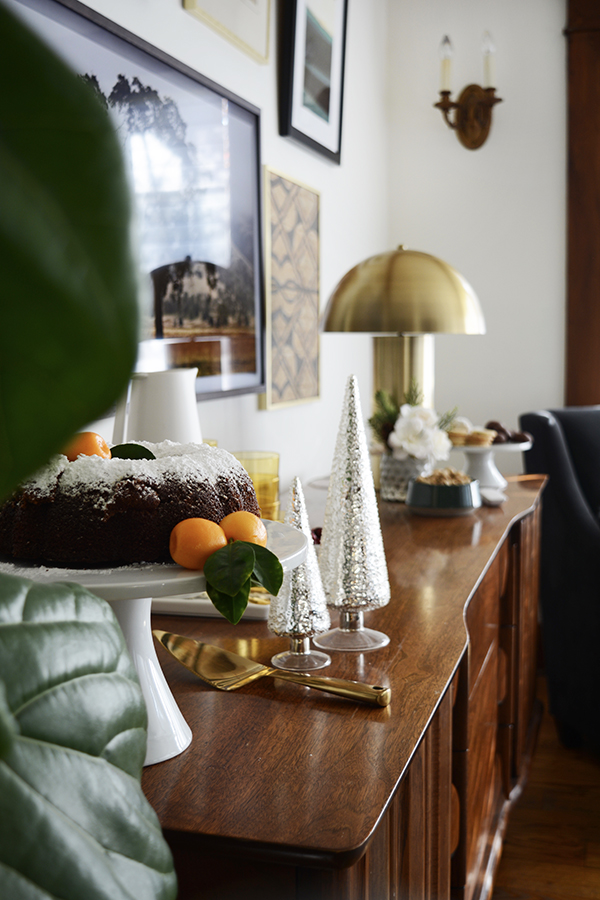
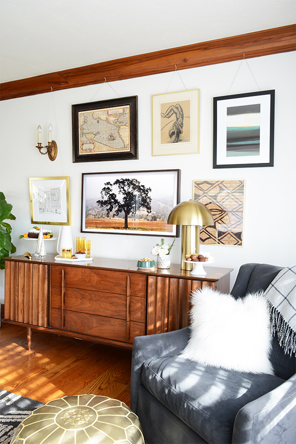
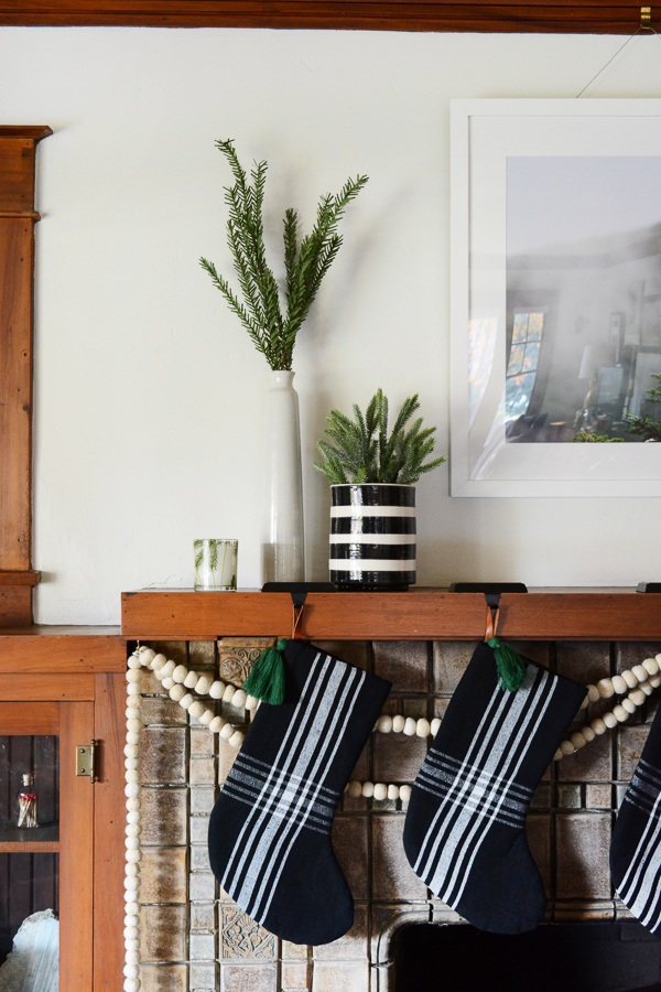
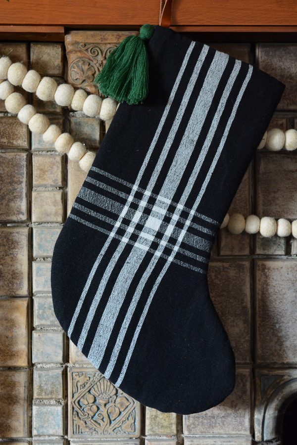
Every year I like to add something to our Christmas decorations. I don’t change up themes or color palettes. I really just stick with green and white and all the metalics and shiny things. So this year I added new stockings. I felt like out beautiful 100 year mantel desired new stockings.

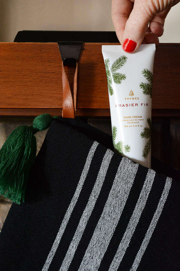
Everyone will be getting Thymes Frasier Fir Hand Cream in their stockings. It’s thick and creamy, but not greasy – just right!

My plan of attack to decorating for the holidays is to first of all put away most of my everyday knickknacks. Then, just start making little vignettes on any of the surfaces – like coffee tables and mantels. I try not to over do it. But, it sure is fun to have pretty Christmas things sprinkled throughout the house. And really, candles are as good as it gets when you want to have a little ambience.

Even bathrooms need a little Christmas cheer. I love this hand soap and lotion set. No ugly bottles here, and it comes in the cutest faux bois ceramic tray.

We also rearranged the living room and put the tree in the middle of the window. I actually really love it there. Now, it’s time to sit back and enjoy the season. Not an easy task, when life seems to get busier and busier each year. But, I’m going to light a yummy candle and snuggle up under and blanket and watch a Christmas movie with my family this weekend. I hope you can make sometime to really experience Christmas as well.

Thank you to Thymes for kindly sponsoring this post. All opinions are 100% honest & completely my own.

 

Design

Cost Plus World Market Black Friday Deals

November 20, 2017

Well, I think we can officially start shopping for Christmas. Thanksgiving is just about here and there are some GREAT Black Friday sales out there. I know I’ll be hitting my Bakersfield, Cost Plus World Market this weekend. I’ve got all the details for their awesome Black Friday event and 3 really fun gift guides to help you start your gift shopping. I’ve picked out some awesome pieces for the Coffee Connoiseur, the Budding Baker and the Hopeful Hostess in your life. Cost Plus World Market is a treasure trove of fantastic gift ideas, you don’t want to miss out.
Black Friday is going to be great! The 1st 100 in-store customers get a $10 certificate for Cost Plus World Market. And then on Saturday and Sunday, the 1st 100 customers will get a free tote bag. Also the 1st 100 customers in store on Friday, November 24th through Sunday, November 26th can play the Peru-se Our Store Instant Win Game. All you have to do is scratch the Golden Llama game piece to see if you are a winner! You could WIN one of 3 trips for 2 to Peru!
And there are some fantastic deals that you won’t want to miss like:

*Must be 18 years old or older to receive the $10 Certificate. Certificate is valid in-store on 11/24/17 only.  Not Valid online. Not valid on alcoholic beverages and gift cards. One time use only. No cash value or rain checks issued.

And now for some gift guides to help you start shopping.

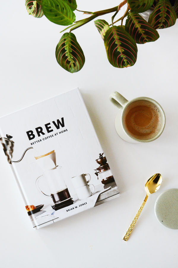
Covered Mug // Brew Book

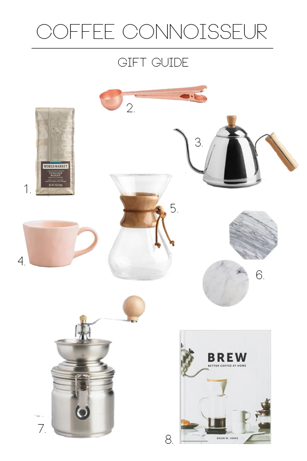
I think everyone knows a Coffee Connoisseur. You are sure to find some really great brewing equipment, good coffee beans, or just a darn cute mug at Cost Plus World Market.

  1. Italian Roast
  2. Coffee Scoop and Clip
  3. Kettle
  4. Blush Mug
  5. Chemex
  6. Small Marble Trivets
  7. Coffee Grinder
  8. Brew Book

Whisk // Rolling Pin // Napkin

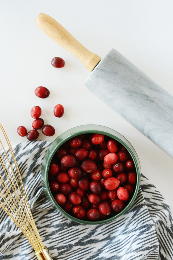
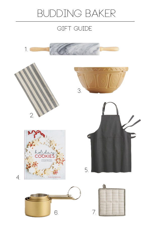
Not only does Cost Plus World Market have all the tools you need to start your Christmas Baking, they also carry a lot of the ingredients. I actually buy most of my spices, chocolate and nuts at Cost Plus World Market.

  1. Marble Rolling Pin
  2. Tea Towel
  3. Mixing Bowl
  4. Cookie Cookbook
  5. Apron
  6. Measuring Cups
  7. Pot Holder

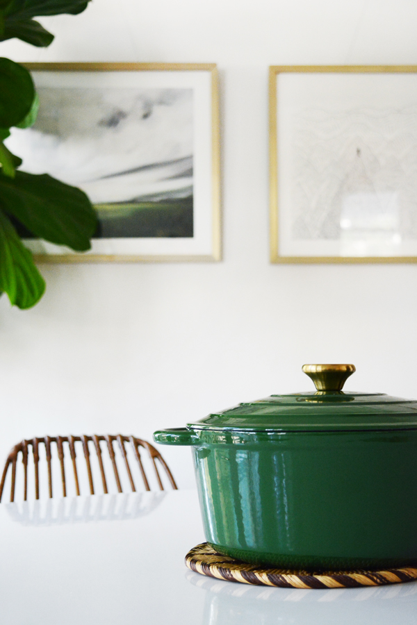
Cast Iron Dutch Oven

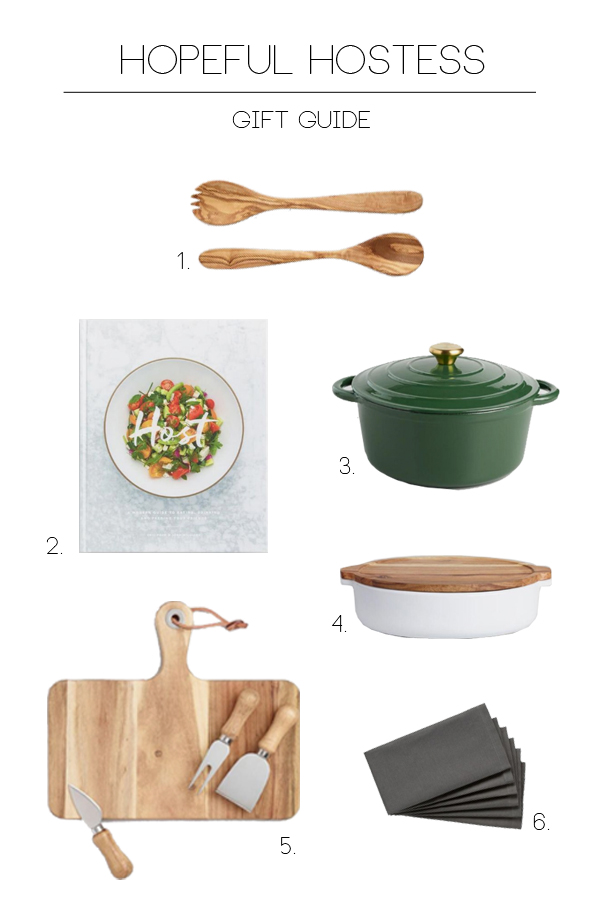
Do you know some that wants to host more dinner parties? If so, stock them up with all the essentials and you will be sure to be invited over for a home cooked meal. Cost Plus World Market makes Easy Entertaining a reality with everything from drinks, crackers, cheese, salami and all the yummy gourmet treats you need to get a party started. 

  1. Wood Salad Servers
  2. Host Cookbook
  3. Cast Iron Dutch Oven
  4. Covered Casserole Dish
  5. Wooden Cheese Board
  6. Dark Grey Napkins

The post is sponsored by Cost Plus World Market, thank you for supporting the companies that help make this blog possible. 

Here’s so of the deals I will be shopping:

Design

Black Shiplap Panelling

November 17, 2017

source

I’ve been itching to tackle another room in our house, but I just haven’t had time. So, in the meantime, I’m just going to keep planning and dreaming. Really, it’s the best part of a renovation or room makeover. It’s the part of any project that is most hopeful, exciting and definitely the least messy.

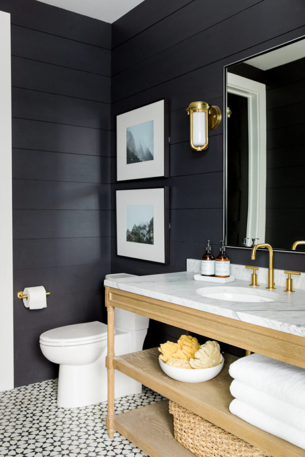
I’d love to take on our little powder room next. And since it’s a small space, I think it would be fun to do something dramatic like black shiplap panelling. I’m really not a fan of the white shiplap, it feels a little too country for my taste. And it might just be a tad overdone right now. But, painting it black feels a quite a bit more sophisticated to me. I’m such a huge fan of exterior siding painted black, but since I live in sunny southern California, this will never happen for me. So, I think I need to bring this look indoors.

Here’s a few good examples of black panelling done right. What do you think? Do you have opinions on shiplap? And do you prefer traditional white, or does a darker more your speed?

Black Shiplap

source

Black Shiplap

source

Black Shiplap

source

Back Shiplap

source

Black Shiplap

source

Black Shiplap

source

Black Shiplap

source

Design

One Sofa, Four Living Room Looks

November 10, 2017

I’ve got lots of new projects going on right now that I haven’t said too much about. I’m pretty excited about this latest project. And I think it’s going to be really fun to share the process with you here on Oleander + Palm. I’ve been hired to furnish and style two model homes in a brand new housing division here in Bakersfield. I’m so excited to be apart of Tarina Home’s newest project, Shamrock Hills. I’m going to make these model homes as O+P as possible, with lots of DIYs, thrifted finds and design on a budget. I firmly believe interior styling doesn’t have to cost a fortune, so I want to create spaces where folks can really experience attainable design.

Today I’m sharing a little teaser into the project. Wanna see what I’m going to do with the living rooms in the two houses?

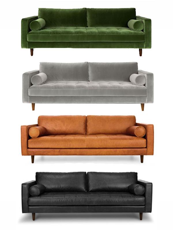
Sven Article Sofa

If I’m going to style a room that’s going to get noticed, I’ve got to start with a really great piece of furniture.

You know when something catches your eye, and you just can stop thinking about it? That’s how I feel about Article’s Sven Sofa. (PS this is totally NOT sponsored.) It’s just a beautiful piece of furniture. I love the midcentury leg, the square arm, the tufted seat cushion and all the gorgeous colors it comes it. I mean, what’s not to love?

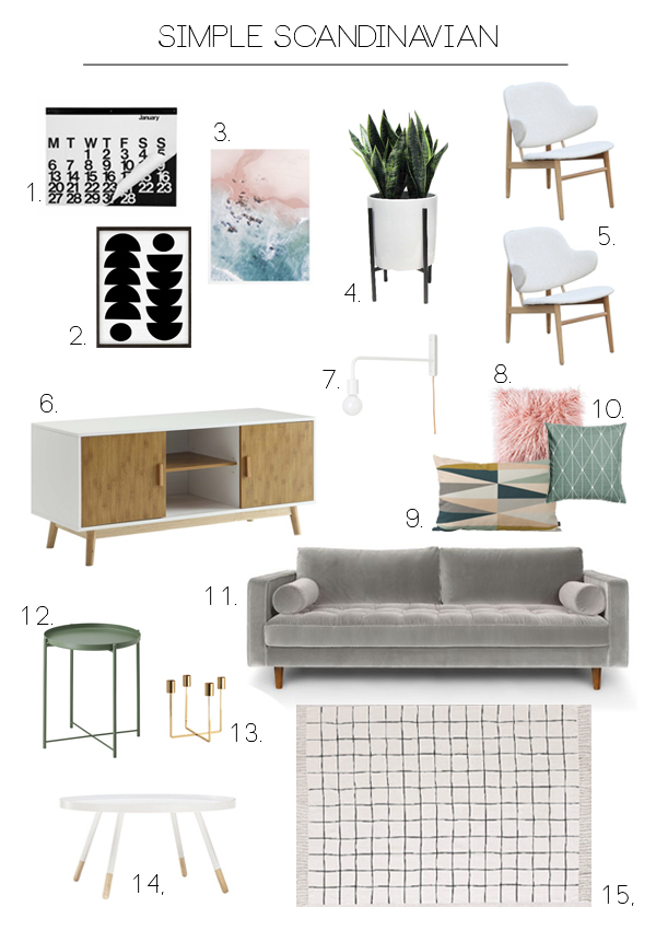
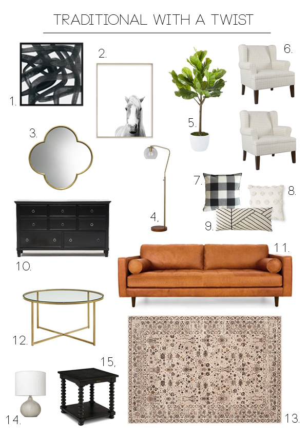
I’ve played with my four favorite versions of the Sven and designed four living rooms to go with them. I feel like the Sven Sofa is one of those classic pieces of furniture that works well some many different styles.

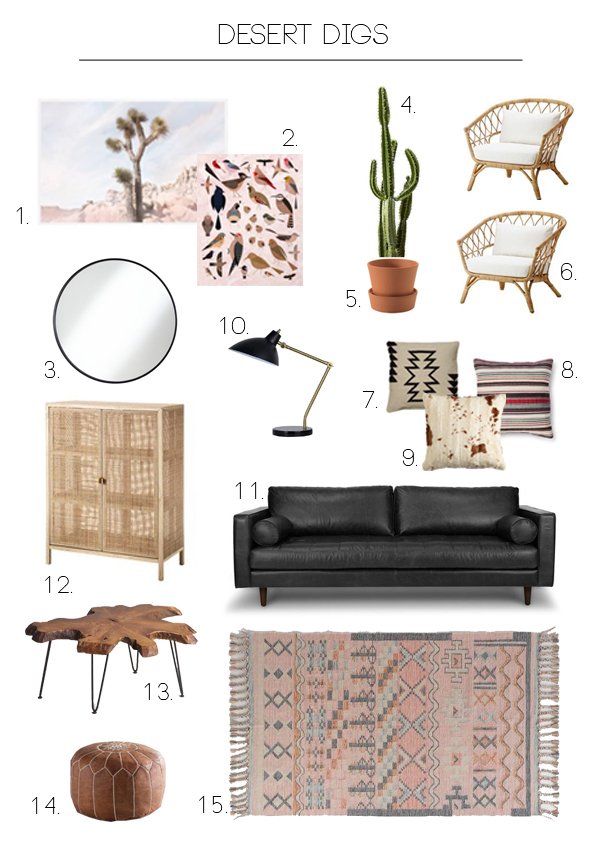
I love the casual vibe. It actually feels right for Bakersfield. We really do live in the desert. I love this strong black leather contrasted with all the pale, natural textures.

  1. Joshua Tree Print
  2. Bird Illustration
  3. Round Mirror
  4. Faux Cactus
  5. Terra Cotta Pot
  6. Wicker Chairs
  7. Black Tribal Pattern Pillow
  8. Striped Pillow
  9. Cow Hide Pillow
  10. Black and Brass Lamp
  11. Sven Black Leather Sofa
  12. Rattan Cabinet
  13. Live Edge Coffee Table
  14. Leather Pouf
  15. Pink Patterned Rug

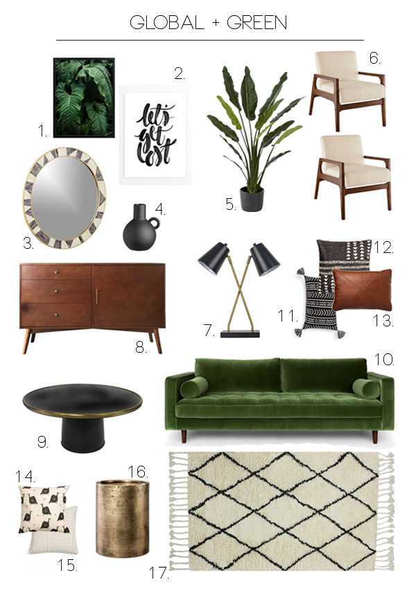
This green sofa gives me all the heart eyes. This look feels a tad sophisticated but still hip and fresh.

  1. Tropical Leaf Print
  2. Typography
  3. Round Mirror
  4. Vase
  5. Plant
  6. Midcentury Chairs
  7. Double Lamp
  8. Midcentury Side Board
  9. Round Coffee Table
  10. Green Velvet Sofa
  11. Tassle Pillow
  12. Black and White Pillow
  13. Leather Pillow
  14. Bird Pillow
  15. Cream Pillow
  16. Brass Side Table
  17. Rug

If you’ve followed here for a while, you know I might be a fan of a pastel Scandinavian look. This look feels like something new for Bakersfield.

  1. Calendar
  2. Black and White Print
  3. Ocean Print
  4. Plant
  5. Chairs
  6. Side Board
  7. Wall Sconce
  8. Pink Fur Pillow
  9. Triangle Pillow
  10. Green Geometric Pillow
  11. Grey Velvet Sofa
  12. Green Side Table
  13. Brass Candle Holder
  14. Round Coffee Table
  15. Grid Patterned Rug

I don’t think my style is very traditional usually, but I do love a few pieces from this style here and there. This look feels the safest, but hopefully not boring.

  1. Black and White Art
  2. Horse Print
  3. Mirror
  4. Floor Lamp
  5. Faux Fiddle Leaf Fig
  6. Wing Back Chairs
  7. Buffalo Check Pillow
  8. White Pom Pom Pillow
  9. Black Lines Pillow
  10. Black Dresser
  11. Camel Leather Sofa
  12. Brass Coffee Table
  13. Cream Rug
  14. Lamp
  15. Turned Leg Side Table

So, which living room do you like best? And why? If I was picking for my house, I think the Global + Green feels most like my current style.  This was a fun creative challenge for me. And I can’t wait to share with you which two styles we are going to bring to life in the models. I’m hoping to take you along every step of the way. So stay tuned.

First stop is the Pasadena Flea Market this weekend!

Design

Brandwell

November 9, 2017

I’ve mentioned this on social media, but I thought I should announce Brandwell here as well. I’m so excited to be apart of this “brand” new adventure.

Here’s what Brandwell is in a nutshell. Brandwell is a game changing brand workshop for you and your business. It’s a two-day immersive workshop that will help you brand and capture your business through strategy, design, content and business planning.

Brandwell Workshop

I’ve teamed up with Shannon and Ashlee of Purveyor House to bring this new project to life. I’m so excited about this collaboration. It feels so good to be working with a team. It’s hard to be working along everyday. I’m really enjoying the community and feedback that I don’t get by working alone here with Oleander + Palm. It’s nice to not have the weight of EVERYTHING on my shoulders alone. We all have strengths in different areas, so it’s fun to see this take shape. It’s also great to be doing something locally here in Bakersfield. I am very passionate about helping our city reach it’s potential. Equipping local business for success feels like a great place to be right now.

Brandwell Workshop

Now, back to the details of the Brandwell Workshop. We are hosting our first workshop January 26-27 here in Bakersfield, CA. This is going to be a very limited space workshop so that we really can work one-on-one with businesses. It’s called a workshop, and it really is a hands-on workshop. This won’t be just be feel good pep talks or inspirational messages, the workshop is going to give businesses real takeaways in the form of customized strategy and even content and imagery that is ready to be used on social media platforms.

Brandwell Workshop

This is just the start, we have BIG hopes and dreams for Brandwell. You can follow along on Instagram for some helpful tips and tools and definitely sign up for the newsletter!

brandwell workshop

Design

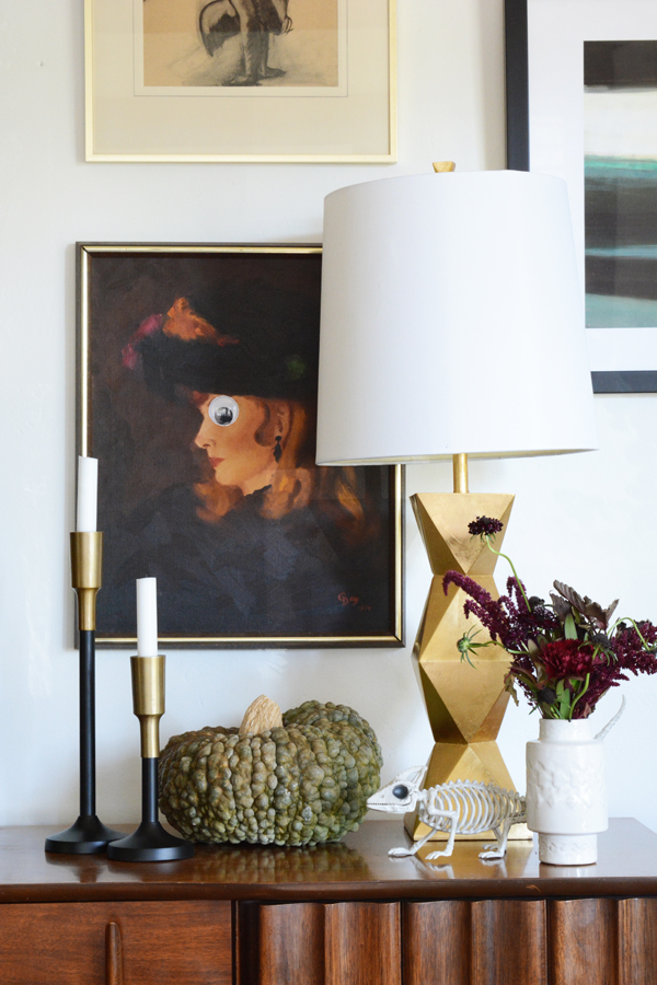
Our House Decorated for Halloween

October 25, 2017

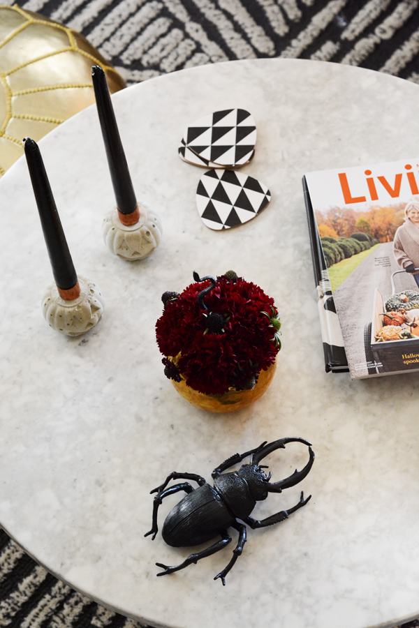
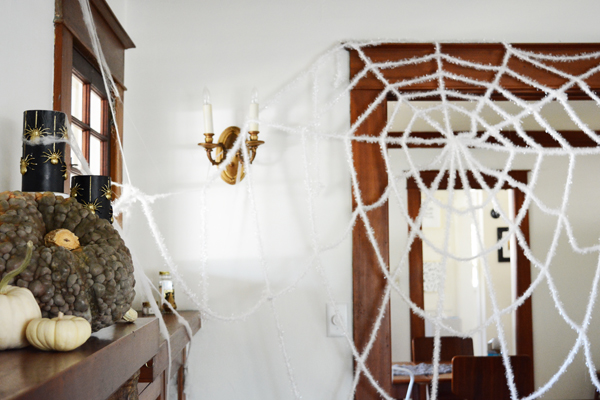
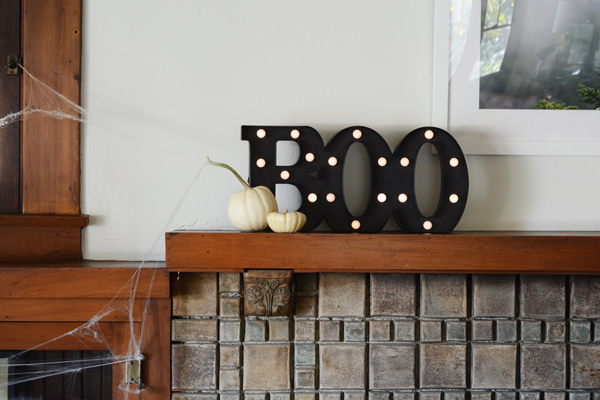
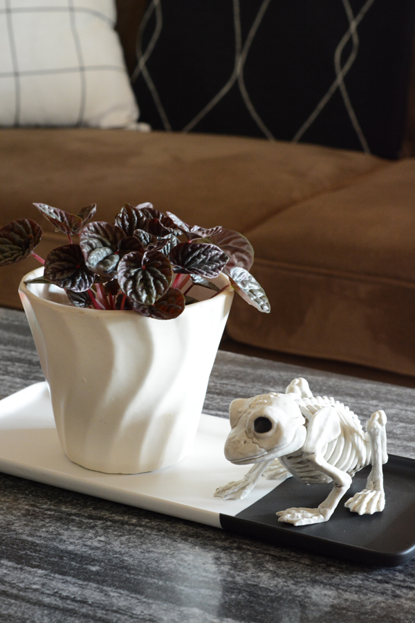
Today I’m sharing all the little Halloween details we’ve added around our house for this spooky season. Olivia LOVES it. We had so much fun hanging spider webs and sticking plastic bugs and spiders everywhere we could think.

Home Decorated for Halloween

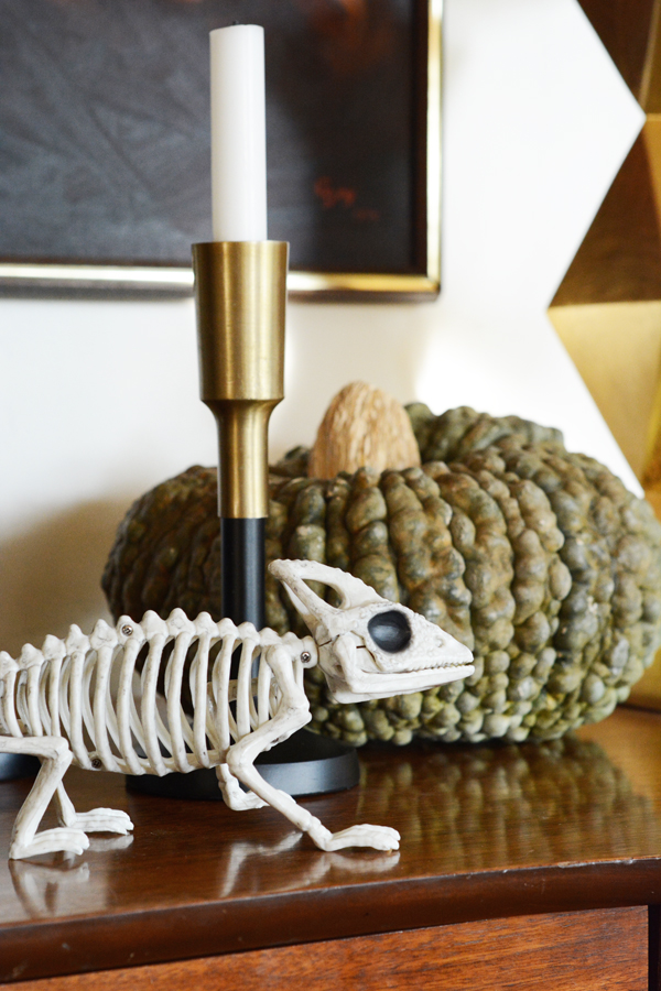
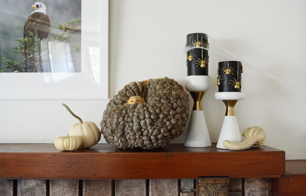
We are hosting a Halloween party again this year, so this is the first layer of decorating. Creepy skeletons and animal parts in jars will come home from Lonnie’s classroom closer to the party. None of this is magazine worthy, or overly styled, I just thought you’d like to see a little peek into how our house looks right now. Maybe there will be an idea or vignette that will catch your eye and inspire you. We’ve collected lots of Halloween bits and pieces over the years, but this year we added some really fun Martha Stewart decorations from Michaels.

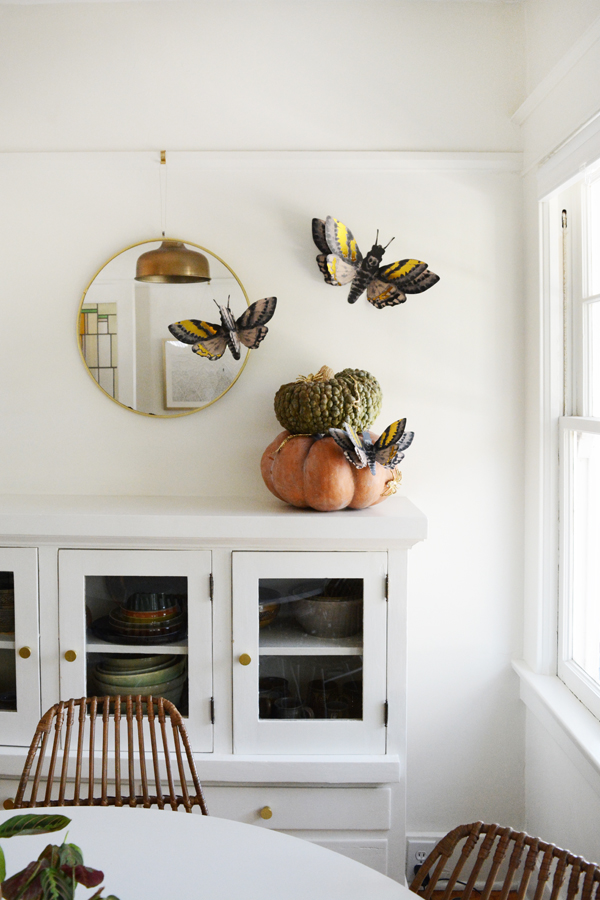
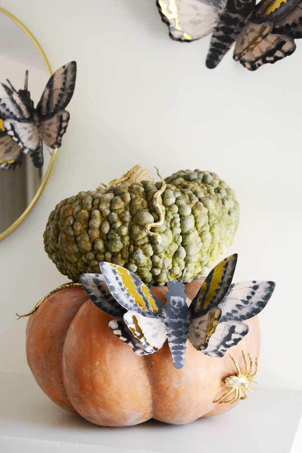
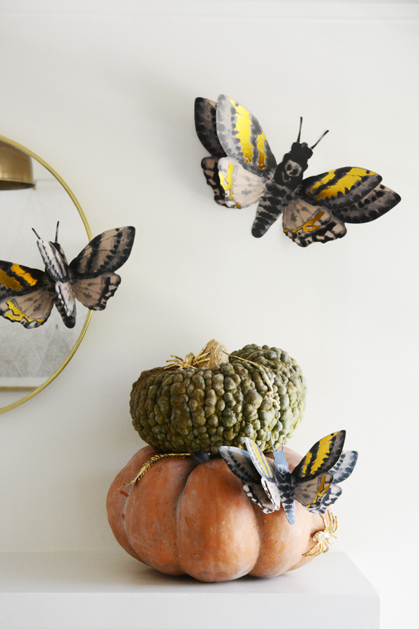
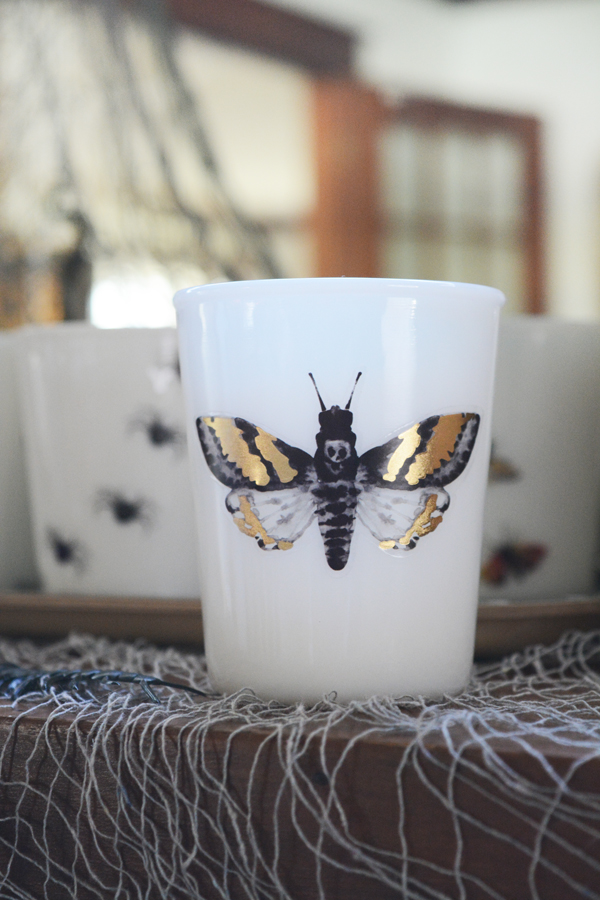
I don’t think our decorations are over-the-top, but I did sprinkle a little creepy, crawly all over the house. These gold foil moths are my favorite addition. I love them with a couple pumpkins and some plastic bugs I gold foiled in our sunroom.

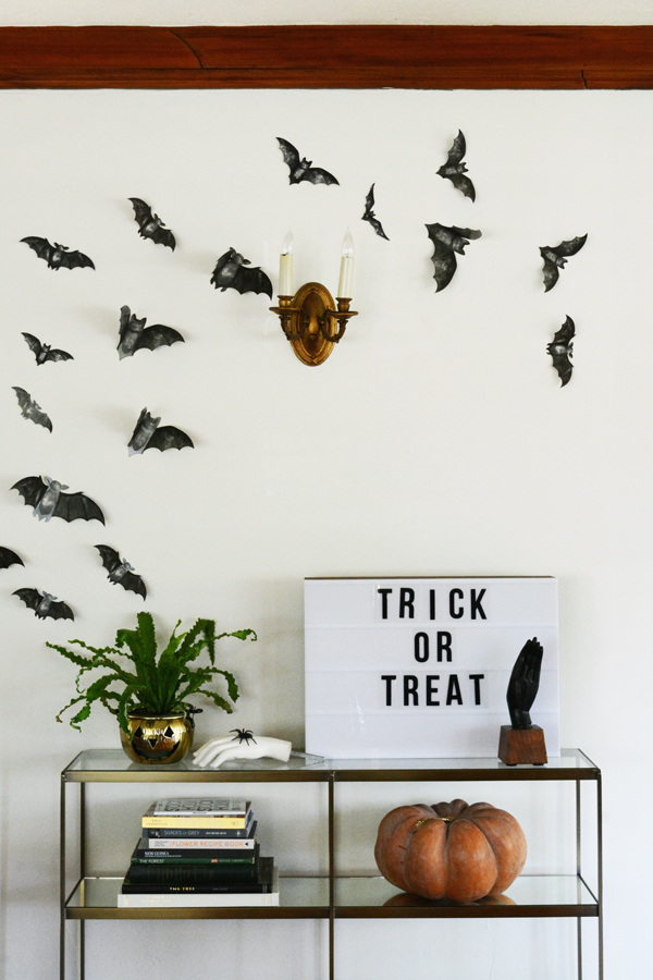
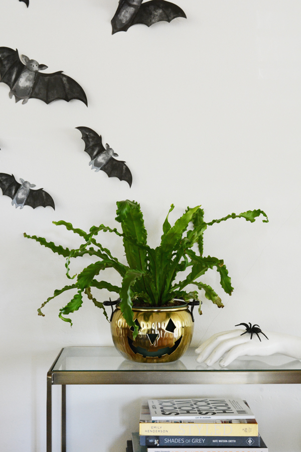
I wall of bats swooping across it is always a good idea. This is a quick and easy way to add a bunch of Halloween drama with very little effort.

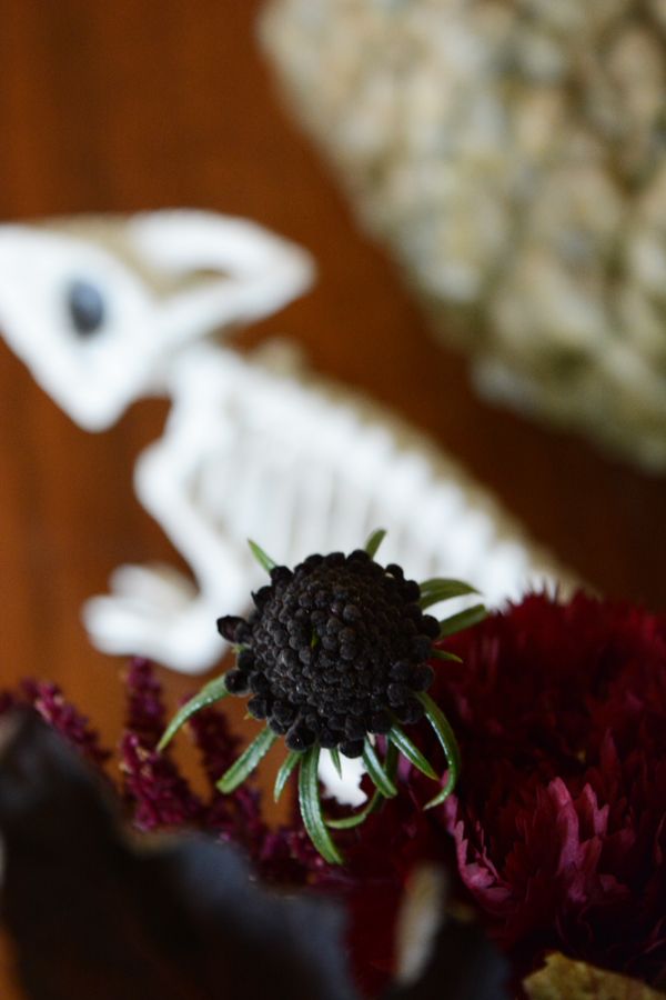
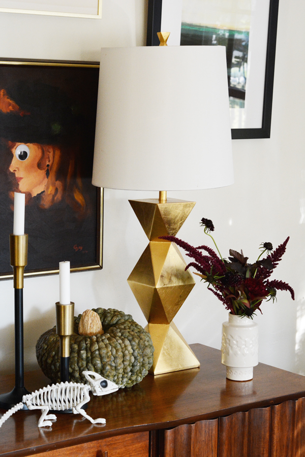
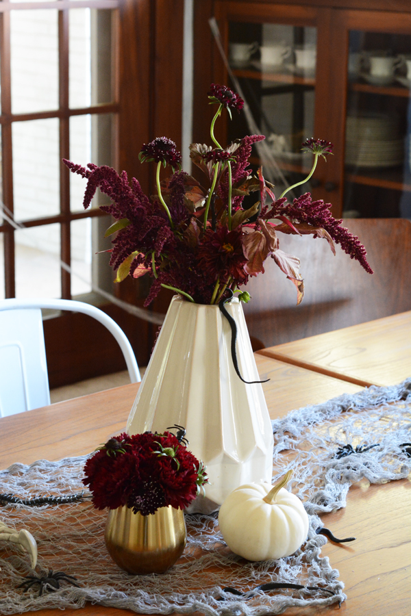
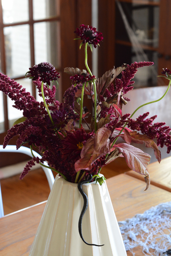
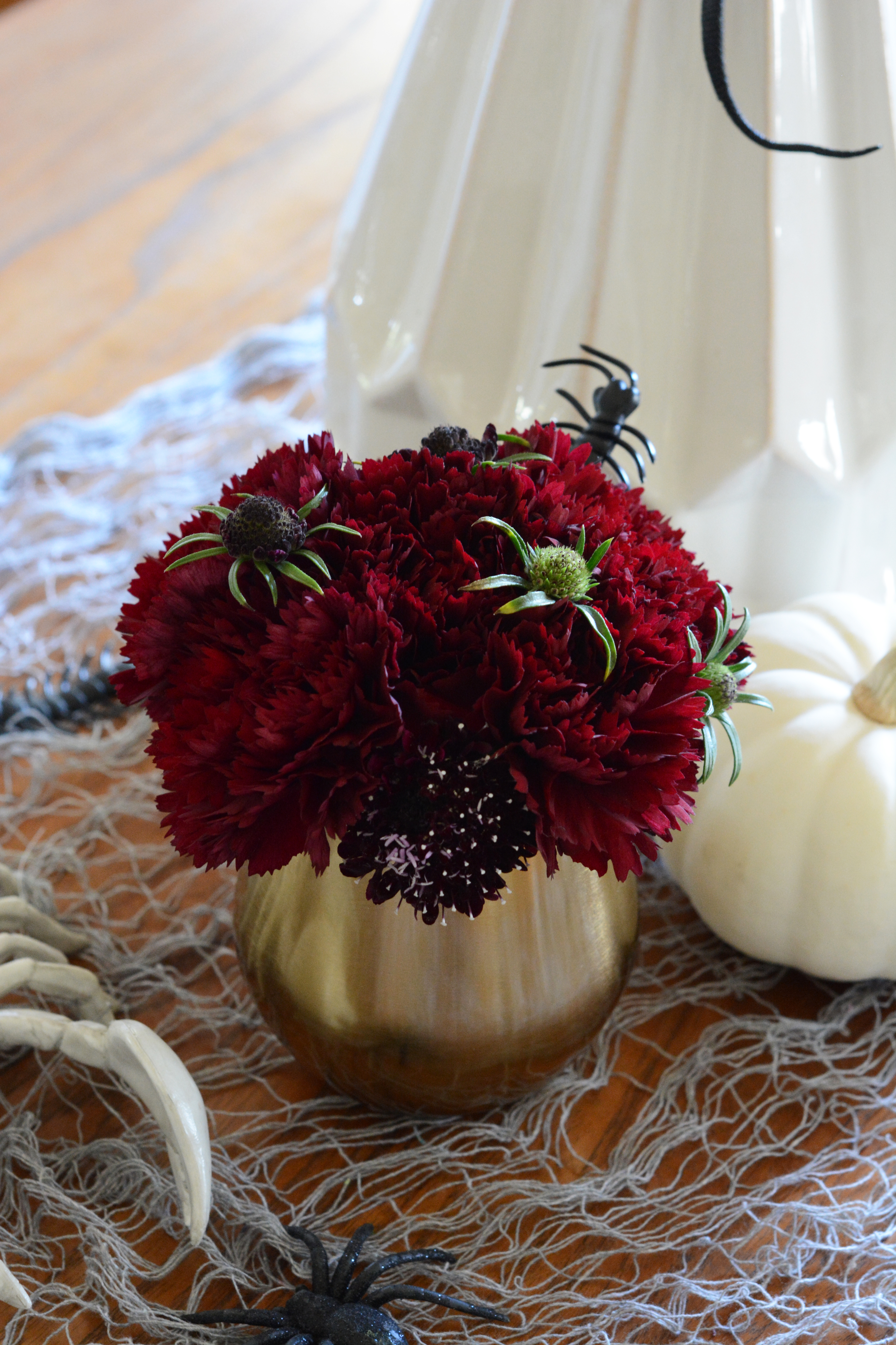
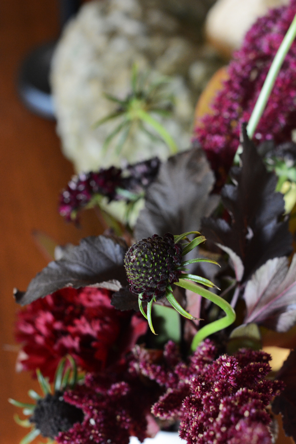
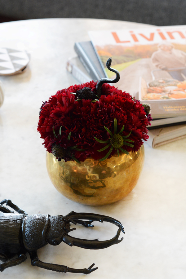
I added some florals to our living room and dining room. Keeping with the sinister vibe, I chose dark crimson reds, deep burgandys and little black buds. I also added more little plastic spiders and snakes creeping out of them.

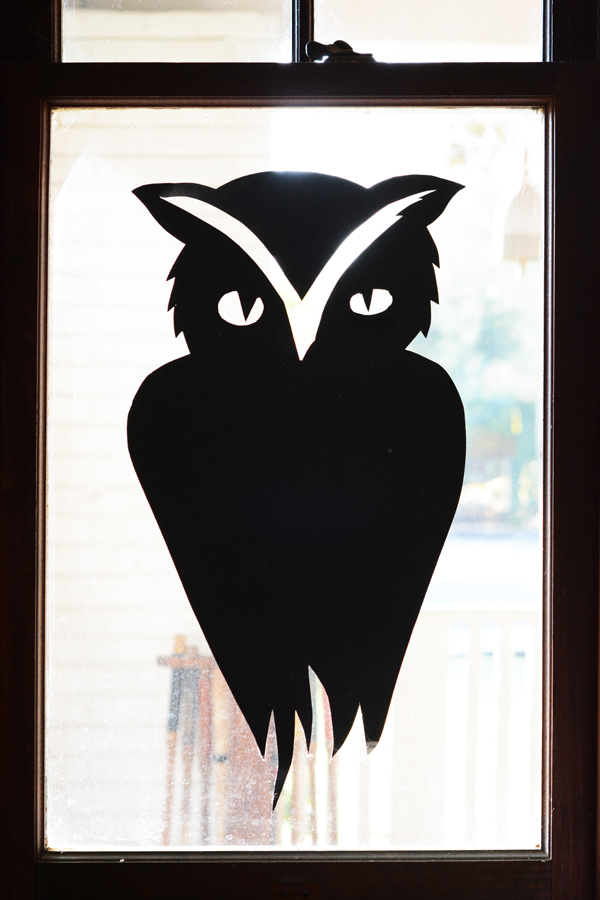
Probably about 8 years ago, the kids and I cut out a couple of these owl silhouettes for our windows. They are one of my favorite Halloween decorations and they are just made out of black poster board.

The cement pumpkin candle stick holders are a DIY from a Halloween past.

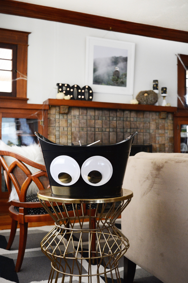
I love to stick eye balls on planters, paintings and this year I added a big pair to the candy bucket.

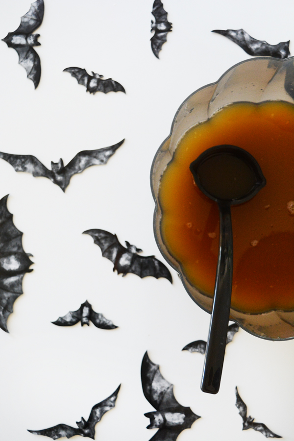
When the day of the party hits, I’ll scatter more bats cut outs around. They are a quick way to add a festive feel to a table top.

Moth, spider and snake stickers added to glasses instantly gives them a spooky edge.

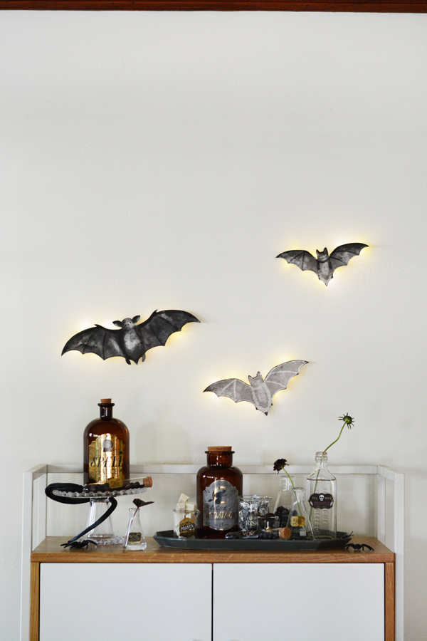
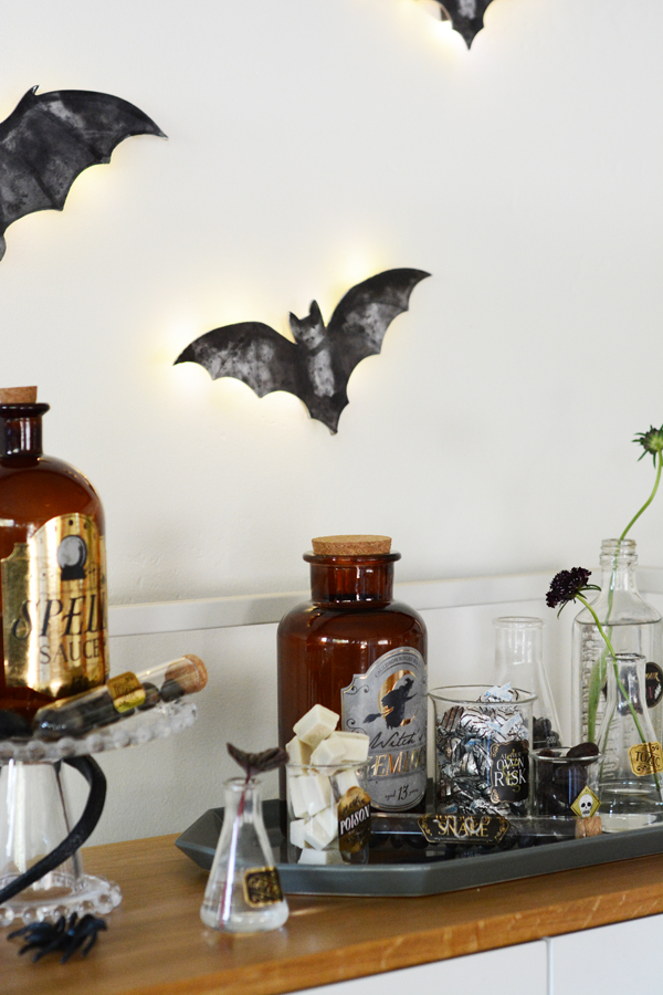
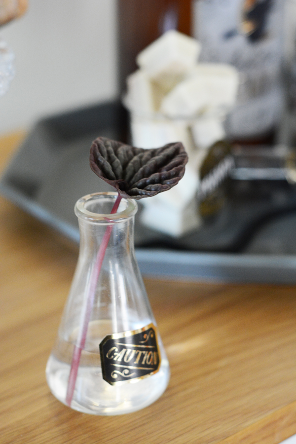
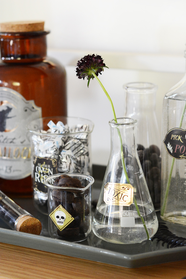
Years ago I started collecting beakers, flasks and old bottles. I added fun labels to them and filled them with sweets and flowers for a dangerously delicious candy bar.

And a few light-up bats watch over the treats.

So, I hope you enjoyed a little tour of our house all decked out for Halloween. And now I better go finish those Halloween costumes.


Design

Mini Hallway Office

September 21, 2017

Well, I hope you are as excited about my little mini hallway office as I am. As you know, I was tired of working from the kitchen table. I needed a permanent place for my computer and most importantly, I needed a “real” office chair.

Mini Hallway Office with wall mounted desk.

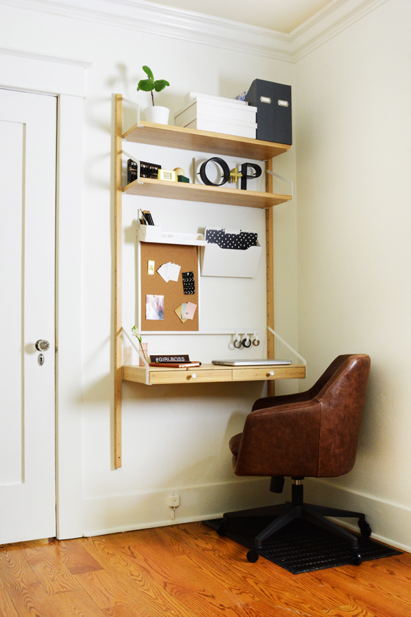
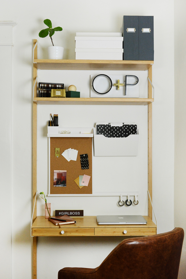
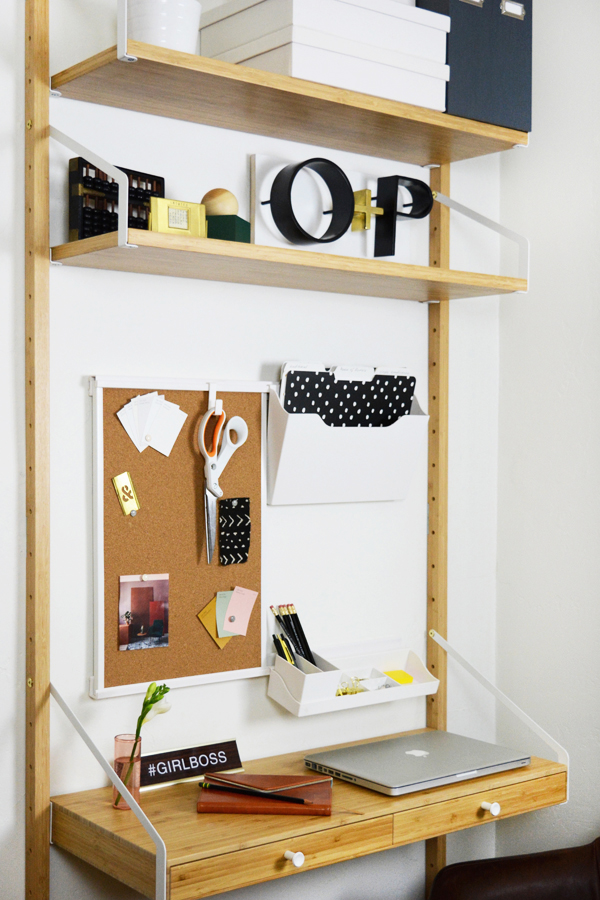
This little space is kind of our hallway/landing. But, I felt like it was an unused space just begging to be useful. On the floor is the grate to our AC intake, so I really struggled to find a piece of furniture that would work here and not cover it up. I decided a wall-mounted desk was the best option with such an uneven floor surface. I hunted down some really great options, you can see them here. I decided on the Svalnas IKEA desk. The price was definitely right at under $150 for the combination I chose and I loved the compact, light, airy feel of this piece. It definitely has a Swedish look about it.

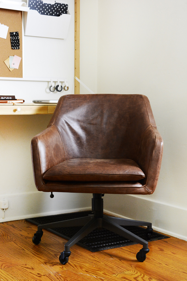
The chair was super important. I blame it on being 40, but my back was just so tired of sitting in a stiff kitchen chair. And even if you aren’t 40, I’m pretty sure a good desk chair is important when you are in front of a screen many hours of the day. While finding a comfortable chair was important, I also wanted something stylish. This is a major corridor in our house and I didn’t want an ear sore there. So, I rounded up some super stylish options. And lady luck was on my side, because West Elm just happened to have a flash sale the day I was ready to order a chair. And, don’t hate me, but I got the Helvetica Leather Chair for a fraction of it’s usual price. It’s usually $599 and I paid $229!!!! Yep, pretty happy about that. I should be 100% honest with you, I think it’s probably a little big for the space and the size of the desk, but I’m going to over look that because it’s just SO DARN COMFORTABLE! Sometimes function wins, and really it’s a handsome chair, just really big handsome chair!

Mini Hallway Office with wall mounted desk.

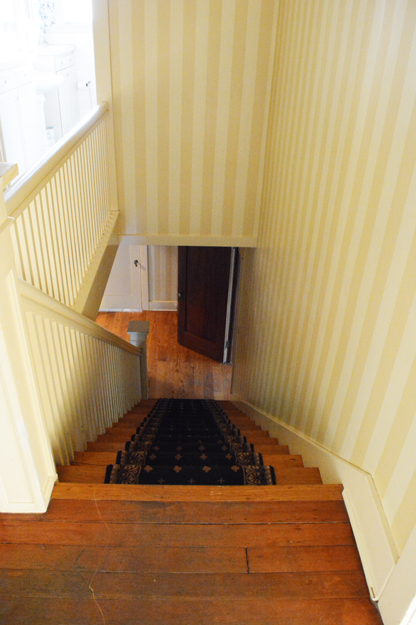
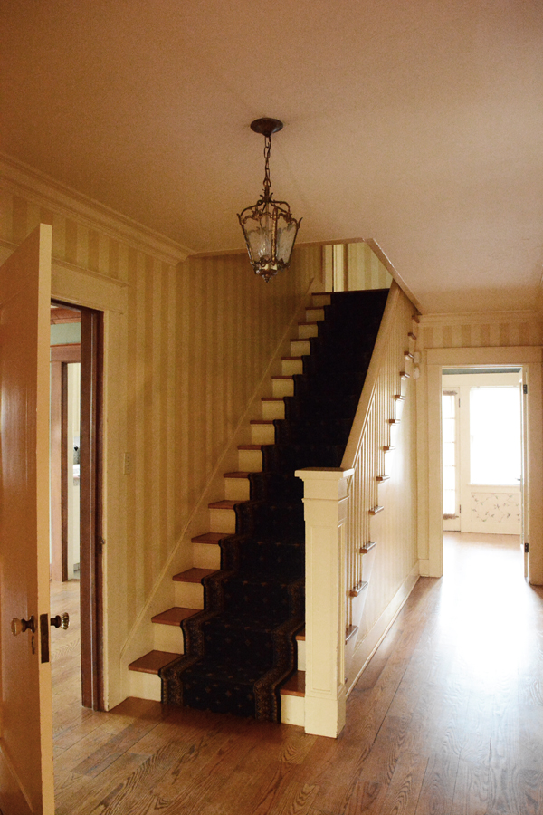
This was a big project (keep scrolling to see before pics). I’m sure it doesn’t look like it, but by the time we stripped all that awful yellow striped wallpaper and primed and painted and painted everything white some more, I wasn’t sure if we’d ever get it done. But, it’s FINALLY done and have a little corner to call an office. It’s not much, but it’s pretty much perfect as far as I’m concerned. I have a little bit of storage, a very comfy chair and surface that is just for my computer (and I don’t have to move it when it’s time to eat).

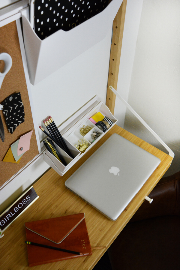
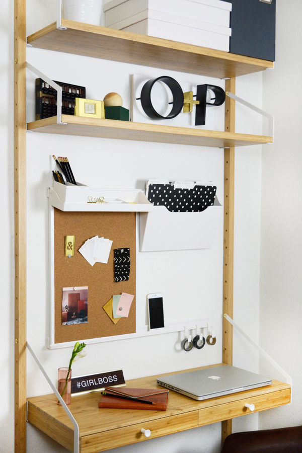
I really wanted to maximize storage and organization in this tiny area, so I installed Martha Stewart’s Wall Manager System. It’s awesome, I just installed two rails and then all the accessories, like the cork board, hanging shelf, hanging file sorter, and hooks just slide or hook on. You can change things up and move them around to what works best for you. I feel like a have a little command central now for Oleander + Palm.

I also added Martha Stewart’s Stack+Fit Magazine Files and File Boxes to hide some of the clutter and keep things in order. All these great Martha products can be found at Staples.

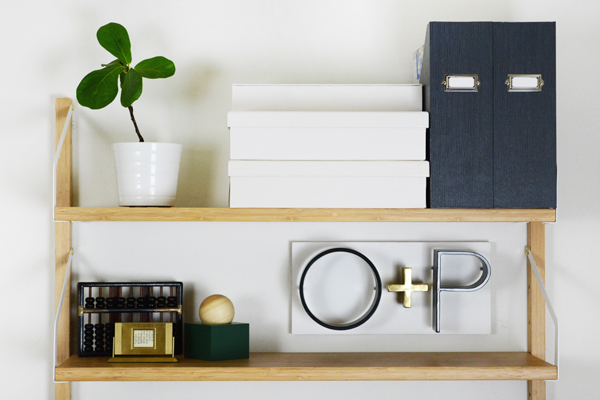
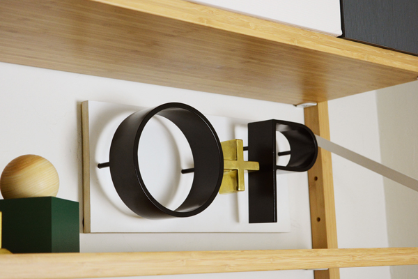
And most importantly, I now have a place to hang with O+P sign that my brother, Ash, welded for me for my birthday. I feel legit!


See (in the image above and below), you can move around the different components super easily. If I need more table top space, I move the hanging shelf to the top of the cork board, but If I want more space for notes and pinning things on the wall I can move the shelf to a different spot. Oh and the cork board also has a white board on the other side, so I can flip that around too.

So, are you looking to carve out a little work space for yourself or maybe just a place for homework? You don’t need a spare bedroom, a home office or even a room at all, a landing or even a hallway will do.

Oh, and here’s some befores of the space:

As you can see, SOOOO MUCH WALLPAPER!!!!!!! This first shot is taken from the top of the stairs. I took that open door off to give the space a little more room. That door leads to the dining room. The door to the left of the desk leads to the living room. Next on the never ending to-do list is the stairs. I will be painting the banisters soon and figuring out what I want to do with the carpet runner. It is definitely going, I’m just not sure if i want to install another runner or do away with carpet on the stairs all together. Most likely there will be no carpet. I find that it’s just a place to attract dust bunnies and cat hair.

And one more thing, the light fixture has been replace, don’t you fret about that.


Design

Simply Grove Shop

September 18, 2017

If you are not familiar with Kirsten Grove’s blog Simply Grove, you are missing out. I’ve been a long time fan of EVERYTHING she styles. This lady has impeccable taste and has an eye for what is new and fresh. I’m so excited that she has opened a shop. The brick and mortar is in Boise Idaho, which I will visit this Christmas (because that’s where Lon’s family lives), but don’t fret, there’s a fantastic online shop as well.

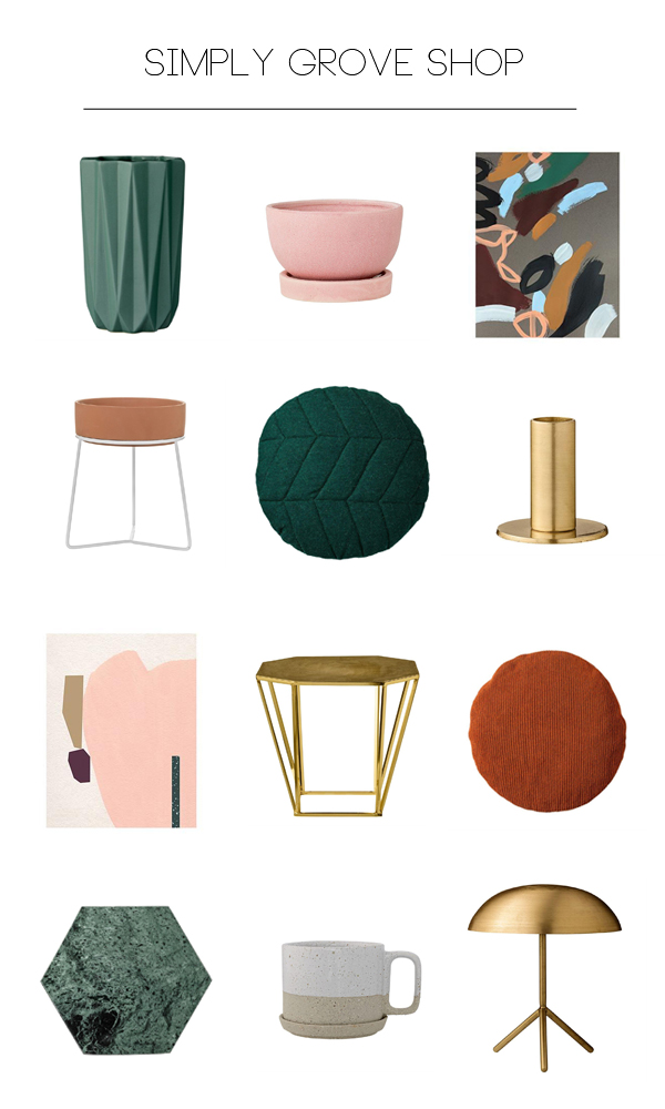
I thought I’d share a few of my favorite picks from the Simply Grove Shop. Kristen’s shop has everything I want, in all the right colors. Her style is modern and clean, but usually with a little mid century vibe and touch of boho. So many of her pieces look and feel like all the pretty things I saw in Sweden but, couldn’t bring home in my suitcase. Oh, and you are going to be so pleasantly surprised by the prices. And O+P readers get 10% their first order, just enter the code OLEANDERANDPALM! 

I’m sure you will see many of these pieces in the next space a style.

1 // 2 // 3

4 // 5 // 6

7 // 8 // 9

10 // 11 // 12

Anything catching your eye? The quilted round green pillow is probably a must. I’m thinking it will be my first purchase.

Design

Gallery Wall Layouts and Free Downloadable Art

September 8, 2017


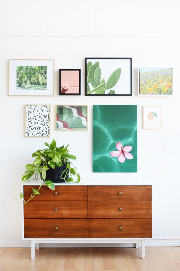
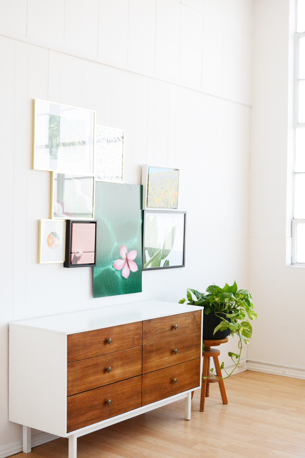
I’m still a big fan of the gallery wall. It’s a fun way to display a large collection of art. If you have a few smaller pieces, once they are grouped together they create one larger statement piece.  I’ve partnered with Mixbook for another fun post. I’ve got how-to’s and free downloadable art, what more could you ask for in life?

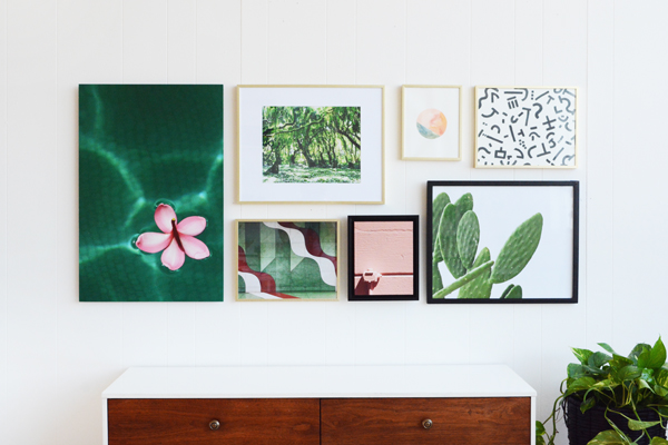
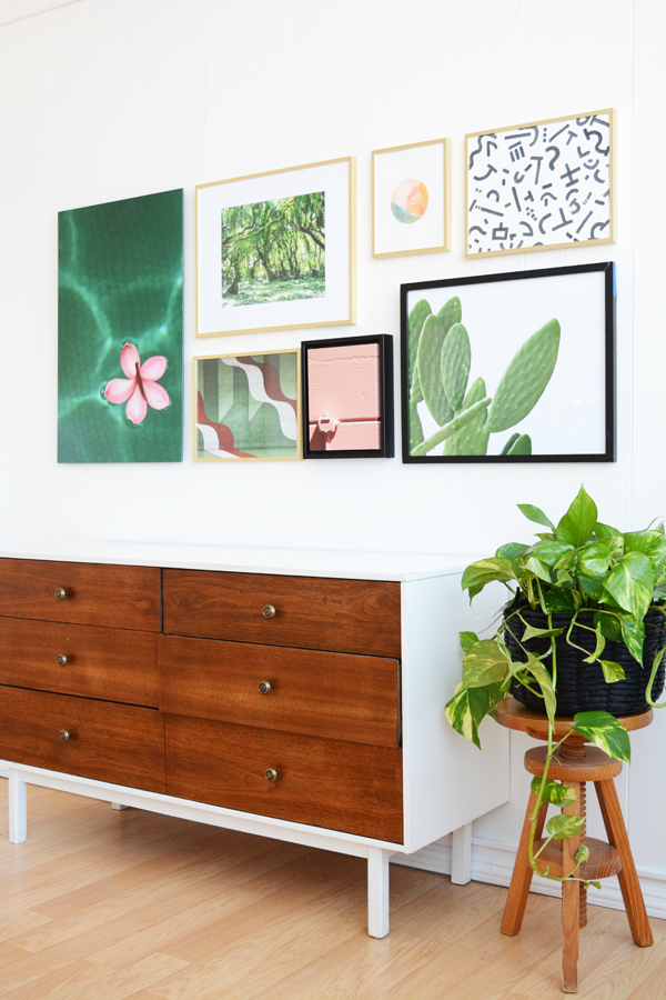
I’ve come up with 5 easy-to-install gallery wall layouts for you.

Gallery Wall Layout Ideas

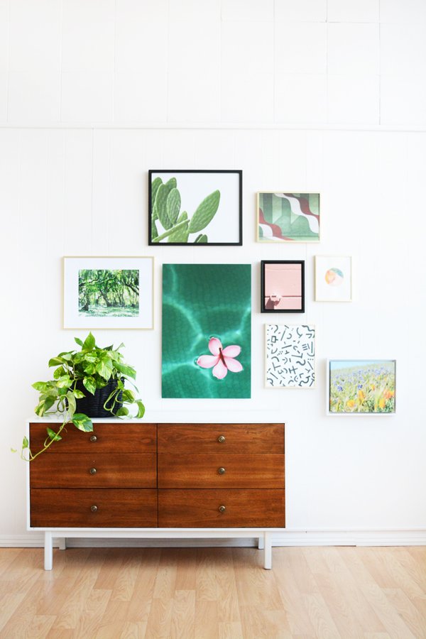
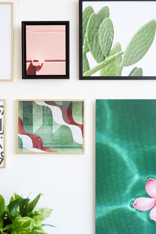
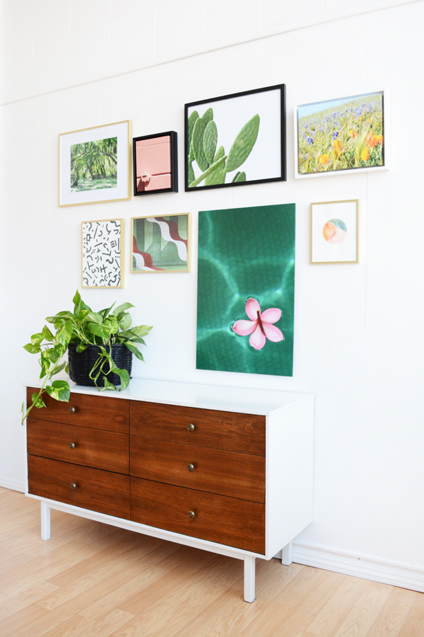
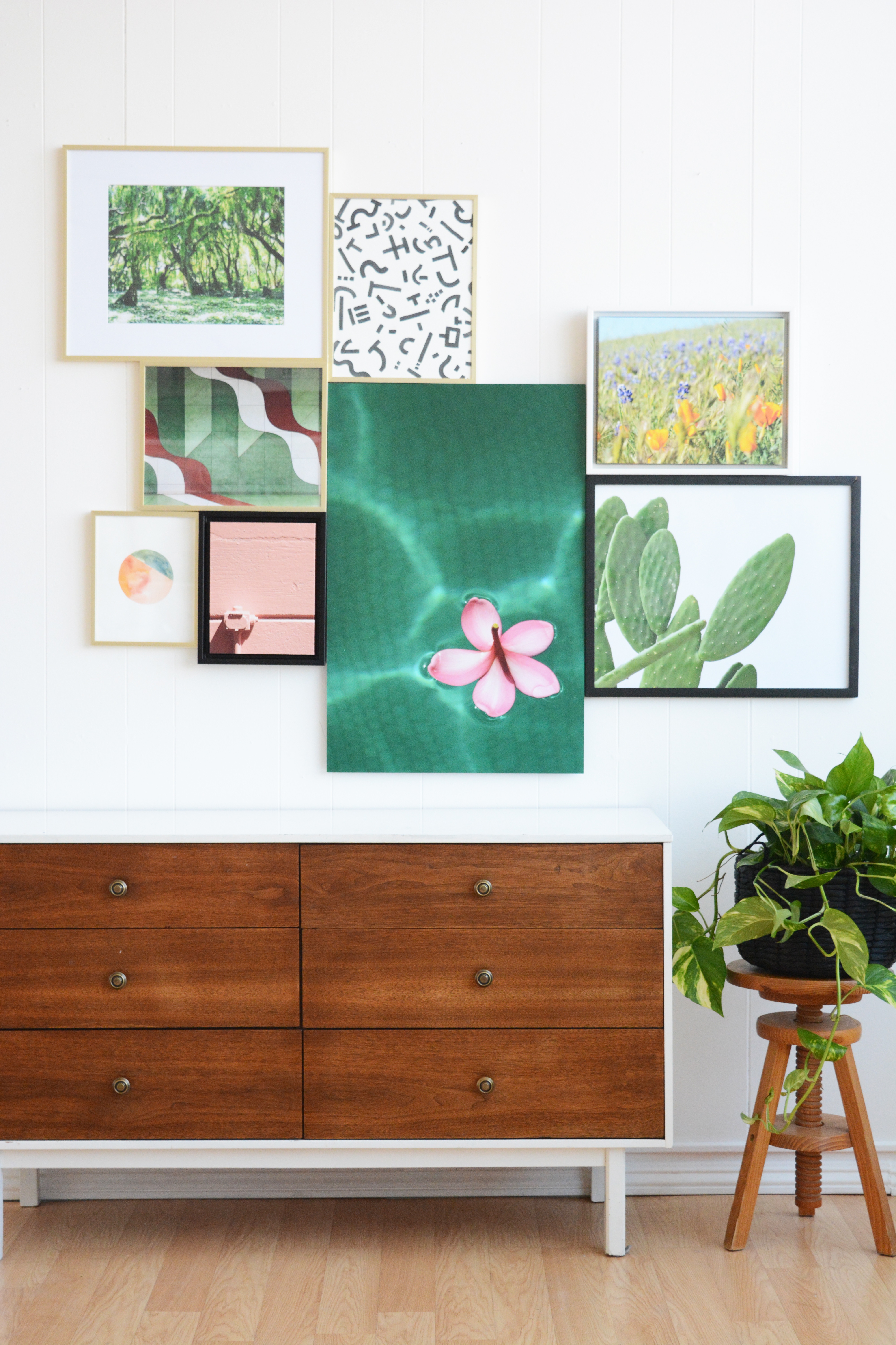
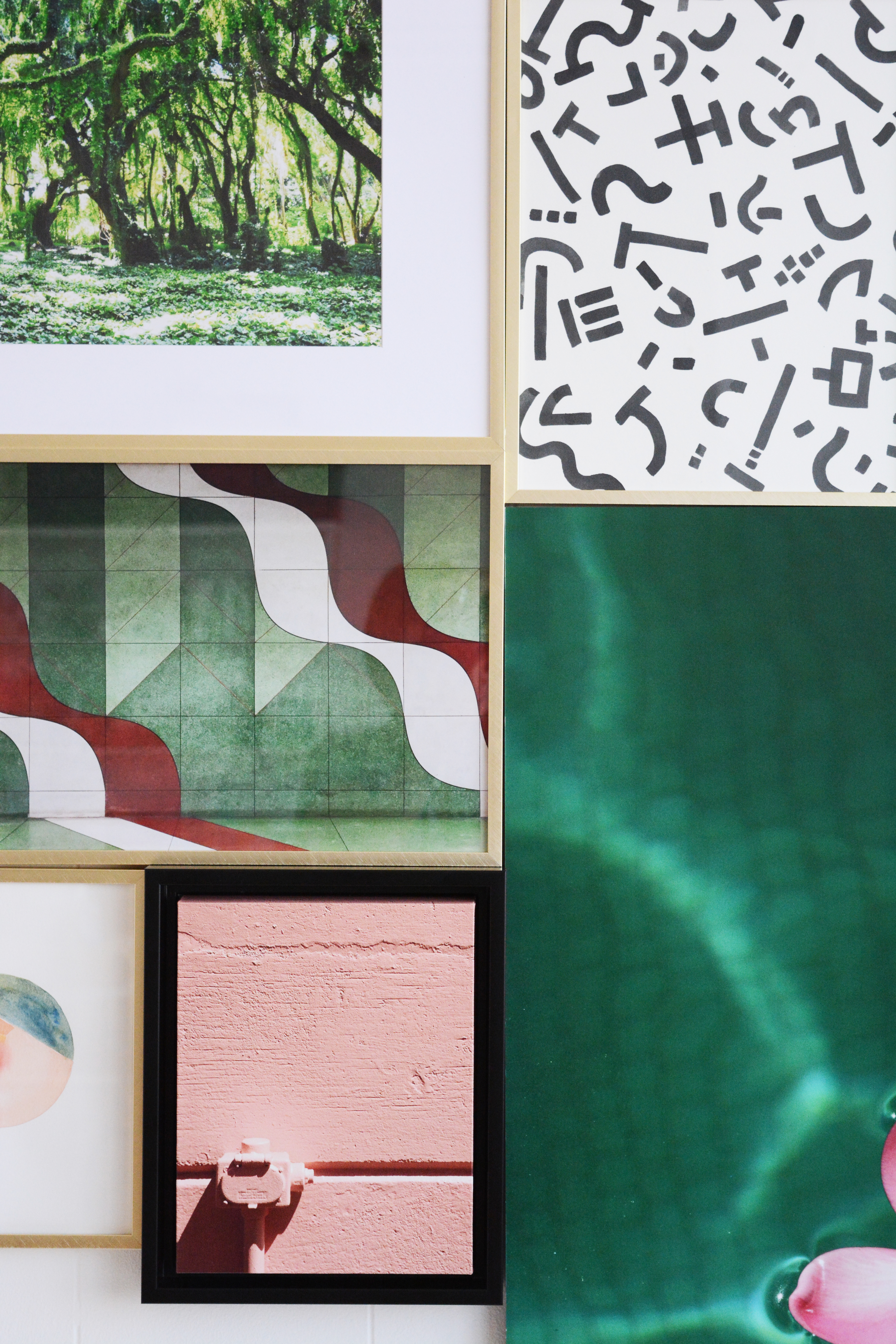
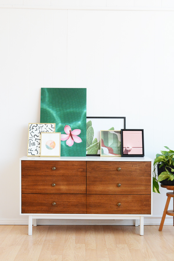
As promised, I’ve got lots of fun FREE downloadable art for you. I printed some of these as inexpensive Poster Prints and also a had a couple made into Framed Canvas Art at Mixbook. The plumeria flower floating on the water is a mounted poster print. I actually really love it. It’s so much cheaper then getting something that size framed, but It’s also a little more formal look then just hanging a poster (which is cool too). I’ve ordered a lot of art from Mixbook now, and every time I am totally impresses with the quality.

And if you want The Plumeria on the Water image, I’m going to give that one as a free downlaod to all my newsletter friends in a couple days. So, if you’ve got your eye on that one, simply fill out the form in the right hand side of my blog and I’ll send you this exclusive download right to your inbox.

Now let’s talk through these layouts and find one that’s right for your art and your home.

WALK THE LINE

This layout takes frames of all shapes and sizes and brings some order to them with a center line. I taped off a line in the middle of my wall and then hung frames exactly 2 inches above and below the line. If you are a fan of symmetry and order, this lay might help you feel better about the mismatched frame colors and sizes.

STUCK LIKE GLUE

This layout takes all your pieces and creates one big assymetrical shape. Start by hanging the center piece first. Often this is the biggest frame. I hung the plumeria as my anchor frame. From there you can start hanging pieces on all the sides of the anchor piece.

THINK INSIDE THE BOX

This is probably my most used layout. I’ve hung a gallery wall using this method. Start again with your tallest piece and anchor it on either the left or right side. Then, like fitting a puzzle together, pair smaller pieces together keeping them all inside an imaginary box or rectangle.

LOPSIDED

If I was to choose a favorite, it would definitely be this lopsided version. This feels the most organic, light and breezy to me. For this layout there are really no rules expect that you should space the frames about equal distance from each other. It doesn’t have to be exact, but a little breathing room around each piece will feel nice. And ya, make it lopsided, hang more pictures on one side than the other and don’t be afraid to let them trail down the side of the wall as well.

THE LAZY LEAN

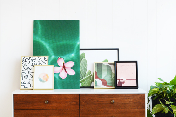
I know this is a no brainer, but I thought it should be included. If you are afraid to put holes in your walls, then The Lazy Lean is for you. This option also gives you the opportunity to change your art often. It’s a casual, no commitment kind of relationship with your art.

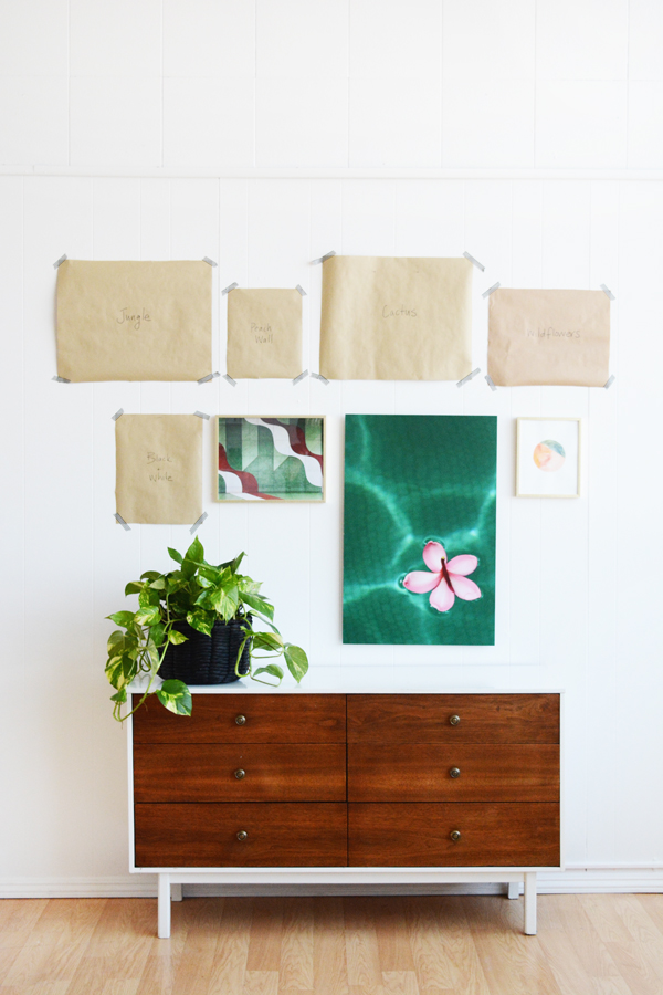
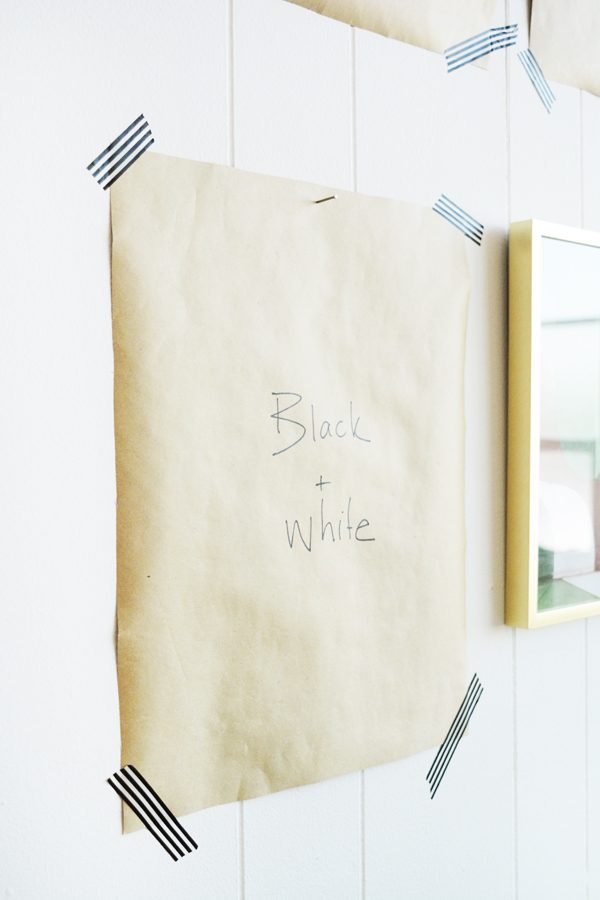
I hope you guys find this helpful. I give you permission to make lots and lots of holes in your walls. But, if you want to get it right the first time, definitely do the butcher paper cutouts first. It takes all the guesswork out of hanging art.

This post is sponsored by Mixbook. Thank you for supporting the awesome companies that help make this blog possible.

Design

What I’ve Thrifted Lately

September 5, 2017

Hi friends, I hope you had a great long weekend. We escaped the heat and headed to San Diego, where my brother lives. We got two beach days in and the water was so warm. San Diego knows how to do Fall.

Well, I’m back with another installment of “What I’ve Thrifted Lately”. And ya, I don’t have a clever name yet. I’m sharing my thrift store, garage sale, flea market and antique mall finds and then how I’m using those pieces in my home. This week’s finds are GOOD! Well, at least I think they are, you let me know what you think.

First up is this cute little brass pitcher. I originally bought it thinking I’d use it for a food styling shoot, possibly a mocktail.  But, I love it as a cute little vase with a little greenery on my coffee table. I picked this up at Goodwill for just $4.99. This is a Goodwill location that I don’t hit very often, but it’s near Olivia’s gymnastics, so I darted in and within 5 mins., I had made my purchase. That’s the thing with thrifting, it doesn’t have to eat up a whole Saturday. I think I find good stuff mostly because I go often.

Also, I should mention the wooden beads, I picked these up a few years ago at a flea market. They are actually counters for billiards or pool. I think they hang on the wall and you slide them across to count. Anyways, I loved the colors of them and they often end up on my bookshelves or coffee table. I think I paid $10 for them.

I bought at least 5 of these cute little wooden and brass boxes. They were $1 each at Restore. I thought I’d use them for gifts, and actually this week I filled one with a necklace I had bought for my sister-in-law and gave it to her for her birthday.

This ceramic bell or wind chime is one of my all time favorite finds. I got it earlier in the Summer, but I think it’s still worth sharing. It’s from the 60s and is definitely handmade. It’s strung on leather and the little flat beads on the string are all pottery as well.  I found this at one of my favorite antique malls in town, Mill Creek and at $17, I couldn’t say no. Now it hangs on your front porch, beside the front door.

We are big campers already, so these green enamel plates seemed like a must. The don’t all match, which doesn’t bother me at all. But, I’m sure we are going to use them often, not just for camping. They are great, indestructible outdoor dishes. These were $1 a piece at Goodwill and I bought all 9.

Here’s a sneak peek at our hallway that we’ve spent so many hours on lately stripping wallpaper and painting walls and trim. As you can see, the stairs and railings haven’t been touched yet. They are next on my list. But, we did put our little IKEA shoe cabinet in and I styled the top of it with a few fun objects.

Let’s be 100% honest here, my husband isn’t always a fan of my thrifted finds. This 1960’s screen print hasn’t grown on him yet. I bought it because anytime I can afford an original piece of art (which isn’t often at all), I like to buy it. I also just liked the blocky composition and the colors felt right for our house. It’s called “Still Life with Pipe”, and no, I don’t think anyone should smoke. I also think it could be a golf club and oversized gold ball. Either way, I like it and it only set me back $30. I reframed because the original frame was in pieces. I picked up a cheap brass frame from Target and I think it’s an interesting addition.

So, here’s what I spent:

  • $4.99 – brass pitcher
  • $10 – wooden beads
  • $1 – wood and brass boxes
  • $17 – ceramic bell
  • $9 – green enamel plates
  • $30 – vintage screen print

Total – $71.99

Thought? Anything in my finds this week that speaks to you? And do you like this series?