Food & Drink

Peach Ginger Moscow Mule Mocktail

October 17, 2017

I was pleasantly surprised to see fresh peaches still at the grocery store this week. I love ripe, juicy nectarines and peaches in the Summer. So, when I saw them this week I bought I whole box. The last couple of weeks have been crazy with work and travel, so we needed a little Monday afternoon treat yesterday. I made these yummy Peach Ginger Mock-Moscow Mules for my family and we might have also poured this yummy Peach Ginger sauce over vanilla ice cream as well.

Peach Ginger Moscow Mule Mocktail

If it involves Ginger Beer, I’m a FAN! So, any version of a Moscow Mule is a hit with me. This is a great make-ahead mocktail. Make the Peach Ginger sauce, and then just store it in the fridge. When you are ready to serve this yummy mocktail, just mix a little syrup with your favorite ginger beer and you are done!

Peach Ginger Moscow Mule Mocktail

Peach Ginger Moscow Mule Mocktail

  • 3 ripe peaches
  • 2 tbsp. freshly grated ginger
  • juice and zest of one lime
  • 1 cup sugar
  • 1 cup water
  • ginger beer
  • ice
  • peach and lime slices for garnish

In a blender, place the peaches, ginger, lime, sugar and water. Blend of high to make a smooth puree. Pour the puree into a small pot. Bring to a boil and then reduce to a slow simmer. Simmer for 5 mins. Remove from the heat and pour through a fine metal sieve to remove any large pieces of pulp. Pour into a glass bottle and store in the fridge for up to 1 week.

To make the drink, fill a glass with ice add about 2 ounces of the peach syrup (add more of less depending on how sweet you like it). Top off the glass with ginger beer and stir. Garnish with a slice of peach and lime.

And if you would like a spiked version of this drink, a splash of vodka can definitely be added.

Peach Ginger Moscow Mule Mocktail Peach Ginger Moscow Mule Mocktail

Cheers friends!

etc.

Camp Chlorophyll

October 11, 2017

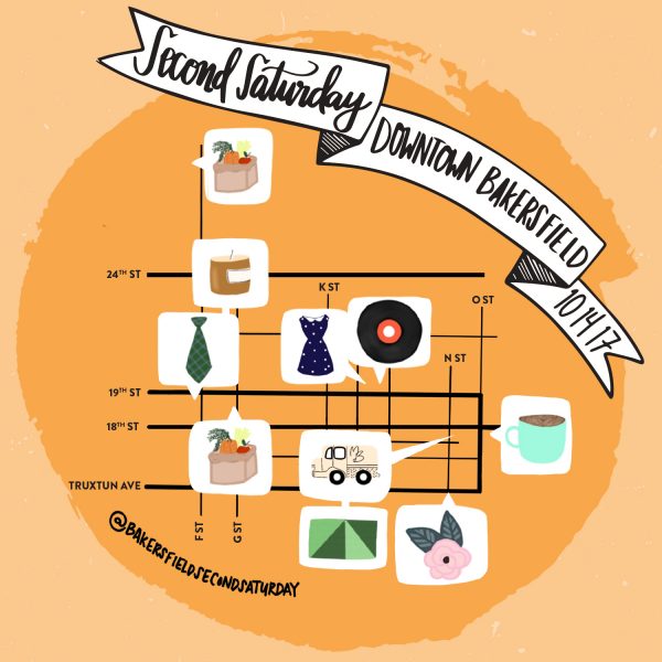
This is for all my Bakersfield friends! Do you know about Second Saturday? Second Saturday is Downtown Bakersfield’s monthly weekend gathering that brings the community and businesses together. The goal for Second Saturday is to provide an atmosphere of excitement for what’s good in our city. Each month downtown business owners are highlighted to curate a monthly gathering that is family friendly, fun, and inspired by the seasons.

This Saturday from 10am – 2pm I’m teaming up with the Bakersfield High School Ecology Club to host Camp Chlorophyll. This is a FREE event for kids aged 2-10. There will be fun art and Science activities at the Chlorophyll Wall.  It’s going to hands-on and lots of learning. So, bring your kiddos downtown for Second Saturday.

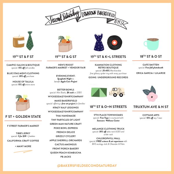
Come on downtown and let’s hang out. There’s really so much to see and do. Here’s a map and a list of all the businesses that are participating. For more information, you can follow Second Saturday on Facebook + Instagram.

DIY

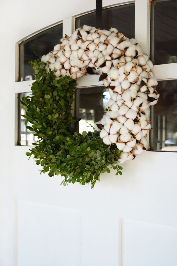
DIY Modern Fall Wreath

October 5, 2017

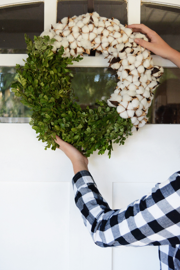
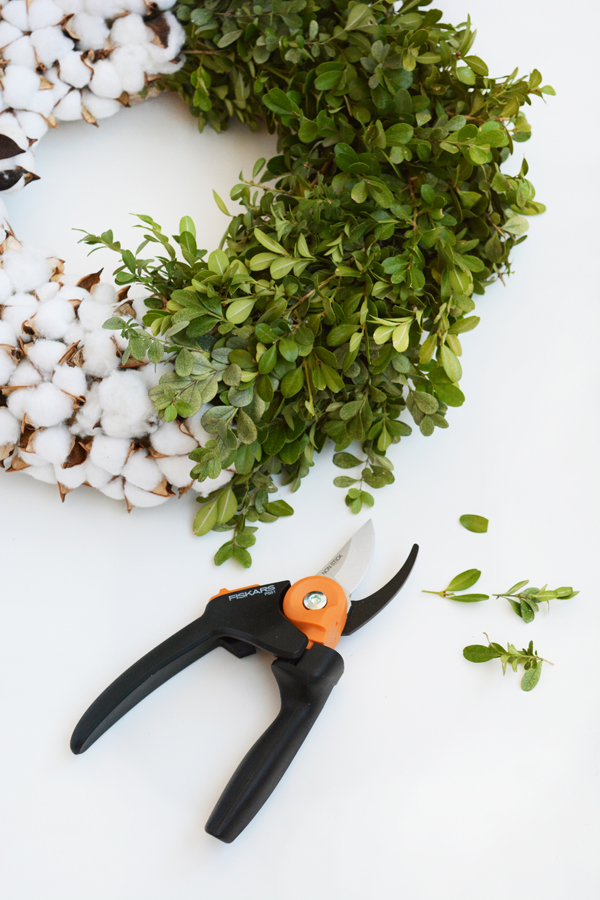
Fall seems like the season we welcome folks into our homes. We’ve spent all Summer outdoors and now we are ready to snuggle up indoors for a while. A nice way to start this cooler season is to add a pretty handmade wreath to your door. A wreath on your door says that you are expecting folks to be arriving and you wanted friends and family to have a warm welcoming. This year I made this modern, two toned wreath for something a little different. Instead of traditional Fall leaves in browns and oranges, I decided that this was a pretty palette for Fall.

DIY Modern Fall Wreath

Fall is that transition season taking you from Summer to Winter, so this wreath has a nod to the season before and the season to come. Both boxwood and cotton grown here in Southern California, so I was able to do a little foraging for this project. And the nice thing about both of these materials is that they will dry and still stay beautiful for a long time. This idea of a two toned wreath could definitely be done with other greenery and leaves as well. Pinecones paired with Fall leaves could be very pretty.

DIY

A New Door for the Guesthouse

September 27, 2017

This is for my instagram friends, before I tell you about our FANTASTIC new door, just watch the video and you’ll find out what color I painted the inside of the door. I know the suspense is killing you.

It’s been a while since I shared an update on our little guesthouse. If you are new here, I’ll fill you in really quickly. We bought our house just over a year ago and one of the first projects we decided to take on was the little guesthouse attached to our garage. Our house was built-in 1918, and the guesthouse need A LOT of work. You can check out the bedroom and bathroom reveals for my details. But, we use the guesthouse for friends and family that come to visit and we also rent it out on airbnb as well.

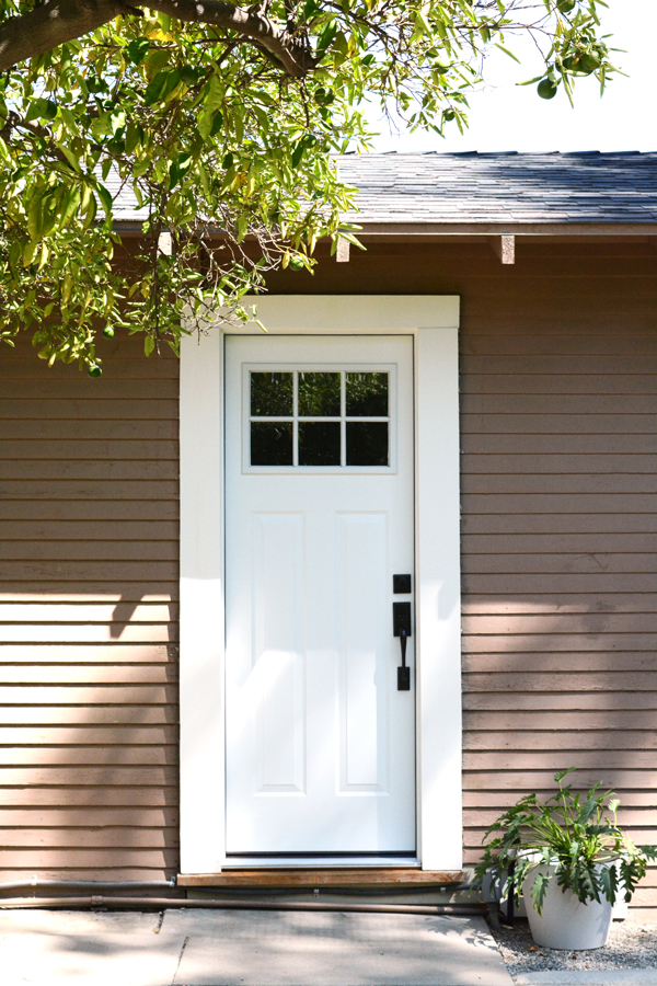
Craftsman Door by JELD-WEN, installed by Home Depot

We did so much work on the space and we knew that the door needed to be replaced REALLY BADLY. The door was literally falling apart. All the glass panes were tilted and slanted to the side. There were 1 inch wide gaps at the top and bottom of the door that let in dust and bugs on a regular basis. We had replaced the handle and lock earlier in the year, but guests often struggled with the door still. After temps as high as 115 F this Summer, we realized that we just couldn’t keep the room cool. Heat just penetrated through the single pane glass on that door.

But, we just couldn’t work up the courage to take on this big project. If you know anything about old houses, you know that walls, floors and doorways are not always straight or level. In our last house, we replaced an exterior door ourselves and then had issues with it for years to come. And while we do DIY very often, we decided we wanted this project done RIGHT, so we called the experts at Home Depot.

Our house is a Craftsman house, so we really wanted to stay true to that style. Home Depot’s, JELD-WEN Steel Craftsman door seemed like the perfect fit for our house. It comes in 6 classic colors, we chose the crisp white. I love that this door still has some glass at the top, but also still provides privacy. One of the best features of our guesthouse is how bright and airy the space is. We didn’t want to take away all the natural light in that corner of the room.

Not only is this door extremely handsome, this steel door is strong and secure. We are so happy to have an energy efficient door. We’ve already saved in cooling bills and I’m sure we will save with heating this winter as well. This door glides open and shut with ease and seals almost airtight. With the old door, you could see light coming through on all sides, this door keeps the outside stuff outside, where it belongs.

We chose to hire the professionals. Bob + Andy from the Home Depot door installation team went above and beyond in installing our new door. Home Depot’s professional door installers are local, licensed, insured, and have undergone a thorough background-screening, so you can feel confident that you are getting reliable help. My installers took the time and care to remove all the original trim without damaging it and then replaced it like it had never been touched. They also had to cut new moldings for the outside of the door, and did an awesome job keeping with the style and era of the house. These guys worked long and hard. The installation took over 9 hours to do and it was 112 F here on the day they were here working on our guesthouse.

If you are the market for a new door, I would definitely recommend this JELD-WEN Steel Craftsman door and Home Depot installation.

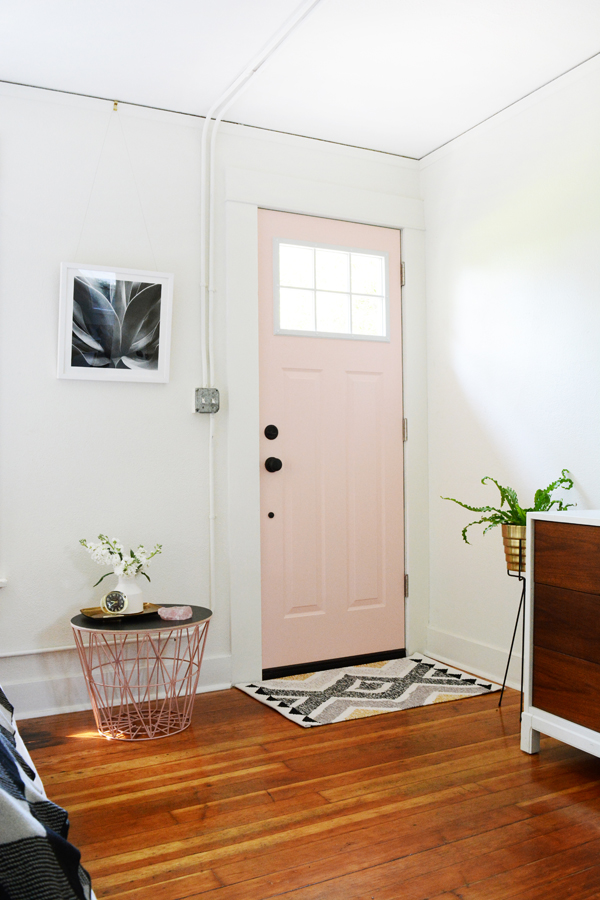
Craftsman JELD-WEN door from Home Depot painted pink.

Oh, and I decided to have a little fun with the inside of the door and paint it a fun color. I polled folks on instagram and a pretty pale pink got over 80% of the votes. I have lots of touches of pink through the room already, and I might as well use this color while millennial pink is still a thing. To be 100% honest, I really just wanted to paint the inside black, like my kitchen door.

This post is sponsored by Home Depot, thank you for supporting the companies that help make this blog possible. 

DIY

DIY City Market Bag

September 25, 2017

DIY City Tote Bag

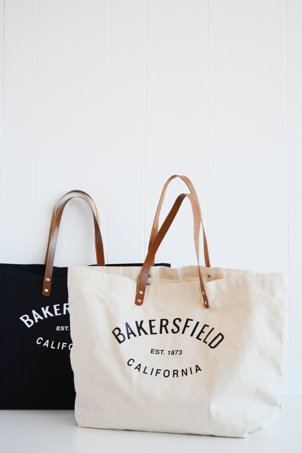
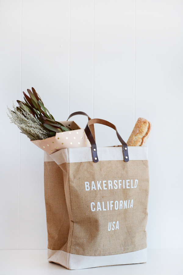
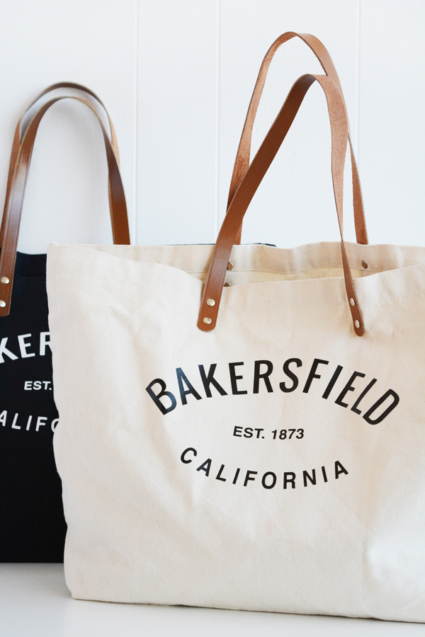
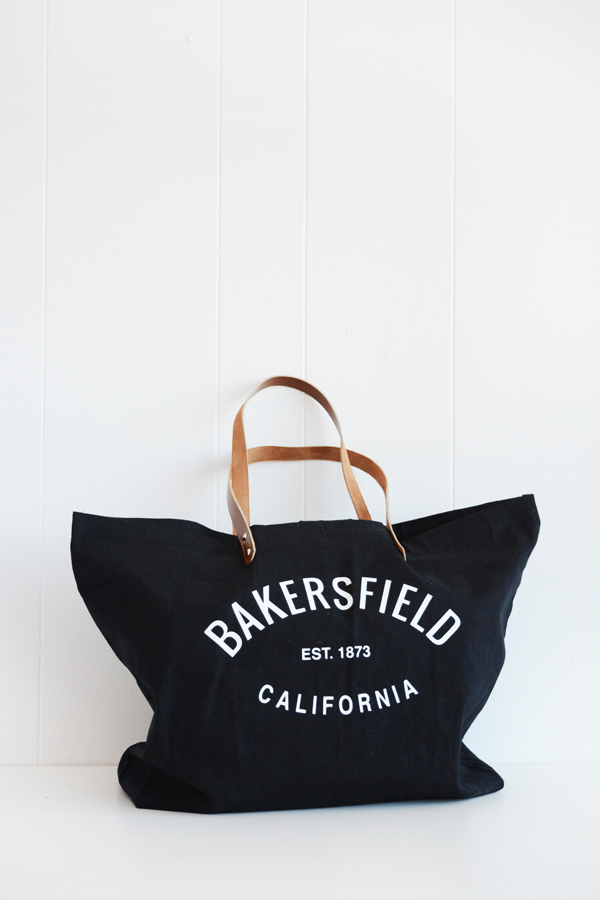
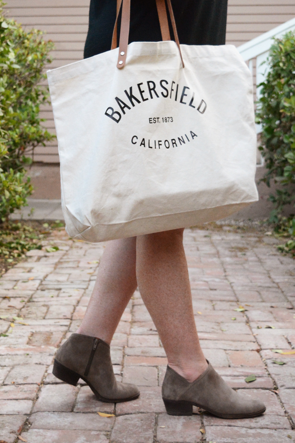
Wanna be a hipster in your own town? Step One: carry a cool market tote bag stating where you live. I made a few bags with my home town, Bakersfield, California proudly stated on the side. Everyone is going to ask you about it and they are definitely going to want one. Which makes you hip, right? I firmly believe have have to love where you live and what better way to say it then to carry the name everywhere you go.

DIY City Market Bag

I started with a couple canvas totes and a tall burlap market bag, both of which I found on amazon (I’ll like them below in the supplies). Then you are going to need to decide what you want you bag to say. I played with two designs. The burlap bag is my copy-cat version of the Apolis market bags. The handle on the amazon one I found is definitely not as nice as the original, but my budget version is holding up pretty well so far. On the burlap bag I mimicked the Apolis font and spacing and on the canvas bags, I simply curved the lettering on the city and state and added a date to the center.

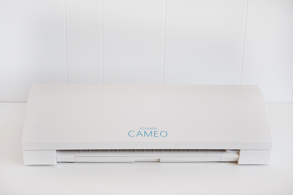
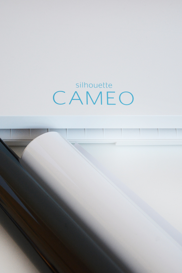
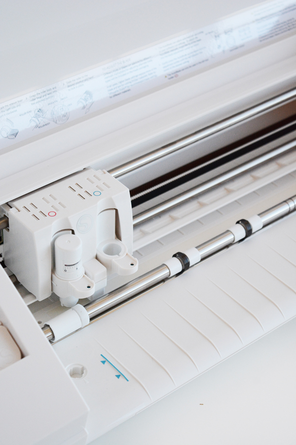
Then, using my new Silhouette Cameo machine, I cut out heat-transfer vinyl letters in a matter of minutes and adhered them to the bags. DONE! I just love a simple, customizable project like this. Each of these bags cost under $20 in supplies to make and they turned out looking like bags something you’d pay a lot more for. This is why we love to DIY, am I right?

DIY City, State, Country Market Tote BagDIY City, State, Country Market Bag

Here’s why I love the Silhouette Cameo – I don’t have to save my work as a jpeg or pdf and then upload it to a program and then cut away all the background. None of that! I can take any font/text or illustration directly from Adobe Illustrator right to the Silhouette software. One click from Ai and I’m ready to cut. Ya, it’s really that easy.

Here’s what you’ll need:

One of these bags:

Simply type out the text with your city, state and country. I used Adobe Illustrator, but you can use the silhouette software as well, make sure you reverse the image before cutting. This video tutorial was helpful. Then, using the Silhouette Cameo, cut out your text. Weed away all the excess vinyl, leaving just the text on the vinyl backing. Place the lettering on the bag where you want it positioned, then using an iron with no steam, adhere the vinyl to the bags.

I used the heat-transfer vinyl in black and white to create high-contrast lettering on the bags. I love how sharp the black bag with the white lettering looks.

I know that definitely not everyone owns a personal cutting machine, like a Cricut or Silhouette. But, for those of you that do, I think it’s fun to share some projects that you can make with your machine. But, if you are serious DIYer, I really do think you’d enjoy having a Silhouette Cameo.

A big thanks to Silhouette for providing me with a machine and play with. 

etc.

The Week’s End

September 22, 2017

Well, it feels good to have one more “room” done in our house. If you missed yesterday’s post, my little home office is DONE! I’m ready for the weekend. This week was tough. I felt tired, probably because it was non-stop work, but I also felt like I was getting absolutely nothing done at all. Can you relate? Anyways lots of feelings and worries come along with being exhausted and having a long list of things you just can’t seem to get done. But, I’m looking forward to the weekend, even though I’ll still be working. My parents and brother are in town. So, at least I can put them to work as well, tee hee. And it’s guaranteed that I will not have to cook and my mom will make lots of really yummy food. She’s already make 3 loaves of Caramel Apple Monkey Break and is working on a yummy pork chop and wild rice dinner for tonight. 
The weather is kind of a boring topic, but this week has been soooo lovely. It reminds me how much a love living in Bakersfield this time of year. I’m so excited for Fall. After a very hard Summer, temps in the 70s and 80s are so welcome. Granted, it’s supposed to be back up to 95 F this week again. But, I’ll take this break from the heat happily. And the best part is that we haven’t had our AC on all week long. Just for some perspective, our electricity bill last month was $600 and we don’t even turn the AC on upstairs. The kids have been camping out in the living room most of the Summer. Well, Denali actually has slept upstairs without an AC all Summer, sometimes her room is 98 F. Ya she’s a tough kid.

My brother and I will be building things this weekend. It’s a really fun local project that we are working on. He’s super talented and I always learn things when I work with him. You can follow along on IG stories for lots of behind the scenes.

Anyways, thats the update on my life lately, whether you wanted it or not. I hope you have a great weekend. And if you have a second, here’s a few things I think you should check out on the internet this weekend:

Design

Mini Hallway Office

September 21, 2017

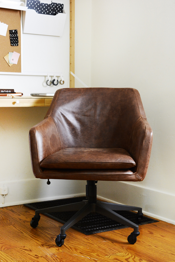
Well, I hope you are as excited about my little mini hallway office as I am. As you know, I was tired of working from the kitchen table. I needed a permanent place for my computer and most importantly, I needed a “real” office chair.

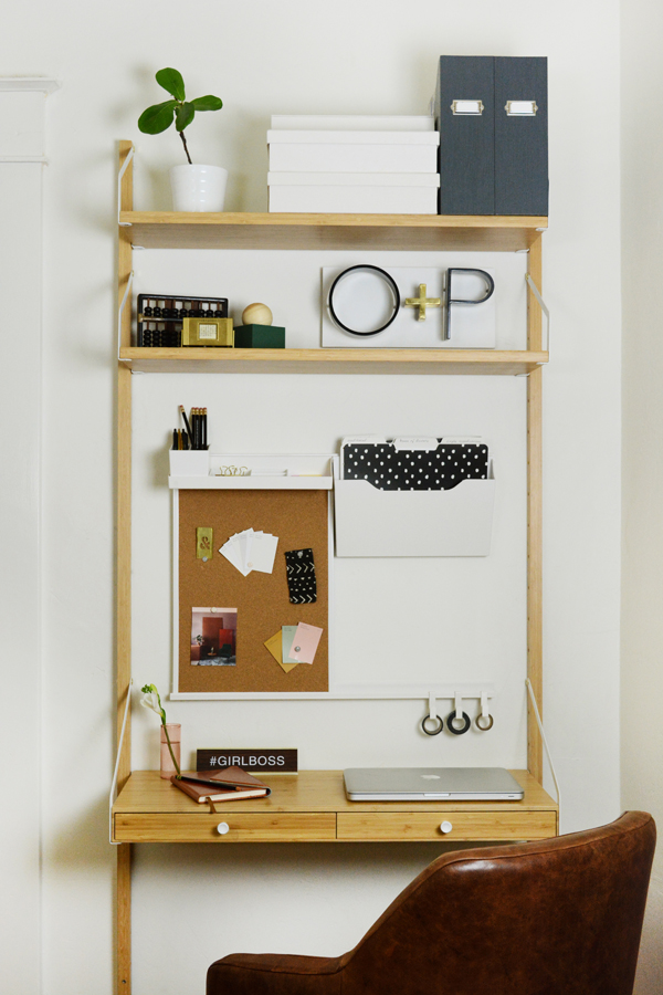
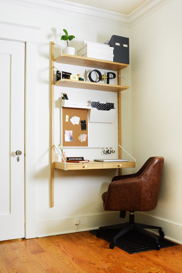
Mini Hallway Office with wall mounted desk.

This little space is kind of our hallway/landing. But, I felt like it was an unused space just begging to be useful. On the floor is the grate to our AC intake, so I really struggled to find a piece of furniture that would work here and not cover it up. I decided a wall-mounted desk was the best option with such an uneven floor surface. I hunted down some really great options, you can see them here. I decided on the Svalnas IKEA desk. The price was definitely right at under $150 for the combination I chose and I loved the compact, light, airy feel of this piece. It definitely has a Swedish look about it.

The chair was super important. I blame it on being 40, but my back was just so tired of sitting in a stiff kitchen chair. And even if you aren’t 40, I’m pretty sure a good desk chair is important when you are in front of a screen many hours of the day. While finding a comfortable chair was important, I also wanted something stylish. This is a major corridor in our house and I didn’t want an ear sore there. So, I rounded up some super stylish options. And lady luck was on my side, because West Elm just happened to have a flash sale the day I was ready to order a chair. And, don’t hate me, but I got the Helvetica Leather Chair for a fraction of it’s usual price. It’s usually $599 and I paid $229!!!! Yep, pretty happy about that. I should be 100% honest with you, I think it’s probably a little big for the space and the size of the desk, but I’m going to over look that because it’s just SO DARN COMFORTABLE! Sometimes function wins, and really it’s a handsome chair, just really big handsome chair!

Mini Hallway Office with wall mounted desk.

This was a big project (keep scrolling to see before pics). I’m sure it doesn’t look like it, but by the time we stripped all that awful yellow striped wallpaper and primed and painted and painted everything white some more, I wasn’t sure if we’d ever get it done. But, it’s FINALLY done and have a little corner to call an office. It’s not much, but it’s pretty much perfect as far as I’m concerned. I have a little bit of storage, a very comfy chair and surface that is just for my computer (and I don’t have to move it when it’s time to eat).

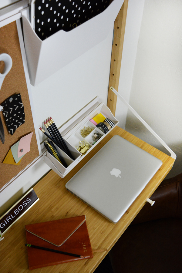
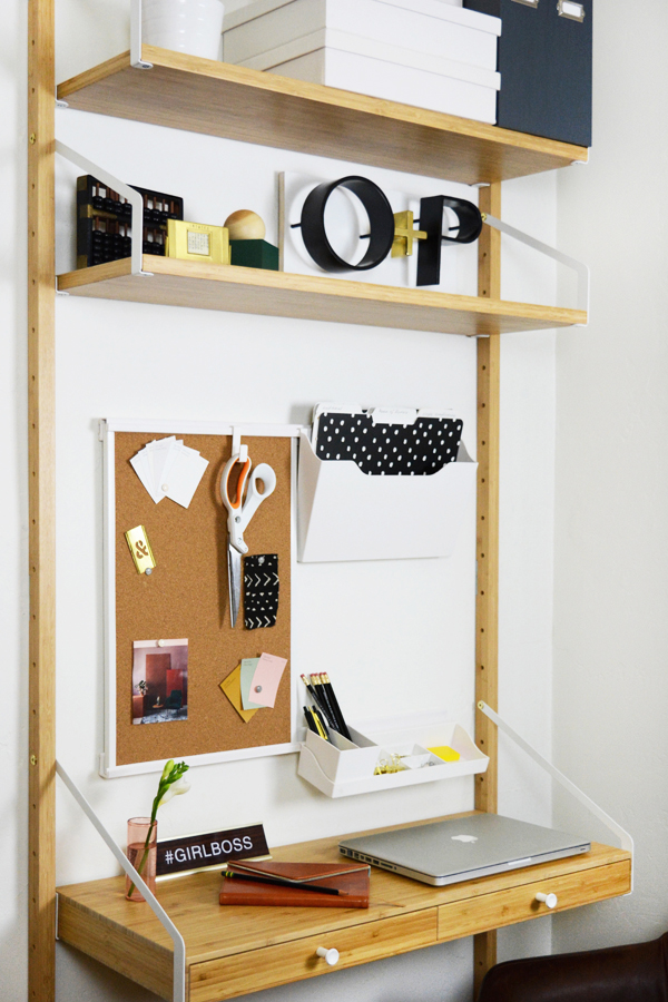
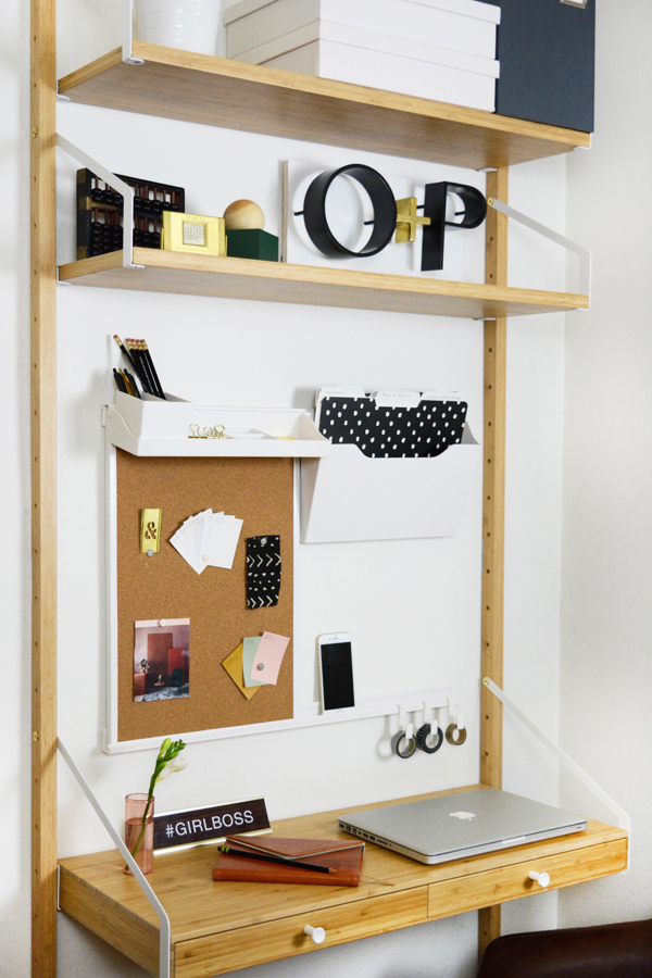
I really wanted to maximize storage and organization in this tiny area, so I installed Martha Stewart’s Wall Manager System. It’s awesome, I just installed two rails and then all the accessories, like the cork board, hanging shelf, hanging file sorter, and hooks just slide or hook on. You can change things up and move them around to what works best for you. I feel like a have a little command central now for Oleander + Palm.

I also added Martha Stewart’s Stack+Fit Magazine Files and File Boxes to hide some of the clutter and keep things in order. All these great Martha products can be found at Staples.

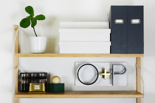
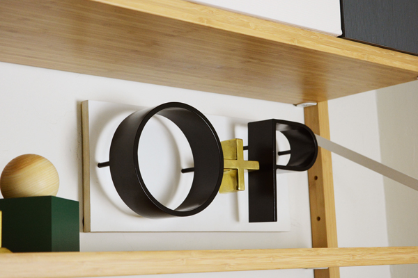
And most importantly, I now have a place to hang with O+P sign that my brother, Ash, welded for me for my birthday. I feel legit!


See (in the image above and below), you can move around the different components super easily. If I need more table top space, I move the hanging shelf to the top of the cork board, but If I want more space for notes and pinning things on the wall I can move the shelf to a different spot. Oh and the cork board also has a white board on the other side, so I can flip that around too.

So, are you looking to carve out a little work space for yourself or maybe just a place for homework? You don’t need a spare bedroom, a home office or even a room at all, a landing or even a hallway will do.

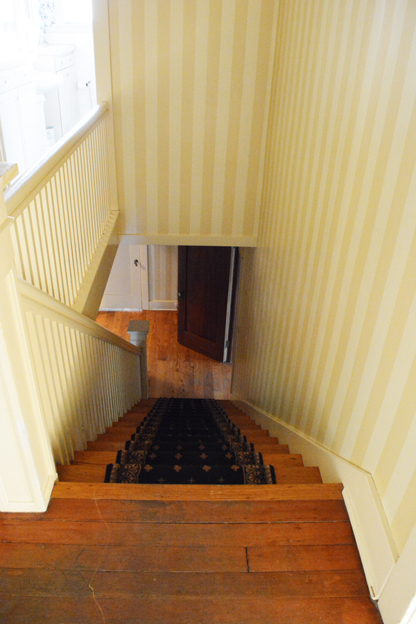
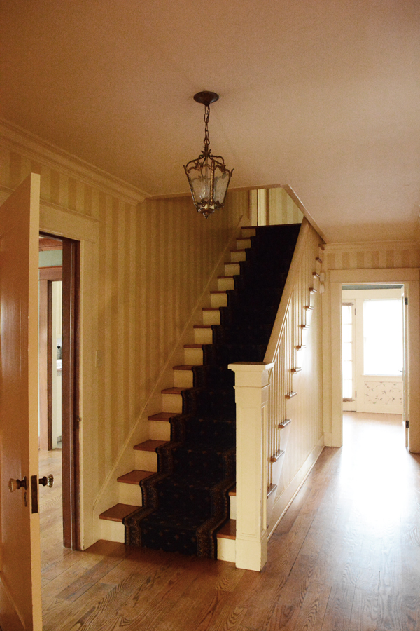
Oh, and here’s some befores of the space:

As you can see, SOOOO MUCH WALLPAPER!!!!!!! This first shot is taken from the top of the stairs. I took that open door off to give the space a little more room. That door leads to the dining room. The door to the left of the desk leads to the living room. Next on the never ending to-do list is the stairs. I will be painting the banisters soon and figuring out what I want to do with the carpet runner. It is definitely going, I’m just not sure if i want to install another runner or do away with carpet on the stairs all together. Most likely there will be no carpet. I find that it’s just a place to attract dust bunnies and cat hair.

And one more thing, the light fixture has been replace, don’t you fret about that.


Design

Simply Grove Shop

September 18, 2017

If you are not familiar with Kirsten Grove’s blog Simply Grove, you are missing out. I’ve been a long time fan of EVERYTHING she styles. This lady has impeccable taste and has an eye for what is new and fresh. I’m so excited that she has opened a shop. The brick and mortar is in Boise Idaho, which I will visit this Christmas (because that’s where Lon’s family lives), but don’t fret, there’s a fantastic online shop as well.

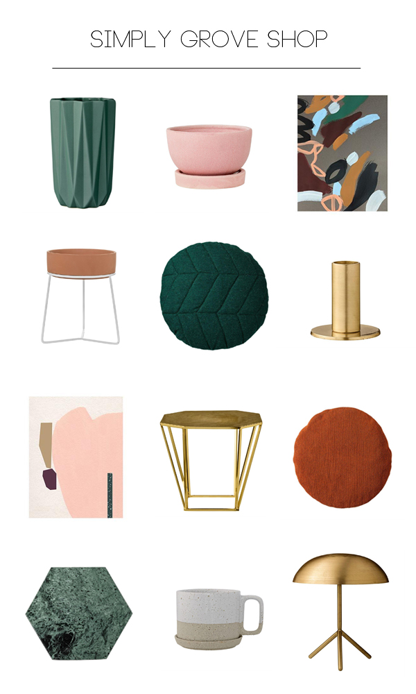
I thought I’d share a few of my favorite picks from the Simply Grove Shop. Kristen’s shop has everything I want, in all the right colors. Her style is modern and clean, but usually with a little mid century vibe and touch of boho. So many of her pieces look and feel like all the pretty things I saw in Sweden but, couldn’t bring home in my suitcase. Oh, and you are going to be so pleasantly surprised by the prices. And O+P readers get 10% their first order, just enter the code OLEANDERANDPALM! 

I’m sure you will see many of these pieces in the next space a style.

1 // 2 // 3

4 // 5 // 6

7 // 8 // 9

10 // 11 // 12

Anything catching your eye? The quilted round green pillow is probably a must. I’m thinking it will be my first purchase.

etc. / Food & Drink

Orange Cranberry Rosemary Mock-Mimosa

September 14, 2017

Orange Cranberry Rosemary Mock-Mimosa

It’s been a doozy of a week. I could definitely use a mid-week mocktail! How about you? This Orange Cranberry Rosemary Mock-Mimosa is the perfect drink to get you in the mood for some Fall weather and the those yummy familiar flavors of the holidays. Yep, I said it, holidays. Does that stress you out and get you excited? Fall always feels like the busiest time of year for us. So, I’m currently bracing myself for an even more hectic season. But, today the high is only supposed to be 86 F and that sounds AMAZING!  When I took kids to school this morning it was in the 60s, YIPPEEEEE! When we are in the dead of Summer, it feels like cooler weather will never come. I’m excited for a change in Season.

Orange Cranberry Rosemary Mock-Mimosa

I really do enjoy cooking, especially when it isn’t making dinner on a crazy busy week night. For example, making this candied orange peel for the garnish was actually a really fun process and the results are super pretty.

This drink would be great as a classic mimosa with champagne, or you can make it family friendly and use ginger ale. And if you are hosting a big party, this would be great served in a big punch bowl.

You can find the full recipe over on Natalie’s Orchid Island Juice Company. And if you don’t have access to their super yummy juice, equal parts 100 % cranberry juice and orange juice can be used for this recipe.

Orange Cranberry Rosemary Mock-Mimosas garnished with fresh rosemary and candied orange peel.


Design

Gallery Wall Layouts and Free Downloadable Art

September 8, 2017


I’m still a big fan of the gallery wall. It’s a fun way to display a large collection of art. If you have a few smaller pieces, once they are grouped together they create one larger statement piece.  I’ve partnered with Mixbook for another fun post. I’ve got how-to’s and free downloadable art, what more could you ask for in life?

I’ve come up with 5 easy-to-install gallery wall layouts for you.

Gallery Wall Layout Ideas

As promised, I’ve got lots of fun FREE downloadable art for you. I printed some of these as inexpensive Poster Prints and also a had a couple made into Framed Canvas Art at Mixbook. The plumeria flower floating on the water is a mounted poster print. I actually really love it. It’s so much cheaper then getting something that size framed, but It’s also a little more formal look then just hanging a poster (which is cool too). I’ve ordered a lot of art from Mixbook now, and every time I am totally impresses with the quality.

And if you want The Plumeria on the Water image, I’m going to give that one as a free downlaod to all my newsletter friends in a couple days. So, if you’ve got your eye on that one, simply fill out the form in the right hand side of my blog and I’ll send you this exclusive download right to your inbox.

Now let’s talk through these layouts and find one that’s right for your art and your home.

WALK THE LINE

This layout takes frames of all shapes and sizes and brings some order to them with a center line. I taped off a line in the middle of my wall and then hung frames exactly 2 inches above and below the line. If you are a fan of symmetry and order, this lay might help you feel better about the mismatched frame colors and sizes.

STUCK LIKE GLUE

This layout takes all your pieces and creates one big assymetrical shape. Start by hanging the center piece first. Often this is the biggest frame. I hung the plumeria as my anchor frame. From there you can start hanging pieces on all the sides of the anchor piece.

THINK INSIDE THE BOX

This is probably my most used layout. I’ve hung a gallery wall using this method. Start again with your tallest piece and anchor it on either the left or right side. Then, like fitting a puzzle together, pair smaller pieces together keeping them all inside an imaginary box or rectangle.

LOPSIDED

If I was to choose a favorite, it would definitely be this lopsided version. This feels the most organic, light and breezy to me. For this layout there are really no rules expect that you should space the frames about equal distance from each other. It doesn’t have to be exact, but a little breathing room around each piece will feel nice. And ya, make it lopsided, hang more pictures on one side than the other and don’t be afraid to let them trail down the side of the wall as well.

THE LAZY LEAN

I know this is a no brainer, but I thought it should be included. If you are afraid to put holes in your walls, then The Lazy Lean is for you. This option also gives you the opportunity to change your art often. It’s a casual, no commitment kind of relationship with your art.

I hope you guys find this helpful. I give you permission to make lots and lots of holes in your walls. But, if you want to get it right the first time, definitely do the butcher paper cutouts first. It takes all the guesswork out of hanging art.

This post is sponsored by Mixbook. Thank you for supporting the awesome companies that help make this blog possible.