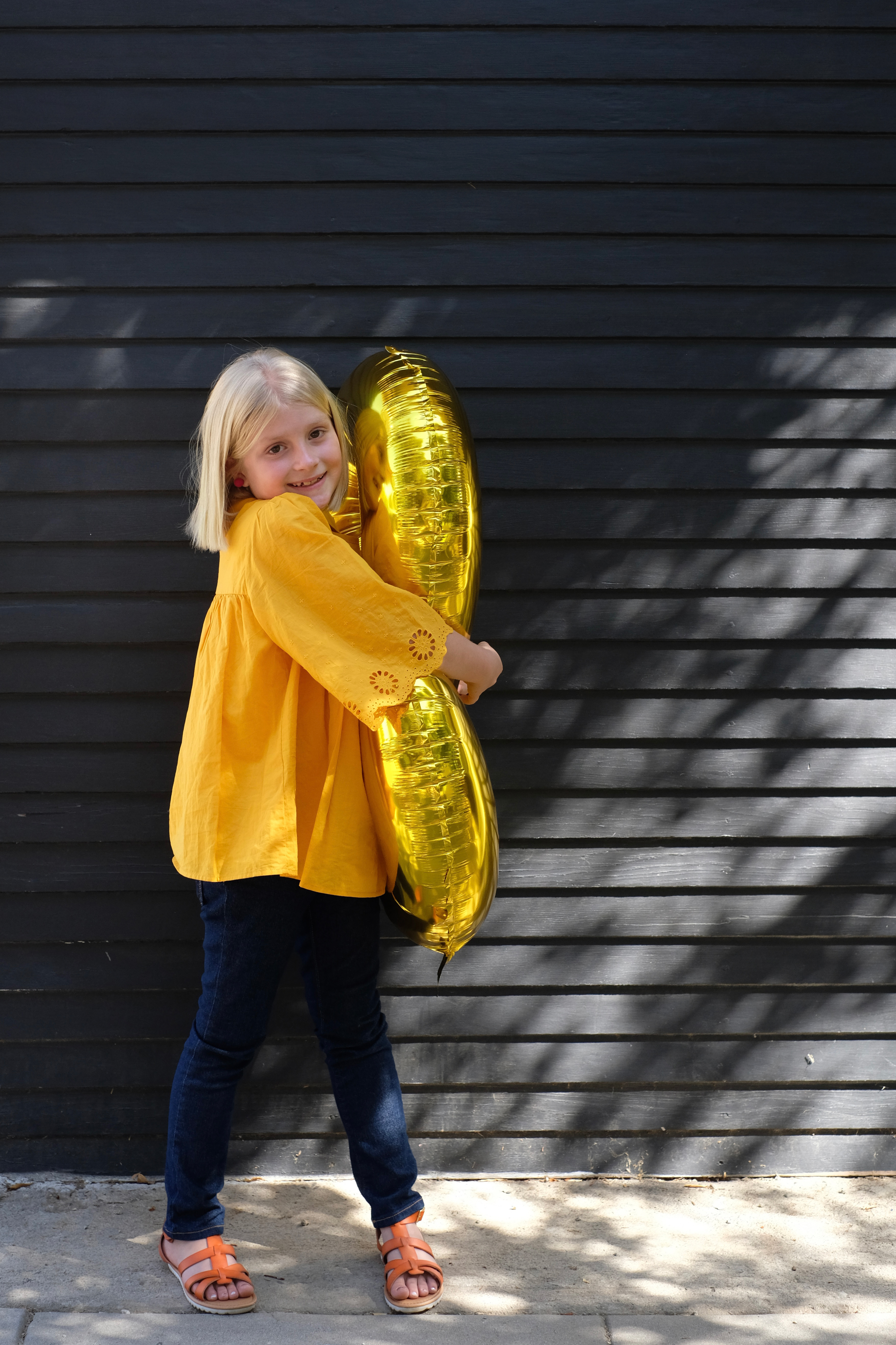
Well, my baby is 8. I shared on instagram that Olivia is a big part of the O+P brand. I started this blog when I was pregnant with her. It’s kind of hard to believe that she is eight and that this blog is ever older. Yikes!
Olivia and her dad are ready the Harry Potter books together and they are on book 3, so needless to say, we are VERY into HP right now. And really, this was such a fun theme to play with. I promised that I would share about this party here. Now, I don’t have any step by steps or instructions because I just didn’t have time to photograph that along the way. In a perfect world, I’d share all that as well. But, a few years ago, I gave myself permission to just have a party and not worry so much about having to take pictures as well. If you want to see more behind the scenes, I definitely shared lots of prep on IG stories (they are in the “Food + Drink” highlight.
But, I will share the menu (I’ll link recipes where I can) and the games and activities we played. There are sooooo many great Harry Potter parties out there in the Pinterest world, but maybe some of our ideas will inspire you as well.
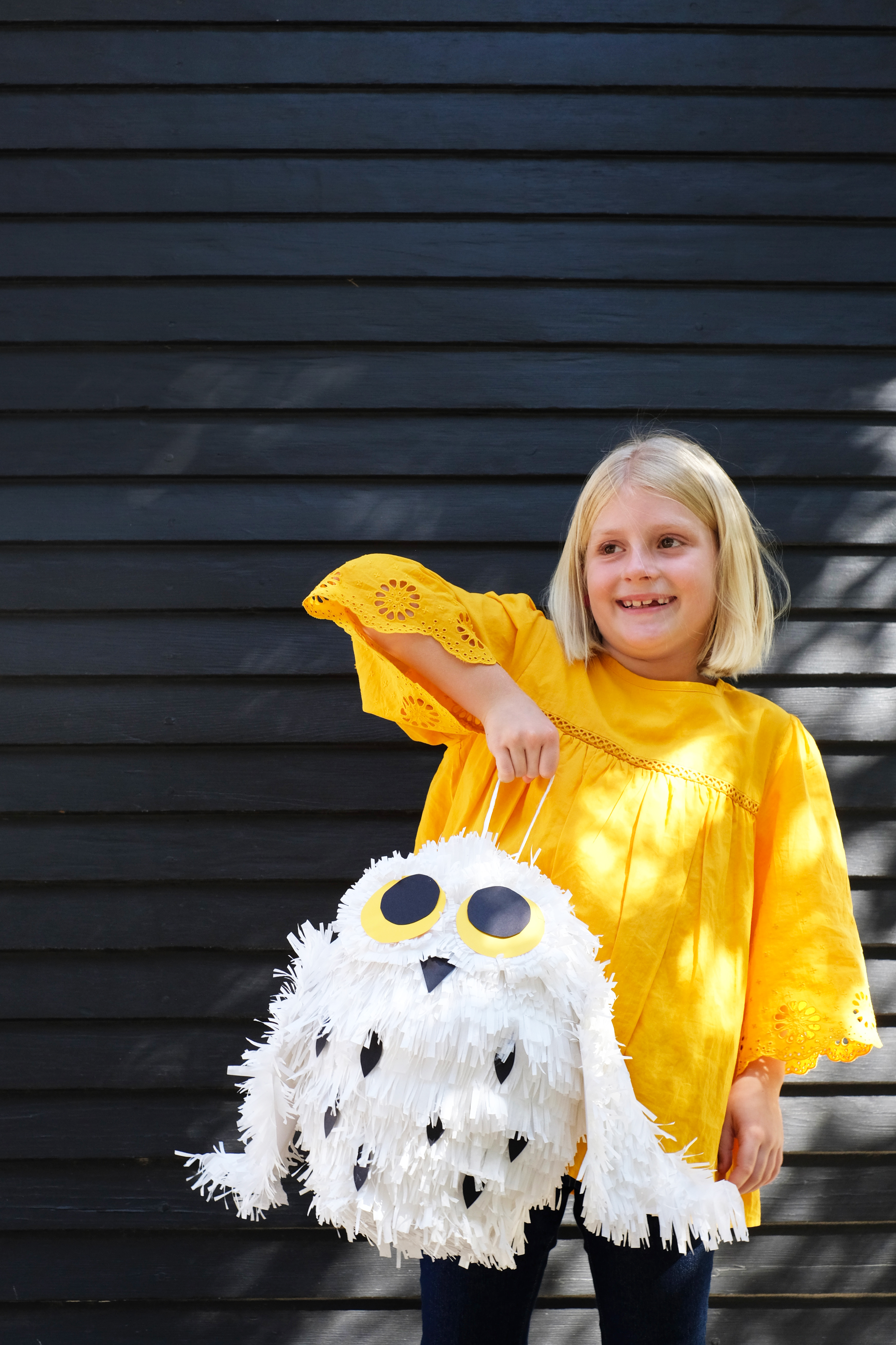
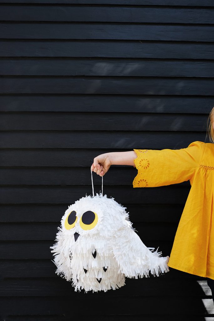
Ok, let’s start with the Pinata! I’m a huge fan of a cute candy-filled pinata. My parents used to make them for all our parties and you better believe there was a theme involved. I actually bought a pineapple pinata at the thrift store and stripped it down to make this Hedwig version. But, really you just need a good oval base and starting with a balloon and paper mache would totally work as well.
I layered the entire body with fringed white tissue paper strips and then I added some cardboard wings, eyes, beak and a few black feather to his chest. This really was one of the simplest pinatas I’ve ever made and he might also be the cutest.
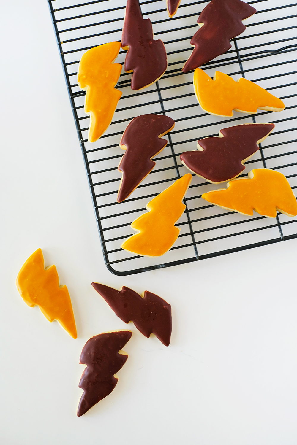
Olivia really wanted to set up the meal like a feast in Hogwart’s dining hall.
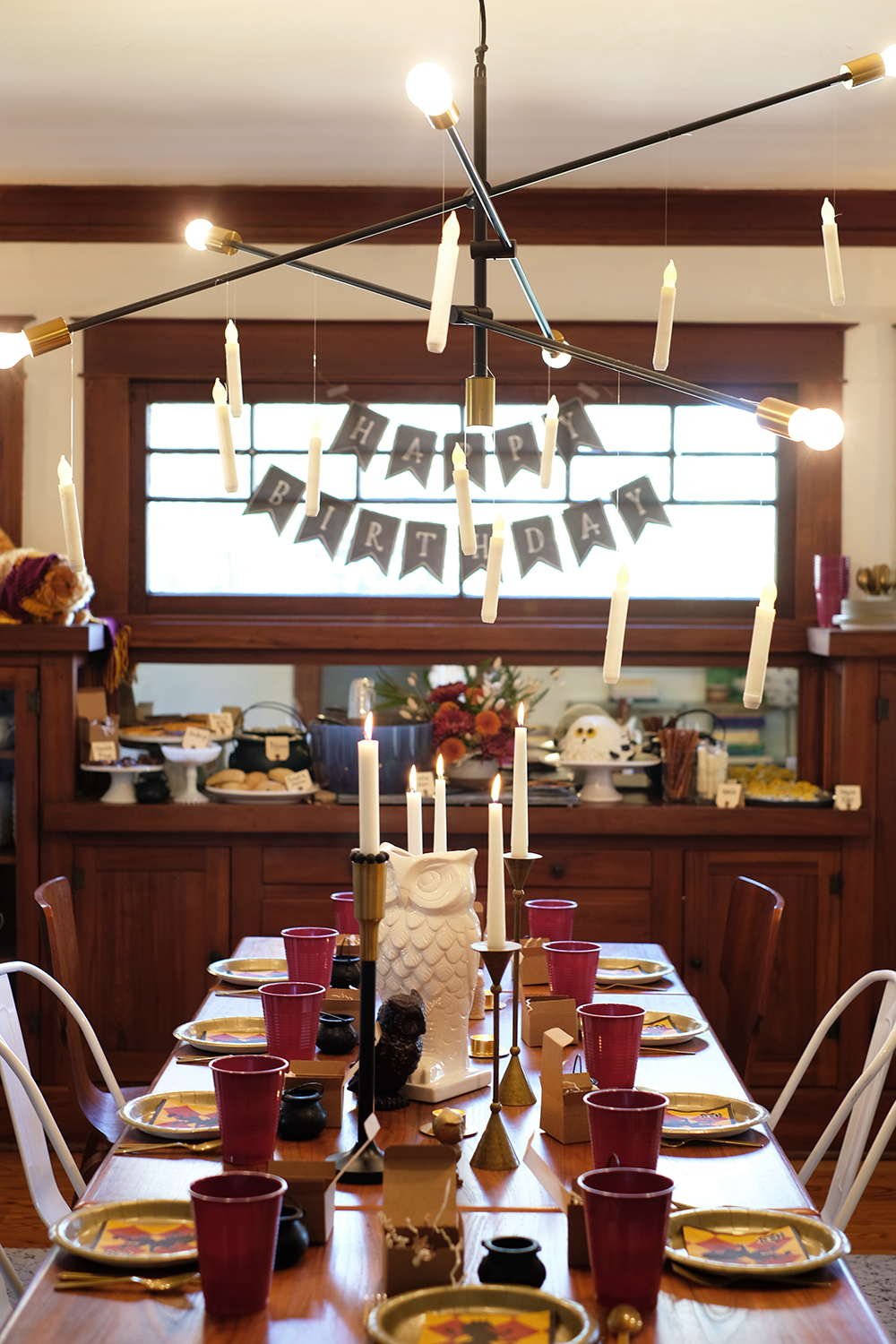
Here’s what was on the menu:
- Lightning Bolt Sugar Cookies (cookie recipe + royal icing recipe)
- Butter Beer Hedwig Cake (my mom followed this tutorial)
- Pumpkin Pasties
- Huffle Puffs (Cheeto Puffs)
- Professor Sprouts Veggies + Dip
- Fried Chicken Legs
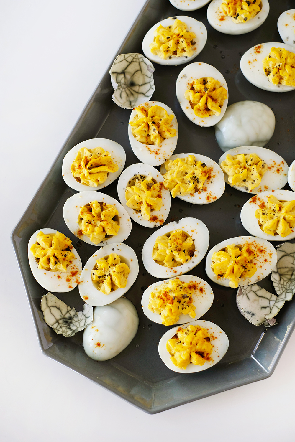
- Dragon Eggs (curry deviled eggs)
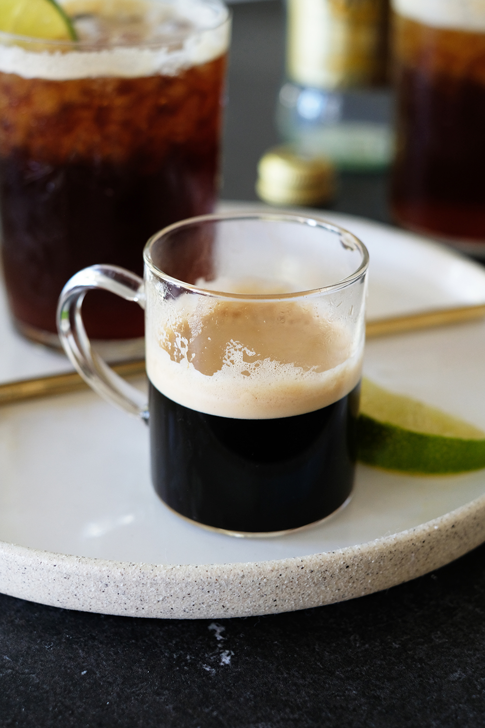
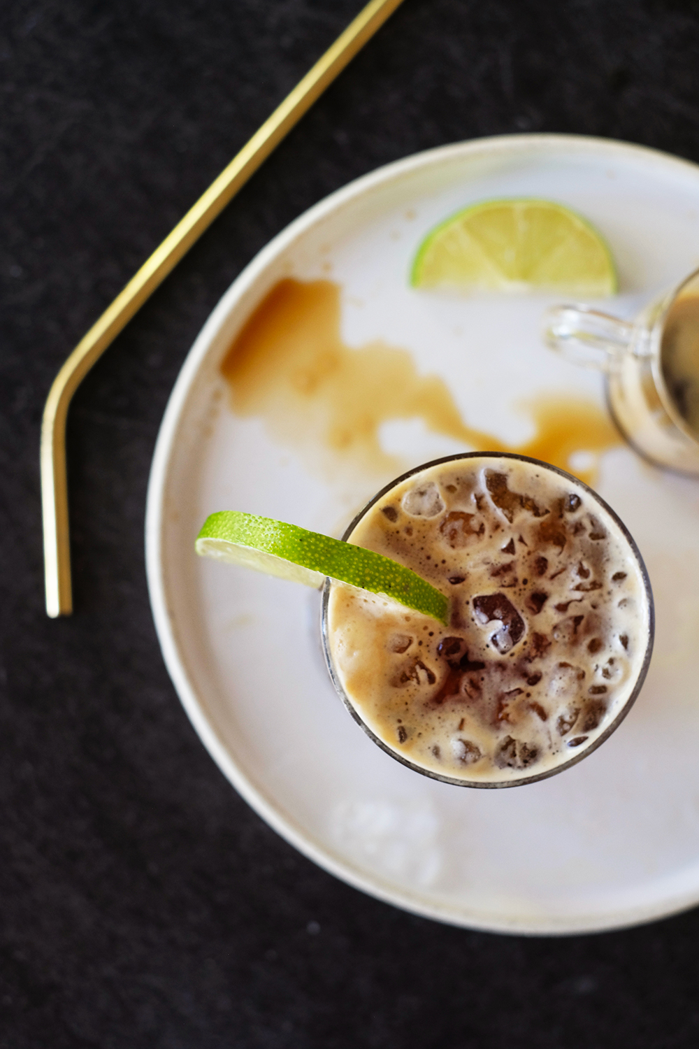
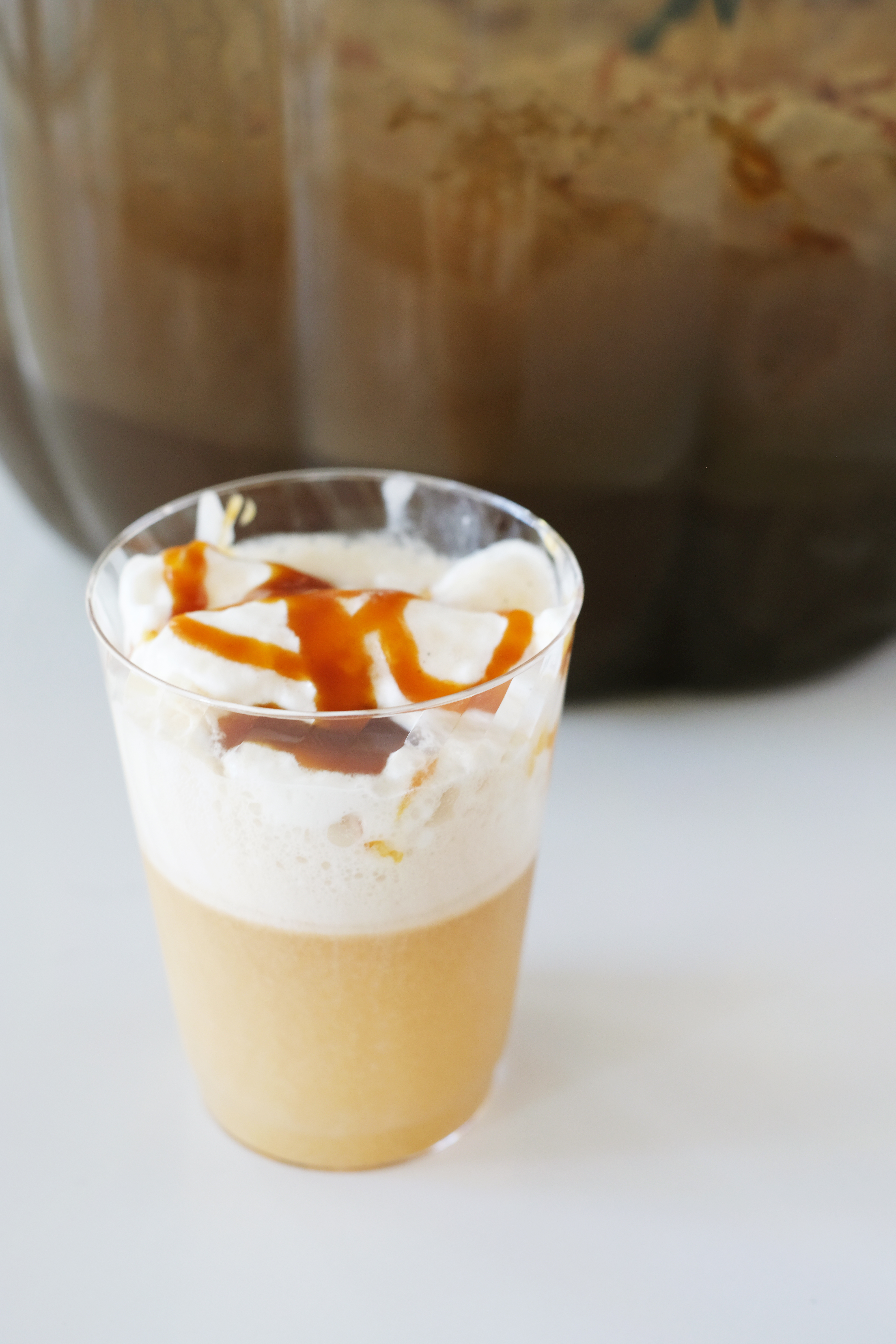
- Butter Beer
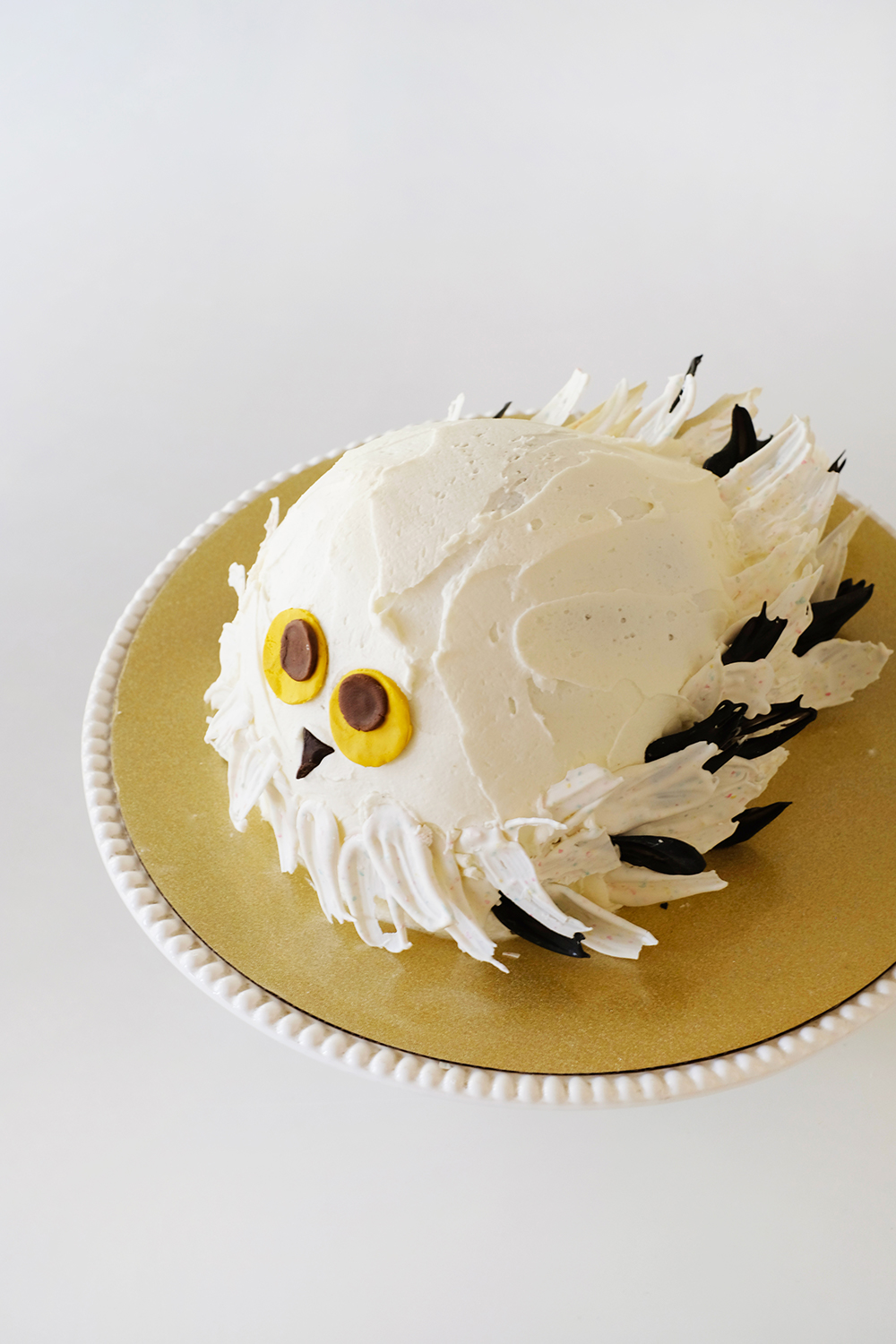
I take ZERO credit for this cake. My mom made it and put it in the freezer for me a week before. And then all I had to do was stick in the chocolate feathers and eyes. Isn’t it adorable?
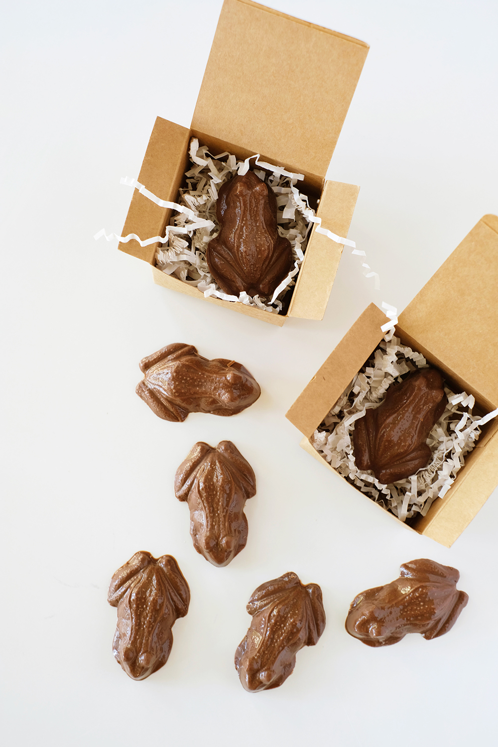
The chocolate frogs look very impressive, but these literally were the easiest part of the party. I bought this chocolate mold on amazon and then just filled it with Wilton Milk Chocolate Melts.

These Dragon Eggs are just fancy deviled eggs with a little curry powder.
These little Pumpkin Pasties were a great item to make ahead. I made a cream cheese, pumpkin pie filling and just my favorite pie crust. Then I brushed them with an egg wash and sprinkled them with sugar.

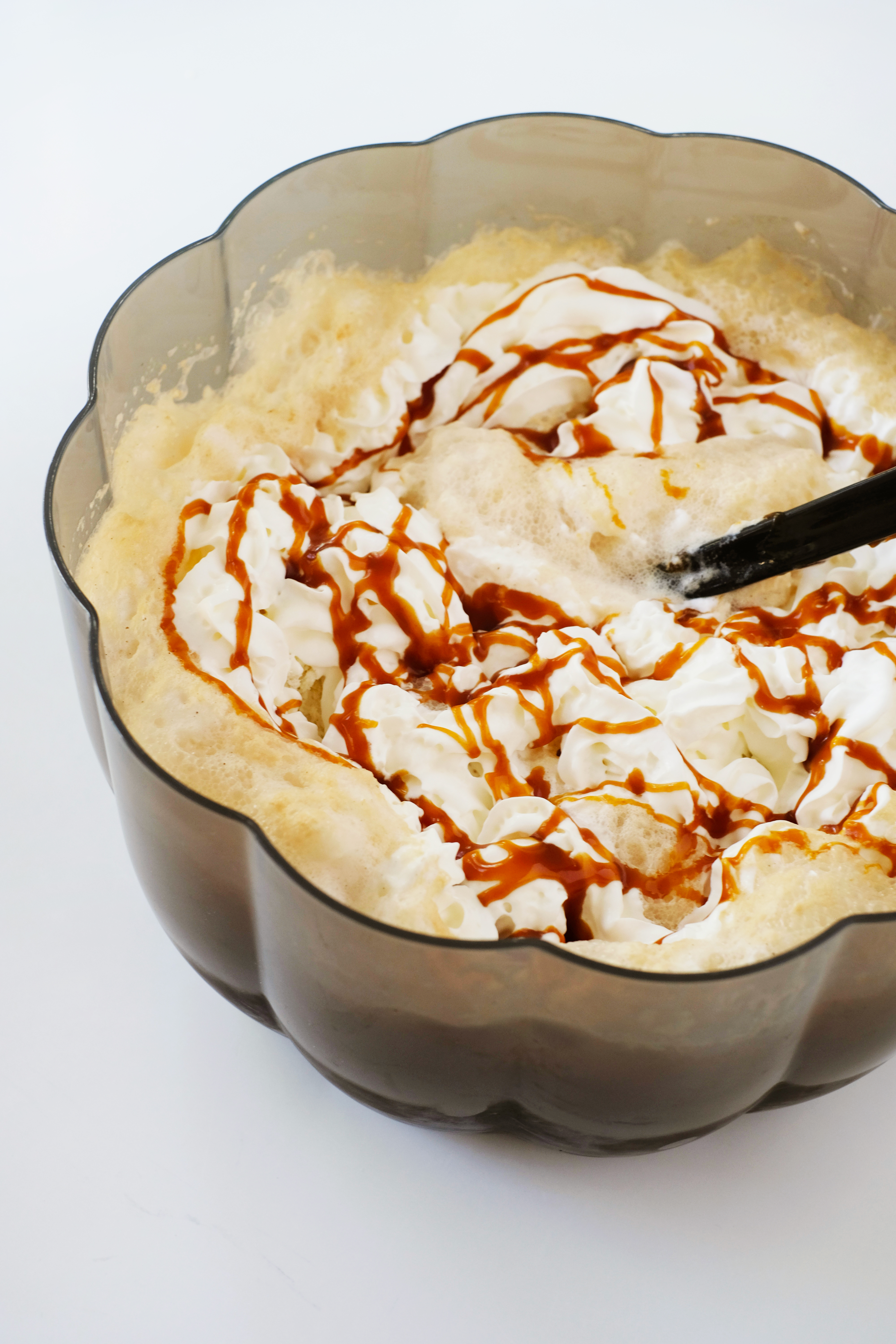
The Butter Beer was a hit. I simply filled a punch bowl with a chilled 2 liter bottle of cream soda, scooped in about 1/2 gallons of vanilla bean ice cream and then topped it with 1/2 a can of whipped cream and drizzled some salted caramel sauce all over it.
Here’s the games and activities we played to keep the kiddos busy:
- Pass the Parcel – This is a game we always played at my childhood birthday parties. You simply wrap a small gift/prize lots and lots of times, putting it in bigger and bigger boxes and wrapping it with lots of different papers. Then like musical chairs, you pass the “parcel” around in a circle. When the music stops, the person holding the gift gets to unwrap a layer of paper. The person to unwrap the last layer gets to keep the prize. I bought a small Harry Potter Lego set and had my husband wrap it at least 20 times.
- Potion Mixing – My husband had the kids mix vinegar and baking soda to make little potions. He made up clever names for all the ingredients, like the baking soda was unicorn horn. We also made edible slime and called it another clever potion name that I can’t recall.
- Stupify Tag – really this is just a fancy version of freeze tag.
- Hegwig Pinata – this always kills at least 15-20 mins of a party.
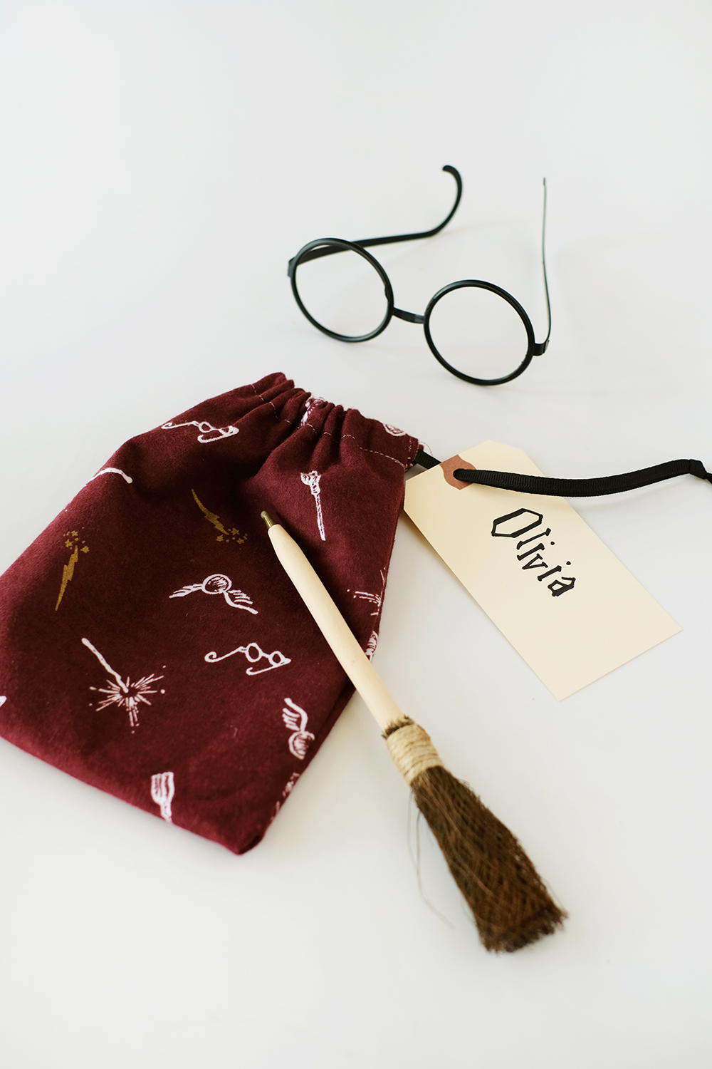
And finally, for party favors, I just ordered some glasses, broom pens and tattoos and filled little diddy bags that I made with some cute Harry Potter fabric.
